
the very first
belgian pilsener beer
belgian pilsener beer
gets a crafty feel.

beer & brand,
evolving since 1928.
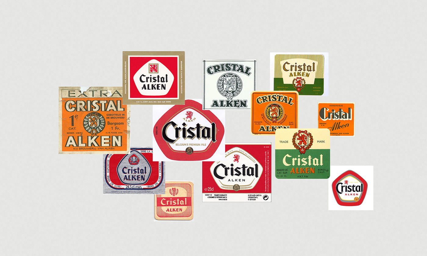
There’s a rich history behind every glass of tasty Cristal. As the first Belgian Pils it played a pioneering role in reshaping the beer world forever. In order to keep up with the ever-changing market, the brand’s visual identity underwent many makeovers over the years.
As we speak, many hectolitres of hoppy Cristal beer are maturing in the vats at Alken Maes brewery, a division of Heineken. Armed with a solid helping of mutual trust, Heineken and skinn teamed up to develop a brand strategy on Cristal’s unique and authentic personality. Our ambition was to let the brand grow from a successful regional player into a strong national brand with a premium feel.

a harmonious blend
of strategy & design.
You can’t hope to capture a strong position in the over-saturated beer market simply by following your instinct. In order to gain an insight into the market and Cristal’s USPs we organised a detailed strategic project. We had a critical ear, ran branding workshops, monitored trends & developments, carried out market research and analysed the results.
During the project certain conclusions became “Cristal” clear. For example, a conscious decision was made to give the Pils a crafty feel. In this way the beer can also benefit from the emergence of craft beers whilst also holding on to its reputation as a real, aromatised Pils.


crafting the
core elements
before being served.
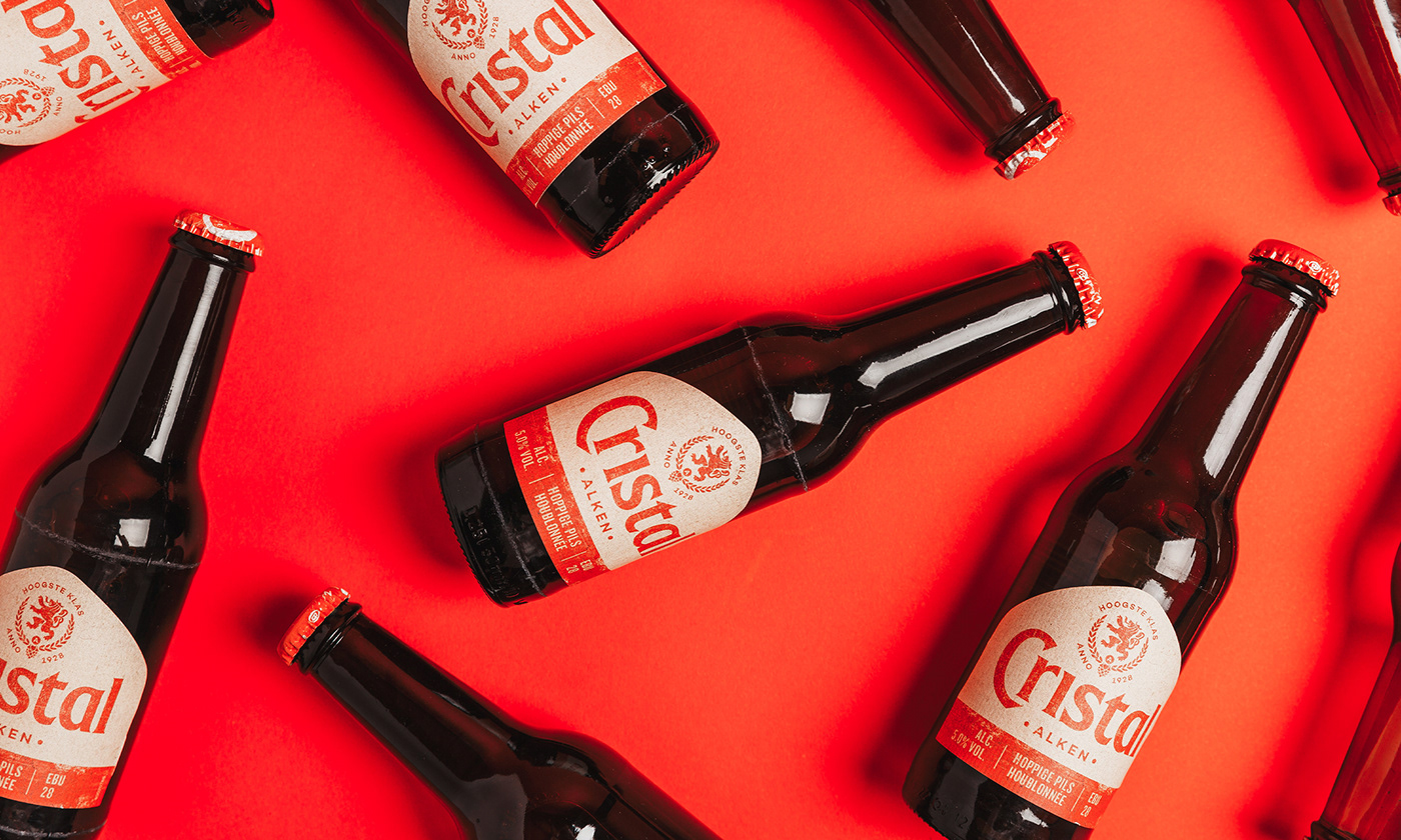
In order to stand out in the busy and colourful shelves it was decided to give Cristal an authentic and clear style. The strategic insights combined with Cristal’s pronounced personality inspired us to allow the evolution of the brand’s visual DNA.
We determined the core elements by carefully examining the many Cristal labels - used over the years - and claiming repetitive elements. The unique pentagon shape, the typographical logo, red as the accent colour and the heraldic emblem with lion signature originating from the region of its roots. All elements were given a restyling and have been refined to their essence, without losing the brand’s authentic identity.


brewing a
fresh & consistent
brand framework.
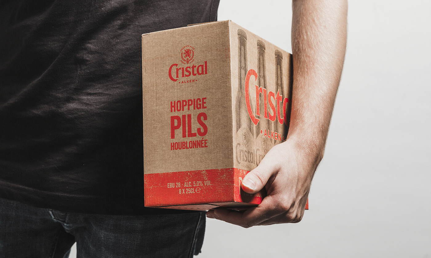
After the maturing process of the visual core elements all components were combined in the brand book. This is a united framework for the brand that can be applied to everything bearing the new branding. Implementation of this framework on things such as packaging, POS marketing, campaigns, gadgets, etc. creates a uniform brand experience with a strong impact.


product & lifestyle
brand imagery.
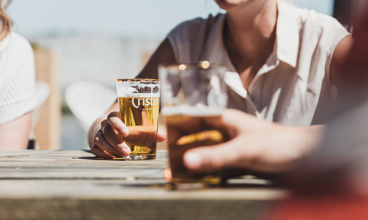
We defined the characteristics for Cristal’s imagery in order to reinforce the general experience of the Cristal brand. Products are featured as pure and honest, combined with an authentic and traditionally-crafted feel. We show ‘real’ people. As they live, work, relax and enjoy. In this way we created a uniform image style for everyone that wants to work with the new Cristal brand.


cheers!
The 90-year-old beer brand now has a fresh new look and respects its original recipe as a real, wholehearted Pils. Let’s drink to that. Santé!


