

Penguin Adult Prize 2013
by Raymond Chandler ''The Big Sleep''
brief.
The Big Sleep is a serious and significant mainstream novel that just happens to possess elements of mystery and crime. The story is well known both in celluloid and print so it is essential to come at it from a fresh angle. Try to design a new cover for a new generation of readers, avoiding the obvious clichés. Originality is key.Audience: all readers both familiar and unfamiliar with the text, male and female.Message: there are many layers and themes within the book. Read it and discover what the book means to you.The judjes are looking for a striking cover design that is well executed, has an imaginative concept and clearly places the book for its market. While all elements of the jacket need to work together as a cohesive whole, remember that the front cover must be effective on its own and be eye-catching within a crowded bookshop setting. It also needs to be able to work on screen for digital retailers such as Amazon.
concept.
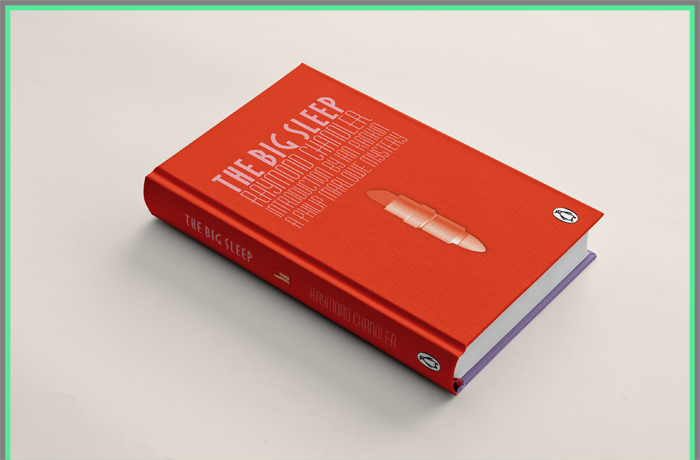
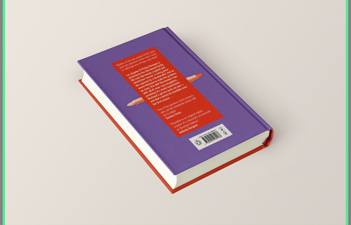
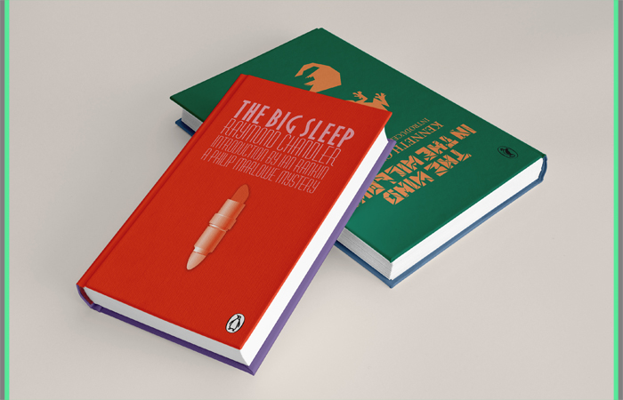
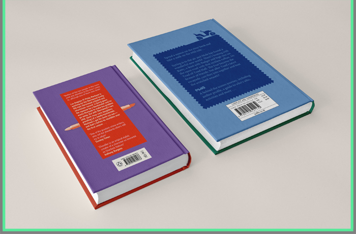
The first thing I took into consideration was the time period in which the book was pubished namely 1939 which was the time when the artistic style Art Deco was popular. So I decided to reflect the time in my design via using 3 distinct for the period typfaces for the titles and back text as well as a color scheme that could be perfecly applied to Art Deco artworks and that is also somehow showing the criminal feel with this bloodish red on the front.The novel is full of key points, actions, things that could be taken as emblematic to portray the essence of it, so I chose to go for trying to combine the female presence and its strong, important, key role in the book with the rough, criminal side of the occuring plot via mixing in one simple shape - a lipstick and a bullet. The interesting side of this I think is that those two objects are at the same time in full contrast with each other (normally) but in this case they definitely complement each other so I thought it would be interesting for the audience to think over that. I also wanted everyhingto be as simple and clear as possible and thought it's a strong visual so I used it in a different way on the back cover plus spine so that I could stress on it even more.
Puffin Children's Prize 2013
Book Cover Design the classic children's novel
by Kenneth Grahame ''The Wind in the Willows''
brief.
Students are invited to design a whole new cover look for The Wind in the Willows, in order to reinvent this classic for a new generation of readers, encouraging children (and adults) to revisit it time and time again, and ensuring that it remains an integral part of childhood.The judjes are looking for a striking cover design that is well executed, has an imaginative concept and clearly places the book for its market of both children (to pick up and buy for themselves) and adults (to buy for children). While all elements of the jacket need to work together as a cohesive whole, remember that the front cover needs to be able to work on its own and be eye-catching within a crowded bookshop setting. It also needs to be able to work on screen for digital retailers such as Amazon.
concept.
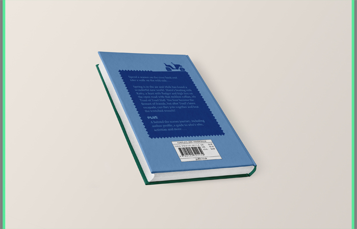
First of all with the color scheme I bring out some freshness the old classic novel needs usually but along with that it also goes well with the story itself because greenish and blueish tones are associated with nature in relation to the river and the spring season as well. So I think the combination of colors stand out nicely and overally gives some boldness and could appeal to both children and adults as it is not so bright to distract but at the same time has got that feeling of brightness so that it catches attention.For the illustrations and typography. I tried to consider all elements - front, spine and back. I used sharp and crispy strokes for the animals ( the four main characters in the story ) on the front and the car on the back as well as for the letters forming the title of the book to reflect the time, the artistic period through which the book emerged namely a bit of Cubism, Constructivism and Futurism - all linked via the usage of sharpness, angularity and geometric shapes and patterns.The title itself along with all this suggests a feeling of wind going on among the tiny bits forming the letters which are actually sharp cut outs which could be seen as abstract leaves in motion = wind.For the author's name, spine and back text used only one typeface - Minion - a classic serif font, according to research the most often used for book covers, just wanted to play safe with it and be concise and not to distract the eye with too much different and unexpected fonts going on having in mind the title's unusual type style.
Overally, I wanted to make a clean, fresh, bold, simple and at the same time detailed book cover which also tells something about the period in which it was created and I think I managed to achieve that to some extend.

Thank You!


