Jaxbird
Brand positioning, Corporate identity, Architecture, Website
Jaxbird is a an consulting company who with a passion plunges into challenges and executes them flawlessly. The most important thing are the people and solving their problems using smart creative solutions.
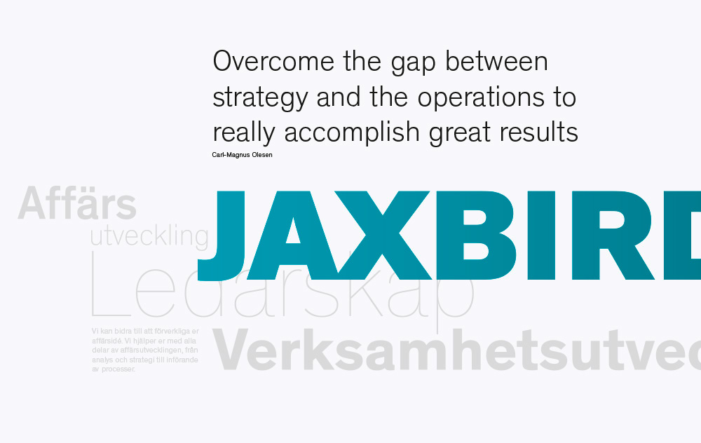
With enthusiasm and excellent listening skills Jaxbird can helps “strategy and the operations to really accomplish great results”. This is typical creator whose mind and ears are widely open. Combining
this attitude with hint of humour Jaxbird differentiates from other companies in the market.
With enthusiasm and excellent listening skills Jaxbird can helps “strategy and the operations to really accomplish great results”. This is typical creator whose mind and ears are widely open. Combining
this attitude with hint of humour Jaxbird differentiates from other companies in the market.
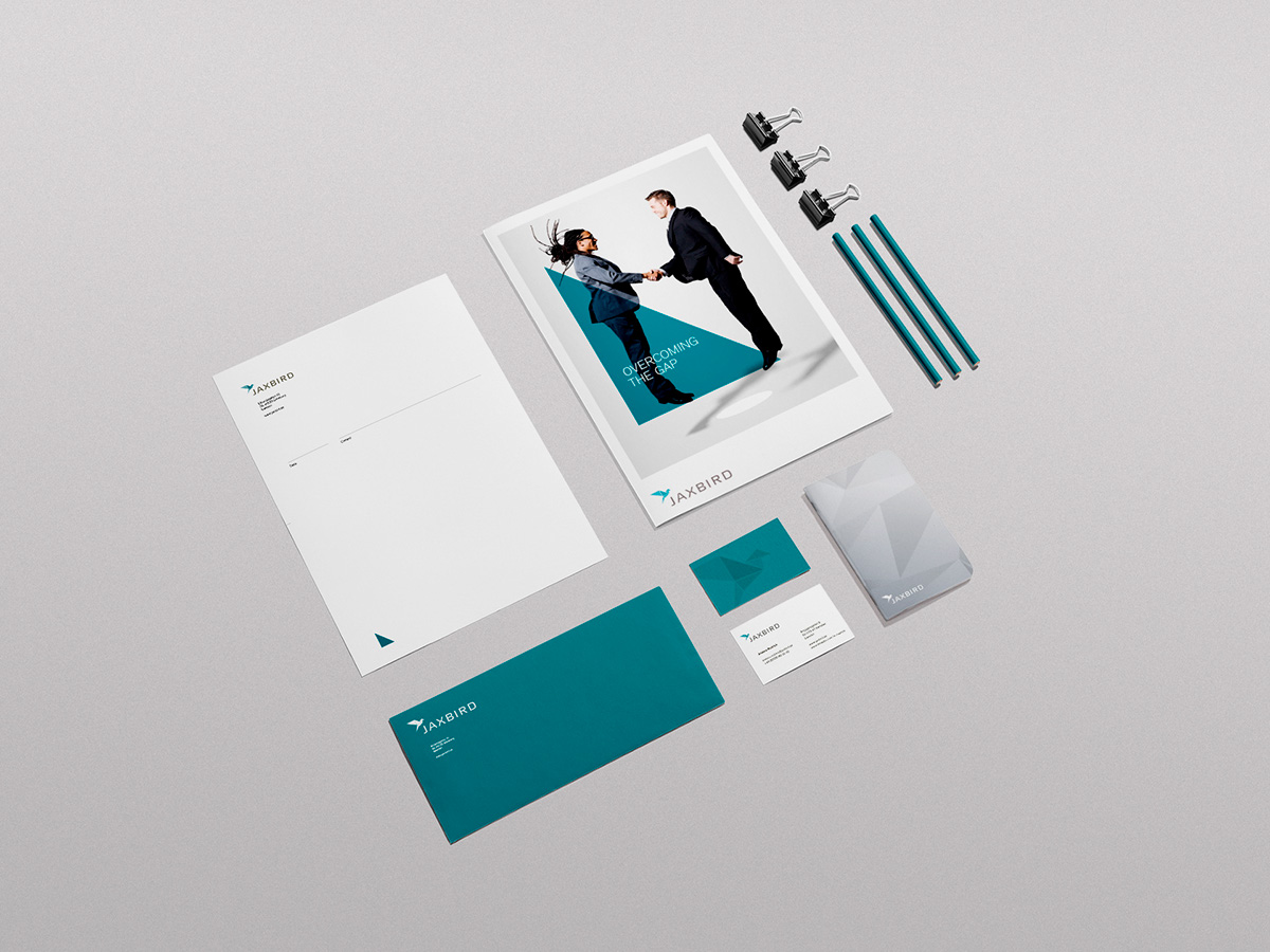
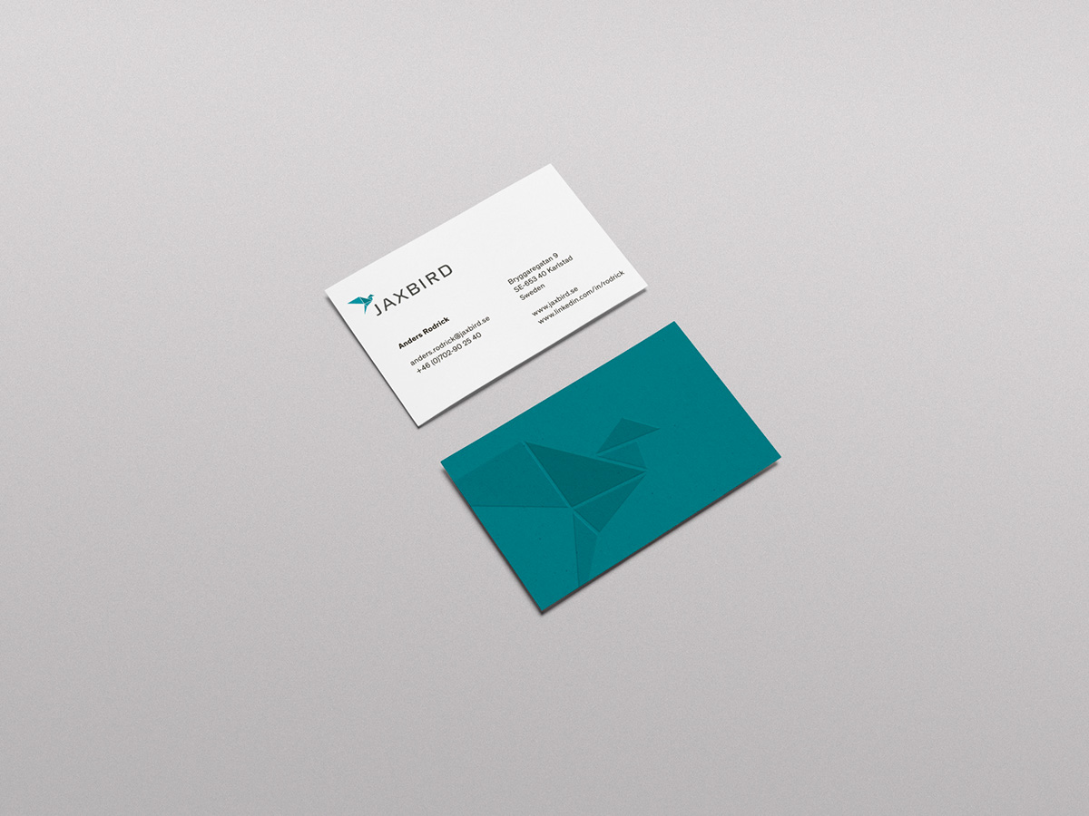
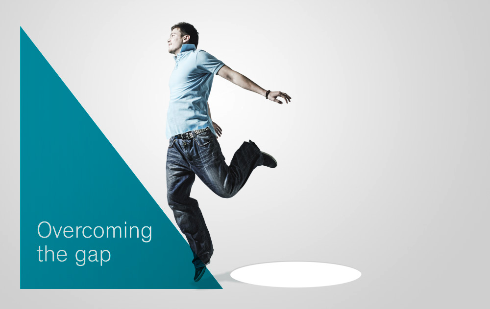
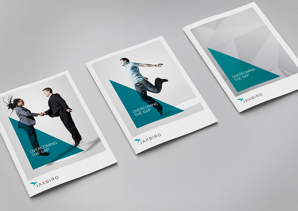
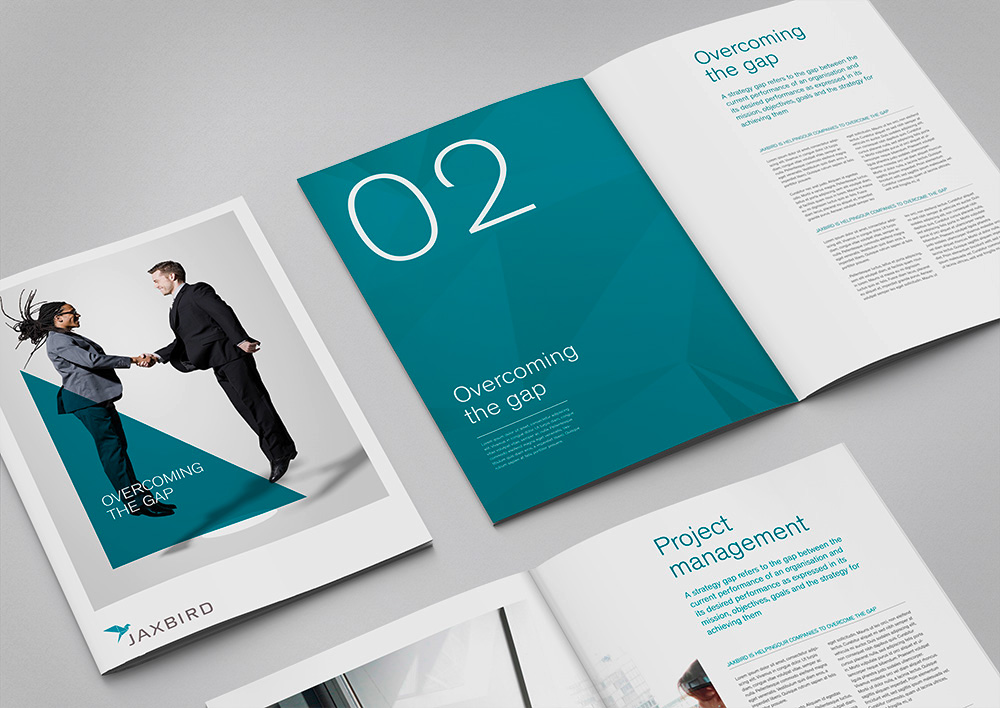
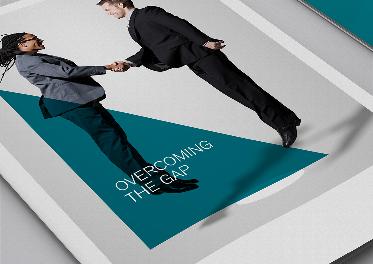
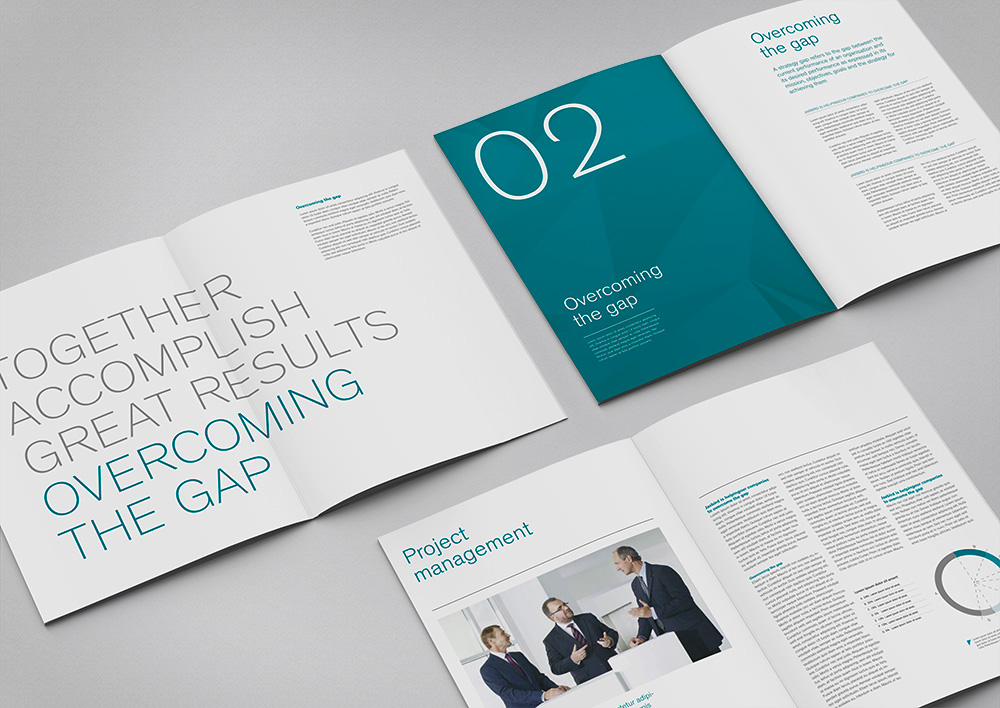
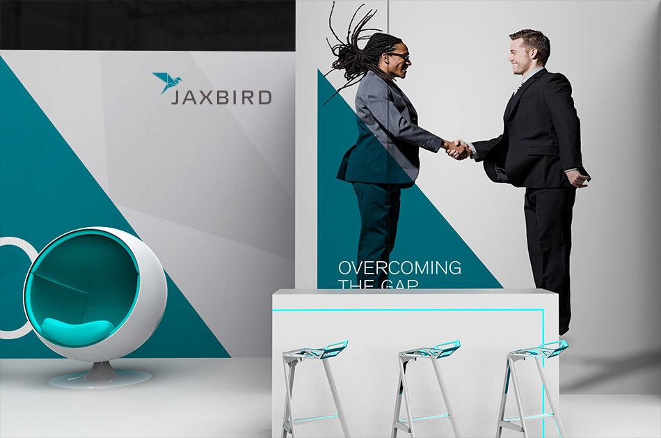
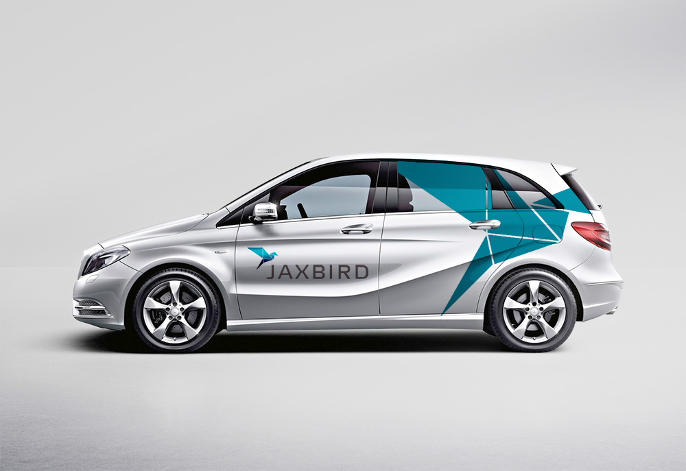
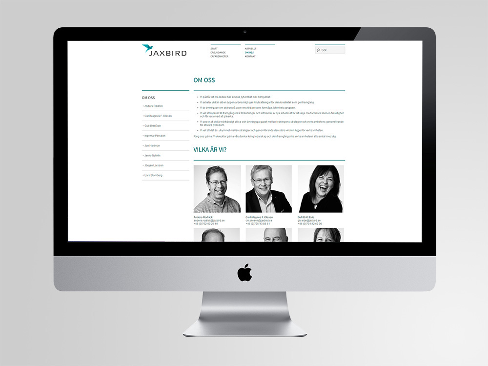
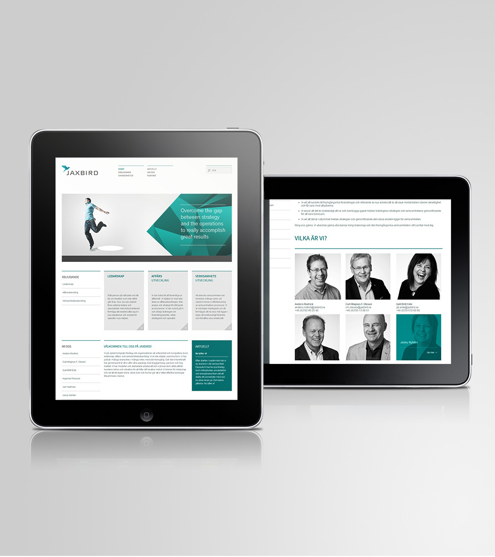
Studio Fuerte was asked to create whole corporate identity. We started the project with brand positioning and determining what Jaxbird really is as a company. After describing identity of the company we started working on a logotype. Symbol refers to the part of the company’s name. Bird in the logo becomes a symbol of connection, unbounded freedom of mind and positive energy. The inspiration for the overall form was the origami crane, referring the simplicity, creativity and patience, being also part of minimal aesthetic so similar to Sweden and Japan. The rigid and geometrical shape is visualisation of strong Sovereign archetype, which is embodied by this type of visual features.
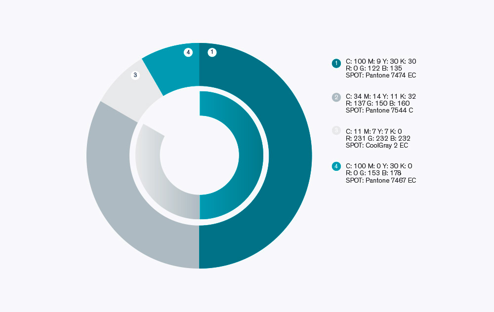
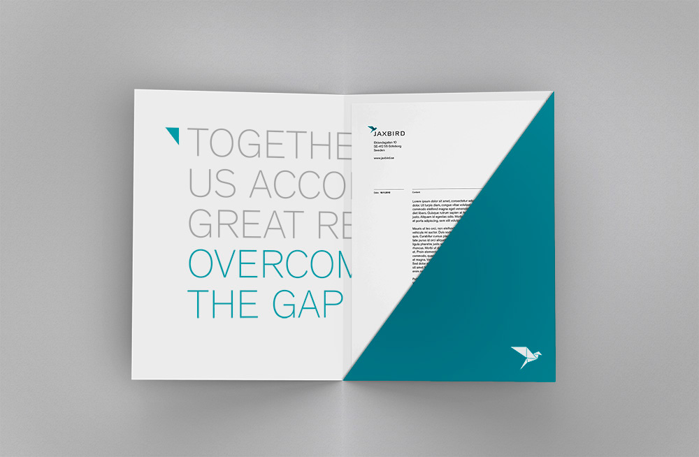
The second part of the project was to create whole visual profile. The triangle, being part of the logo has become the main element of the identity. Origami is a combination of crests and folds and only their perfect combination leads to final form. The same is with institutions – they are combination of smaller elements. Application of only part of the logo is a metaphore that smaller elements lead to results. This also creates strong, and characteristic design element that is easily recognisable, geometric and strong.