


Prosciutto di Norcia
Prosciutto di Norcia is one of the most historic and famous prosciutto in Italy. A truly ancient history built on artisan skills, expert craftsmanship and centuries old traditions firmly rooted in the local area of Valnerina in the center of Italy.
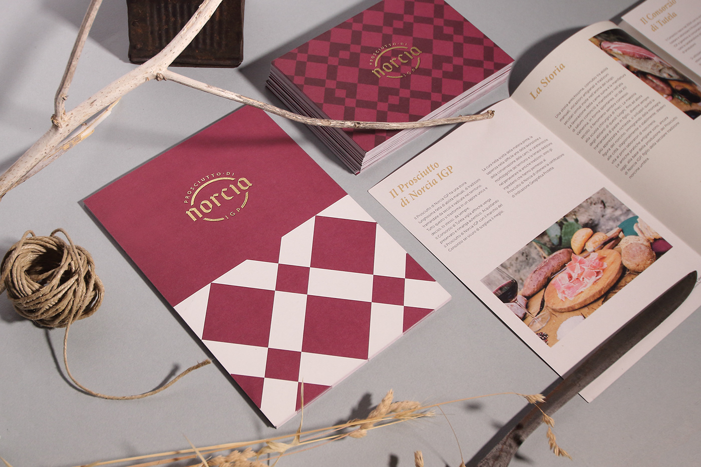
For the whole project we wanted to transmit the two main features of Prosciutto di Norcia: the quality of a high-end brand and craftsmanship of the product through materials, patterns colors and print finishes.
Our goal was clear: to find the right balance between elegance and a warm, tactile and artisanal touch.
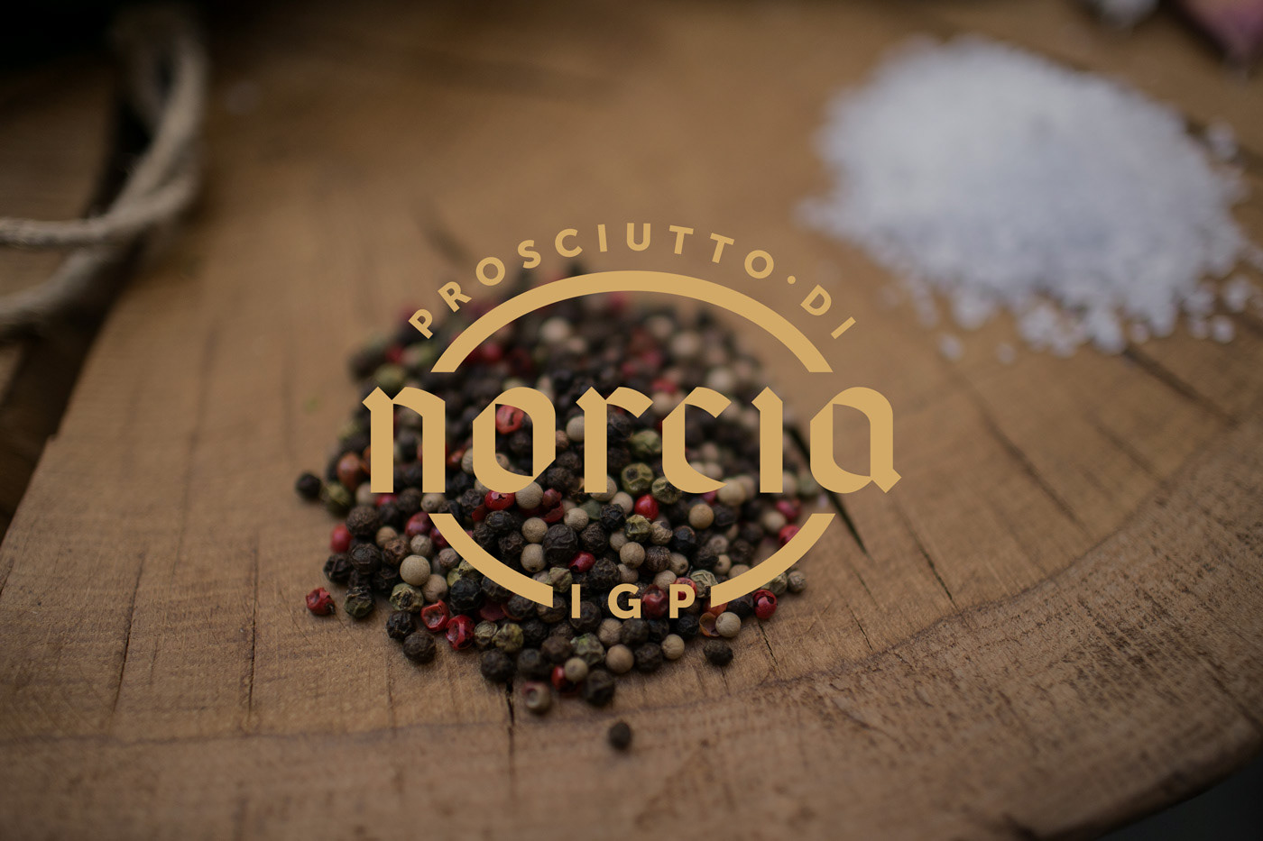
At the core of our rebrand there is the new logo. For the logotype we decided to reference to the historical writings made by the ancient Norcia Benedictine Monks. We were tasked to integrate in the logo the full wording of Prosciutto di Norcia I.G.P.
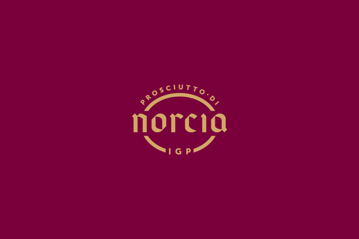
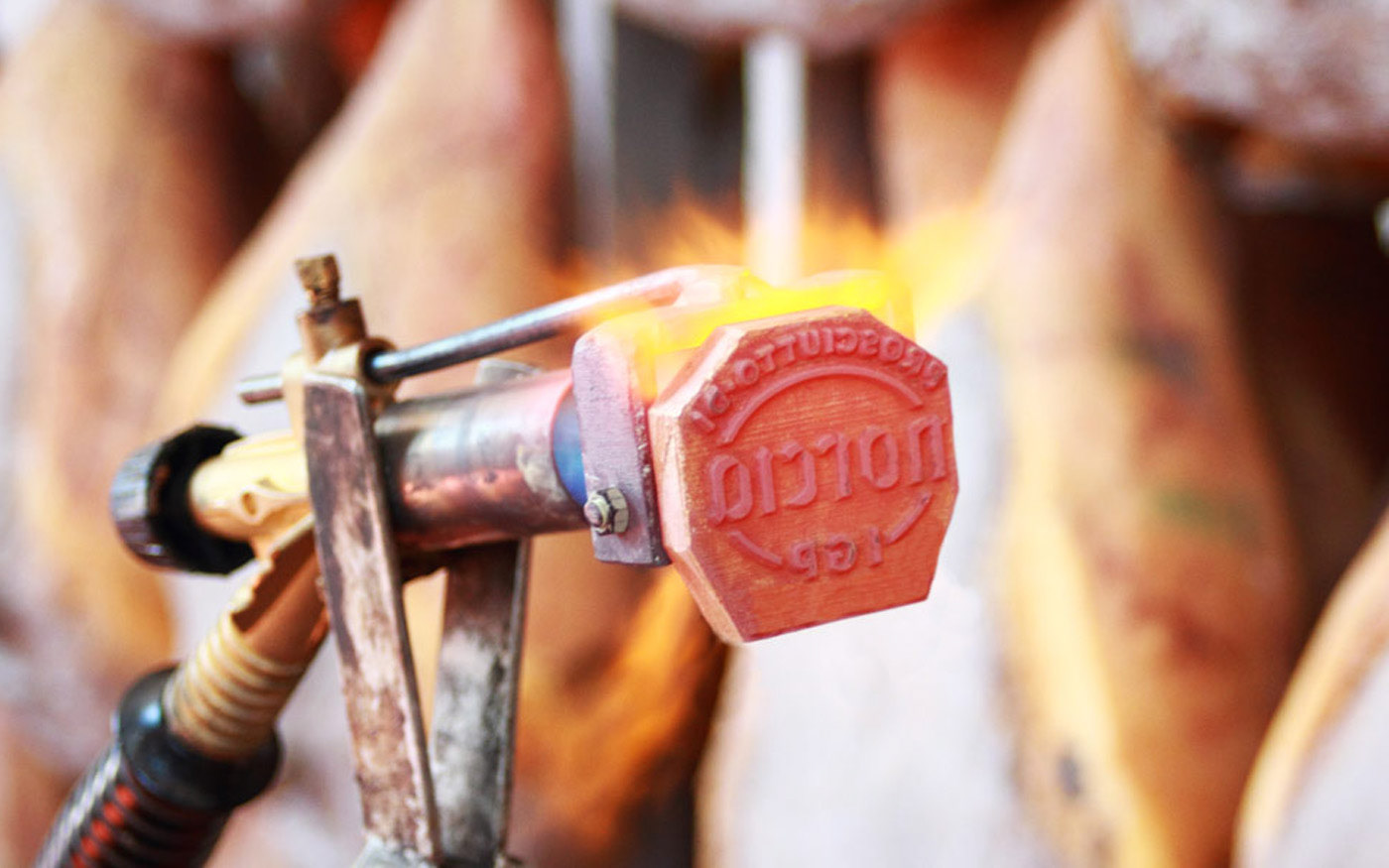
We solved this by creating a logo that reminds a stamp, useful both for advertising purposes and to brand the hams.
The result is a bold graphic mark rooted in traditions but looking to the present.
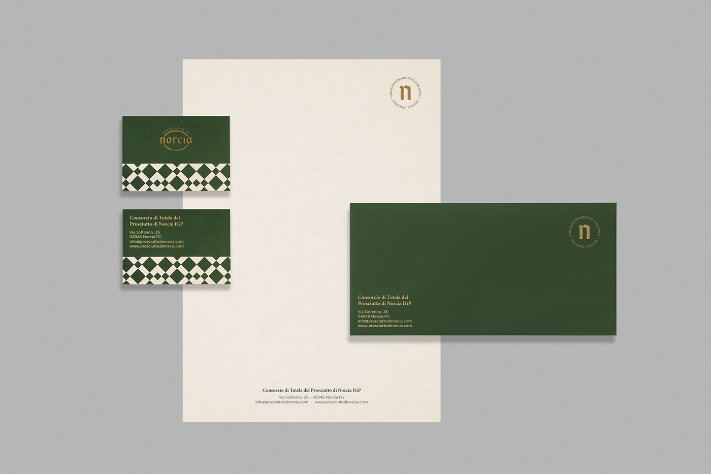
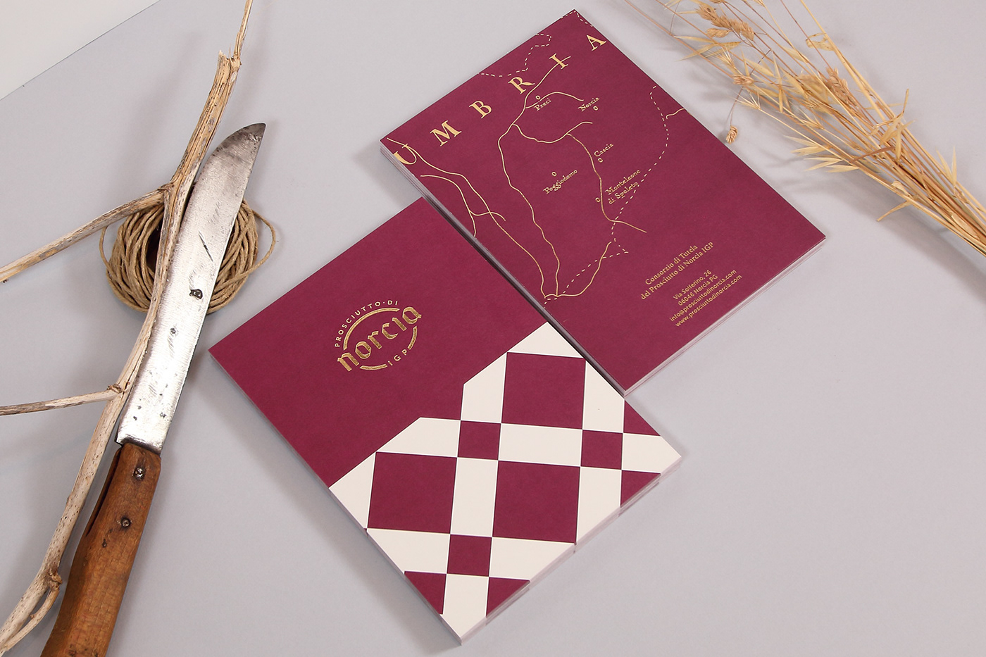
We also designed different square patterns, reminiscent of the floor decorations in some Umbrian medieval churches, and used them throughout the brand identity.
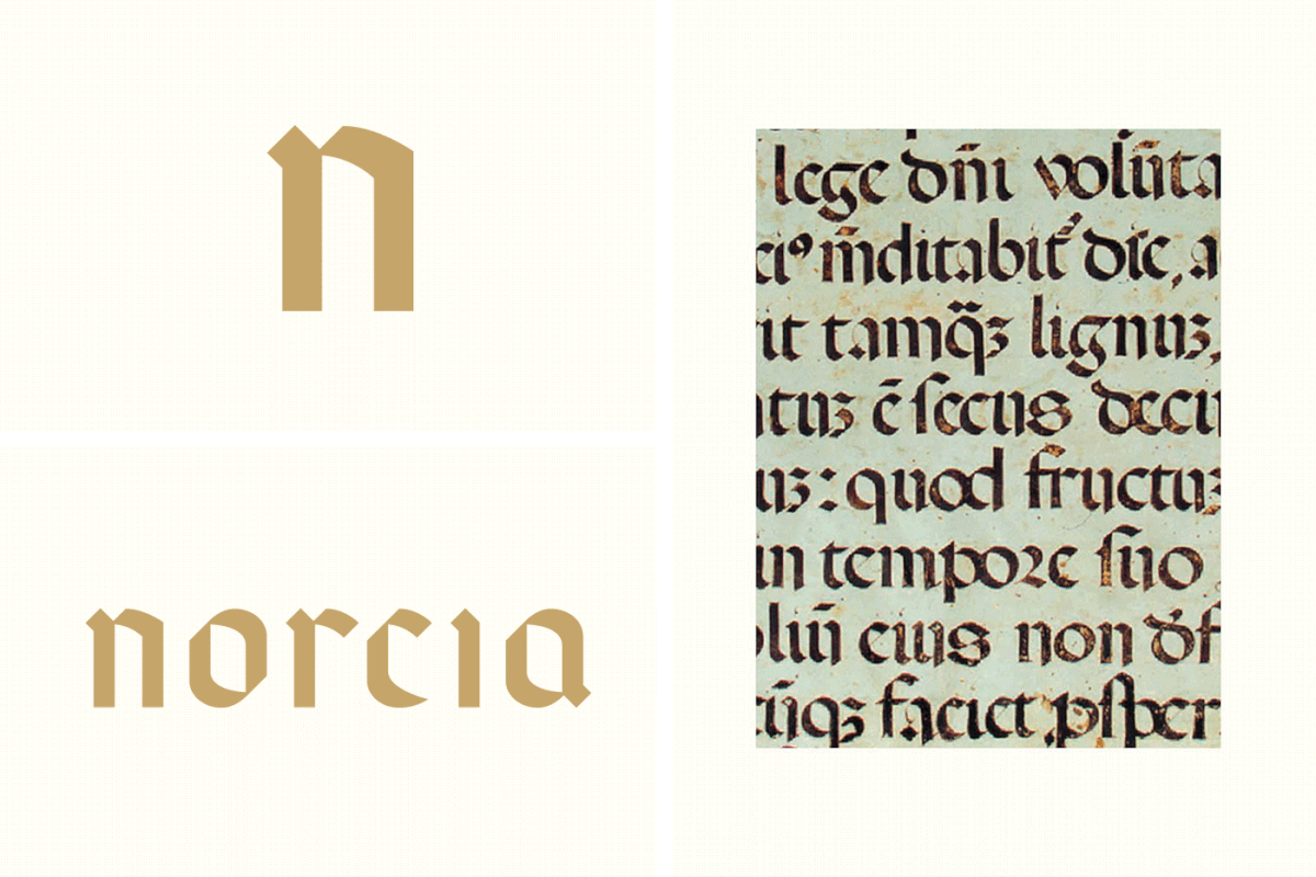
Construction of the logo. Taking the letters of the scribes as a reference, we have designed our letters slightly inconsistent with each other.
We designed 3 logos usable within different applications: a primary logo, a more decorative one and a synthetic one.
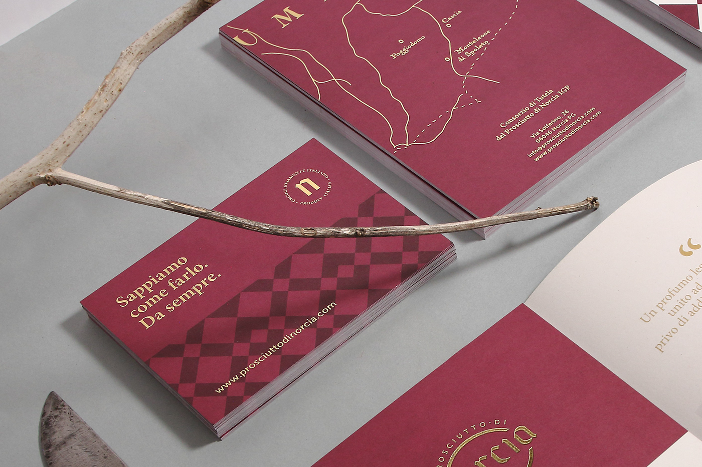

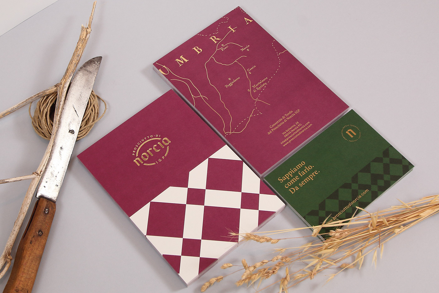
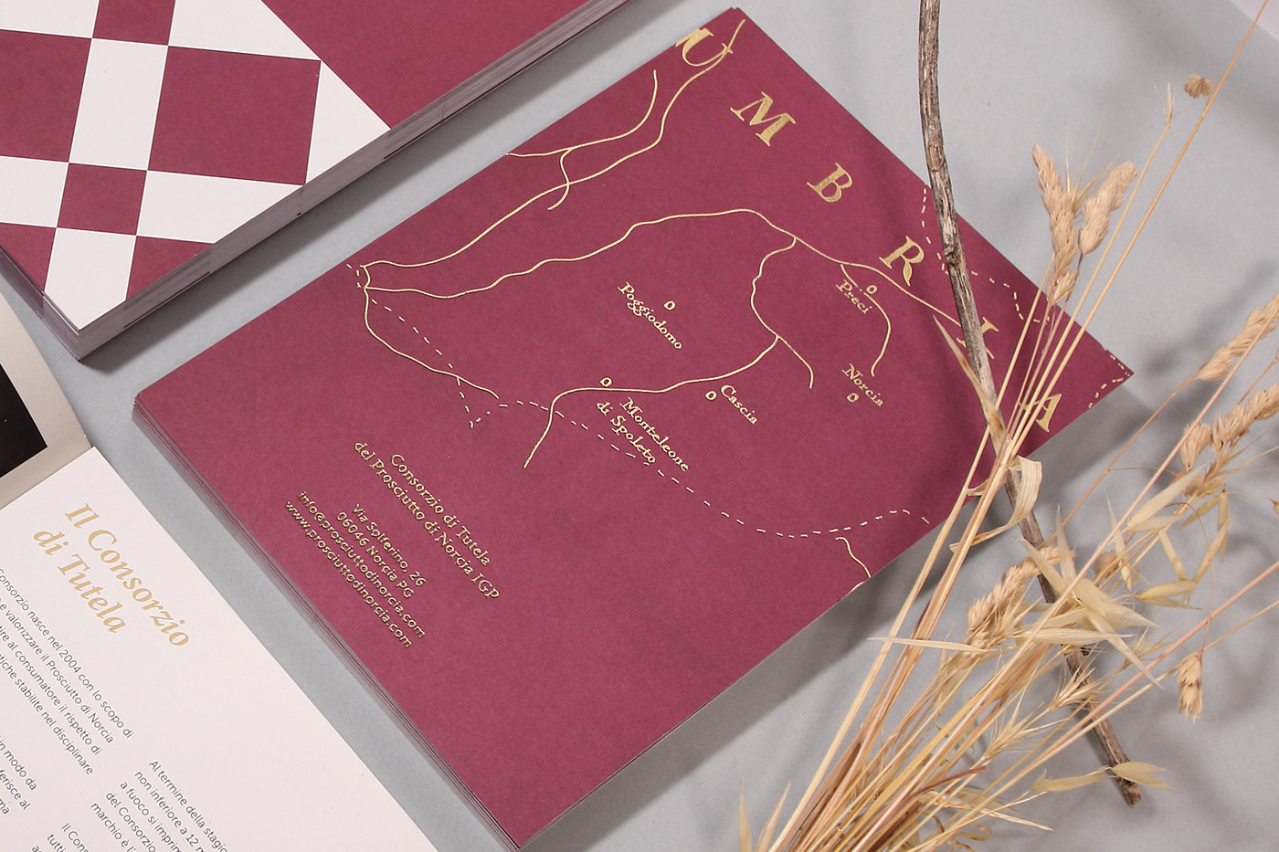
Above a reproduction of an old map that represents the places where the ham have been produced since ancient times.
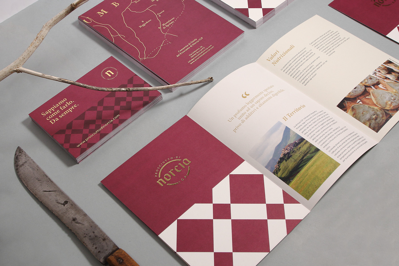
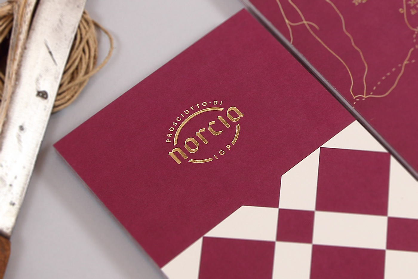
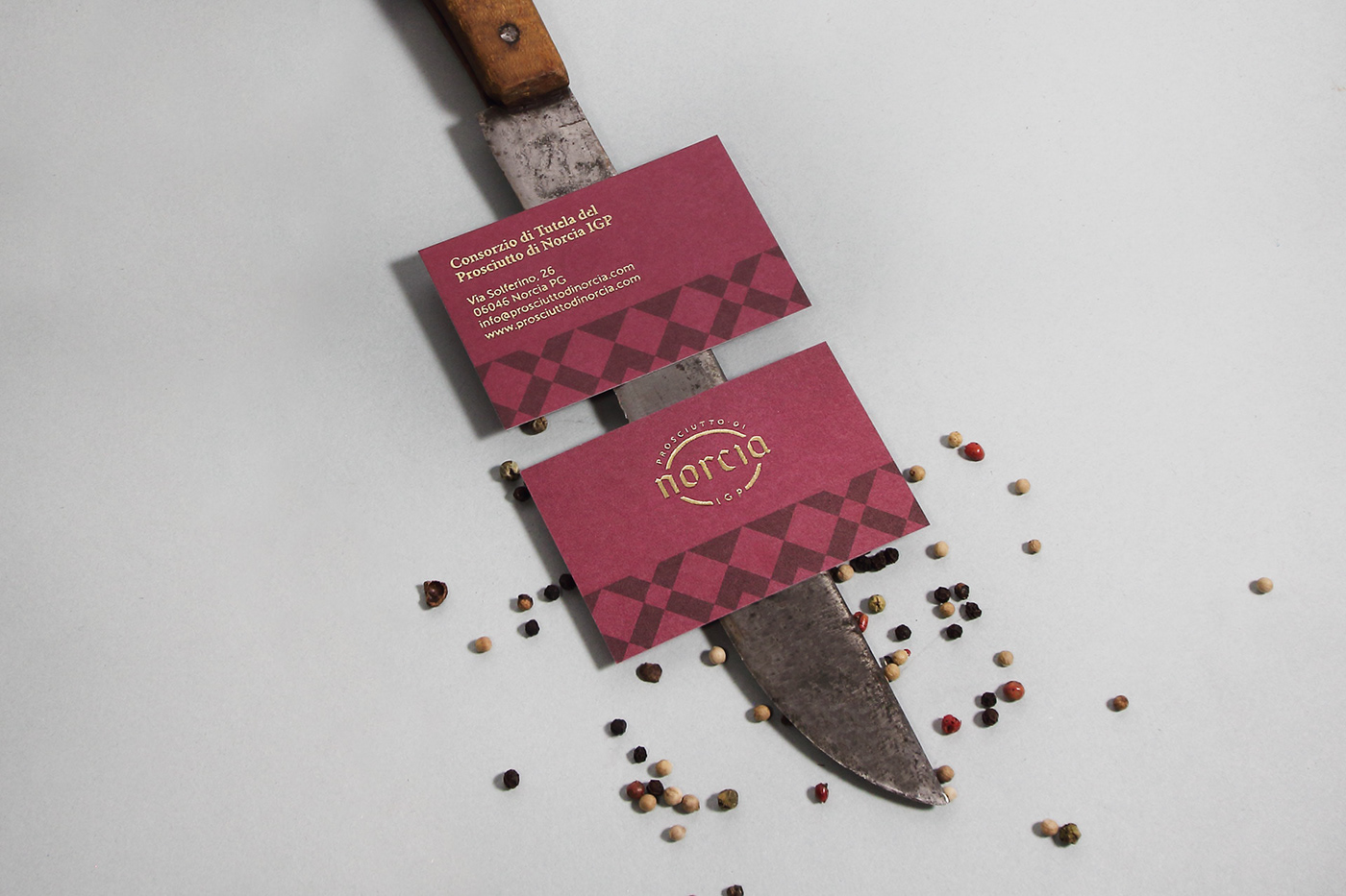

Photo by alessandromari.net
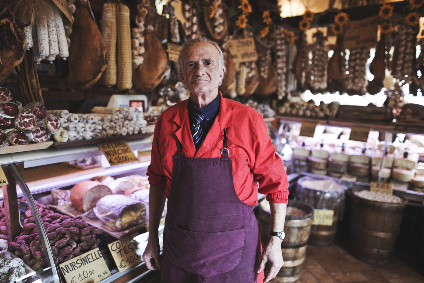
Photo by alessandromari.net
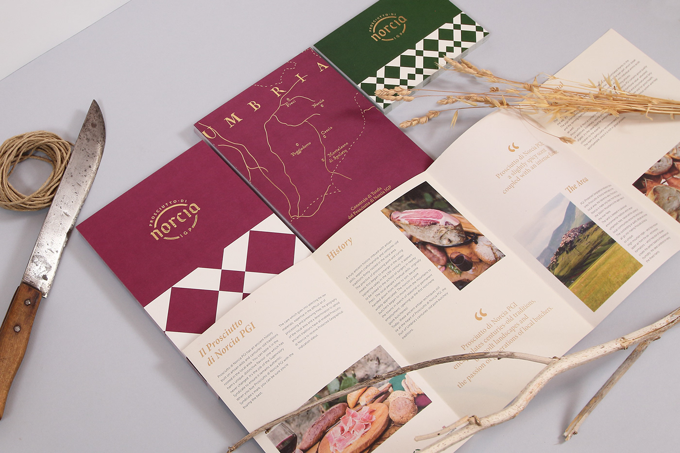
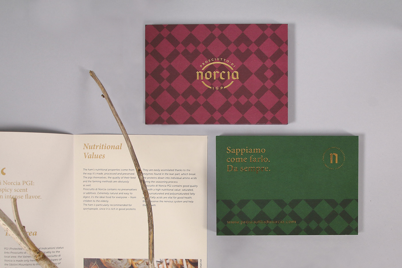

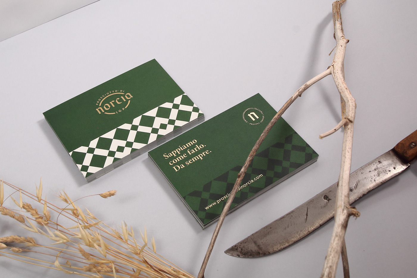
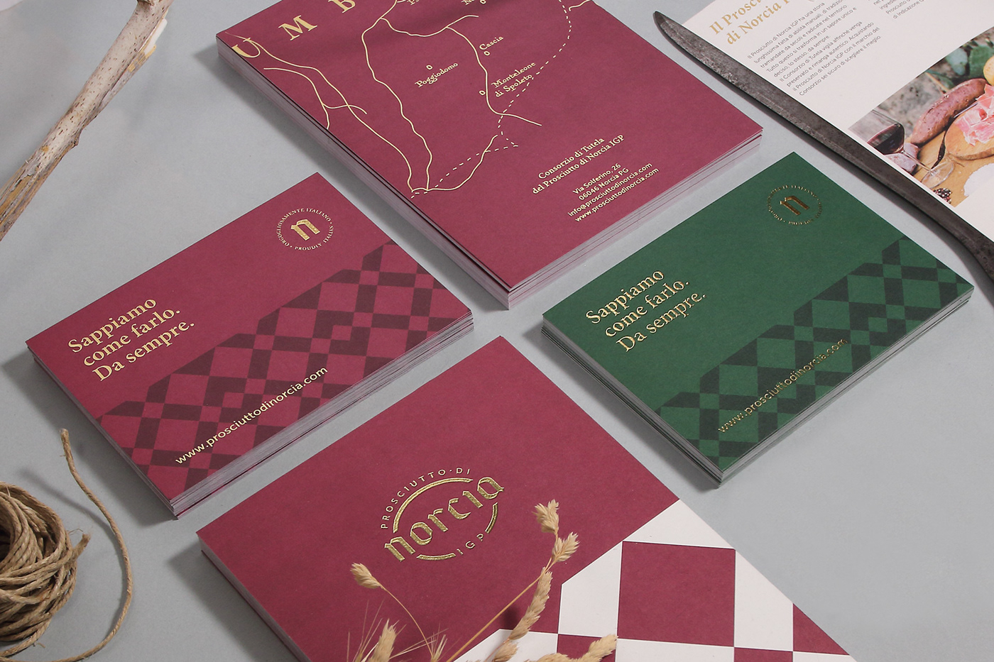
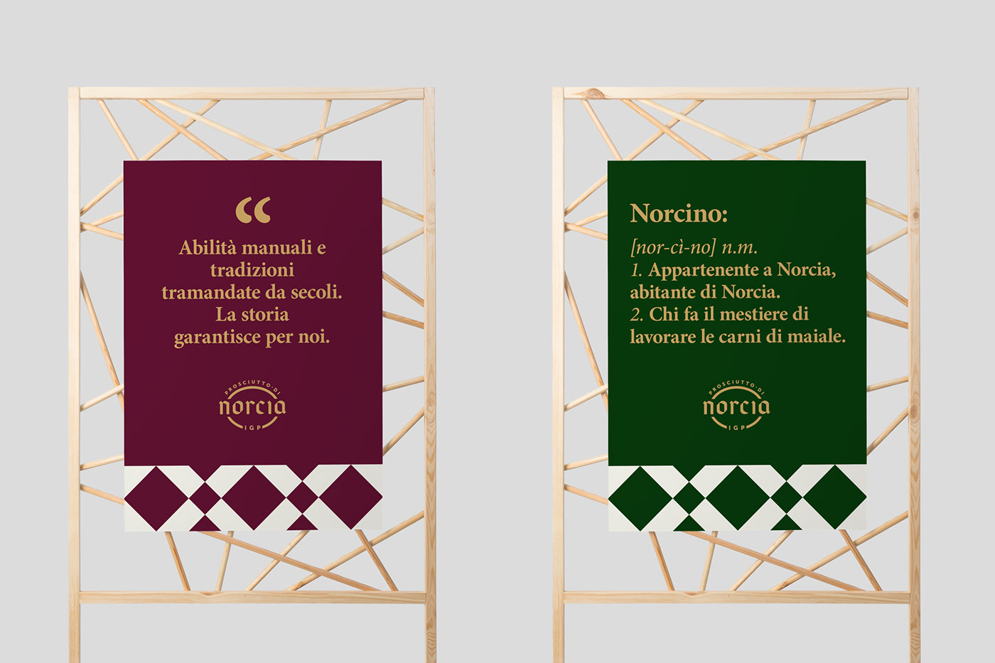

Different patterns and logo combination.

website prosciuttodinorcia.com

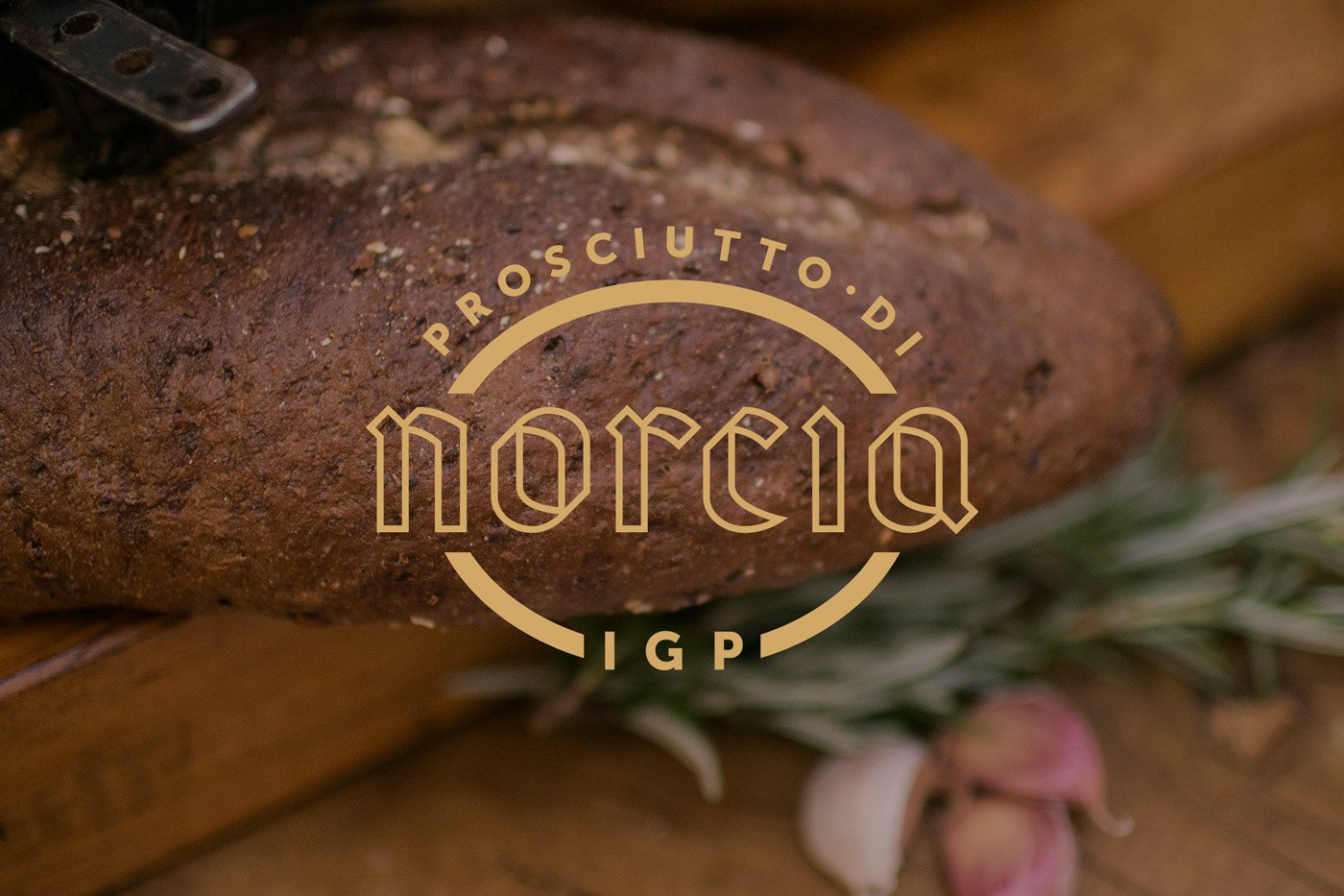
Photo by alessandromari.net


