The project was for my typography III class, we were given the Dr. Bronner's type challenge. The original challenge set out by all-one-typography.com was to redesign the label for Dr. Bronner's Magic Soap without removing any of the original text or adding any new text. Our professor, gave us the ability to remove up to 300 words from the labels design.

A big part of the project for me was to try and make Dr Bronner's soap more accessible to a wider range of customers, the Moral ABC's being an obstacle. Although I enjoy Bronner's religious rants, I understand that to many consumers this is a turn off.

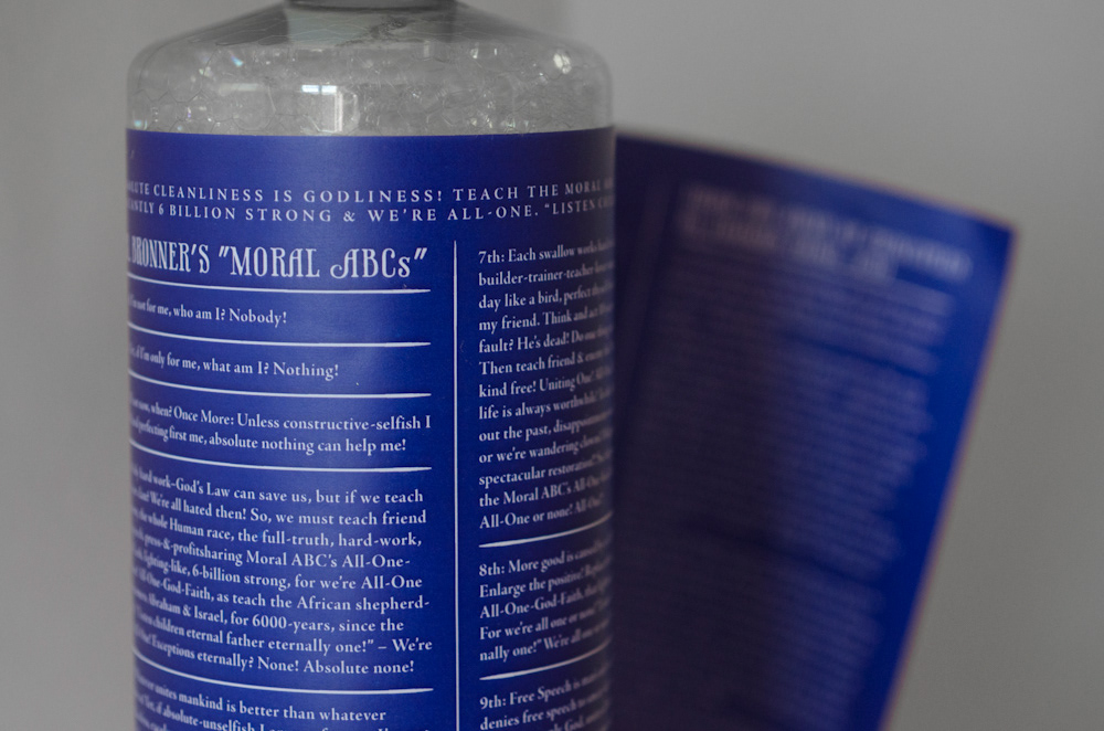
The solution to this obstacle was to create a label that peeled off to reveal the Original Moral ABCs.

The inside reverses to white on reflex blue.

While subduing the text from the cover I improved the text's readability by giving it more space to occupy.
Should Dr. Bronner's label actually be redesigned? …Probably not, it has a cult customer base who know and love the crazy label all too well to let it change. As a project this was fun, but personally I love the label as it is.


