


Penguin Book Project – One Flew Over The Cuckoos Nest, Ken Kesey
The brief was to create a special edition version of a Penguin book off of a list of approximately 20 options. I decided to go with One Flew Over The Cuckoos Nest by Ken Kesey as it was a book I had wanted to read for a while and was already a great fan of the film. To begin with I decided to read the book and depict the themes and symbolism within the story.
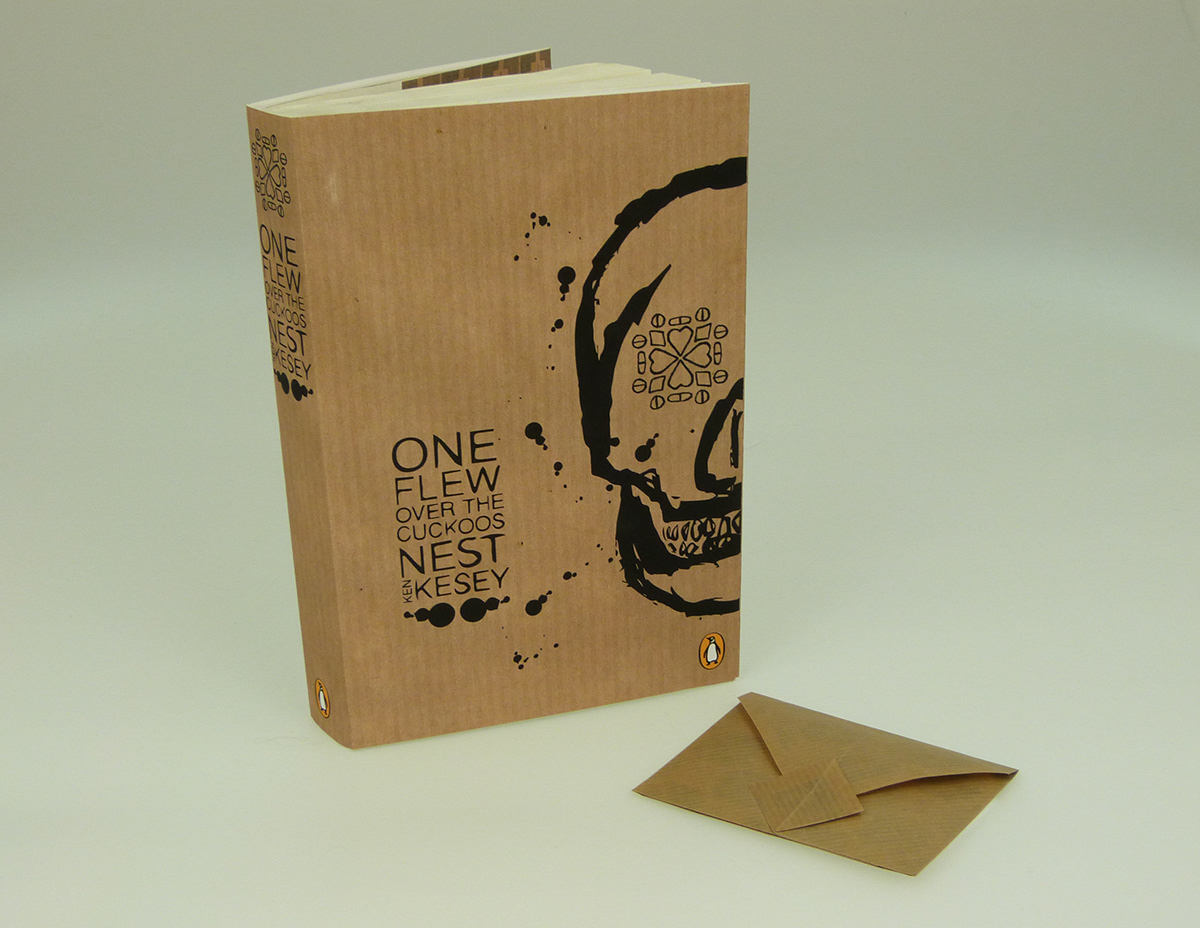
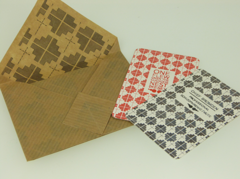
As I had first watched the film, I wanted to make sure that my design was based solely on the book as I didn’t want to cross any wires while designing. One thing I found while reading the book was that the narrator, Chief, who is a main part of the book, is very looked over the film. I wanted to create part of the design to bring his character through more strongly. I looked into Native American design and patterns and found certain shapes I liked and created them into a repeated pattern for the dust jacket inside wings. In the middle of this pattern I created a crucifix out of barbed wire. The crucifix signifies the main character, McMurphy, and how the writer has created him to be symbolic to Christ as he sacrifices himself for the better of others. Another main point of why I have placed a crucifix in this design is because the electric shock treatment table is described in the shape of a crucifix, to again, signify the way in which McMurphy is sacrificed as Christ.
For the main design of the book cover I based it on a skull as this signifies the main theme of death that is represented the whole way through the book. Death is a big part of the end of the story but I think that because it is also present all the way throughout the book in different ways, it cannot be seen as a spoiler.
I created the eye of the skull out of card suits and pills to represent a kaleidoscope eye. Initially, I researched Damien Hirst and looked into his kaleidoscope patterns. When looking into kaleidoscopes in more depth I found that the word deprives from Ancient Greek – ‘to look at, to examine.’ I thought this fitted perfectly into the idea of examining the men in the mental health asylum. Also, the way in which it appears quite trippy links back into the idea of being psychedelic. This highlights the key area that Chief is actually a schizophrenic, which causes hallucinations- seeing things that aren’t there, and the fact that Ken Kesey took part in psychedelic drug trials while writing this book. I wanted my design to be on manila paper because at the start of the book Big Nurse is holding a manila folder with the patient’s files in. I liked this small detail and wanted to carry it through into my final design
I wanted to find a style to use within my book design. Being a fan of Ralph Steadman and the works of Hunter S. Thompson, I thought that this crazy, carefree and unpredictable ink style fitted my chosen title perfectly. I experimented with different ways of drawing with inks and with different mediums such as cocktail sticks, cotton buds, old ink pens etc. I found the cotton buds gave me the best heavy and thick result with good ink spatters as well.
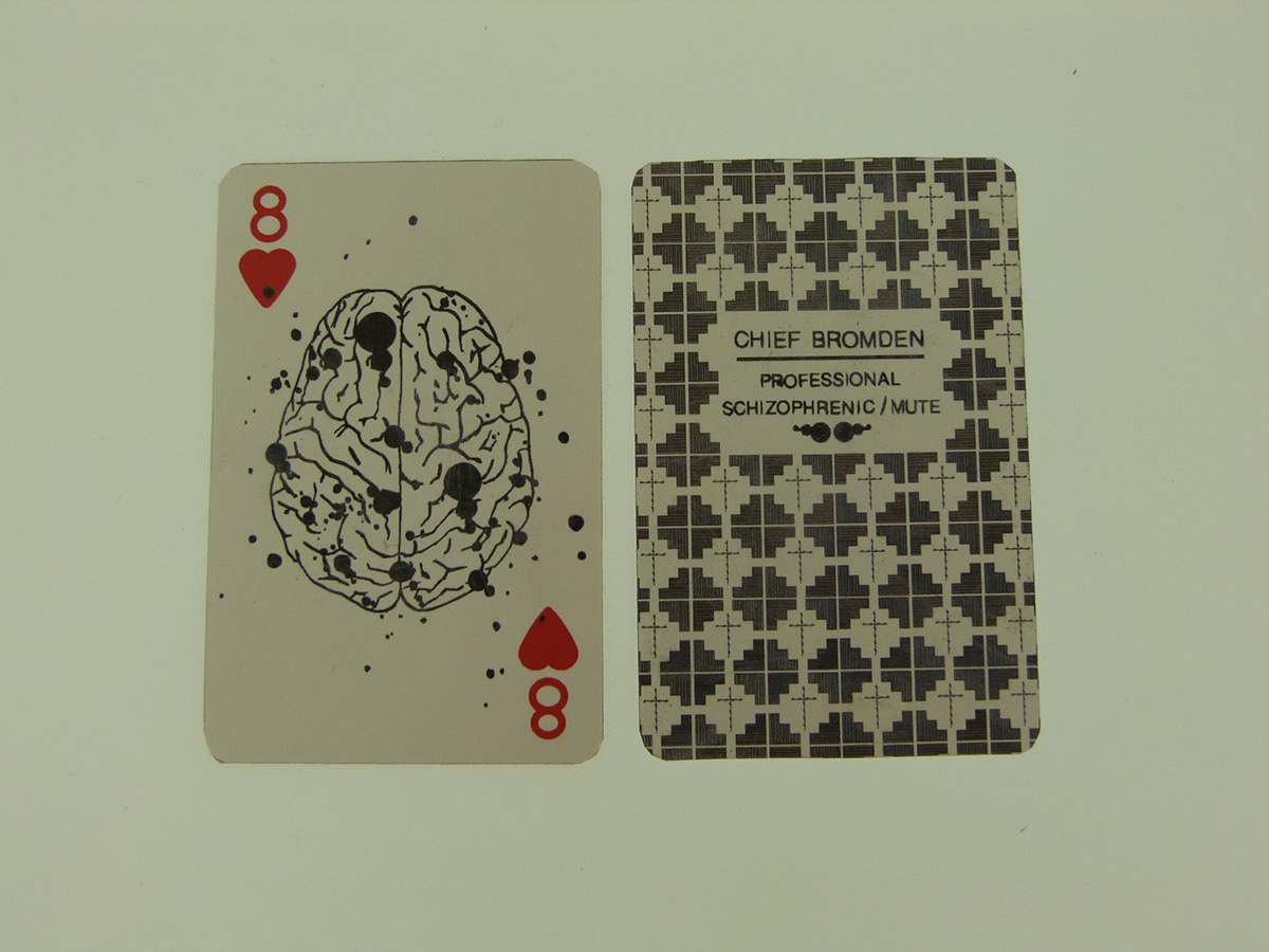
To make my design more special edition I decided to create a bookmark and special promotion for the book. I carried through the Ralph Steadman style with the ink spatters and ink drawings and decided to create a playing card as the bookmark as this is one of the main objects and activities in the patient’s lives and the time that they spend in the day room. I replaced the main suit centre area of the design with a detailed drawing of a brain to signify the psychology side of the book with the ink spatters being significant of the damage in their brain the patients have. Also, the fact that Big Nurse is a controlling character is significant in the way that these are playing cards and the nurse plays the characters of herself and off each other all throughout the book.
As an added extra I made an extra playing card and redesigned the back pattern to fit the title typography in and a small area at the bottom to add a download code in. in the world we are in now, a lot of people have digital things that they can read books on and would rather travel light without any books since the kindle came into play. With this download code, they can flick to the page they are currently on and carry on reading without needing to take the book with them, but still have the hard copy at home for the traditional read.
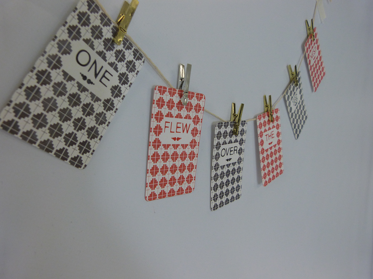
For the promotional piece, I made a set of playing cards similar to the book mark with the native American pattern and placed each word of the title in one to link them together and place on the book case that they book will be sold on. This will make the promotional of the book more eye catching and overtake any distraction of any other book promotion on the same case.


