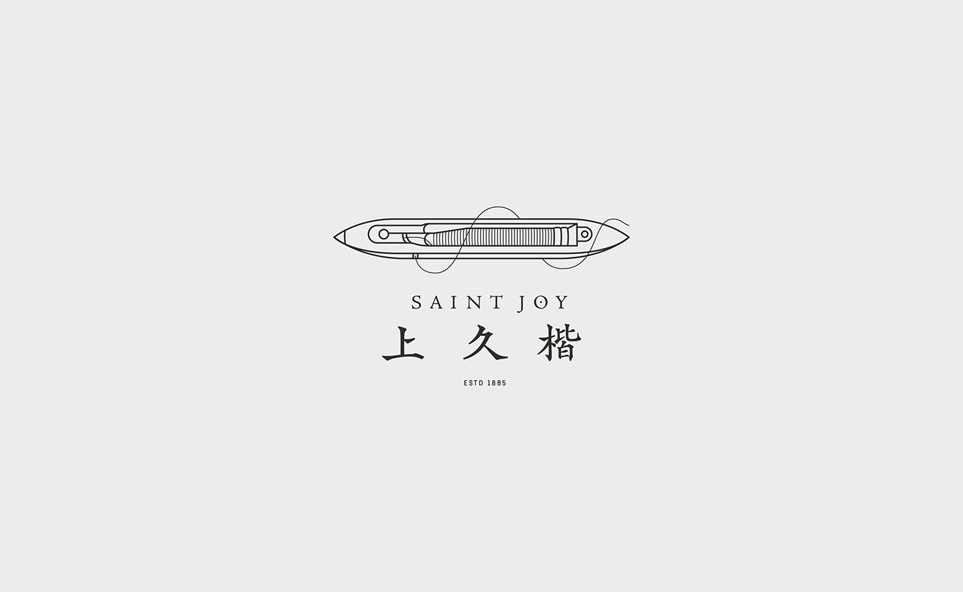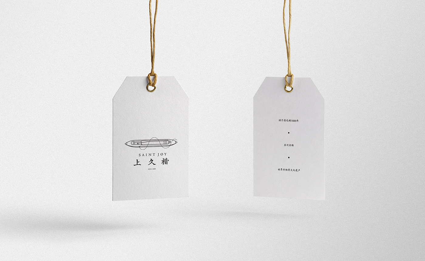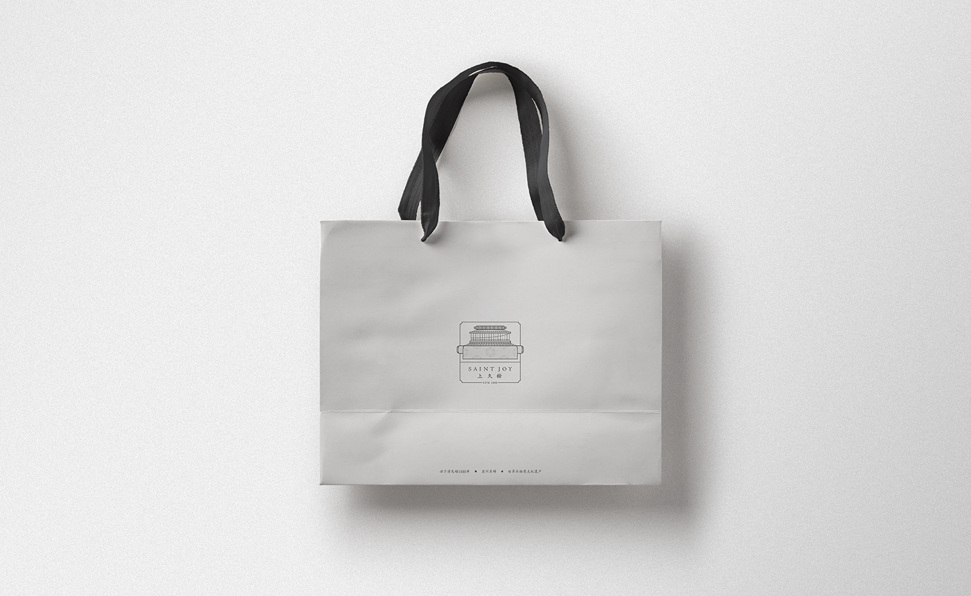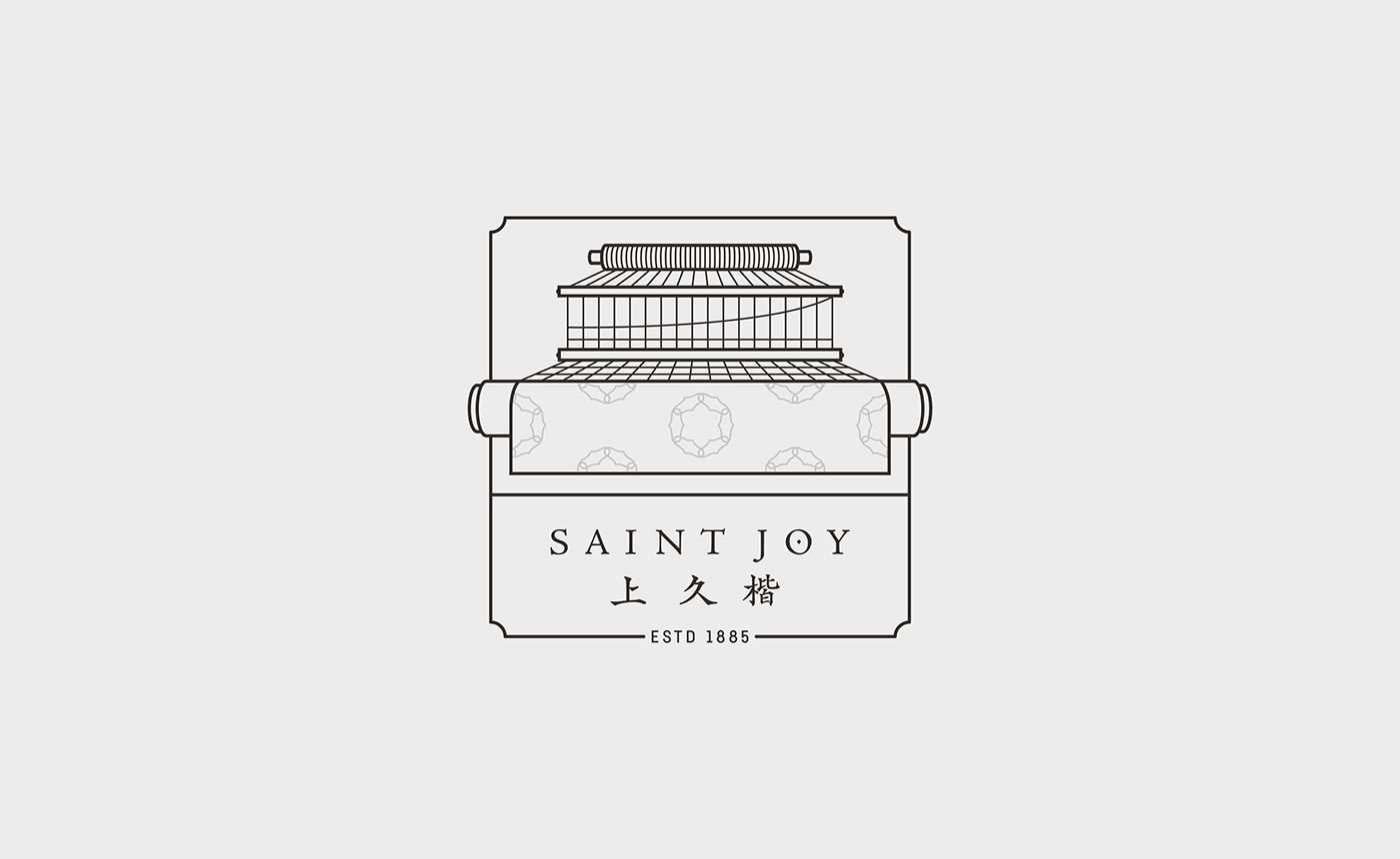
SAINT JOY - Rebranding
-
Saint joy company was established in 1889. They pursue the long tradition inherited from Song dynasty of Chinese Brocade production. Preserving its know-how and loom technology. Their logo has never been updated for a long time. A new direction was designed to fit to the for a younger clients and international audience. Keeping the strong value and philosophy of the brand was a must.
-
Project made in cooperation with Archer Zuo : https://www.behance.net/archerzuo
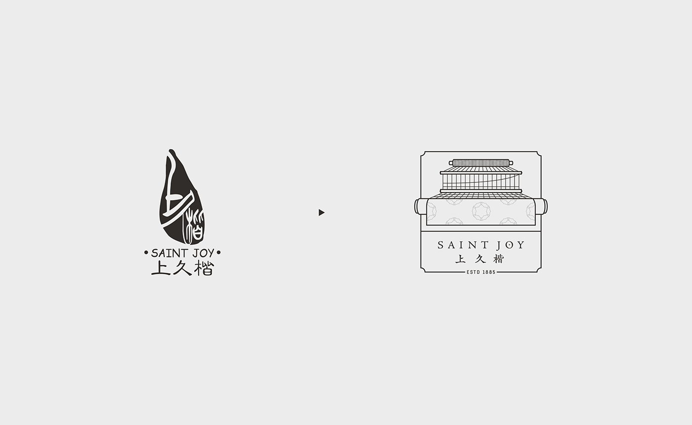
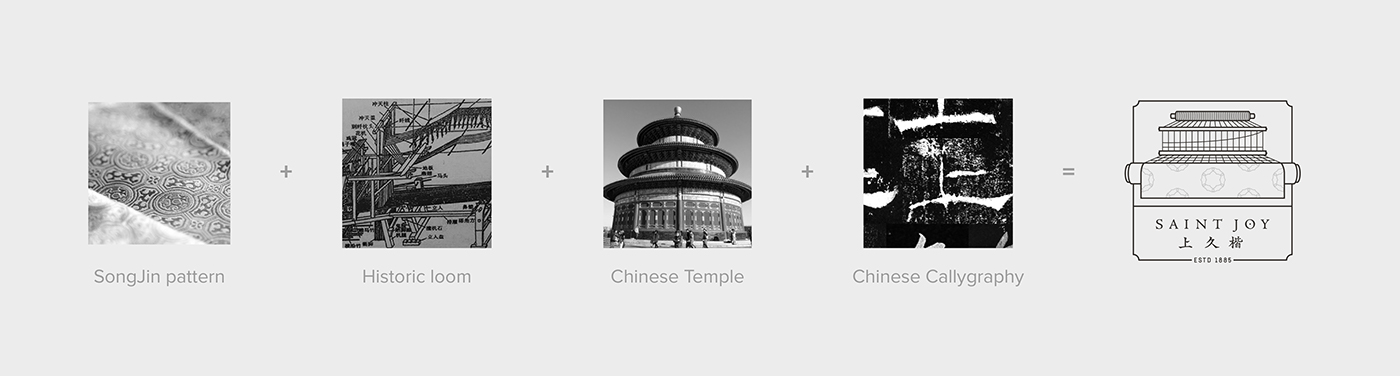
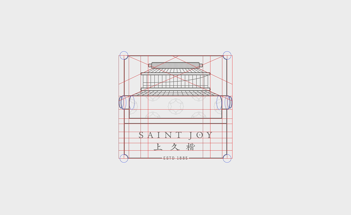
The logo was inspired on multiple historical sources. A front facing looming machine ans some references to the traditional Song brocade patterns can be seen in the final logo.
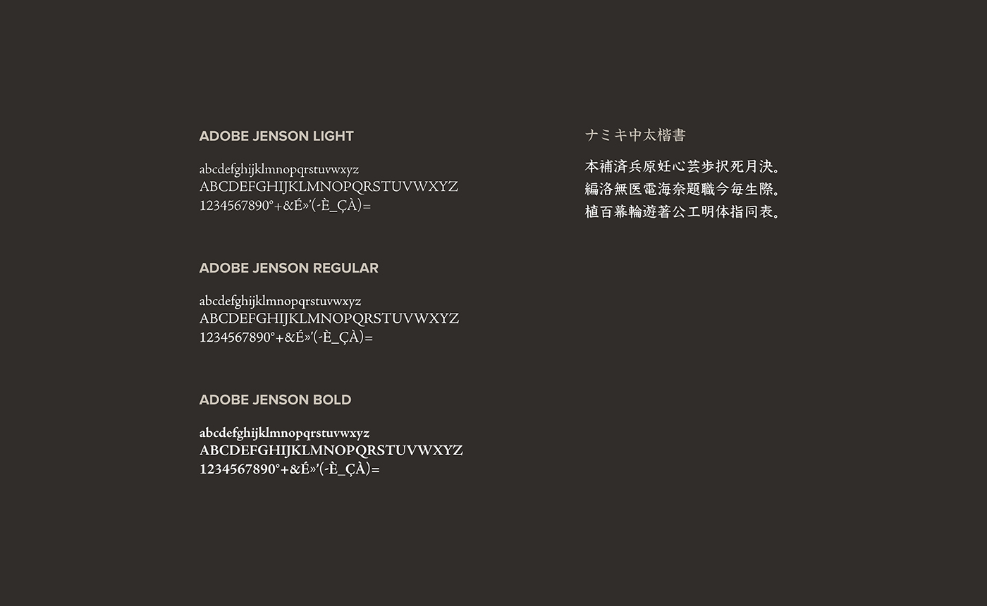


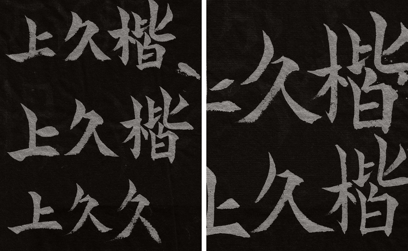
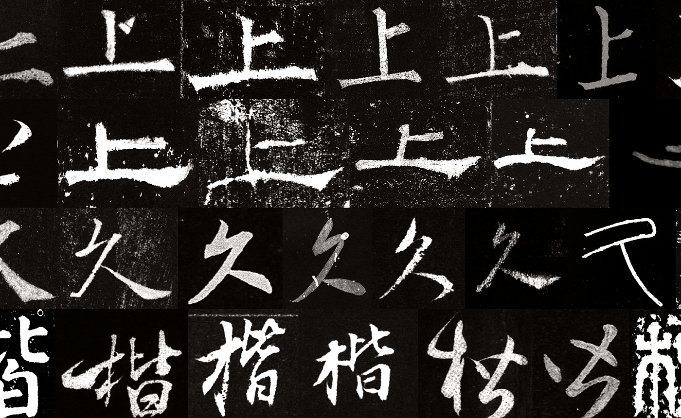
Chinese font was designed by Archer Zuo, a Chinese font and calligraphy designer. Its inspired from traditional Chinese characters.
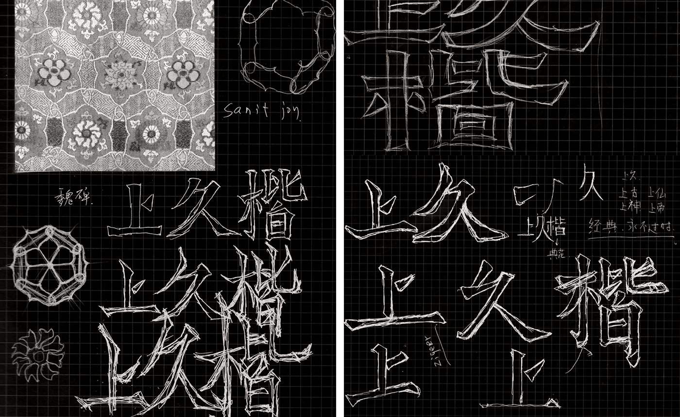

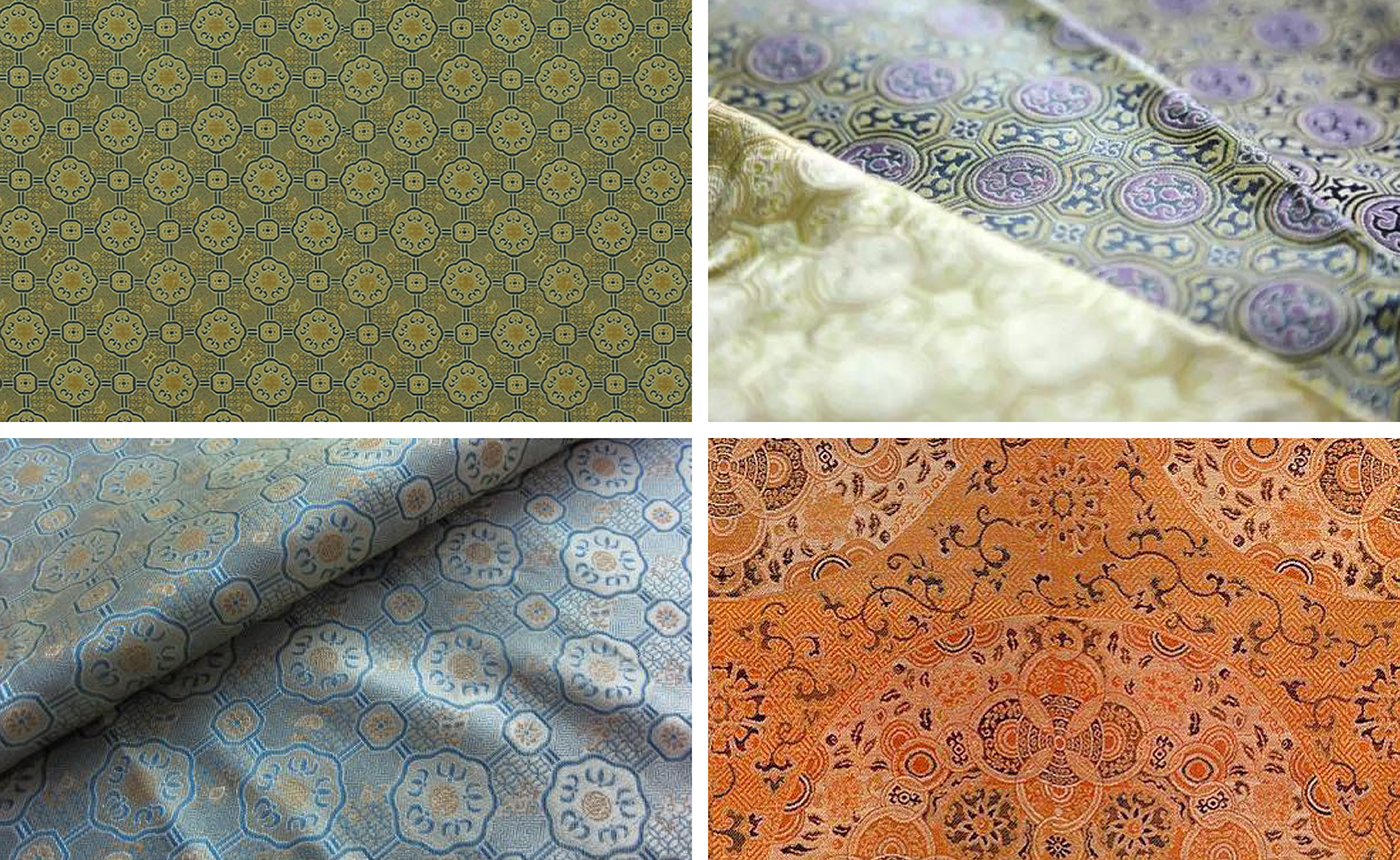
The Song dynasty brocade is known to be the most complicated, elegant and beautiful form of brocade silk. Developed during China’s ancient Song dynasty, 1000 years ago, Song brocade fabrics are characterized by their bright colors, exquisite patterns and solid yet soft texture.


A secondary symbol representing a shuttle has been created in the same style as the main symbol.