The ReBranding Project for my own Freelance company the" Republic of Design" that i established 3 years ago, when i first take my degree in multimedia, now after i learn and understand the principle of design and through many clients in making logo, I decide to rebrand the my own logo now :D

This is my Old company Logo

This are the Base Color i picked from the old Logo

There are the criteria or "emotion" that will be the Core in my logo
Simplicity means that i want to keep it have a simple shape and tidy, show the professionality and organized in the working
Colourful means that we play with a lot of colour, not monotone and creative
Adaptable means that this logo can adapt in any project surface or media, this symbolize that we can do all kind of style that client desire
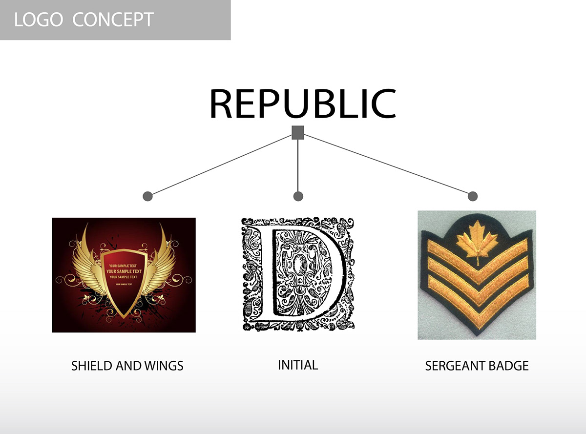
Some References about symbolism of the word "Republic"


The Typeface name is "Tes"
For the Uppercase it has Solid shape and curve ,but in the lowercase the have that nice pointy corner, so i retouch it a bit, and make it a bit curvy on the pointy's side
For the Uppercase it has Solid shape and curve ,but in the lowercase the have that nice pointy corner, so i retouch it a bit, and make it a bit curvy on the pointy's side

Can be put in white or Black surface

This is what i meant by "Adaptable" .
It can be implant with pattern for special occasion, or can be a mascot or character that represent the character, or even can be a country's flag. this is my special ability that i applied in this logo, so that it can represent my company as well as the concept or the mascot itself.
(and of course for that we need a master giga mother of god dragon level of creativity)

