


Winning project in the competition for the new visual identity of the Warsaw Public Transport.
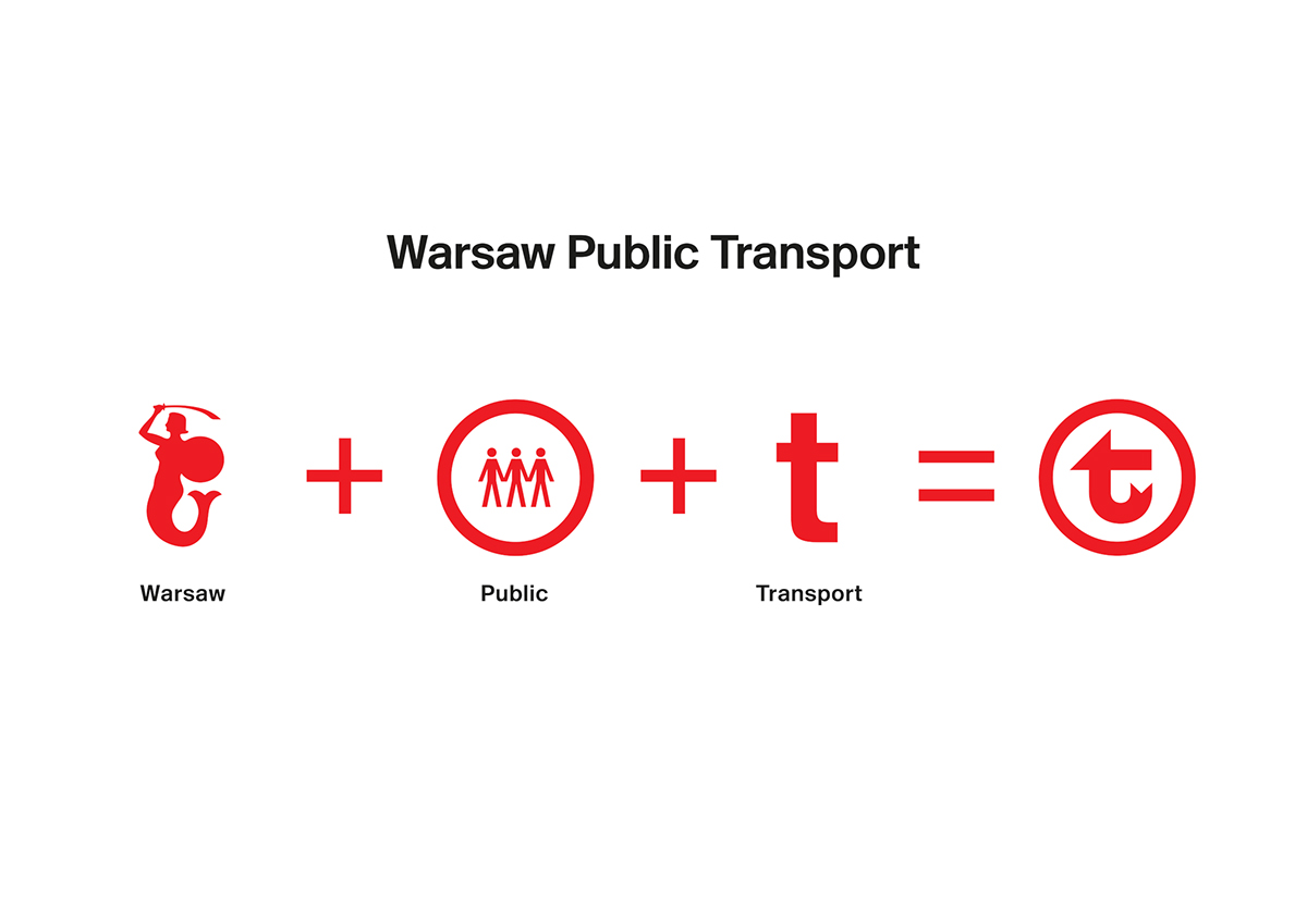
The mayor of Warsaw decided to unify all the existing signs for the urban transportation by replacing them with one consistent brand. The starting point for the new logo design was an attempt to directly translate the name “Warsaw Public Transport” into the language of visual forms. The dominant element of the sign – the letter “T” (for “transport”) – was reshaped to convey the meanings associated with what is public and typical of Warsaw. We borrowed the distinctive Warsaw Mermaid tail and placed the sign in a circle, symbolising the inclusiveness, reliability and accessibility.
design: Type2 + Threedotstype


