CIROPE
Logo design
[Brand Identity]
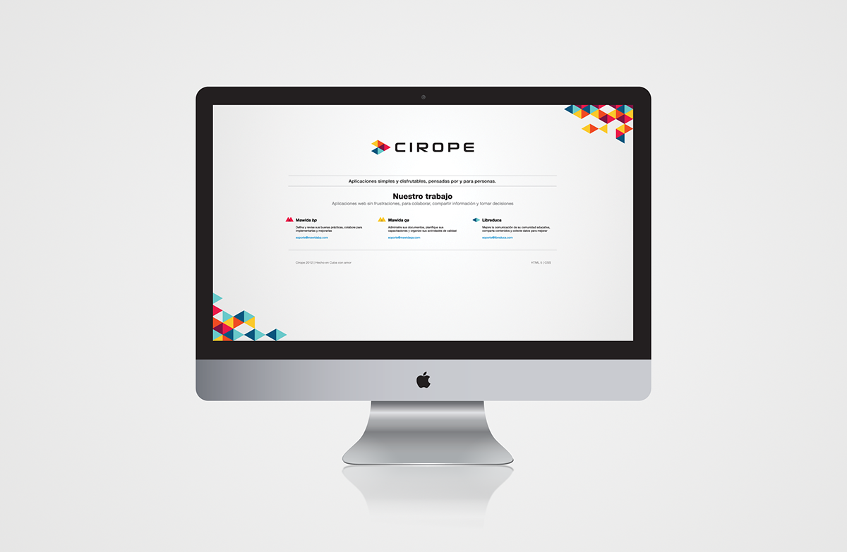
Cirope is an emerging software company from Argentina that builds Open Source web applications (educational and audit). Its attention is centered on users, and on the results and value they get using the company softwares. They do massive customer support and they speak directly with the users trying, when possible, to best implement their suggestions in the company products.
[Audience]
Latinamerican students of all ages and people with high education
[Values and keywords]
Continuous innovation, learning, focus on content and user eperience, simplicity, straightforwardness
[Audience]
Latinamerican students of all ages and people with high education
[Values and keywords]
Continuous innovation, learning, focus on content and user eperience, simplicity, straightforwardness
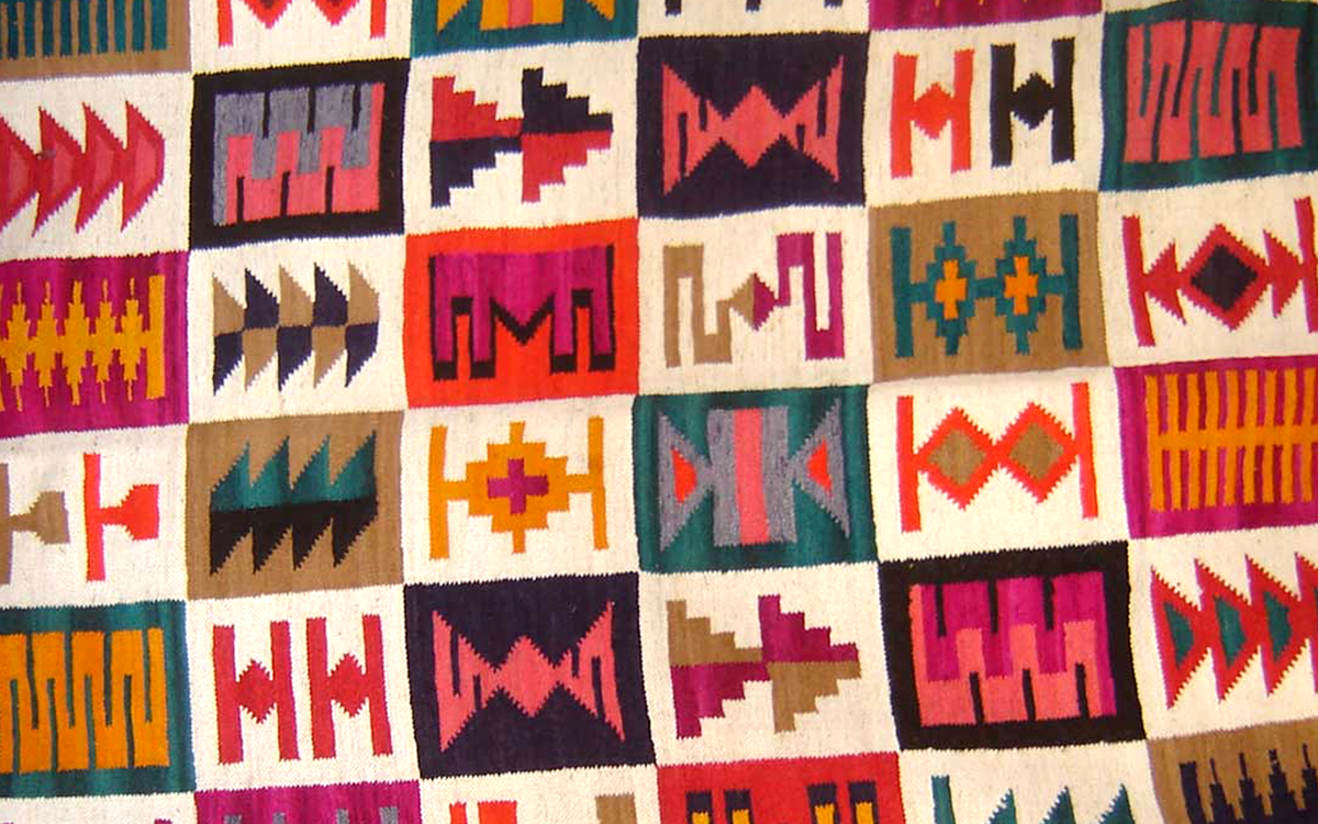
Inspiration - Andean tapestry traditional patterns
CONCEPT
- colors and pattern > reinforce the latinamerican identity of the software house / direct connection with the users
- geometrical structure / right direction > growth, improvement, innovation, straightforwardness
- one shape, multiple colors > one company, multiple solutions for multiple problems
- colors and pattern > reinforce the latinamerican identity of the software house / direct connection with the users
- geometrical structure / right direction > growth, improvement, innovation, straightforwardness
- one shape, multiple colors > one company, multiple solutions for multiple problems


Alternative color combinations

Cirope applications
Libreduca > a tool made to help managing educational content, a very easy-to-use app that lets the student learn at his (or her) own rhythm
Mawida QA > document management and training tracking tool
Mawida BP > keeps track of best practises, similarly to an audit tool but with more features
[NOTES: "libro" is the Latin word for "book"; "mawida" is a Mapuche word (a language isolate spoken in south-central Chile and west central Argentina by the Mapuche people) and it stands for "mountain". The symbols represent, in order, a geometrical synthesis of a book and a mountain chain]