


L'ACCADEMIA / THE ACADEMY
ITA
Harim Accademia Euromediterranea forma a livello professionale negli ambiti della moda, del gioiello, della fotografia, dell’interior and product design e della comunicazione, con sede a Catania e Tripoli (Libia). Il suo obiettivo principale è quello di consacrare il Mediterraneo quale nuovo bacino creativo e testimoniare, di conseguenza, l’impatto che il design e la moda possono avere sul benessere culturale ed economico di tutta la zona mediterranea.
Harim opera nel campo della formazione professionale nel settore moda e design da molti anni, ottenendo crescenti successi sia in campo nazionale che internazionale. In particolare si propone di sviluppare ed affinare la capacità creativa e le abilità pratiche degli studenti attraverso l’impiego di metodi formativi d’avanguardia e docenti di rinomata fama e comprovata esperienza.
ENG
Euromediterranea Harim Academy specializes, such as the Universities of design, in the fields of fashion, jewellery, photography, interior design, product design and communication. This institution is located in Catania and Tripoli (Libya). Our objective is to nominate the Mediterranean basin into a new creative one, that will show the impact that design and fashion can have on the cultural and economic well being of the entire
Mediterranean area.
Harim has created a professional training environment for fashion and design for many years, achieving national and international increasing success. In particular, we want to develop and improve the creative and practical skills of our students with advanced training methods with the help of our expert teachers.
LA NECESSITÀ / THE NEED
ITA
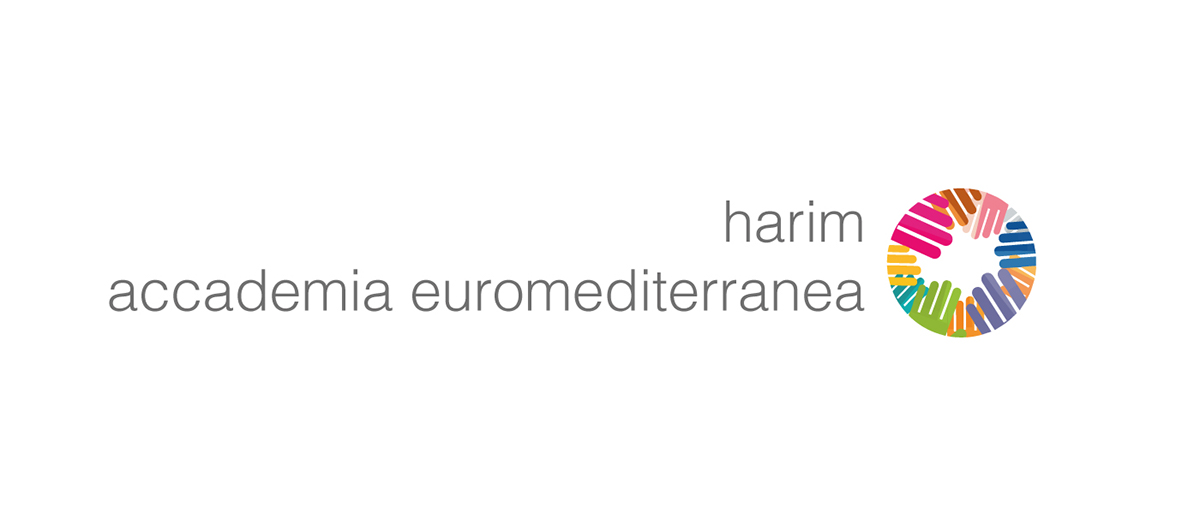
Nonostante il suo programma innovativo ed i suoi metodi di insegnamento all’avanguardia, l'accademia appariva all'esterno con un'identità poco chiara e non molto in linea con le nuove tendenze, non riuscendo a trasmettere efficacemente il senso di creatività e dinamismo tipico della stessa Accademia. Entrano in gioco fattori chiave della quotidianità di un ambiente così creativo in cui poter sperimentare e apprendere competenze innovative. L'Accademia aveva dunque bisogna di apparire moderna, attuale ed invogliare gli studenti ad entrare a far parte di essa. Vi era anche un problema con la rappresentazione visiva del nome, "Harim" e "Accademia Euromediterranea" possedevano la stessa gerarchia e questo provocava confusione agli utenti che non riuscivano ad identificare precisamente il nome primario dell'accademia, cioè “Harim”.
ENG
Despite its innovative program and its avant-garde methods, the academy appeared outside without a definite, outdated, and old personality. He could not convey the sense of creativity and dynamism that incarnate and represent everyday life within the academy, and did not translate outside an environment of creativity in which to experiment and learn innovatively new professions. The academy therefore needed to evolve its visual identity to appear modern, current, and entice new students to become part of it. There was also a problem with the representation of the naming, "Harim" and "Euro-Mediterranean Academy" possessed the same visual hierarchy and this caused confusion for users who could not give a precise identification to the primary name of the academy, "Harim".
VECCHIO MARCHIO / OLD LOGO
NUOVO MARCHIO / NEW LOGO
ITA
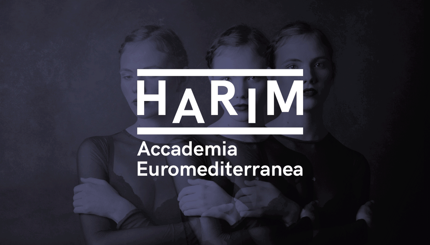
Abbiamo progettato un marchio composto da un semplice ma riconoscibile lettering che mettesse in risalto il nome di Harim per renderlo l'assoluto protagonista, che fosse di impatto e facilmente identificabile ai suoi fruitori. Tramite il lettering abbiamo cercato di creare un'identità dinamica, vivace ma allo stesso tempo seriosa in modo tale da far acquisire un aspetto più istituzionale. Un marchio che potesse, quindi, essere semplice ma allo stesso tempo incisivo per dare risalto al nome primario di Harim.
ENG
We designed a trademark consisting of a simple but distinctive lettering that emphasized the name of the academy to make it the absolute star, memorable and of immediate impact to its users. Through the lettering we have tried to convey a dynamic identity, lively but at the same time serious in order to acquire a more institutional aspect to the academy. A trademark that could be simple, but at the same time impressive and could highlight the primary name of the academy.
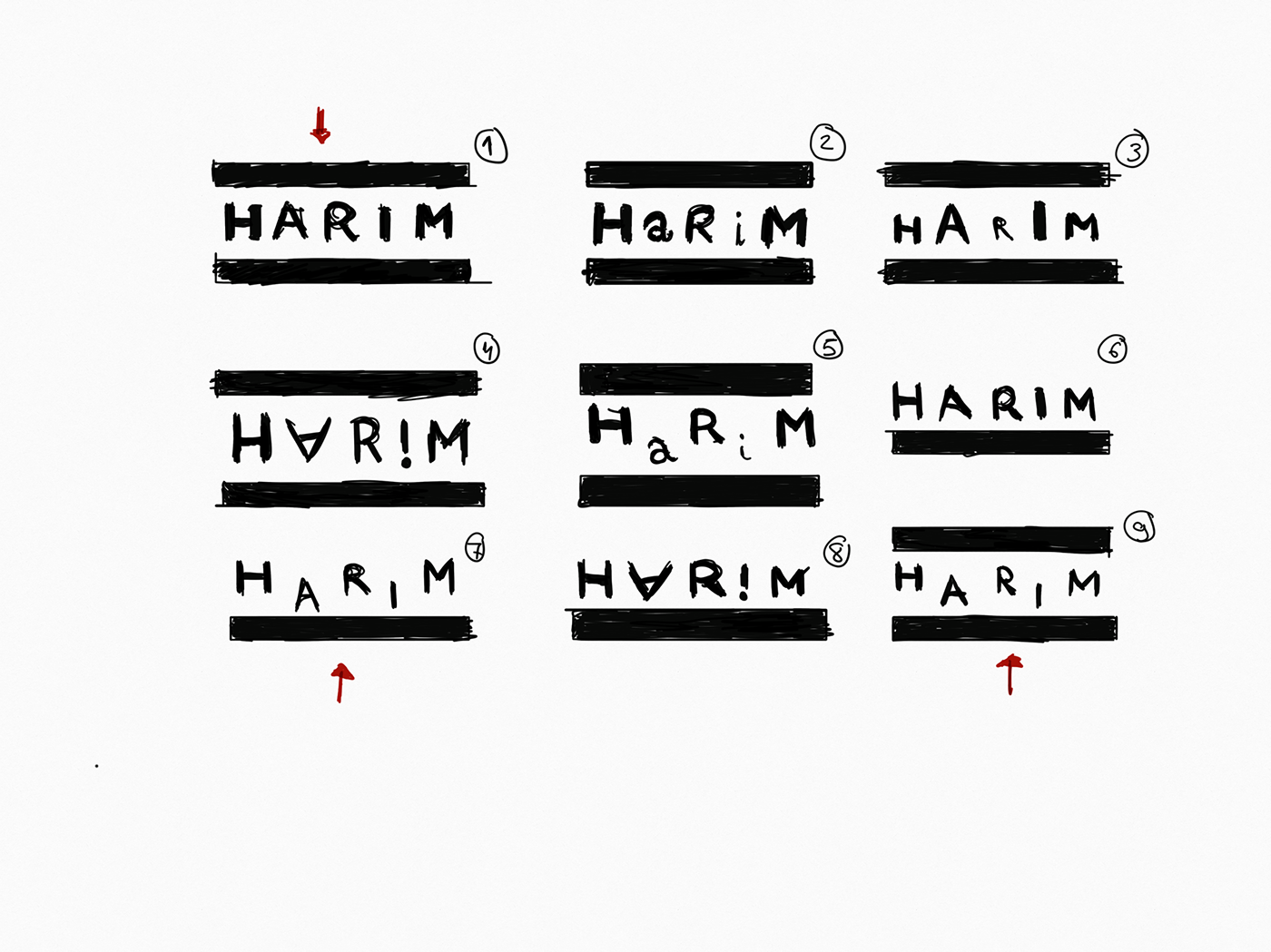
LET'S SKETCH!


TYPEFACE
ITA
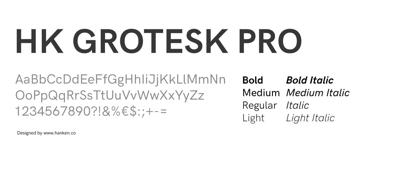
Il carattere tipografico scelto per la realizzazione del marchio e la comunicazione istituzionale è l’HK Grotesk Pro. Si tratta di un carattere senza grazie geometrico ispirato a grandi classici come l’Akzidenz e l’Helvetica. Il suo aspetto moderno lo rende perfetto per vari utilizzi e su supporti sia cartacei che digitali.
Abbiamo selezionato questo carattere per dare ad Harim un’immagine moderna ed attuale che possa essere sempre riconoscibile e adattabile.
ENG
The typographic character chosen for brand design and institutional communication is the HK Grotesk Pro. This is a geometric sans serif character inspired by great classics such as Akzidenz and Helvetica. Its modern look makes it perfect for various uses and on paper and digital media.
We have selected this character to give Harim a modern and current image that can always be recognizable and adaptable.
We have selected this character to give Harim a modern and current image that can always be recognizable and adaptable.
SISTEMA COLORE / COLOR SYSTEM
ITA
La struttura dei corsi di Harim - Accademia Euromediterranea è molto vasta ed articolata e, pertanto, aveva bisogno di maggiore ordine e chiarezza. Abbiamo deciso di assegnare un singolo colore ad ogni settore formativo estraendo la palette colori dal vecchio marchio per riuscire a creare anche un collegamento con il passato dell'Accademia. Ogni artefatto comunicativo prodotto per i quattro settori avrà dunque un colore univoco, andando così a creare dei veri e propri sub-brands.
ENG
The structure of the academy courses is very wide and articulate and therefore needed greater order and clarity. We therefore decided to give a single color to each sector by extracting the color palette from the old brand to also create a link with the academy past. Each communicative artifact produced for the four sectors will therefore have a unique color and thus create true sub-brands.

STATIONERY


ID CARD


BRAND MANUAL


BORSA / BAG

BROCHURE CORSI / COURSE BROCHURES


POSTER PROMOZIONALI / PROMOTIONAL POSTER


UN NUOVO SITO WEB / A NEW WEBSITE
ITA
Nel processo di rebranding ci siamo occupati anche del restyling del sito web. Il precedente sito era freddo e privo di una personalità definita, delineando un grave problema all'interno del sistema visivo.
Abbiamo progettato un portale al passo con i nuovi trend e, allo stesso tempo, capace di integrarsi agevolmente con la nuova Brand Identity. Integrando il nuovo sistema di colori abbiamo ridefinito l'intero aspetto grafico ma, soprattutto, una gerarchia di navigazione specifica e chiara, riuscendo ad implementare una UX più semplice e pratica per gli utenti.
Abbiamo progettato un portale al passo con i nuovi trend e, allo stesso tempo, capace di integrarsi agevolmente con la nuova Brand Identity. Integrando il nuovo sistema di colori abbiamo ridefinito l'intero aspetto grafico ma, soprattutto, una gerarchia di navigazione specifica e chiara, riuscendo ad implementare una UX più semplice e pratica per gli utenti.
ENG
In the rebranding process we also took care of web site restyling. The previous site was cold and did not have a definite personality outlining a serious problem within the visual system.
We have designed a portal to keep up with the new trends, but above all to reflect and integrate with the new brand identity. By integrating the new color system, we redefined the whole graphic aspect, but above all a clear hierarchy that has allowed us to implement a clearer and more practical UX.
We have designed a portal to keep up with the new trends, but above all to reflect and integrate with the new brand identity. By integrating the new color system, we redefined the whole graphic aspect, but above all a clear hierarchy that has allowed us to implement a clearer and more practical UX.


Visita il sito completo qui: www.harim.it
Full website here: www.harim.it


