Concept Statement:
The 2010 merger between United and Continental airlines, creating the world's largest airline, means combining two leading airlines with vastly different corporate image and history.
Instead of utilizing this as an opportunity to announce the birth of a bigger and better airline with a new identity, the post-merger logo is basically the previous Continental globe logo substituted by the word United set in the old typeface.
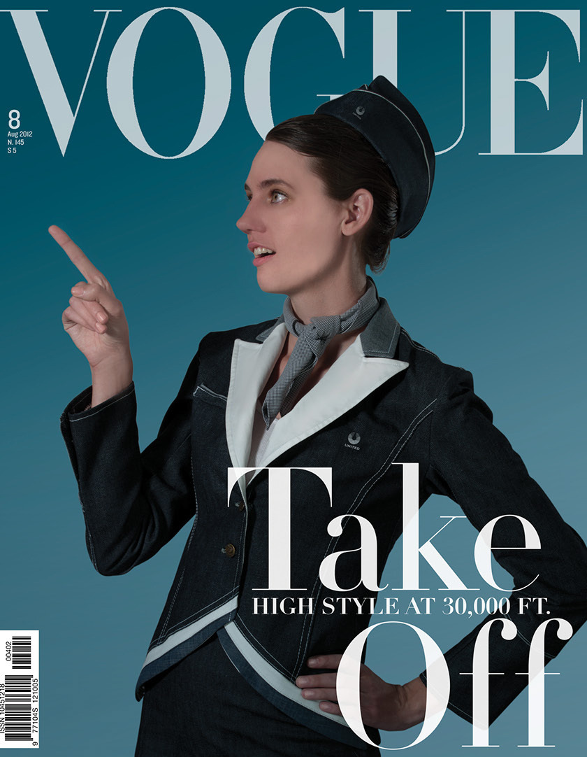
We believe the merger poses a great opportunity to totally recreate a new identity for United Airline. Our goal is to recapture the timeless history of United and its Tulip logo which had enjoyed a strong brand identity for decades while injecting freshness to the post-merger brand. To emphasize United's heritage, we decided to pay tribute to United's legacy in U.S. commercial air history with the Americana design style including the use of denim as the key fabric material and United's original navy blue color with a retro twist. To update the brand, a bold and modern typeface is used.
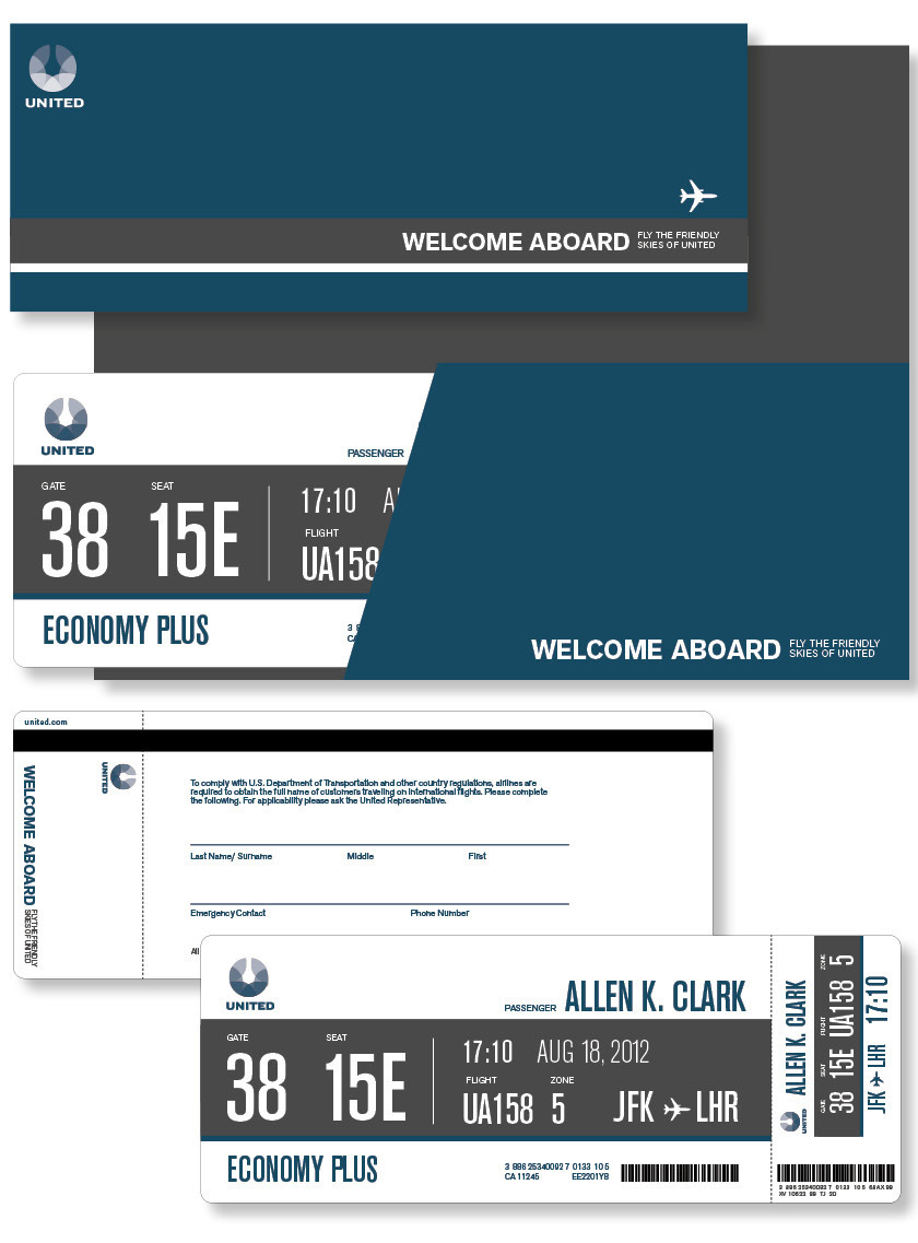
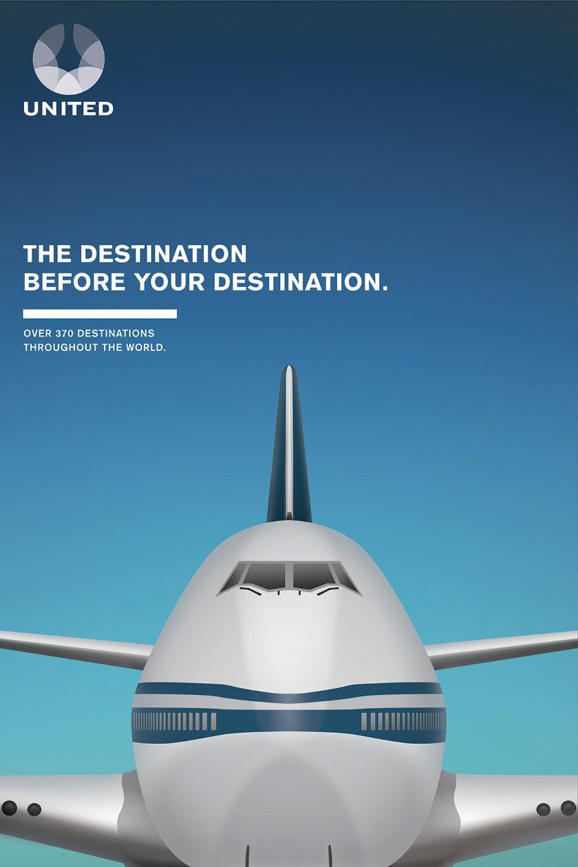
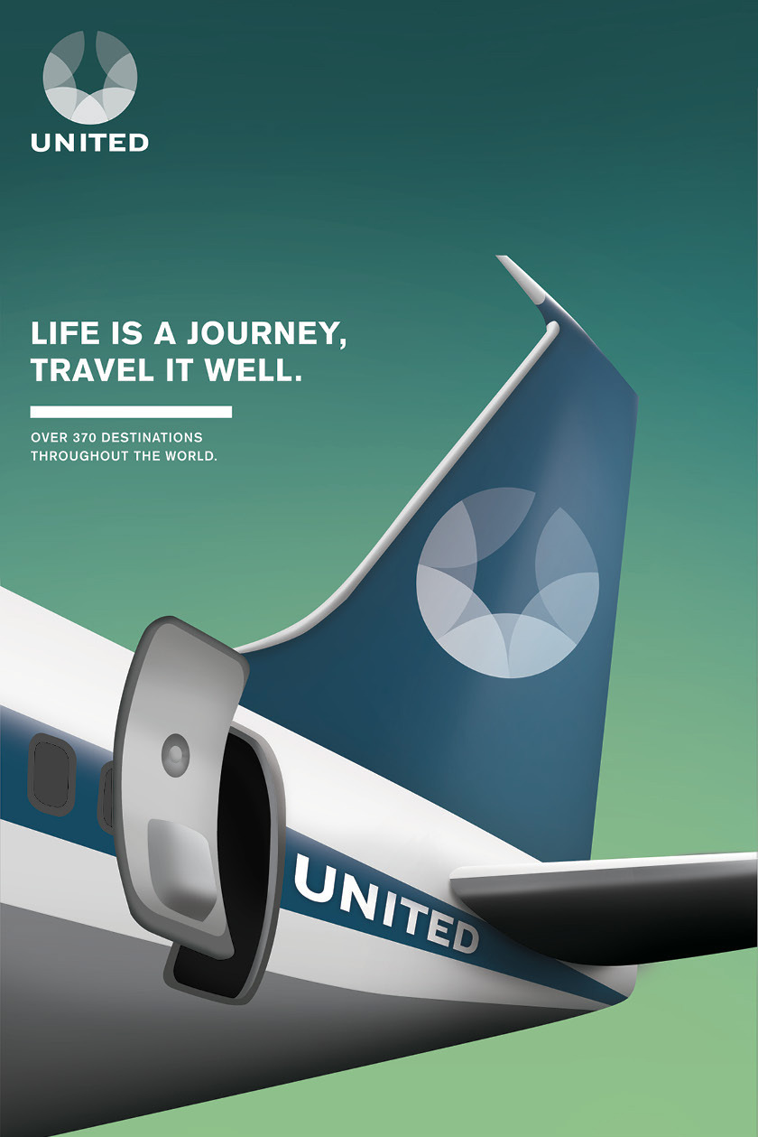
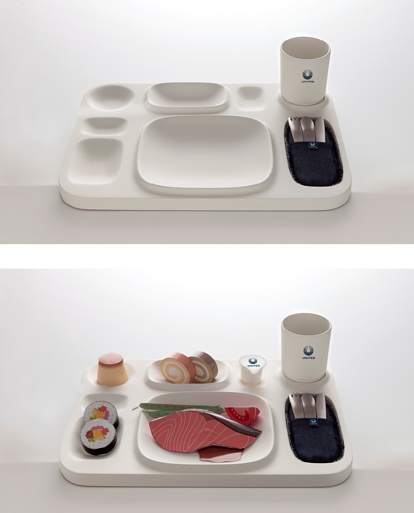
Our rebranding effort aims at providing a new and inspiring identity for the passenger's total experience, from pre-flight (Poster, tickets, brochure) to in-flight (meal tray, amenities kit, backseat screen user experience) to post-flight (amenities bag serves as a reminder of the brand).
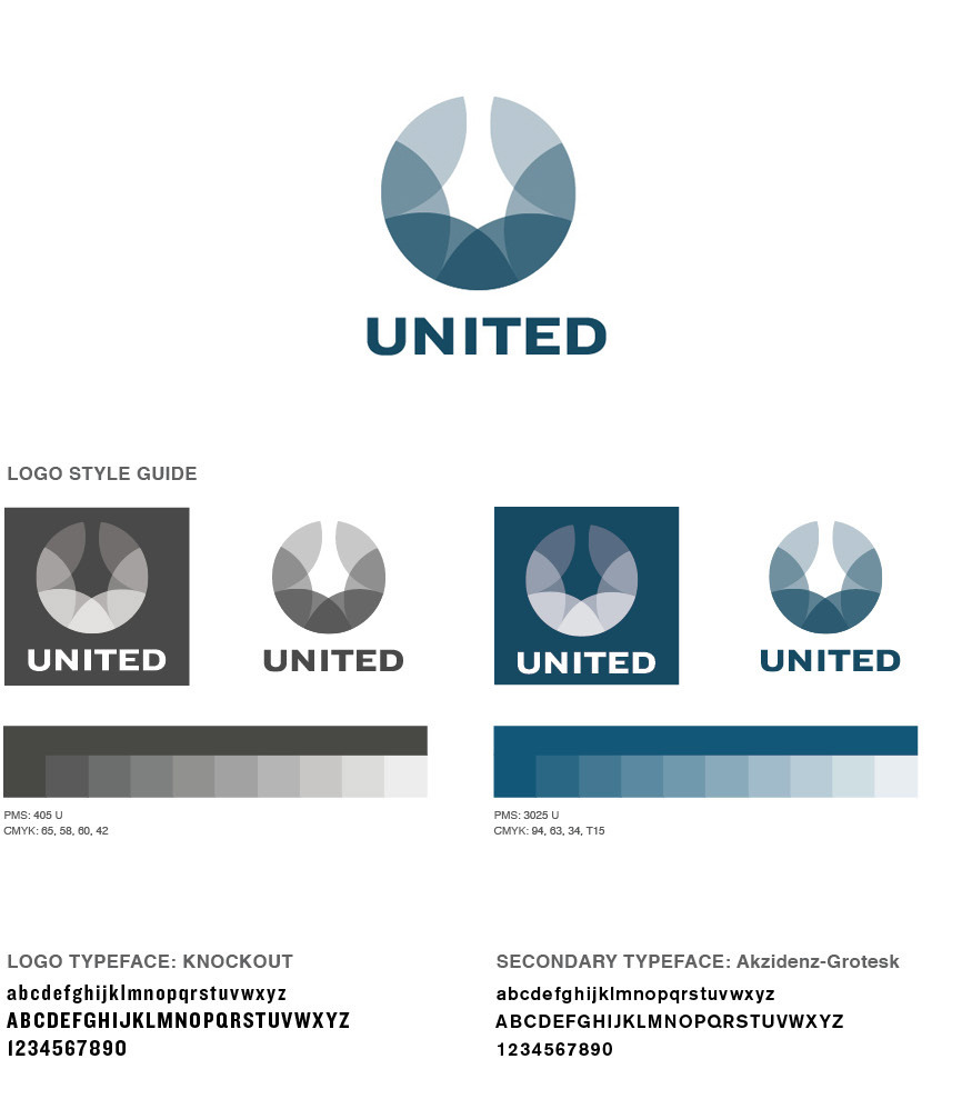
Logo Concept
The new logo features a stylized U by linking six marquise-shaped segments which represent the six continents that United Airline flies to. It is round in totality which is a nod to Continental's previous globe logo.
The 2010 merger between United and Continental airlines, creating the world's largest airline, means combining two leading airlines with vastly different corporate image and history.
Instead of utilizing this as an opportunity to announce the birth of a bigger and better airline with a new identity, the post-merger logo is basically the previous Continental globe logo substituted by the word United set in the old typeface.
We believe the merger poses a great opportunity to totally recreate a new identity for United Airline. Our goal is to recapture the timeless history of United and its Tulip logo which had enjoyed a strong brand identity for decades while injecting freshness to the post-merger brand. To emphasize United's heritage, we decided to pay tribute to United's legacy in U.S. commercial air history with the Americana design style including the use of denim as the key fabric material and United's original navy blue color with a retro twist. To update the brand, a bold and modern typeface is used.
Our rebranding effort aims at providing a new and inspiring identity for the passenger's total experience, from pre-flight (Poster, tickets, brochure) to in-flight (meal tray, amenities kit, backseat screen user experience) to post-flight (amenities bag serves as a reminder of the brand).
Logo Concept
The new logo features a stylized U by linking six marquise-shaped segments which represent the six continents that United Airline flies to. It is round in totality which is a nod to Continental's previous globe logo.