Rybinskkabel
Identity for one of the leading Russian cable industry
Identity for one of the leading Russian cable industry

Rybinskkabel – one of the leading Russian cable industry with a broad range of products.
Large production base, formed in the Soviet Union and more recently modernized, allows the highest quality products. With the new management, Rybinskkabel closes the problem space, set and achieve new goals, is on track to its leading position. Needed a new visual identity to explain changes occurring at the plant, and to set the right direction of development. Binding fit.

Before and after
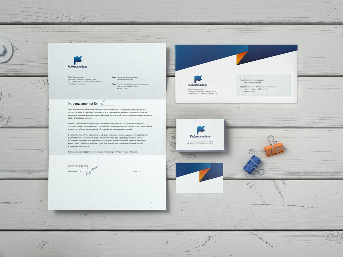
LOGO
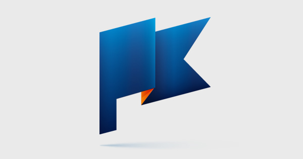
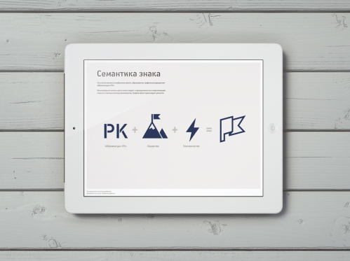
The logo is an image of the flag formed graphically simplified abbreviation "RK" (РК). Grapheme flag translates the company's values: high goals and achieve them, quality, responsibility and leadership.


VISUAL LANGUAGE
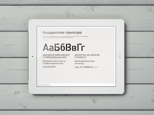
The basic style elements - a fragment of the flag, which goes beyond the branding surface. This course emphasizes the graphic scale and strength inherent in the symbolism. Stencil fonts required for product labeling, is also actively used by any other branded media. Font sets the right mood and style for added visibility. Another technique, ensuring identity - alternating blue and orange, and the sealing of the inner surfaces of the carriers in orange.