

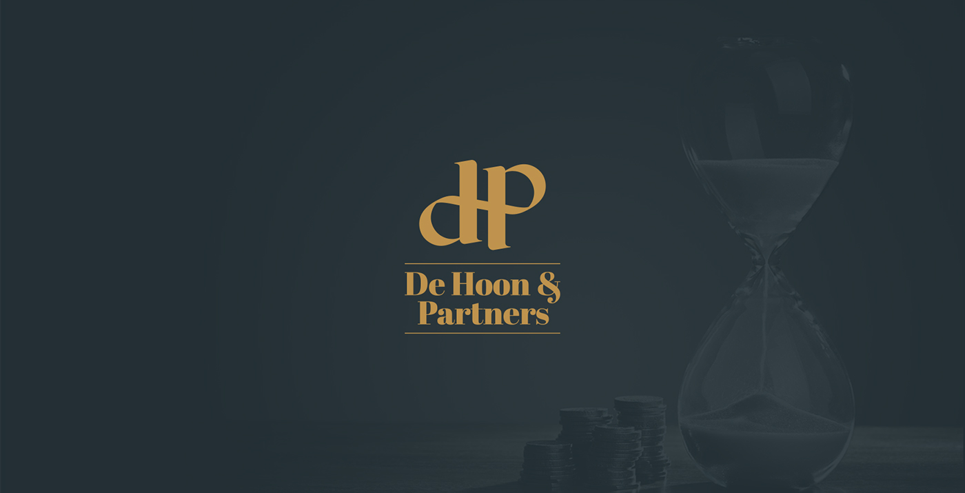
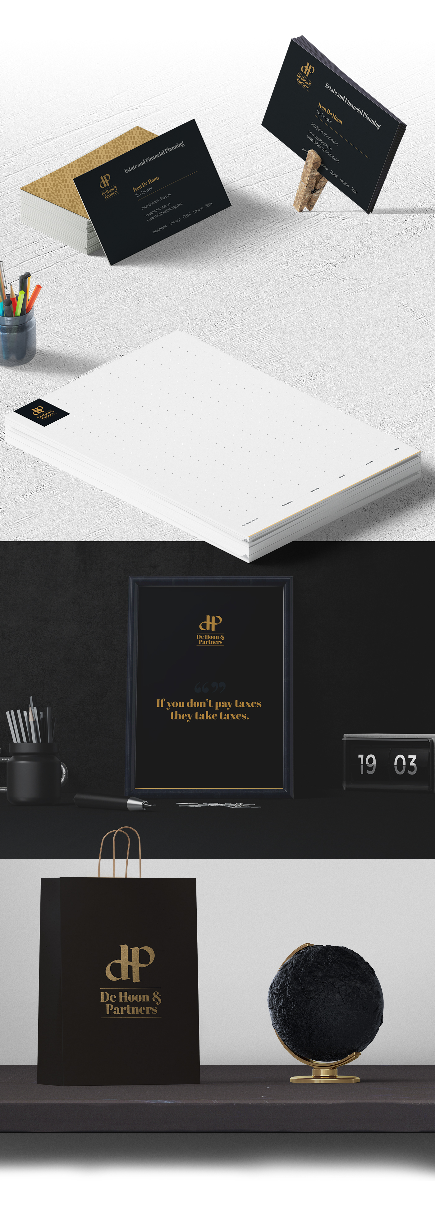
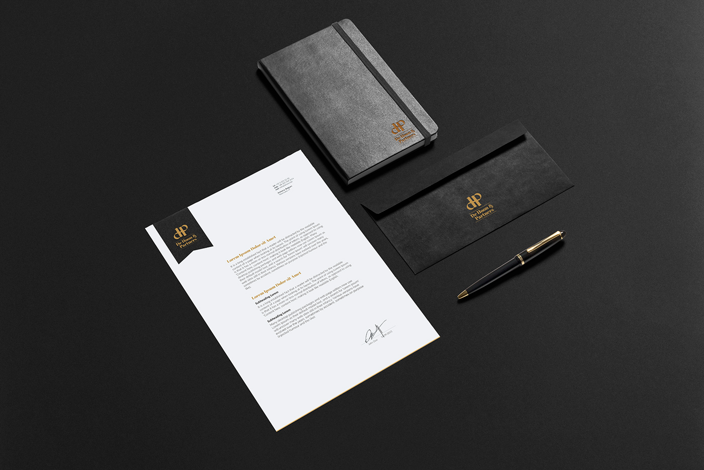
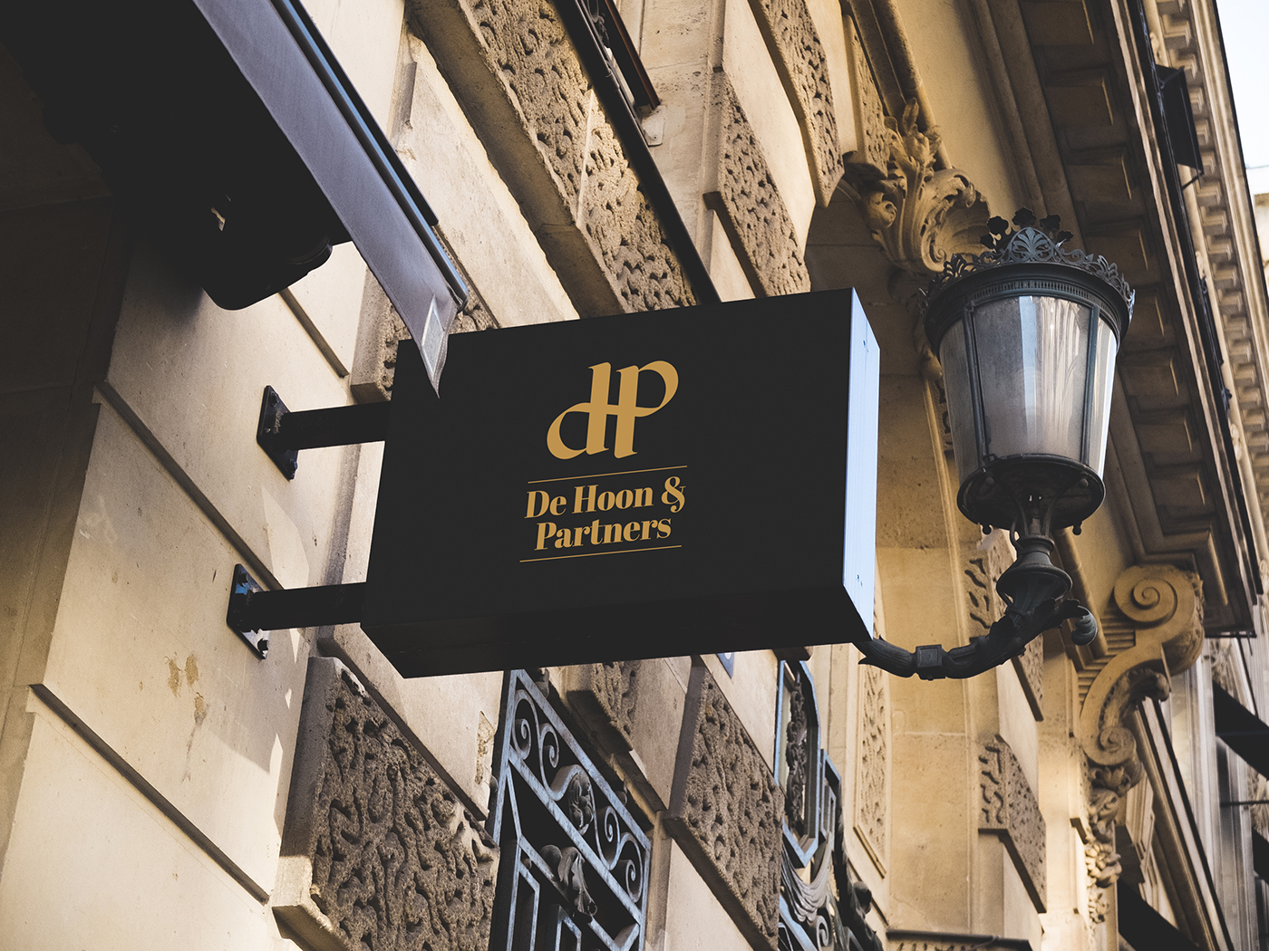
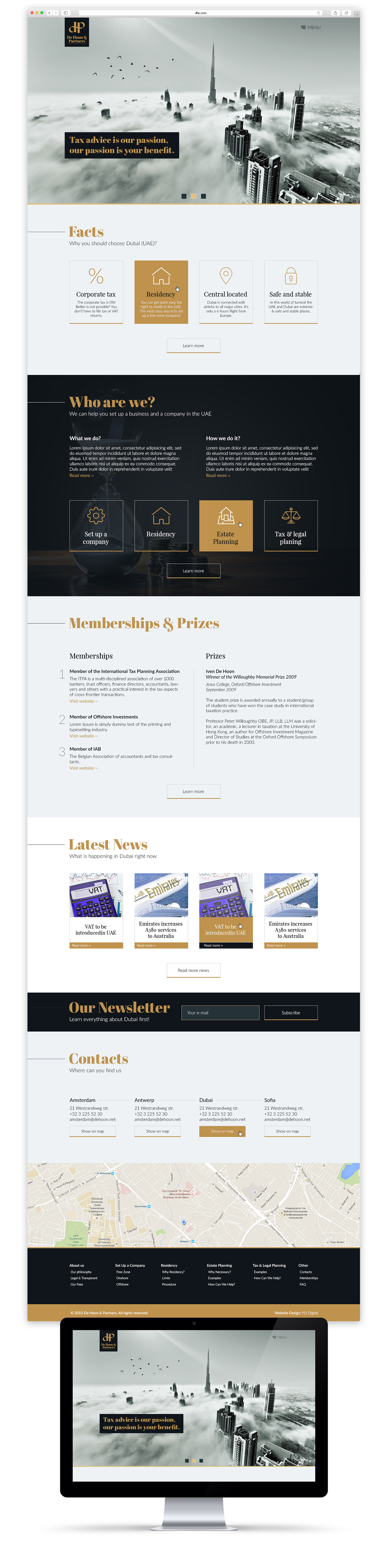
De Hoon & Partners
Legal & Tax Advisors
—
Philosophy
"We aim to provide affordable international tax advice. We feel it is a human right to know which option will result in the lowest taxes. After all, you have worked hard enough to earn your money. We feel tax-friendly countries and solutions are a bare necessity. Otherwise, national governments will continue to increase tax rates with disastrous consequences for private enterprise, the foundation of all prosperity."
The Challenge
We had to create a symbol that fully reflects the brand values. Professionals, who are always ready to help.
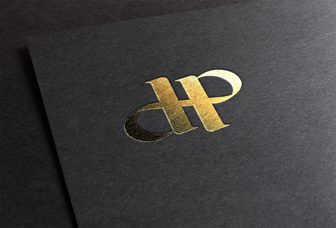
The Creative Approach
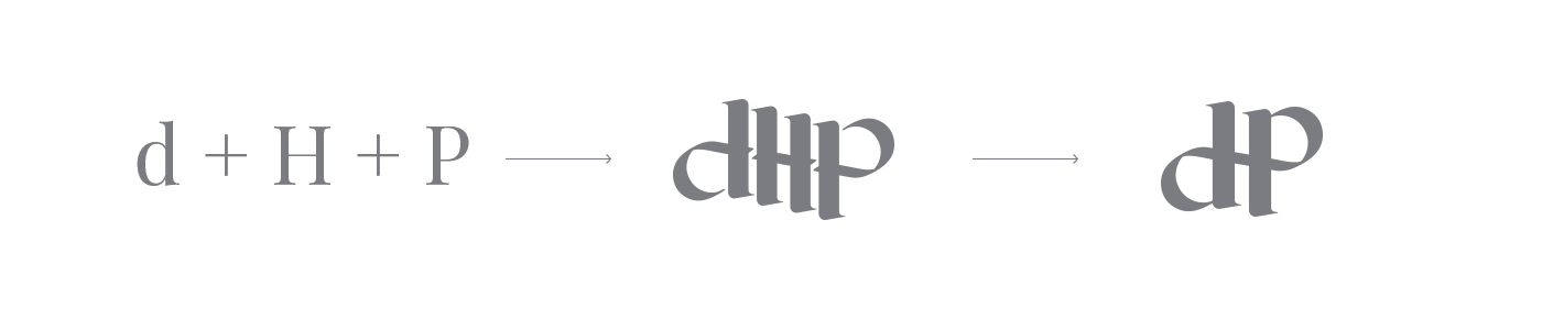
We took advantage of the repeating shapes of the letters in DHP. We combined them and the outcome was just what we were looking for. The massive spines of the letter “H” represent the stability in our deeds. The crossbar of the letter “H” is also the bowl of the letter “d” and the letter “p” and it represents the symbol of infinity.
The strong and massive typography shows that we are an experienced team of professionals which is always ready to help!


Credits
—
Agency: Prodesign Bulgaria
Client: De Hoon & Partners
Art Direction: Marian Naydenov
Graphic Design: Todor Lichev
Account Executives: Marina Mateeva, Marian Naydenov


