
The brand
Sparaw is a well-known argentine brand, which sells cold pressed juices and vegan food. They came looking for us with a clear need: they wanted to expand their brand through his own retail stores with a more consistent identity since they felt that their previous identity did not convey the values of the brand.
Commercial objective
Their objetive was to position Sparaw as a premium leader brand in the raw food market.
Briefing and research
We analyzed their previous identity and competitors and realized that both Sparaw and several competitors used a handcrafted and rustic language to convey the natural value of their products. So we came to the conclusion that we had to differentiate and realized that type of language would not help us to position it as a premium brand.
Together with the client we defined their main differential attributes:
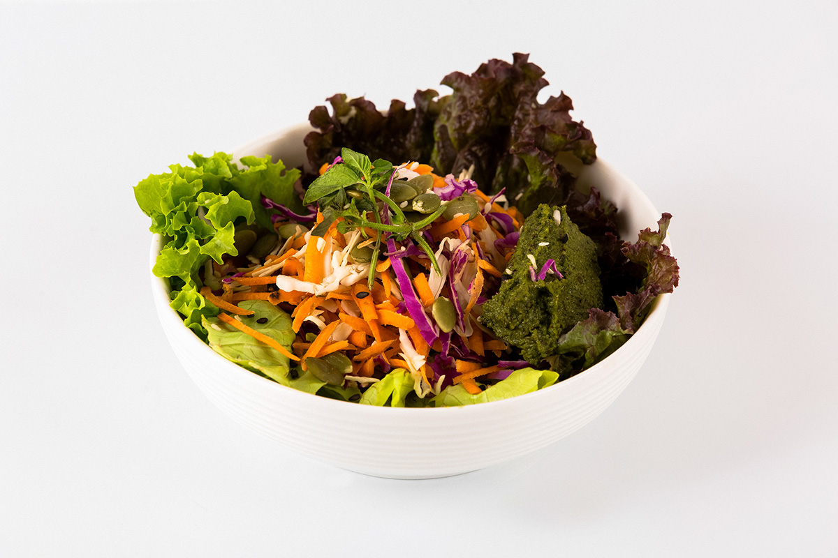
1. Being 100% organic: hay use 100% organic food grown in their own orchard (no other actor of the competition is organic).
2. Sustainable: for the care and the conscience with which they make their products.
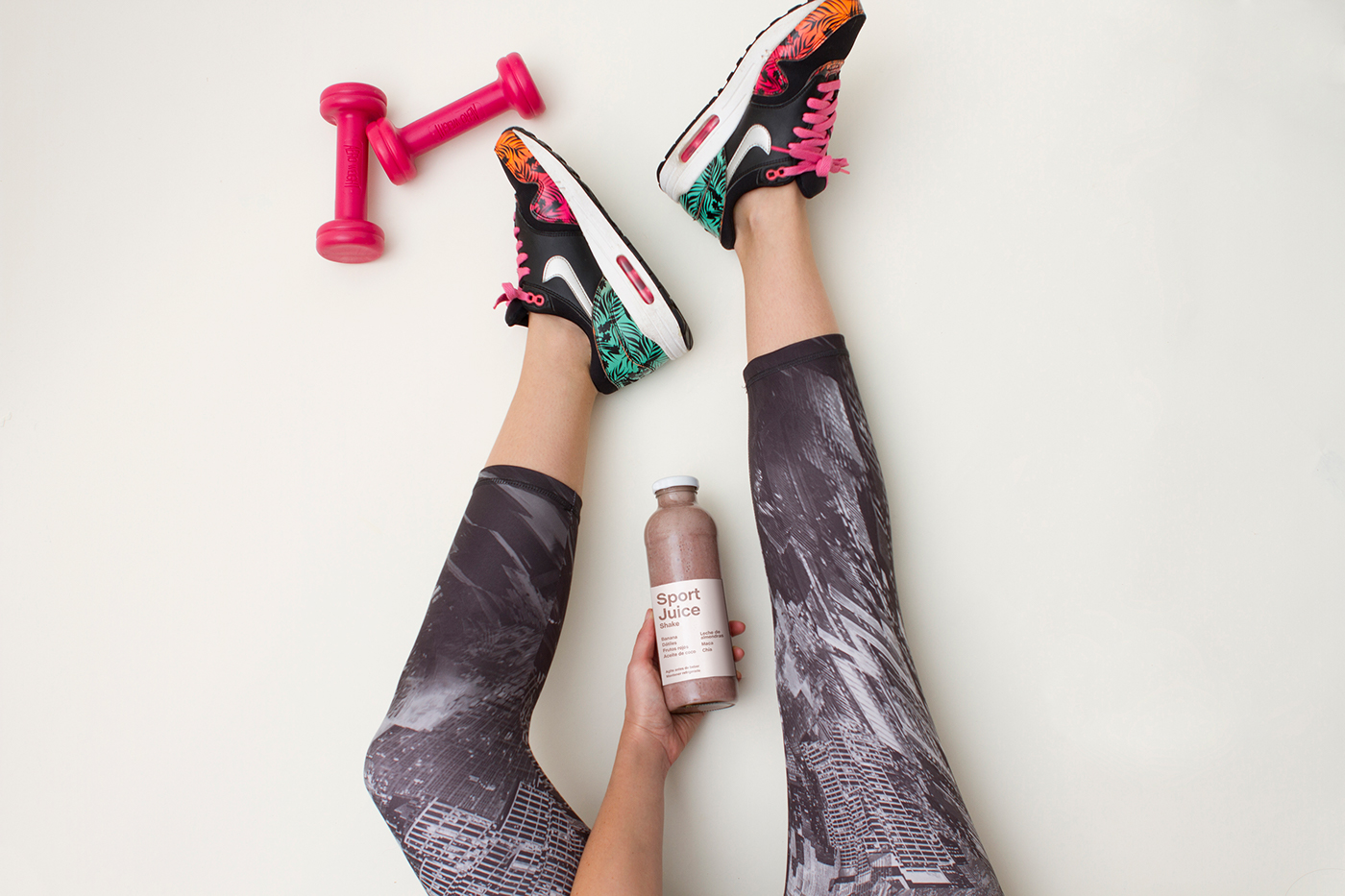
3. Highly nutritious products: their products have more vitamins, minerals and antioxidants than conventional products, thus being more energetic and improving performance and well-being. In fact that's why this type of food is called "live food".
We also rescued other secondary values such as the demanding and the clean style of their processes: they carefully select each of the elements that include in their products resembling even the processes of laboratories; and the great knowledge their team has in terms of nutrition and health.
We investigated Sparaw´s consumer and discovered that many used Sparaw products exclusively for the "detox plan" and did not know that they could incorporate the juices into their daily life or that Sparaw produced raw food in addition to the juices.
The strategy
We defined our strategy was to:
1. Generate a coherent and consistent identity system, in which all the communication pieces where aligned and convey the Sparaw philosophy.
Give Sparaw a more premium and authentic look
Communicate that Sparaw is not just a nutritious juice but a lifestyle.
Teach people how to consume Sparaw and its benefits to increase consumption.
Highlight their differential qualities.
The concept
From the client's briefing and our research we define a concept to communicate: "Sparaw is full of life”.
We really enjoyed this project, we believe the result is a strong an inspiring brand.
Sparaw –– March 2017.

The Visual Identity
Logo
We decided to give the logo a solid feeling and a strong presence through the selection of a typography (Chalet) with enough body, modern and easy to read. The idea was to create a simple and memorable logo.
To communicate the human and soft side of the brand we decided to intervene the type by molding some of its letters, contributing with an organic and warm feeling, and thus achieving a personal and unique logo.
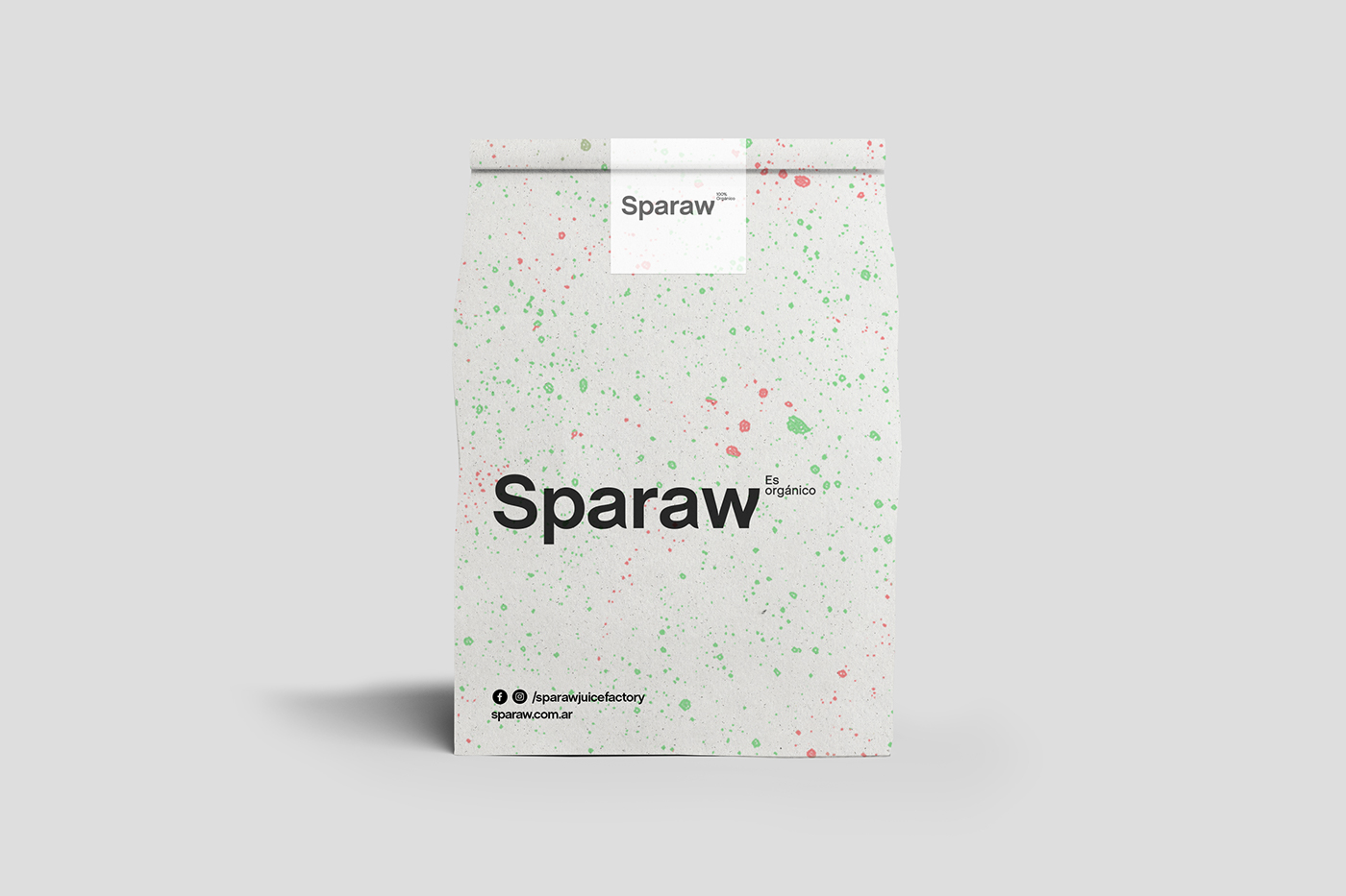
Being 100% organic was their great differential value so we decided to incorporate it into the logo. Its location in the main version of the logo is not random, it refers to chemical formulas.


Color Palette
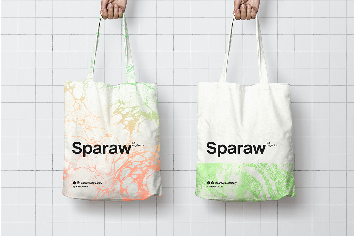
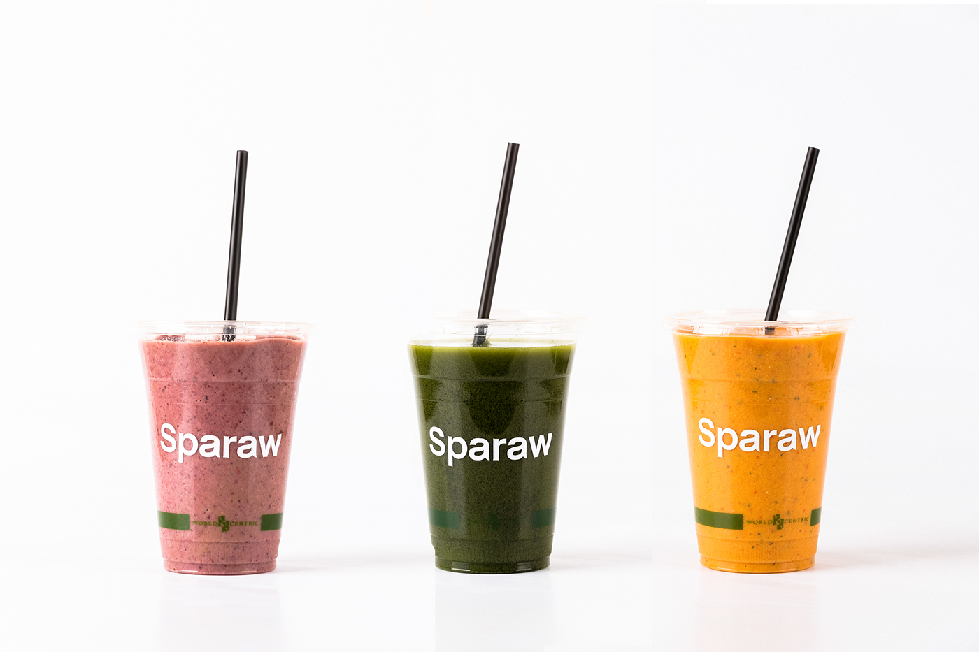
We chose a palette of pastel colors "almost fluo" to convey modernity, freshness, and vitality.

Verbal communication and content.
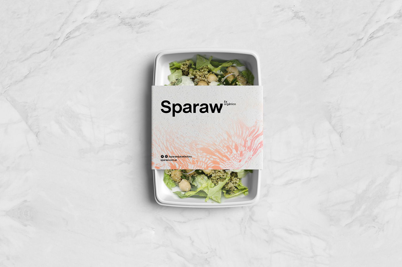
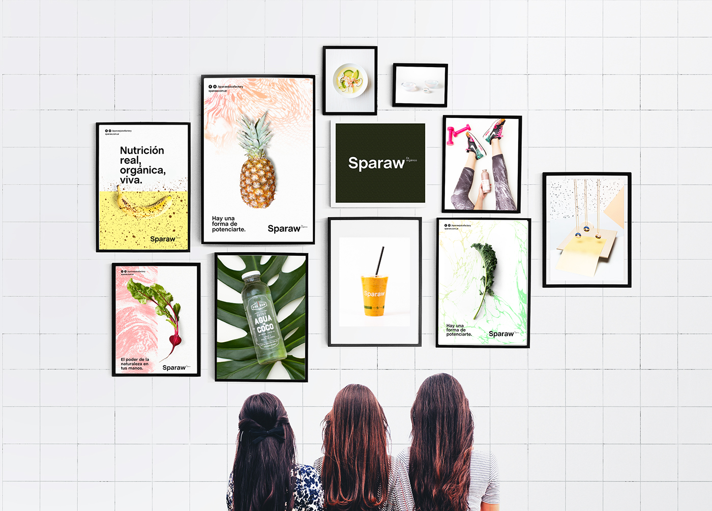
The tone of voice is direct and clear, neutral and objective. Our intention is mainly to transmit the benefits of consuming Sparaw products, the sensations they generate and the lifestyle that it promotes. We choose pieces with high visibility as packaging and posters to communicate these concepts.
On the other hand, since the knowledge of the brand was one of its main strengths, we created social media templates that shared this knowledge not always trying to sell a product, thus providing an added value to customers and followers.
We also expanded this knowledge in more detail by incorporating on the website a blog-type upgradable section, with content "educating" the consumer, and encouraging healthy and sustainable eating habits.

Layouts and composition
Simple, modern and rational layouts combine negative spaces with patterns of organic shapes inspired in the "rawness" of their product. The same ones which arose from the elaboration process of the juices: splatters; bubbling juice; mixture of organic matter; macro images of plant tissues, all patterns based on the organic essence of the brand.
Finally we decided to combine these elements with images of the fruits and vegetables Sparaw use, to evidence the raw material of its products.


Materiality
As for materiality, we proposed a type of ecological paper which gave a feeling of craftsmanship but always white, thus transmitting a cleaner image.


Photography @gatosuaya