

Beauty Inc - The Next Dimension
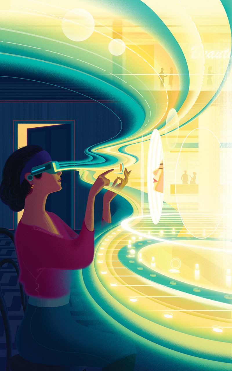
This image is about how the Beauty industry is already harnessing Virtual Reality technology to market it's products. The idea was to create a world within a world, or rather a department store within in a world.

Initially this was a tricky space to work with. The idea lent itself better to a landscape format but the layout was strictly locked down to a portrait orientation. Oliver Yoo who directed this project suggested depicting the light emanating from the VR headset as being curved which gave the whole thing a more dynamic nat

Here’s a few in progress images - the figure started as a pencil drawing that i scanned in painted in Photoshop. The curves also started out as a pencil drawing then i used Illustrator to created these blends.
Shop Magazine - Atomium monument
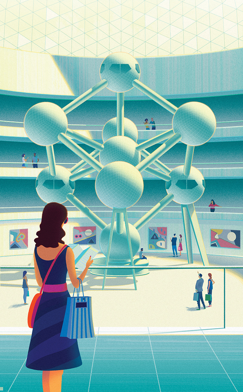
Shop magazine generally to know what they want, and this was no exception. For this the idea was to have The Atomium monument in Brussels in an art gallery with shoppers milling about.
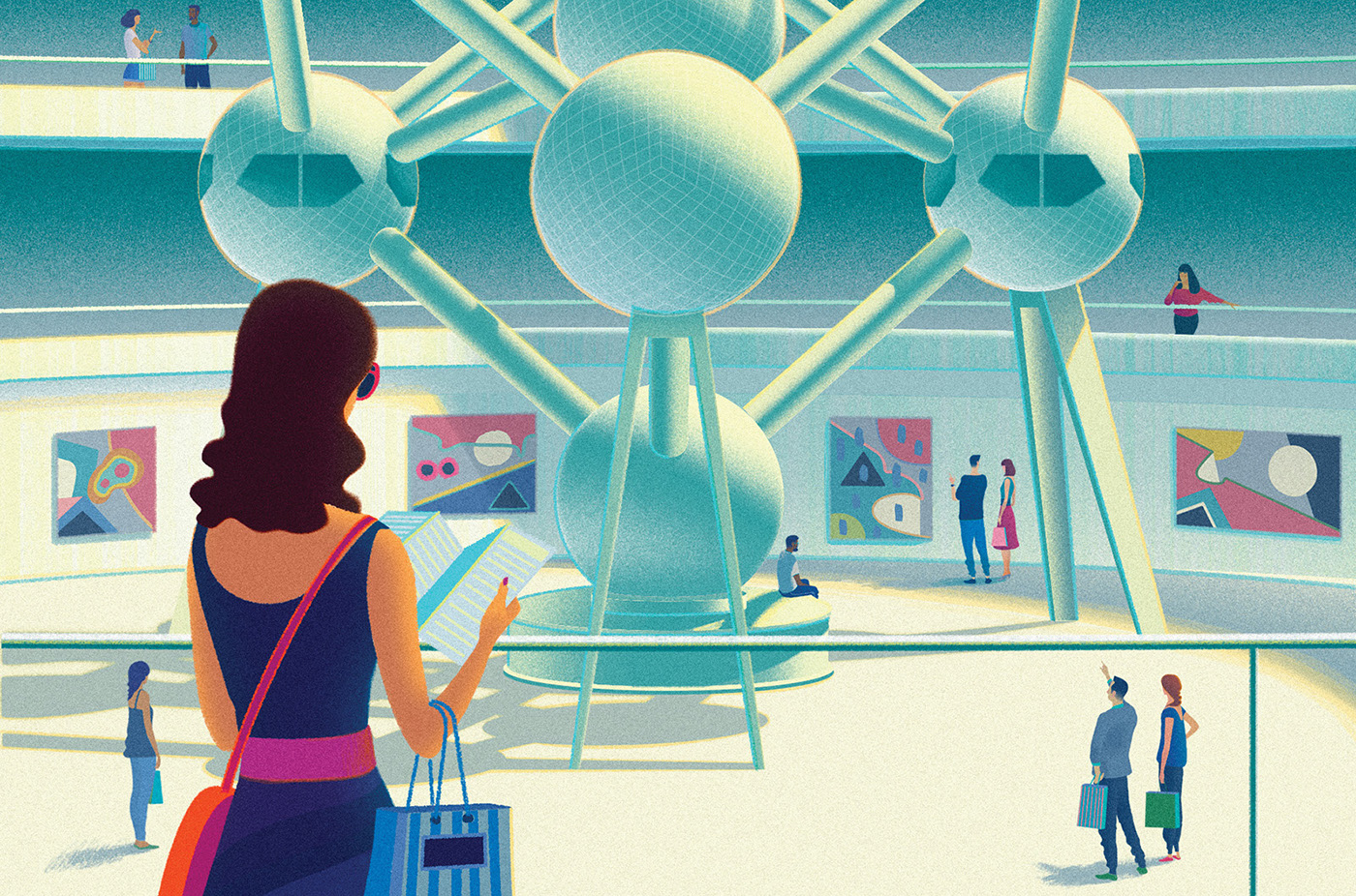
I did offer a few alternatives - I thought referencing Magritte (him being Belgian born and everything) by having people inexplicably floating in the air might be a bit clever, but in the end we kept it more straight forward.


Here are two couples discussing art. Completely unconsciously I depicted the men doing all the talking and pointing, with the women look a bit bored and disinterested.
Women’s Health magazine ‘High functioning Anxiety’
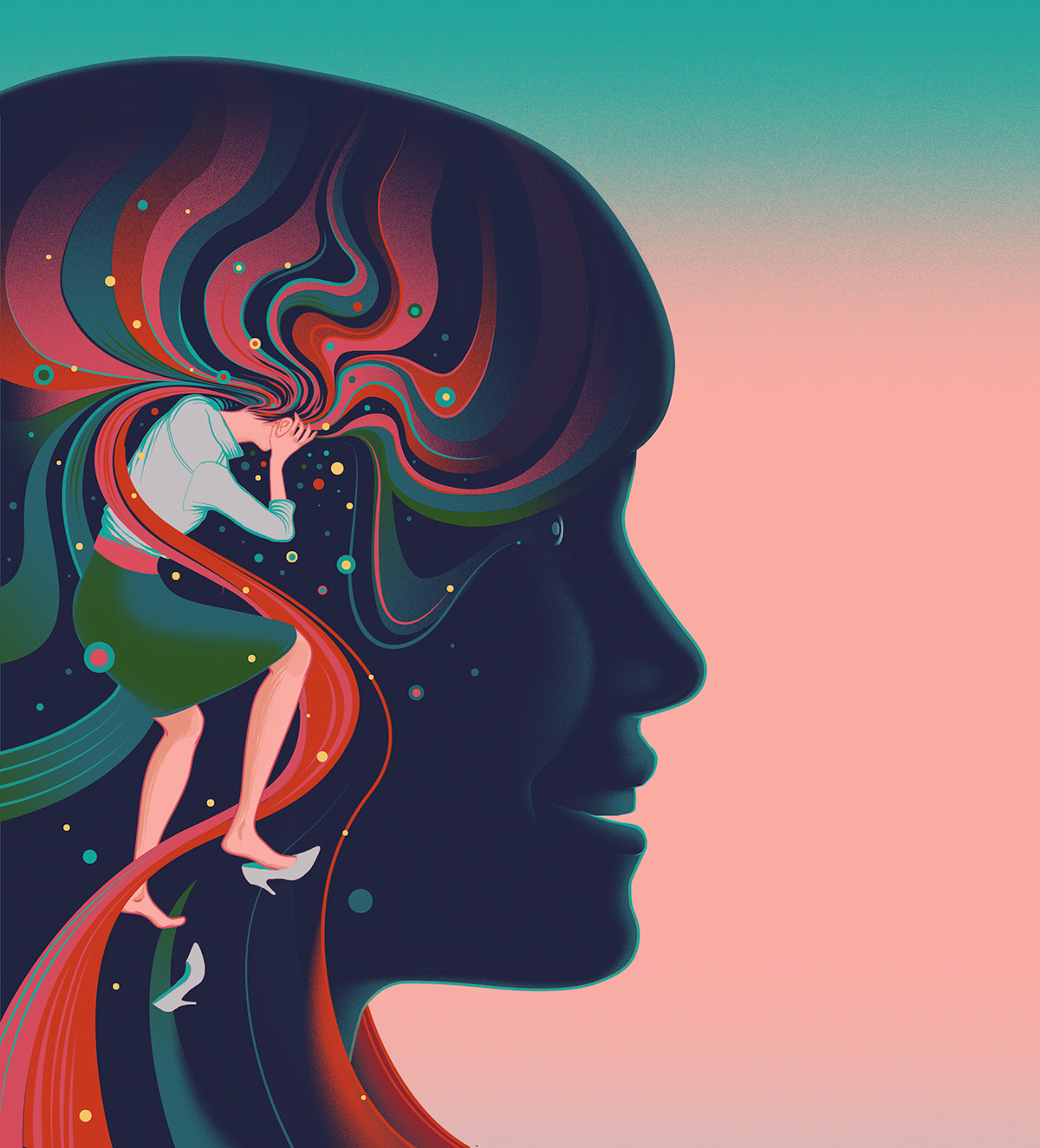
This is the first of three images I made for Women’s Health magazine.


Here’s the initial roughs. Hair being pulled out beneath the calm exterior. And a shoe falling off.

The all encompassing doom-laden cloud of stress. Again this one was a bit tricky with having to negotiate the text layout cutting into the image a certain points, but it’s quite enjoyable (except when it isn’t) working out how it all fits.

Most of the figures I drew straight into Photoshop but these three got the traditional hand drawn treatment.
Variety - Black Mirror season 3

I’m still recovering from the second episode of this. The darkest most unsettling thing i’ve seen for ages.

Here’s some of the roughs, I was clutching at straws a bit with the last two there.
Das Netz - Digitisation & Society

This is a cover image for a German annual digest that discusses new ideas in technology.
This years edition is generally about the effect of Social media on society.
What I wanted to get at with this image was the idea that a new virtual world is being constructed on top of the old physical world Hence virtual holographic stairs perched on real classical pillars.

Because of all the stairs and perspective going on here I started this illustration in 3D to speed things up.
Then I took screenshots and layered those into Photoshop and drew over the top.
Here’s the figure from rough drawing to finished.
The Economist - Colonising Mars

This is a series of three illustration about the technicalities and potential pitfalls facing any planned mission to mars. The deadline for these was 36 hours. which for me isn’t a very long time.


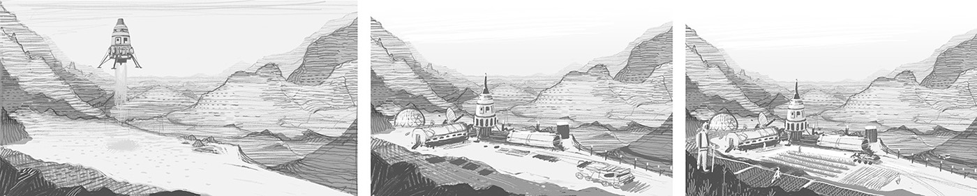
I was in such a rush I didn’t consider that any attempt to grow crops on Mars would have to be contained within an atmosphere controlled greenhouse. The third sketch almost looks like the south of France.
New Scientist magazine - Mapping the Multiverse
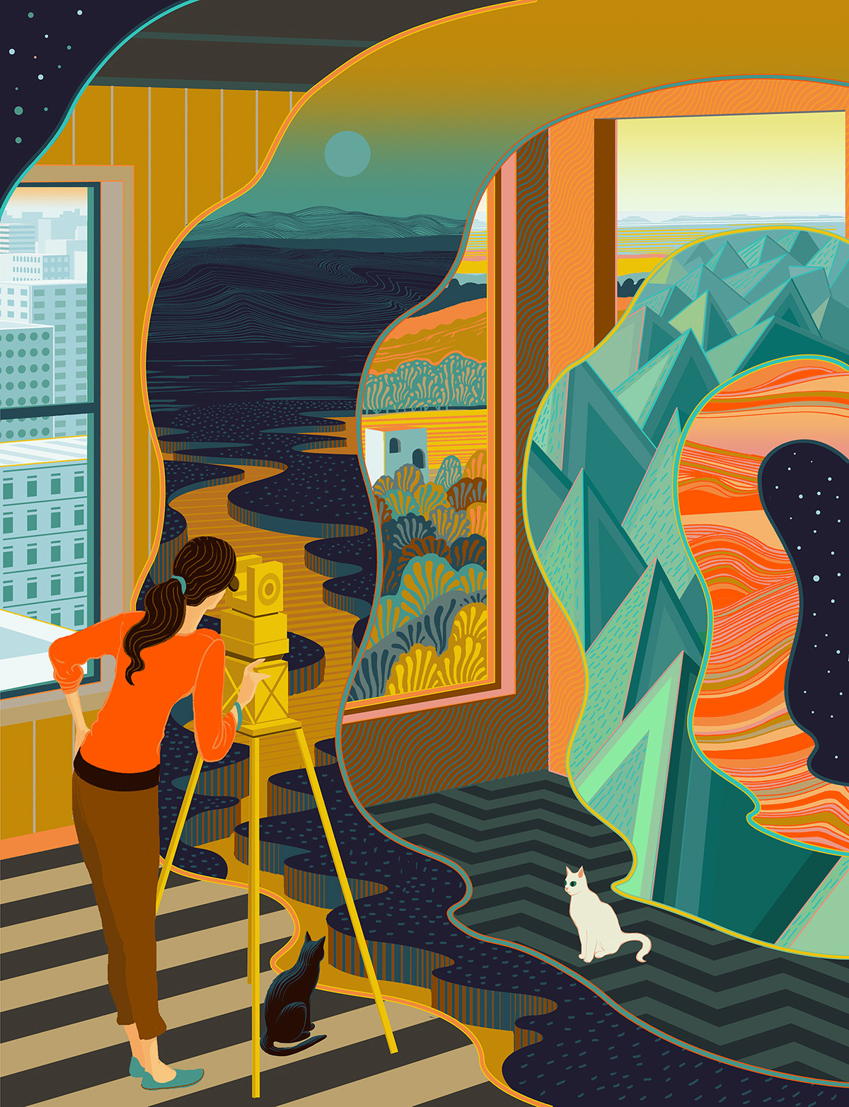
Apparently most Scientists seem to be in agreement that we exist in a multiverse so this feature was more focused on what they might look like, where they might be, understanding our spatial relationship to the multiverse and how we could theoretically travel to other dimensions of it.
The idea here was to create an illustration depicting a scene comprised of various worlds that are all very different except they share the same three dimensional space. Observing this a figure attempting to measure them in some way.
The main challenge was to depict the landscapes as being very different whilst also complementing each other and without cluttering up the whole composition.
The first thing I thought of whilst reading the brief was Philip Pullman's Dark Materials trilogy, (the cats are a subtle nod).


Below are a few false starts and blind alleys, it was a bit like a jigsaw puzzle in that the first steps where the most difficult. I set up the perspective tool in Adobe Illustrator then set about through a process of trial and error creating the different scenes.
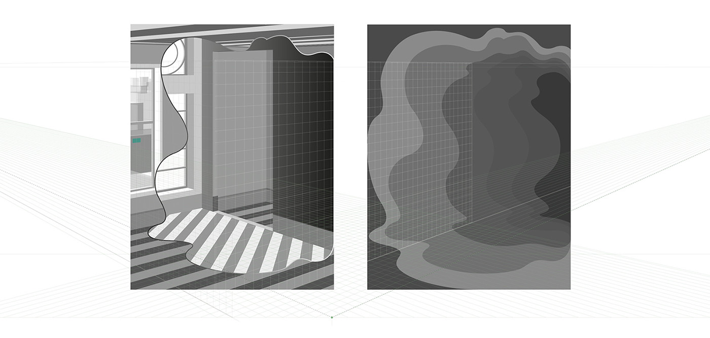
I made various elements in illustrator (not all of them though, mainly the architectural parts) then copied and pasted them into Photoshop where I put everything together.

Usually I tend to start images by working on the background and working forwards but for this image as there was quite a bit of detail I starting with the figures and hung everything around them, which I think is what you're supposed to do, it definitely makes more sense. Below are some of the initial rough drawings.

EMI - Synthematic
This is a cover for a compilation of synth based library tracks.

Fabric Magazine - London’s Green spaces
This is a cover for Fabric Magazine, the Spring issue celebrating London’s green spaces.
This is one of the smoothest jobs i’ve ever worked on in 16 years of illustrating. From initial rough stage to the completed thing it was completely plain sailing, usually on covers there’s a degree of back and forth.

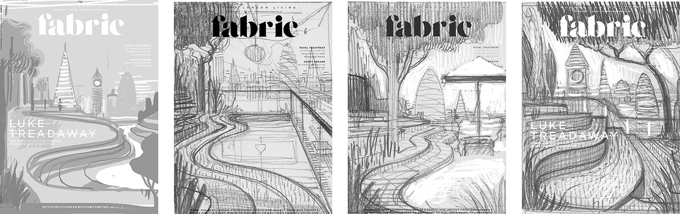
Here’s some of the initial rough sketches.


