Linda corporative Identity
This is a personal project specially developed to me, early in the year 2010 to a very special person too.
LINDA means pretty, beautiful in Portuguese and it is a brand developed for Michele Pampanin, who holds all their copyrights.
I tried to put the whole personality and all that the 'client' is and represents through a strong tea brand.
My sources of inspiration and the development of work you can see immediately below, as well as links to sites where it was featured.
Any kind of comment and criticism are very welcome, feel free to praise too.
I hope you enjoy the work :)

Linda corporative identity

Primary geometrical grid

Circular grid insertion

Final typography execution
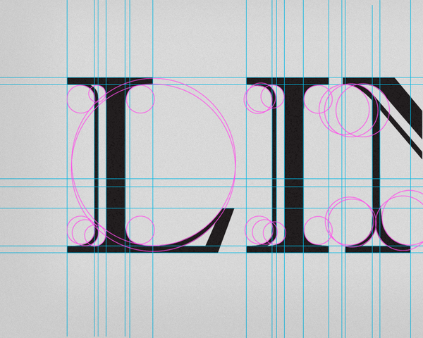
Details of typography grid construction


Details of typography insertion on the main logo structure, the blazon

Circular grid insertions details on the blazon

This circular grid is a simplified version of the final grid, to show more clearly the step-by-step construction of the logo.

P&B negative Linda logo aplication

Grayscale Linda logo aplication

P&B positive Linda logo aplication (i love this version)

Here are some reference sources of inspiration for conceptualizing the logo and choosing the color palette. The main values to be evidenviados was sophistication, elegance, delicacy.

Final color palette on black and on white

Final Linda corporative work aplication, in collors


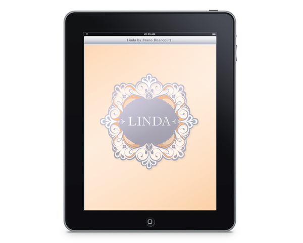
Digital aplication of the Linda corporative identity
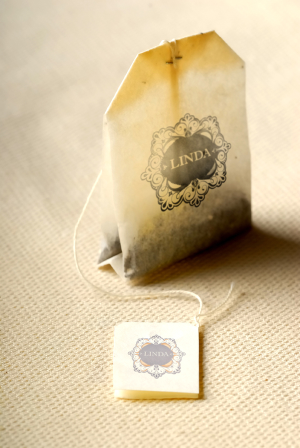
Print and conceptual aplication of the Linda corporative identity