
Background
The STEM Transfer Student Success Initiative (t-STEM) is a collaboration between University of Maryland Baltimore County (UMBC) and partner 2-year institutions that was funded by a grant from the Bill and Melinda Gates Foundation. The purpose of the initiative is to aid and increase the success of STEM students transferring from community college to a 4-year institute.
Project
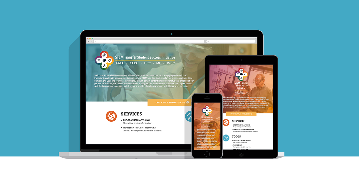
The project started in 2013 and ended in 2016. The final product was a website that provided resources, tools and guides, which included topics such as: planning ahead, financing their degree, learning about career options, and preparing for the classes and new community.
My role was UX design and front-end development as I worked together with a project manager and a back-end developer to design and develop a website that was easy to use and navigate, responsive, aesthetically pleasing, and met accessibility standards.
Process
As the project progressed, more and more content was added as the various subject matter groups collaborating between institutions contributed their work. We eventually went through five different approaches for format, structure, and information architecture as we redesigned for every major addition and shift in content.
Version 1, Version 3, Version 4
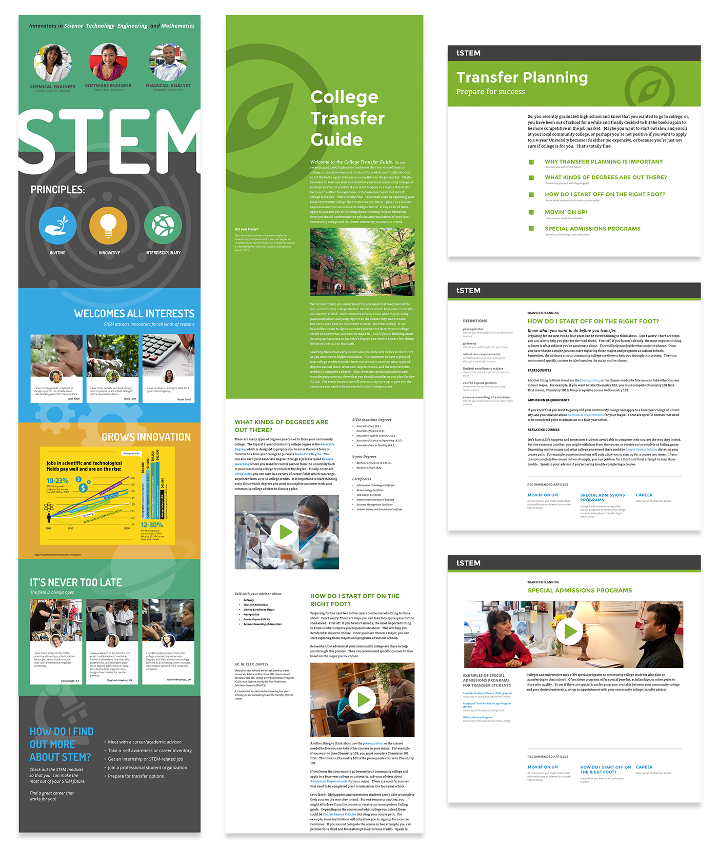
Version 1
The planned content focused on encouraging students to pursue STEM majors and careers. I created a one page layout and chunked information into panels so that it was easy to read. Later on, when we were given content from the Advising group, this structure no longer worked. The Advising content group felt like they had to cram all of their information into a panel the size of a Powerpoint slide, hiding everything in tabs and multiple columns. Not only did this not look terrible, it was tucking away important information, making it less visible and harder for students to find.
Version 3
The focus of the website shifted from being an introduction to STEM majors and careers to an online guide for STEM transfer students. Since t-STEM was originally planned as a course to be taught in a physical classroom with print material, the structure and visual style was influenced by what the print material may have looked like. Each section was treated somewhat like a page (with a secondary column that acted like a wide margin for notes), though all the “pages” were connected so that it would still be a one-pager design. The addition of more content made the one-pager layout too long and difficult to skim and scroll for specific information.
Version 4
I learned my lesson from the ridiculously long one-pagers and broke the content into chunks. We were influenced by GOV.UK which consolidated tons of content and used a drill down navigation pattern to make information easy to find. The concept was that each section would have a main page that would then lead to smaller articles. Unfortunately, some sections had no real hierarchy or would end up having too many levels, so this structure did not work.
Version 5, Version 6, Version 7, Final Version
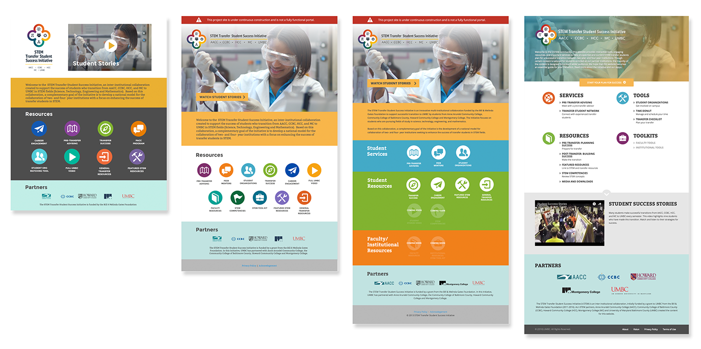
Final Version
The approach we finally decided on was simply putting pages under sections, no longer focusing on breaking down the content into chunks. This meant less clicks and more flexibility for the different sizes of each section. As more and more sections and standalone tools were added, the homepage ended up with an excessive rainbow of colors and too many icons that were not only not very descriptive but also more difficult to browse.
I grouped the icons to reduce the number of colors and then later reduced the number of icons and listed the sections under each group instead for a cleaner page and visual style.
Information Architecture
After the final layout was approved and all of the sections were established, there was a concern if the information architecture was unintuitive and that the Resources section was too heavy. A content audit was conducted and I explored different approaches to the information architecture.
The approaches included: content organized by the stages a student would go through, from introduction to STEM majors, to transferring, to getting acclimated to 4-year institution; content organized by topics, including transfer process, campus life, academic studies, and career; and guide content separated from resources and organized by topics.
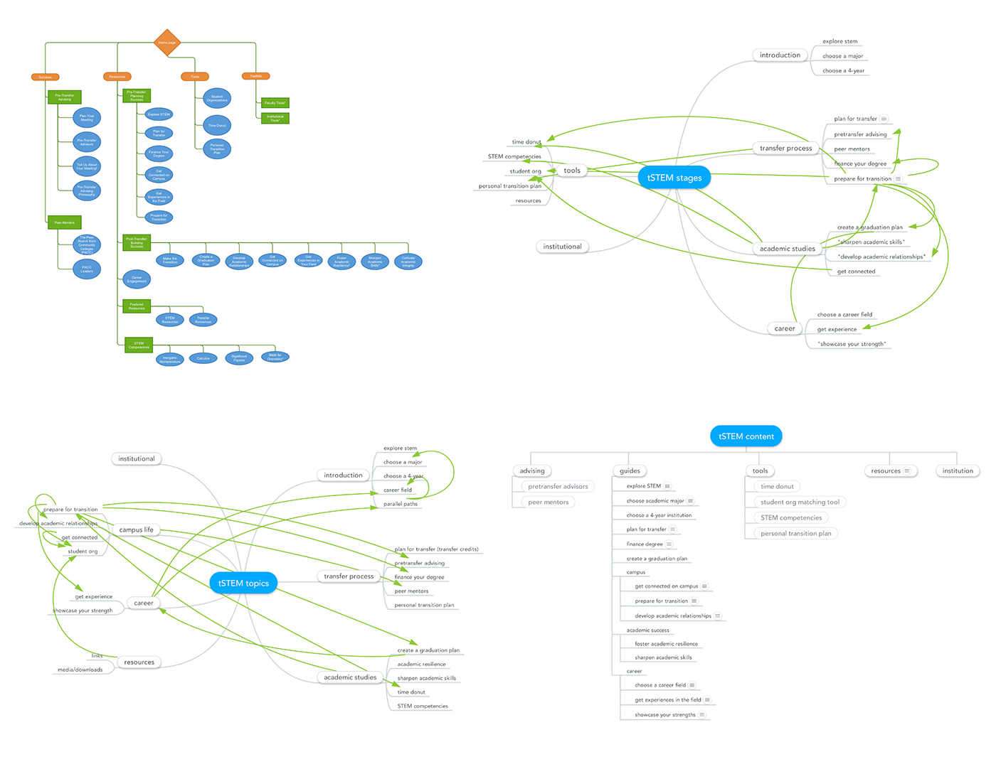
Top Left: original site map. Top Right: stages. Bottom Left: topics. Bottom Right: guide organized by topics.
Usability Test
In the Spring 2016 semester, I took the class HCC 729: Human-Centered Design. I saw an opportunity to conduct a usability test for the t-STEM site. Up until then, we had only had informal discussions to get feedback from users, so I was excited to do a formal evaluation on the site, particularly on the organization of the content.
Multiple usability methods were utilized, including: competitive analysis, personas, user analysis, task analysis, environmental analysis, direct observation, interviews, and heuristic evaluations. The results of these methods lead to low-fidelity prototypes that were tested using a think aloud method and then used for participatory design. Medium fidelity prototypes were designed based on the participatory designs to address the identified issues. Usability tests were then conducted to evaluate both the new design prototype as well as the original site.
A total of 16 participants were involved: two for direct observation, three (including the client) for interviews, one for heuristic evaluation, two for evaluating the low- fidelity prototype using think aloud method and participatory design, two for the usability study pilot test, and six for the final usability study (including two for eye-
tracking). All were UMBC students studying in STEM fields and were between theages of 20 and 26 years old.
tracking). All were UMBC students studying in STEM fields and were between theages of 20 and 26 years old.
Personas
The site’s main intended audience is students transferring from community college to a 4-year university and are majoring in a STEM field. The secondary and tertiary audience groups include advisors, professors and parents, however the personas focused on students.
Personas were created to not only represent the main audience that would be using the site the most, but also to reflect the diversity of student demographics – community college students considering transferring are not all recent high school graduates.

Task Analysis

Paper Prototypes
The prototypes addressed three of the main issues on three pages of the site:
• Main page: poor organization of content
• Featured Resources: Too much text in a single page
• Finance Your Degree: confusing navigation between pages of connecting content

Usability Report Summary

Final Results
The recommended changes based on feedback included:
• Revise the organization and navigation.
• Increase font size.
• Move more major sections to the front page for higher visibility and easier access.
• Move Choose an Academic Major to under the Pre-Transfer resources.
• Rename Featured Resources to something clearer and more descriptive.
• Rename Institutional Tools so that it is clearer that it is content for institutions, not students.
• Combine all the pages of the Finance Your Degree section into one page.
Unfortunately, only some of the recommended changes were implemented due to time constraints.
Lesson Learned
Content before design.
Although we used draft content for the initial designs, we quickly learned that it was nowhere close to the final content.
Having a full understanding of all of the content before starting the design process would have given us opportunity create the appropriate structure and organization from the beginning, rather than adding content as we received it and having to change the structure when the content no longer fit.
Another issue was that at the beginning, all the content was expected to be static, so we did not expect to have content that would need to be updated every semester by our team. In the end, the constantly changing content was not sustainable and was eventually cut or moved to another departmental site within UMBC. This could have been avoided if we had better planning from the start of the process and included a CMS.
In the future, I plan to make sure to have at least draft content for the entire site before starting the design and determine with the client if a CMS is necessary for maintaining the site.
Final Design


