Magazine Advertisement
Introduction
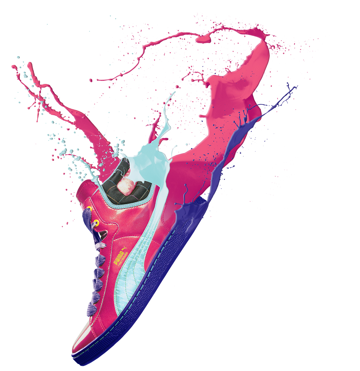
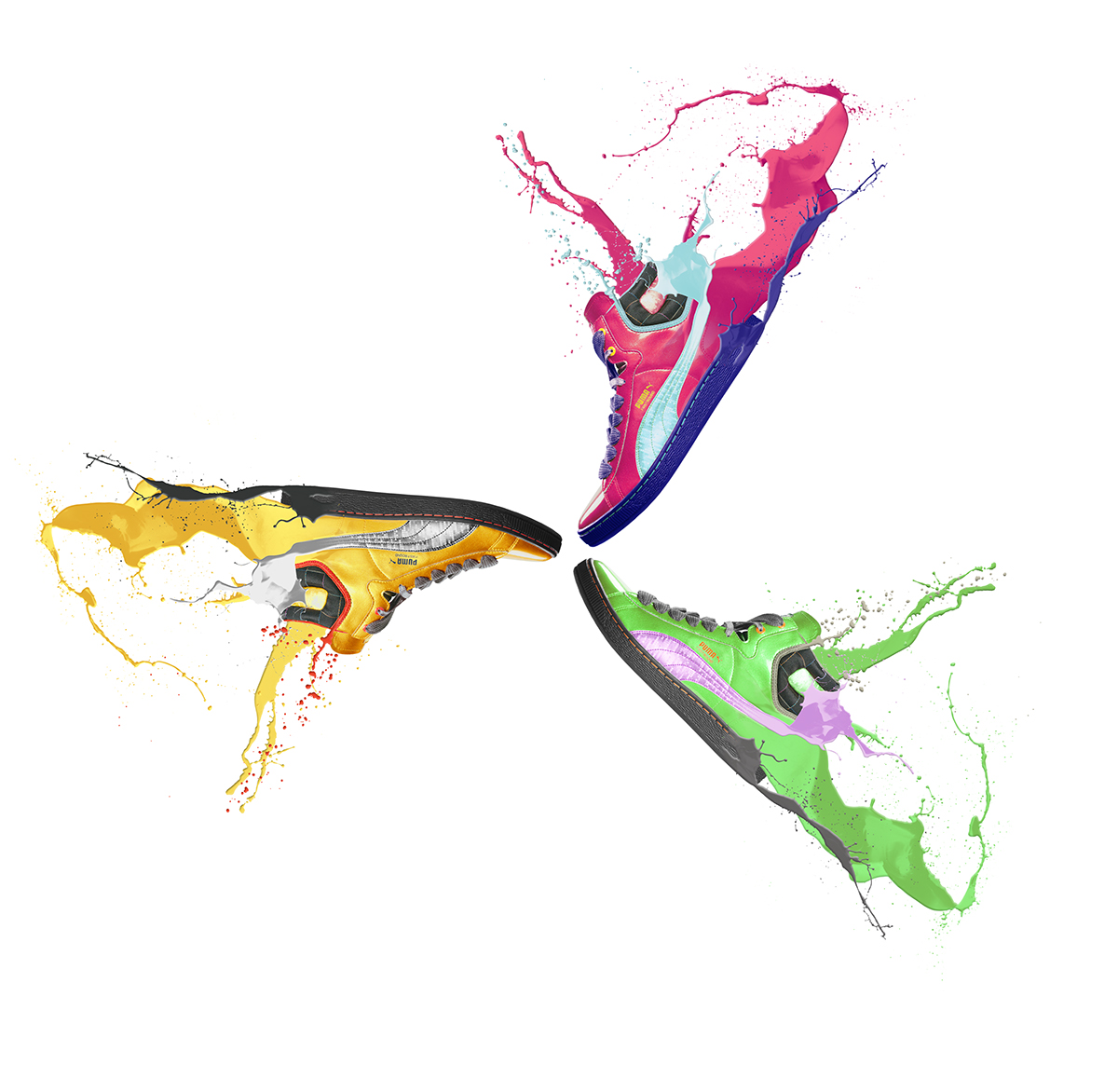
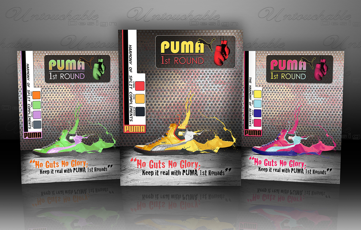
Below exhibits three color combinations and two harmonies, as well, to the Pantone®
Below exhibits three color combinations and two harmonies, as well, to the Pantone®
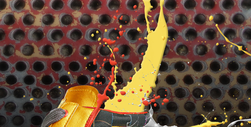
Matching System ink information. Stock photos of the shoes were used from krechowicz.pl.
Objectives
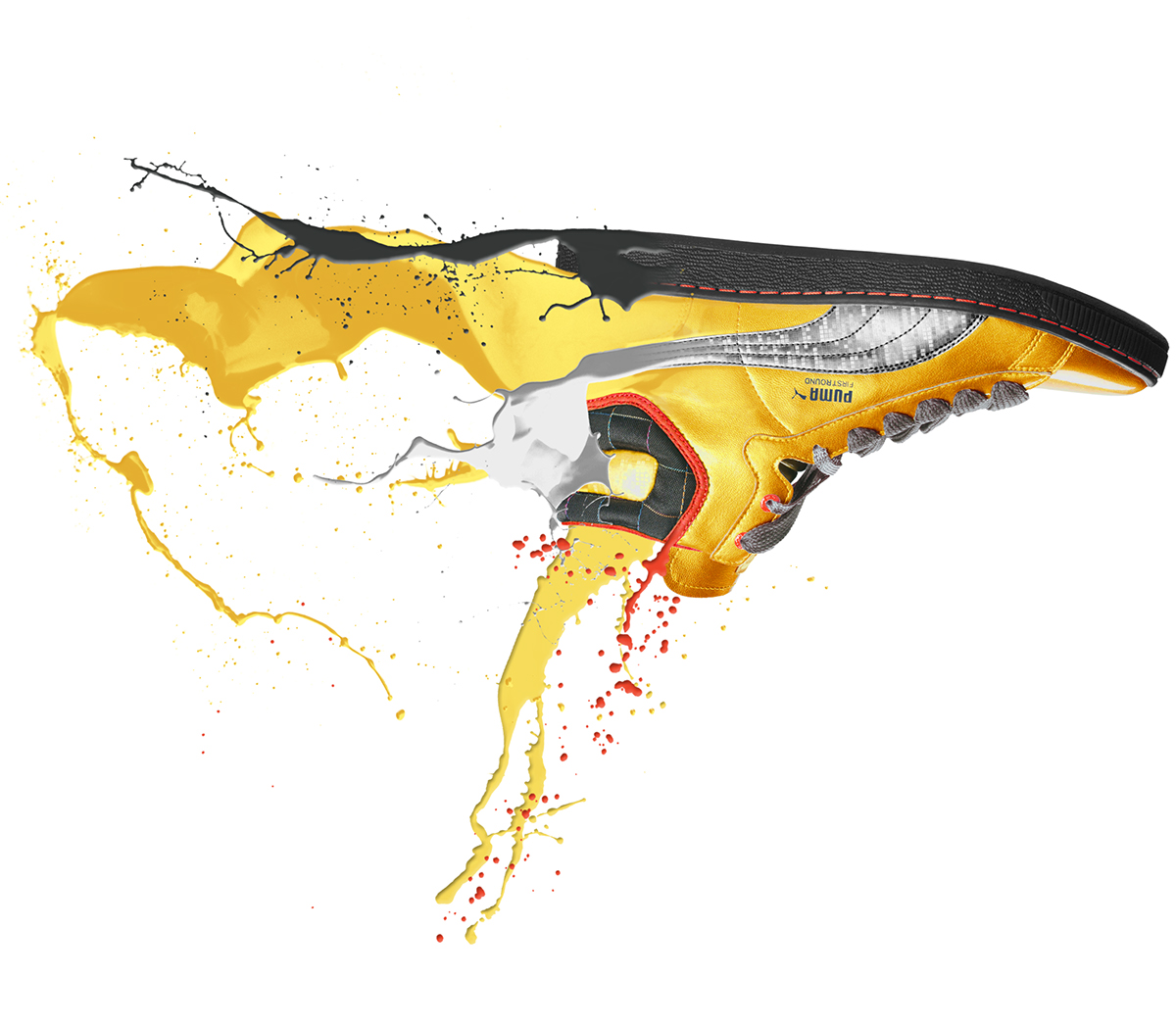
Creative directions for this project were to utilize one color harmony. Additionally, the background creation applied a dramatic arena for the showcase of the shoe. Several fonts and colors weighed heavily on the outcome of the final typography and colorization.
Creative directions for this project were to utilize one color harmony. Additionally, the background creation applied a dramatic arena for the showcase of the shoe. Several fonts and colors weighed heavily on the outcome of the final typography and colorization.
Audience
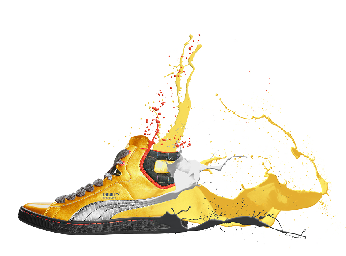
The final color composition and harmony of Split Compliments was chosen for the page. The contrast of the yellow and dark grays was perfect to show off the shoe. This piece was printed on 8 ½ x 11 semi-gloss 80lb paper.
The final color composition and harmony of Split Compliments was chosen for the page. The contrast of the yellow and dark grays was perfect to show off the shoe. This piece was printed on 8 ½ x 11 semi-gloss 80lb paper.