Sling & Stone — Taking aim and looking sharp
Website design, Responsive, Website development, IA & Wireframing, Interface design, Logos & brandmarks, Identity system, Icon design, Style guides
Sling and Stone don’t see themselves as a traditional PR company. With a focus on entrepreneurs, challengers and disruptors, they’re the David to the industry’s Goliaths. With an accelerated growth trajectory that matches that of some of their clients, in true start-up fashion, they hadn’t spent as long as they’d have liked on their branding or website.

Energy. Dynamism. And a sense of fun.
Initially teaming up to work on their website, we were invited to approach their brand identity too, and make sure the bold, energetic brand lovingly mapped out in their guidelines, was reflected in the way they look.
With a name that suggests accuracy, agility and a can-do attitude, we wanted to make sure they were also reflected in the design.
With a name that suggests accuracy, agility and a can-do attitude, we wanted to make sure they were also reflected in the design.


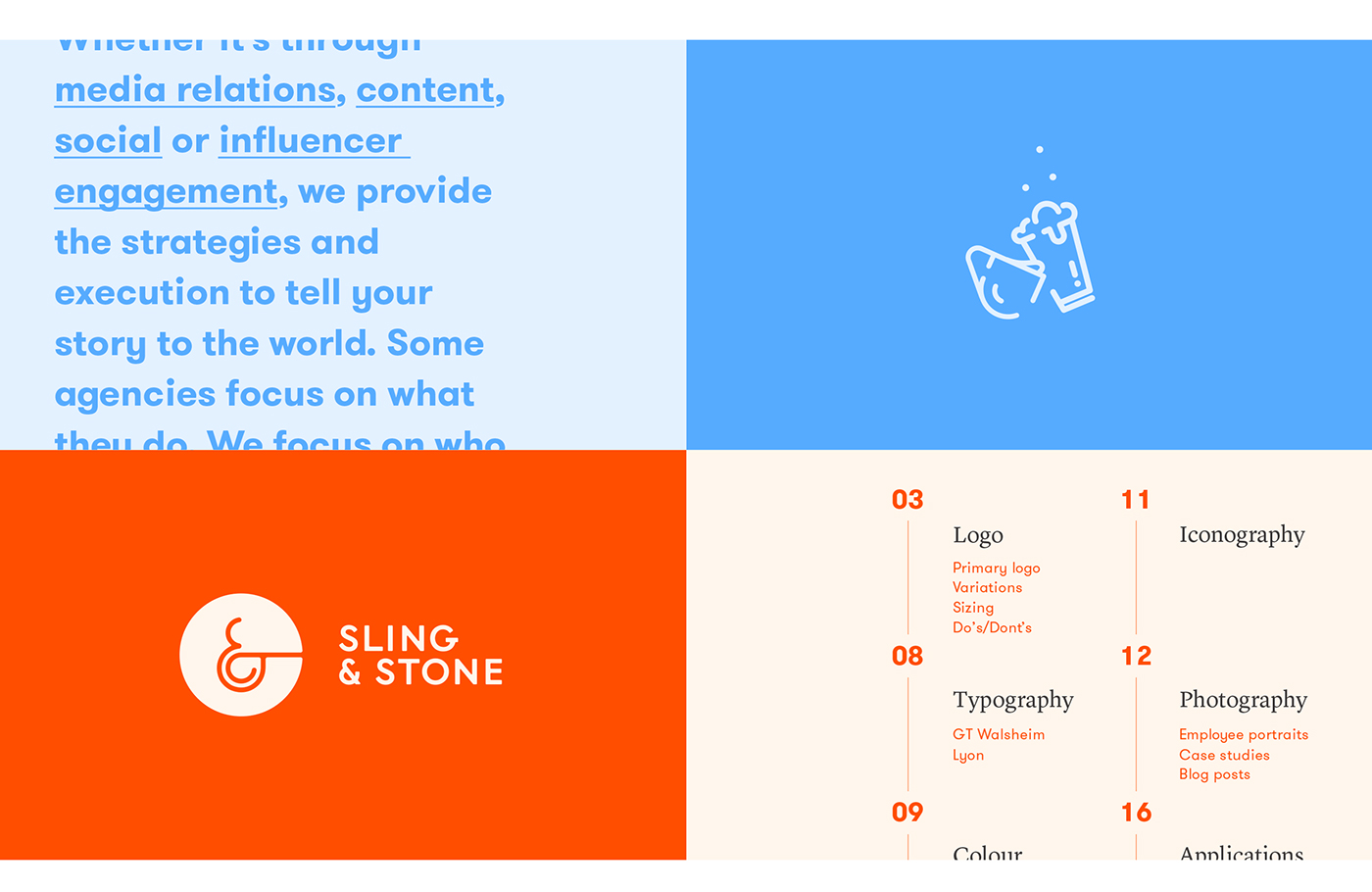
We started with recrafting their logo, taking cues from the arcs of a slingshot in motion to inform the shape of the ampersand and inject more dynamism. The stone acts as the anchor, echoed in the solidity of the circular containment device.


Next, we explored their colour pallette. While the agency has an affinity with orange, it’s a colour used extensively by energetic start-ups. To help make it more ownable, we shifted the scale to find a richer, more saturated burnt orange, and complemented it with a neon blue, and selection of more muted pastels. Together with a bespoke typeface and strong tone of voice, the impression is one of youthful zeal, backed up with strength.


Tying everything together, is the new website. With a focus on simplicity and ease of navigation, we kept everything clean and uncluttered, creating a simple showcase for the people and the work. We took things one step further with a homepage, using the candid photography style in video to demonstrate a typical day in the life of the agency.


With a naturally charismatic and photogenic workforce, using candid images to help project the personality and working style of the business was an easy decision.


Now the nuts and bolts of the brand were in place, it was time to have some fun. We wanted to demonstrate the ‘relationship’ side of the business, both in the client-partnership dynamic, and the great agency team culture – important when wooing new clients and potential employees.
And speaking of fun, we took the agency’s unofficial mascot, Señor Crab, and turned him into a dancing dancing neon sign.
And speaking of fun, we took the agency’s unofficial mascot, Señor Crab, and turned him into a dancing dancing neon sign.

We love what Universal Favourite has created. They didn’t just give us a quick website update and stop there — they looked at the brand more broadly, including the colours, logos, and an entire style guide.
— Vuki Vujasinovic, Founder and CEO, Sling & Stone
— Vuki Vujasinovic, Founder and CEO, Sling & Stone


