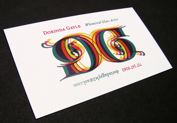
Dorinda Gayle Identity
Abstraction as asset
Abstraction as asset
AIGA Richmond GRADE 5
Winner of Best in Category for Logos/Icons/Stationery
Winner of Judges Choice
"It's simply a 'D' and a 'G'. Printed on both sides of the card it reads back to front, upside down, and from every direction it's whimsical and thoughtful. Plus, it's got a little Bradbury Thompson thrown in."
— Marcus Hewitt, Chief Creative Officer of Dragon Rouge (NY) —

Dorinda Gayle is a glass artist that was looking for a new identity for her developing style. After attending a gallery opening that featured her work, I learned that her work was often hung incorrectly. The irony was that no one (except Dorinda) knew unless they were told. "It wasn't the first time it's happened," she told me as she shrugged it off.
I wanted to create a mark that reflected the abstract quality of her work, and could also be viewed from multiple angles. The mark had to convey qualities of glass, so overlapping layers of color were used to demonstrate the transparent nature. Finally, the logo was printed with a glossy finish on matte paper to further this idea of glass.
The contact information was presented so the viewer would be more likely to turn the card and experience the ambigrammatic quality of the logo. To take this concept one step further, the card was printed double-sided with the information rotated 180°. This gives the card no front, back, top or bottom. This ambiguity captures Dorinda Gayle's work completely.
PROCESS SKETCHES


