Ville de Québec
This was a class project to create an identity system for any international city of our choice. After doing research, moodboards, and many many iterations of sketches, we produced a logo, letterhead, business cards, and an identity manual for our city.

Revision 2. Series of sketches based on three different concepts related to different characteristics of our city.
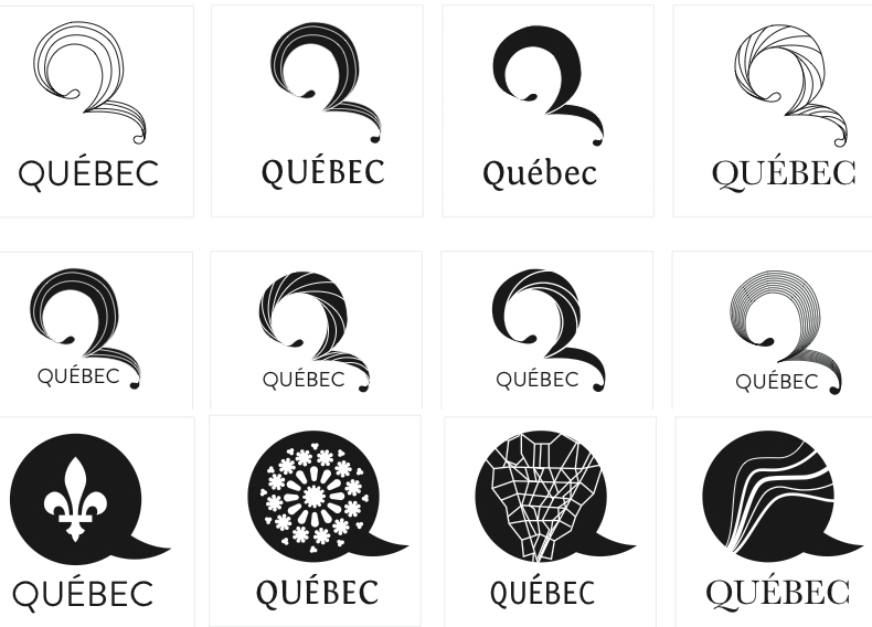
Revision 3. Picked two logos from Revision 2 and did more variations based upon those them.
Revision 4. Picked one logo from Revision 3 and refined it. Two versions with different tails. The bottom was the first one I made, but the one on top was a revised version with better balance.
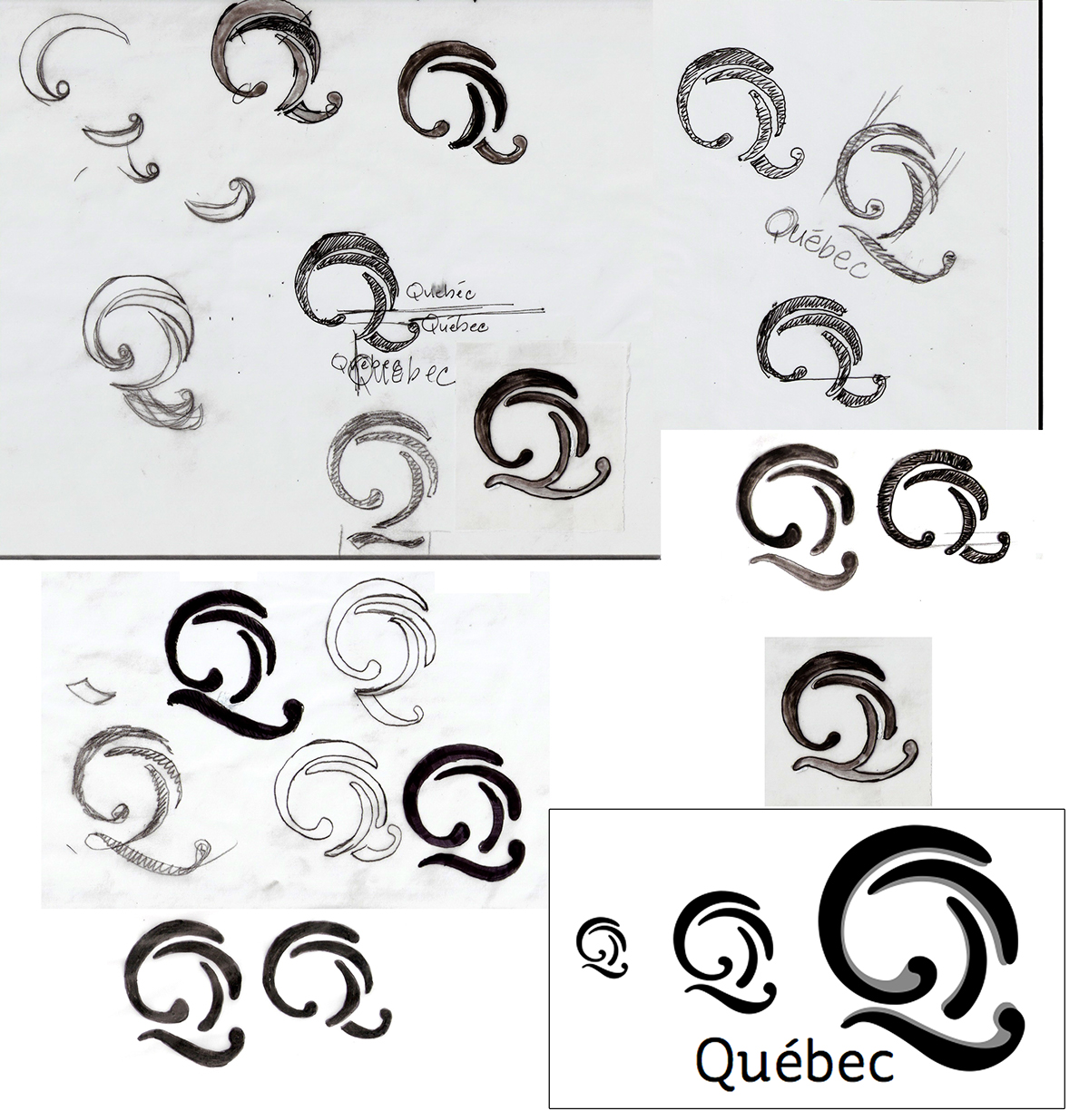
Revision 5. Our original professor was on leave so another professor took over our class. She had a very different style of process from the first professor. There was a focus on doing things by hand instead of digitally, using tracing paper, pencil and pen. This method made it easier to create different iterations quickly and allowed us to explore more possibilities. The box in the bottom right corner contains the final logo, the black layer showing the last refinements.
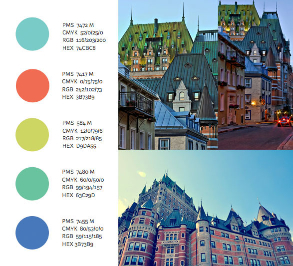
Colors were chosen based on the buildings in Old Québec, specifically the rooftops.
Blue was chosen as the main color for the logo as both reflect the meaning of the city's name – Kébec is an Algonquin word meaning "where the river narrows" – and the location of the city in the Saint Lawerence River valley.
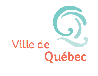
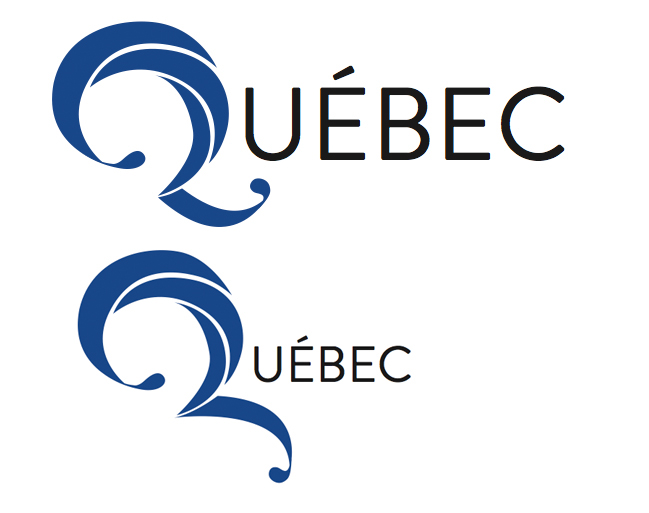
Final logo.
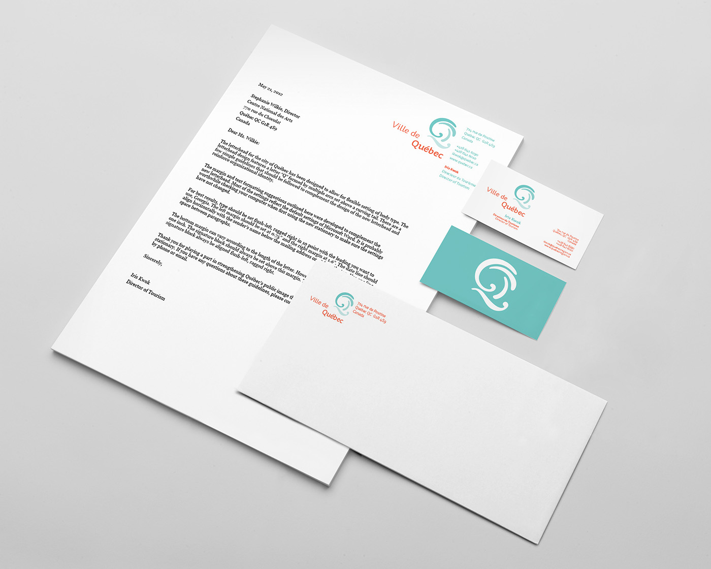
The letterhead, envelope and business card. Both French and English are used.

