Gold Diggers Cookbook
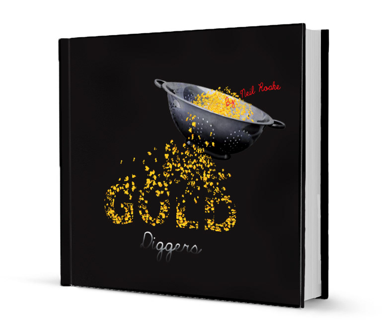
The Front Cover
Originally we were told that the front cover had to strictly be typographic gold foiling on a black background. As the project progressed we were able to play around with more freedom with regards to the gold foiling as well as introducing some imagery. My concept for the cover was to have gold flakes through a colander. The image of the colander not only relates to cooking but also symbolizes the sieve used in the olden days to separate the gold from the soil. The gold flakes make up the word "Gold" as well as suggests the movement of the ingredients when draining them in a colander.
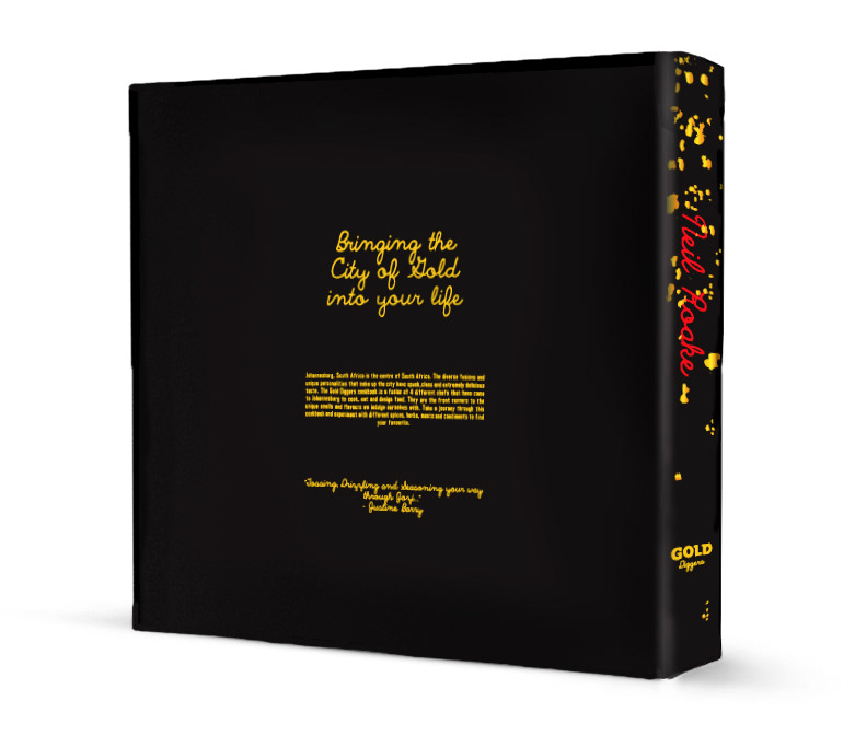
Above is the back and spine of my Gold Diggers Cookbook Design.
Please note: The photography used in this cookbook are not my own. We were asked to choose a style of photography to show the photographic direction that the Cookbook would follow.
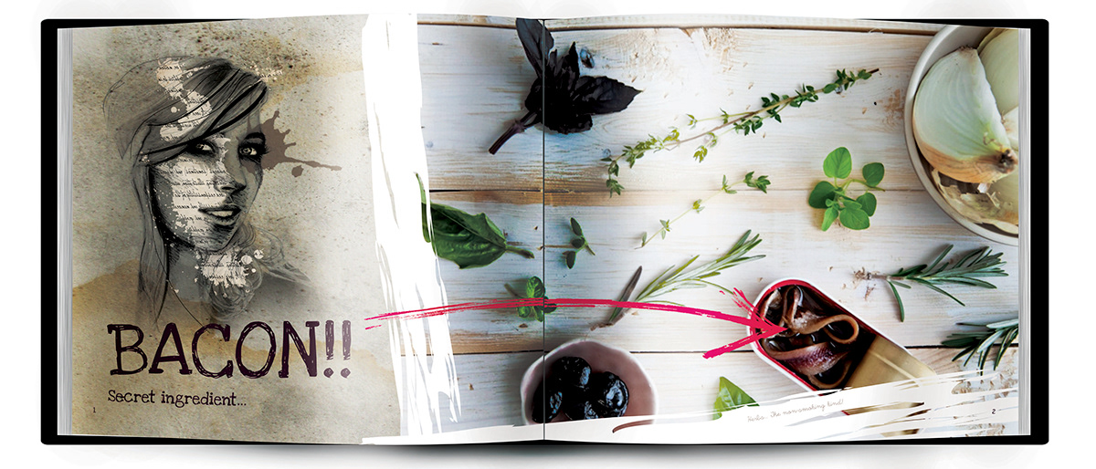
Above is the Chef Page. The idea for these pages is for each chef to have an aerial shot of their most favoured ingredients to cook with as well as share any secret ingredients they have when it comes to food.

Above and to follow are the Recipe pages.
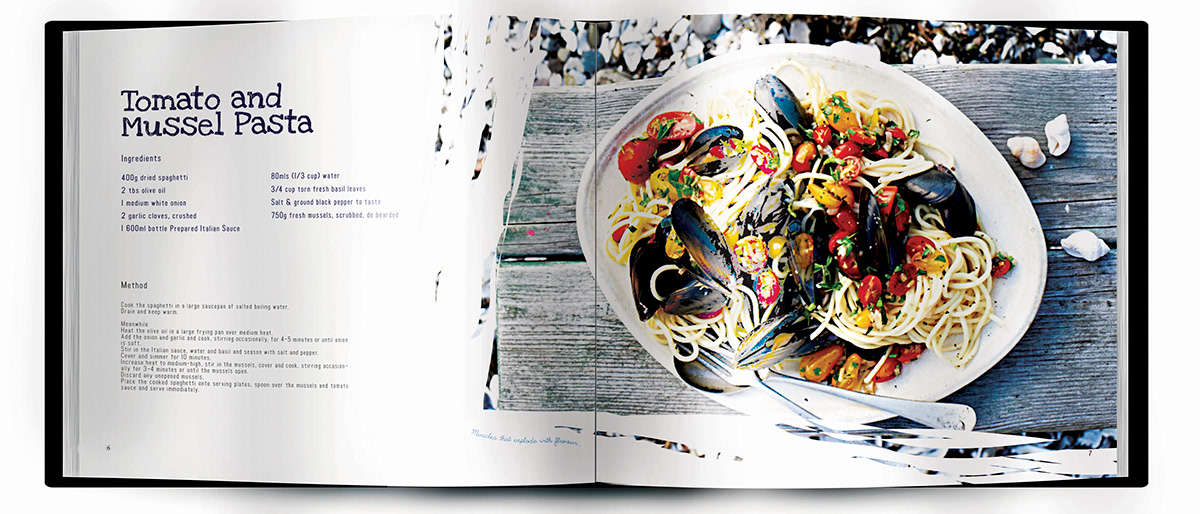
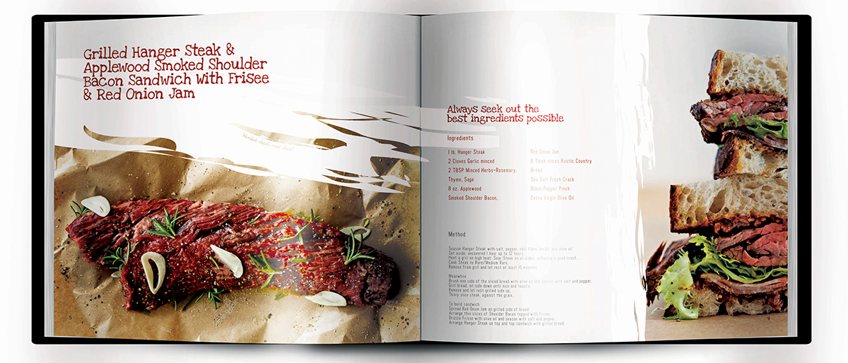
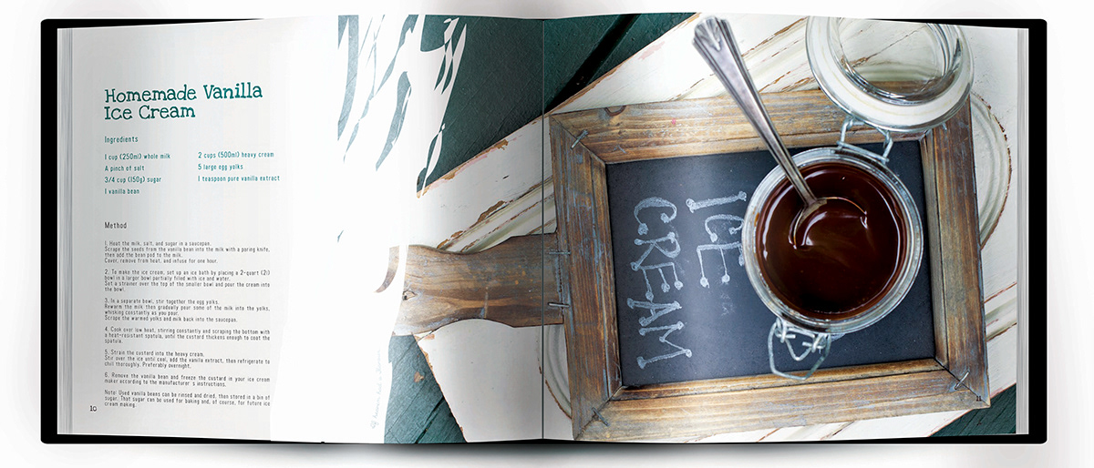
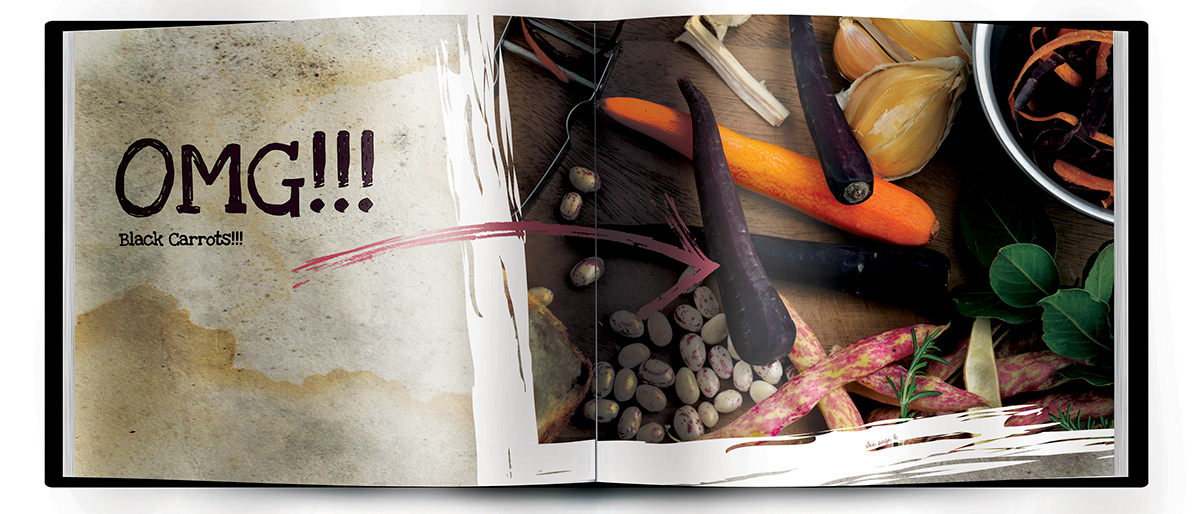
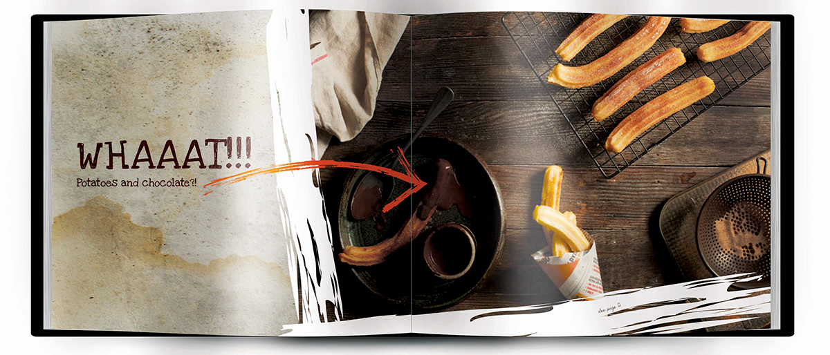
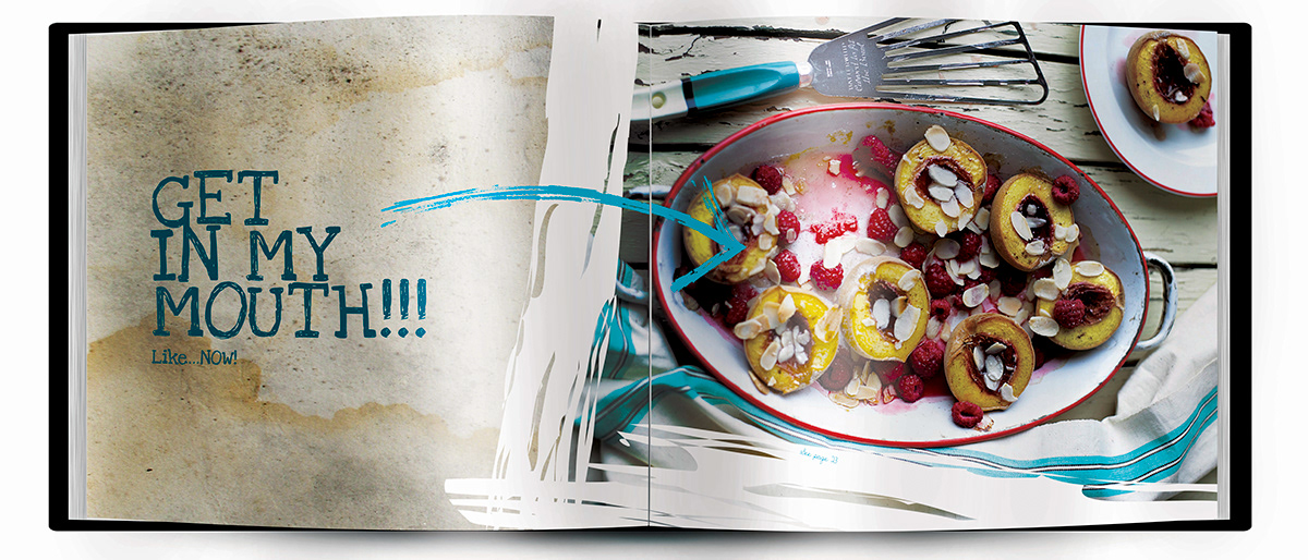
The Above and to follow are the splash pages. The idea for these splash pages are for the images to be of unusual food combinations or ingredients paired with a funny comment. These splash pages serve as the breathing space between the condensed recipe pages as well as the divide between the chapters or chefs.
