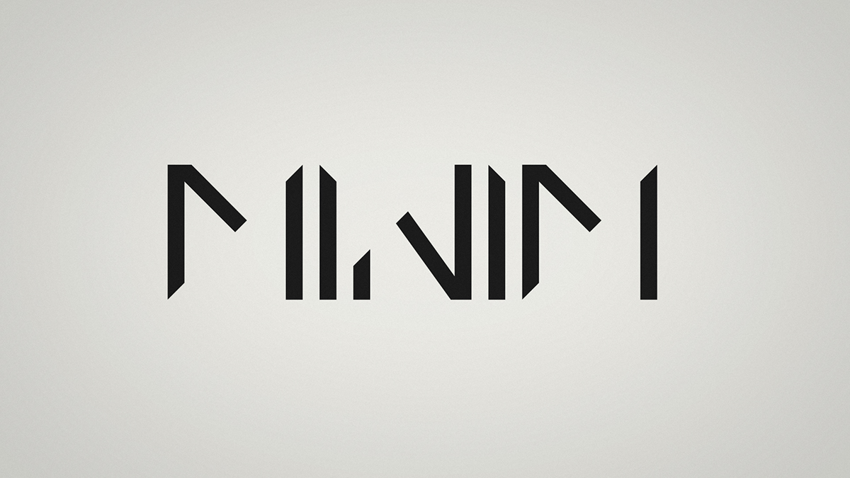
Minim
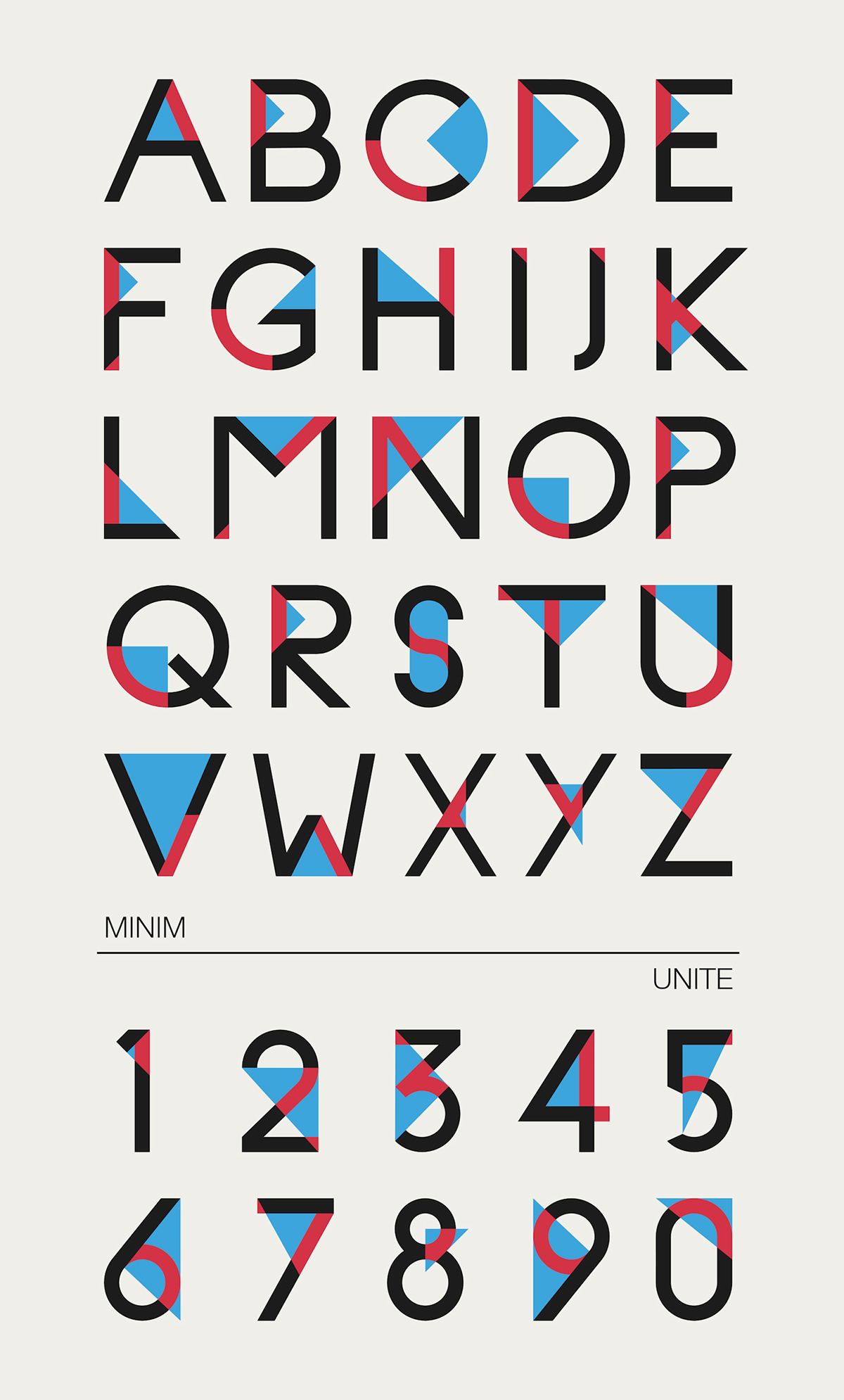
Minim Font, Typographic Experiment.
It’s always hard for me to describe my projects, i see them as obvious, simple, normal.
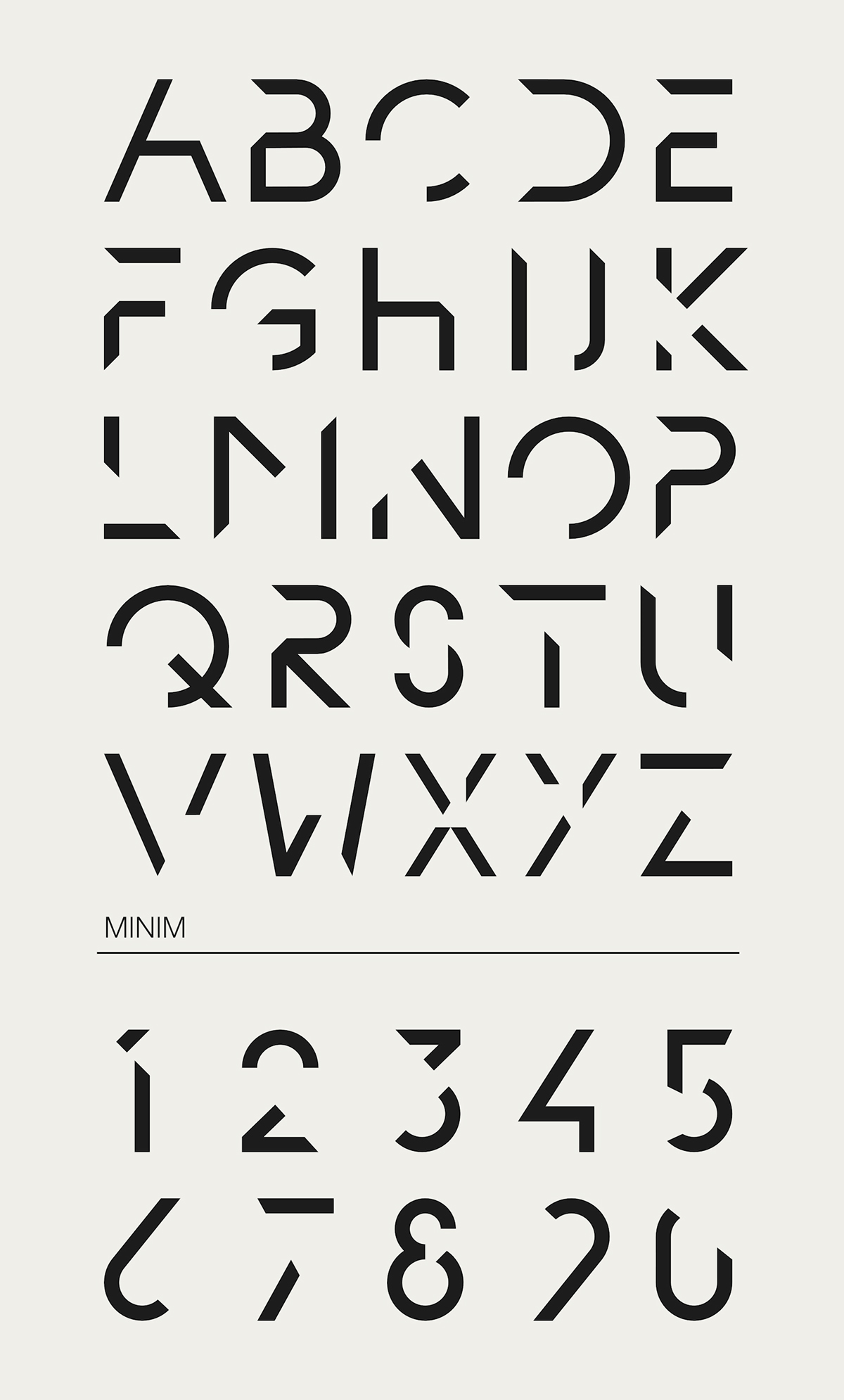
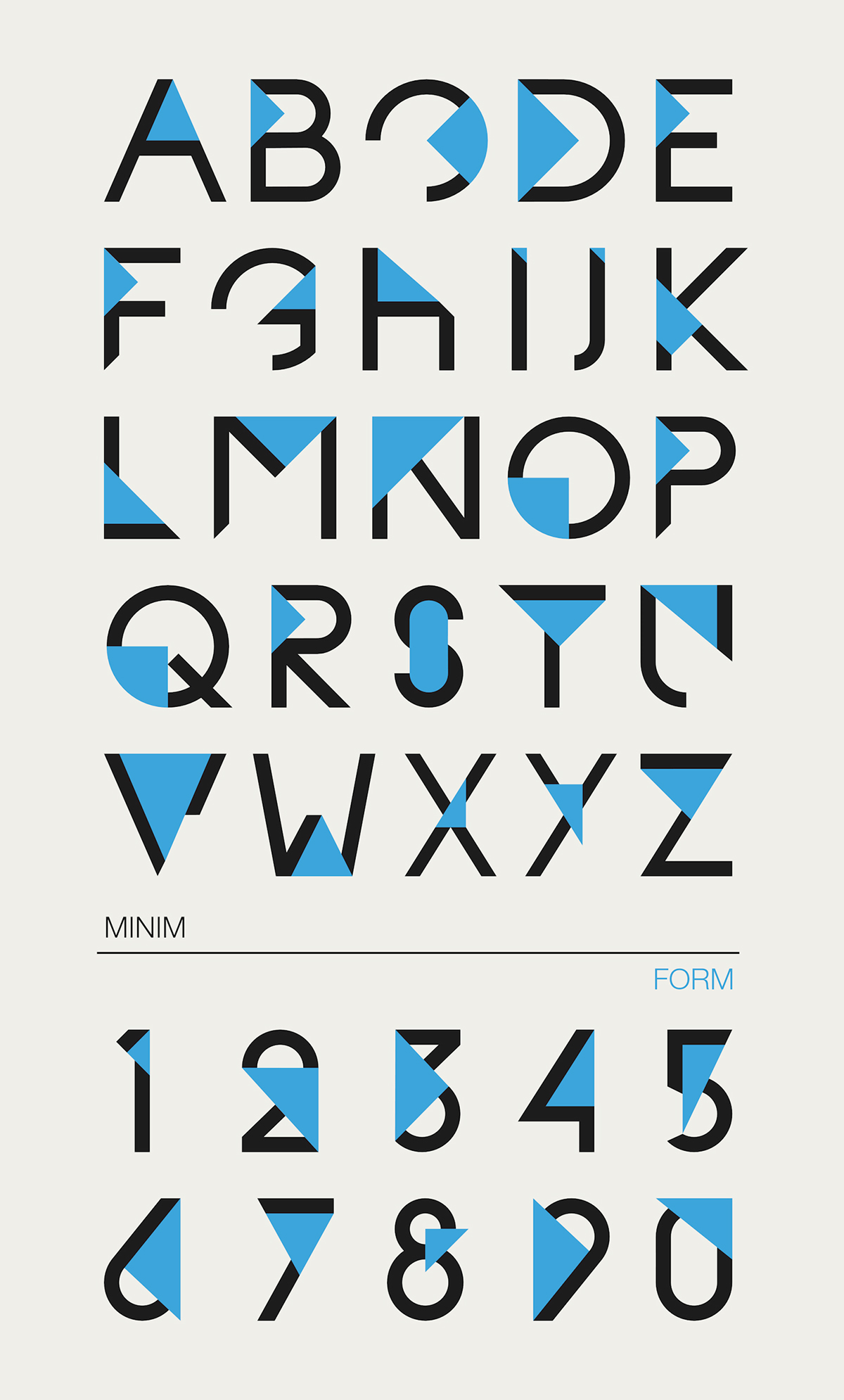
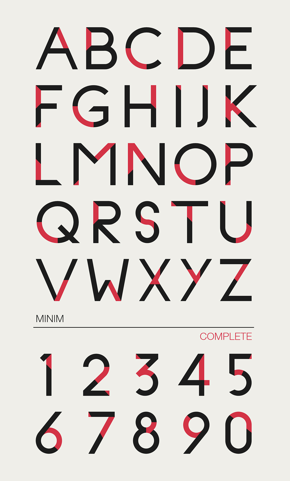
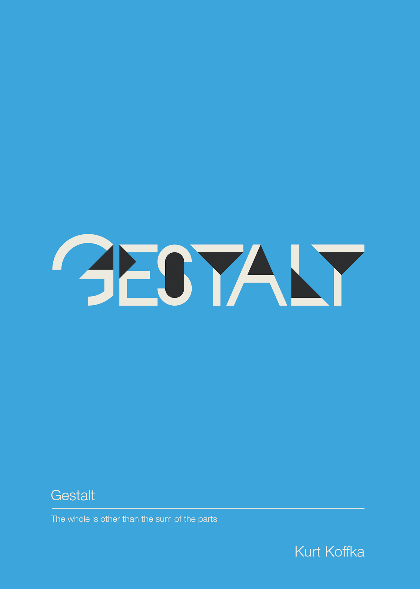
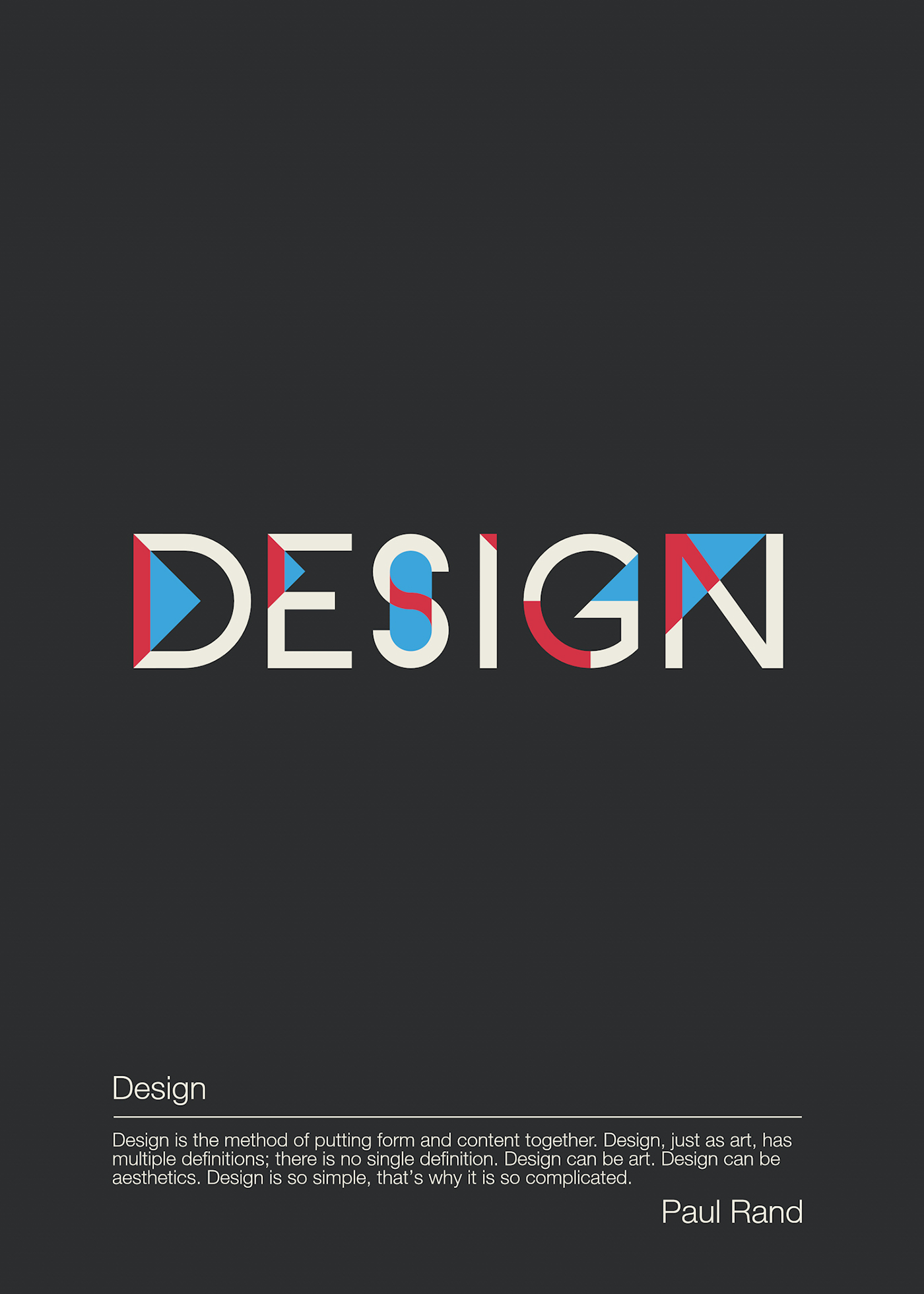
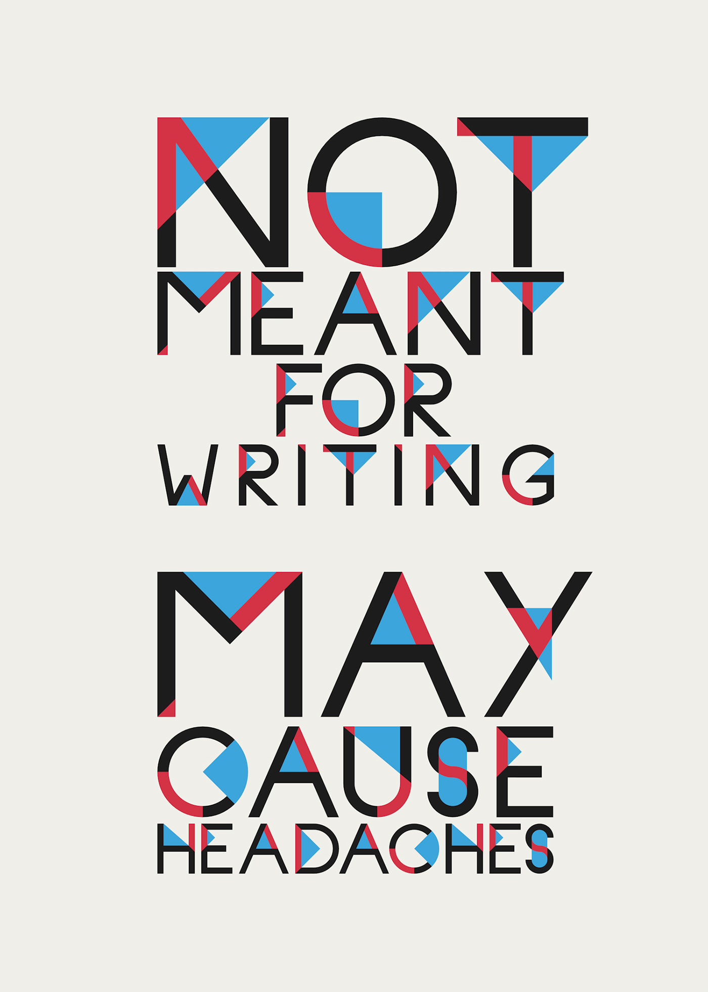
Minim Font, is a personal project, it’s an exercise of synthesis, concentration, form. The idea was to see how far I can go in… what, where and how much elements of a letter can I remove, and still maintaining its iconic meaning/value. By removing elements, I create new lines, new space, new form, Gestalt. It’s an entire font so some rules where necessary, in order to create a coordinated font. That was achieved with a modular method of creating the letters. For example the letter M, it’s the same module, repeated three times. There are some exceptions of course. Some letters where easy, some, much more difficult.
The name, Minim, is minimal in its own way. Five letters, yet only 3 used. It starts and ends in the same way.
The name, Minim, is minimal in its own way. Five letters, yet only 3 used. It starts and ends in the same way.
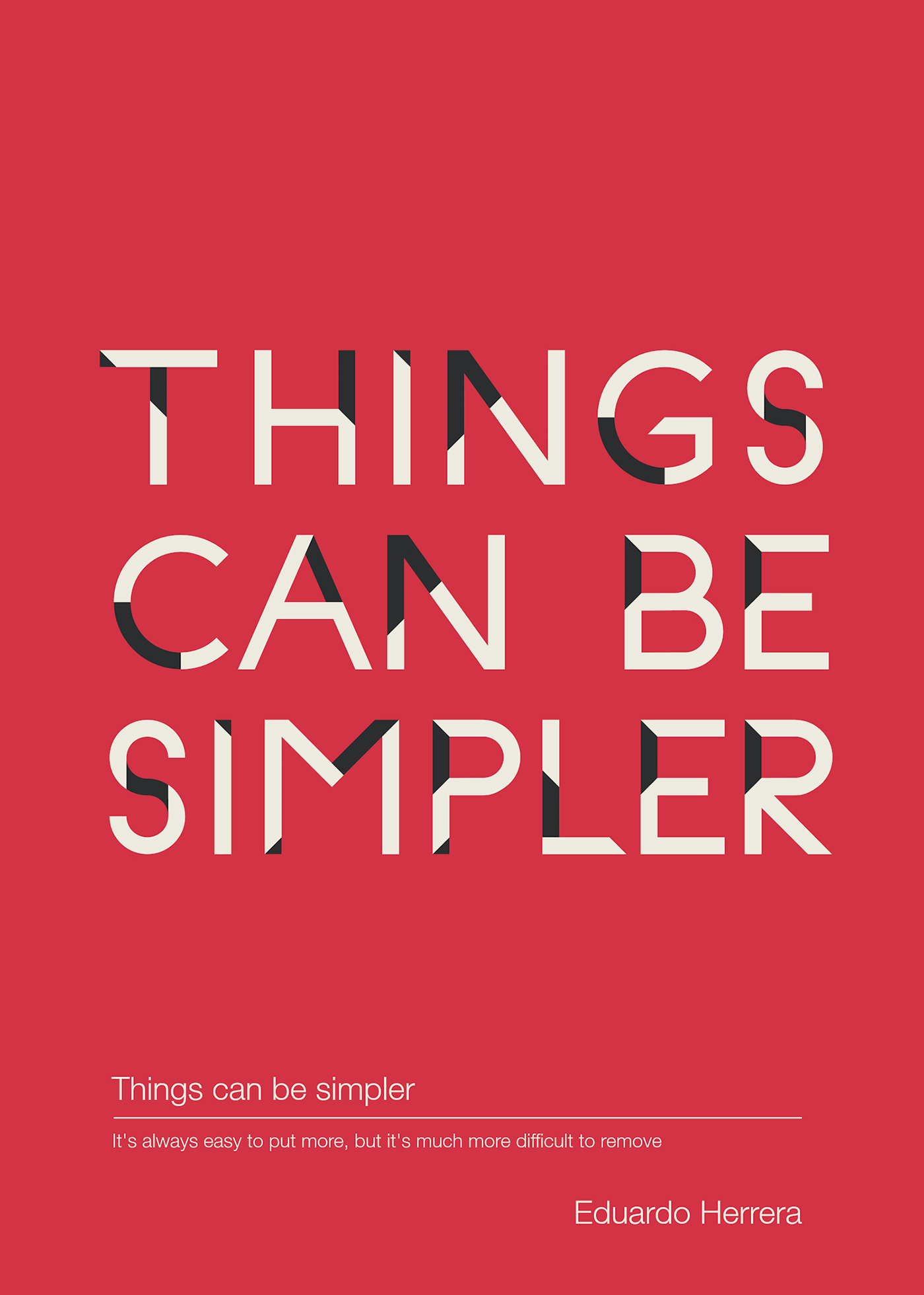
Simple yet complicated, less but better...