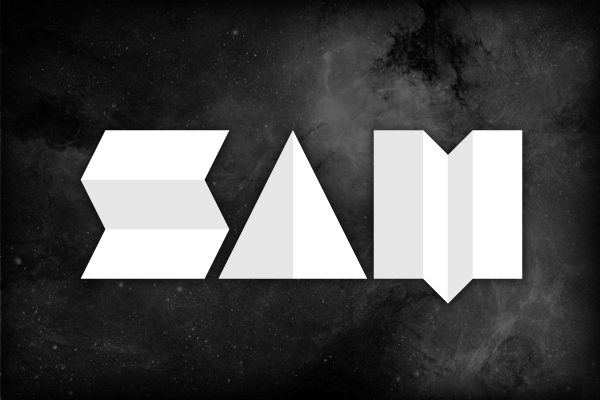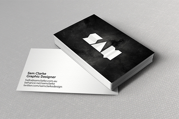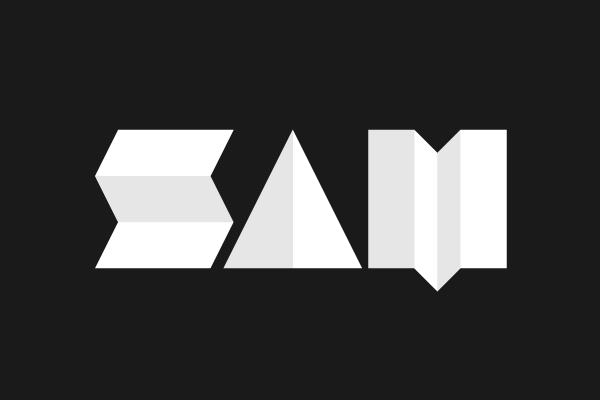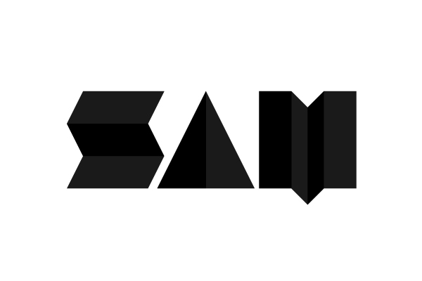
Designing for me has always began with paper. Whether it was sketching ideas in my notebook or arranging paper squares for a magazine layout. It always started out with a blank page.
The concept for my logo evolved simply by folding paper. I wanted to keep it clean and simple. Letting only the subtle shadow of the folds define the structure of the letters.
As I’m now moving toward a career away from printed media, where everything is created digitally, I thought it fitting that the logo that represents me, that represents my work, also pays tribute to the medium that it all began with.