


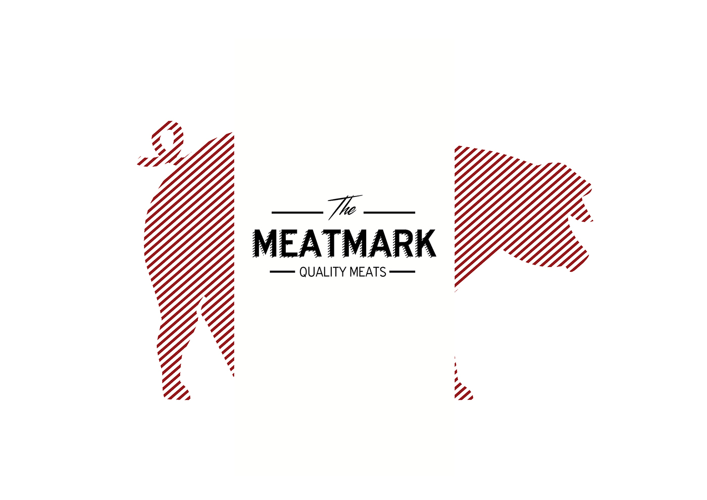
The MEATMARK
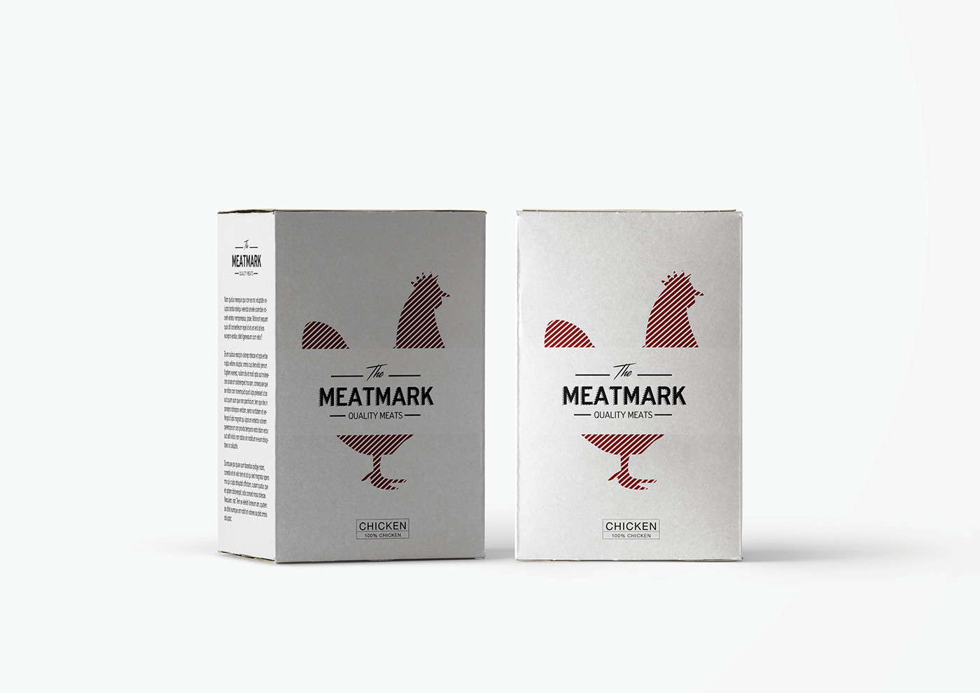
The company’s main objective is the processing and packaging of meat,
in response to the growing demand for packaged products. The target consumer: a wide but eclectic clientele.
Ι opted for a design which would include a direct reference to the very natural source of the product,
the meat which contains every package. Red it's the color of the fresh meat, also can stimulate the appetite.
Simple and clean typography by using two different fonts, in order to give an extra deepness.
LOGOTYPE
PACKAGING

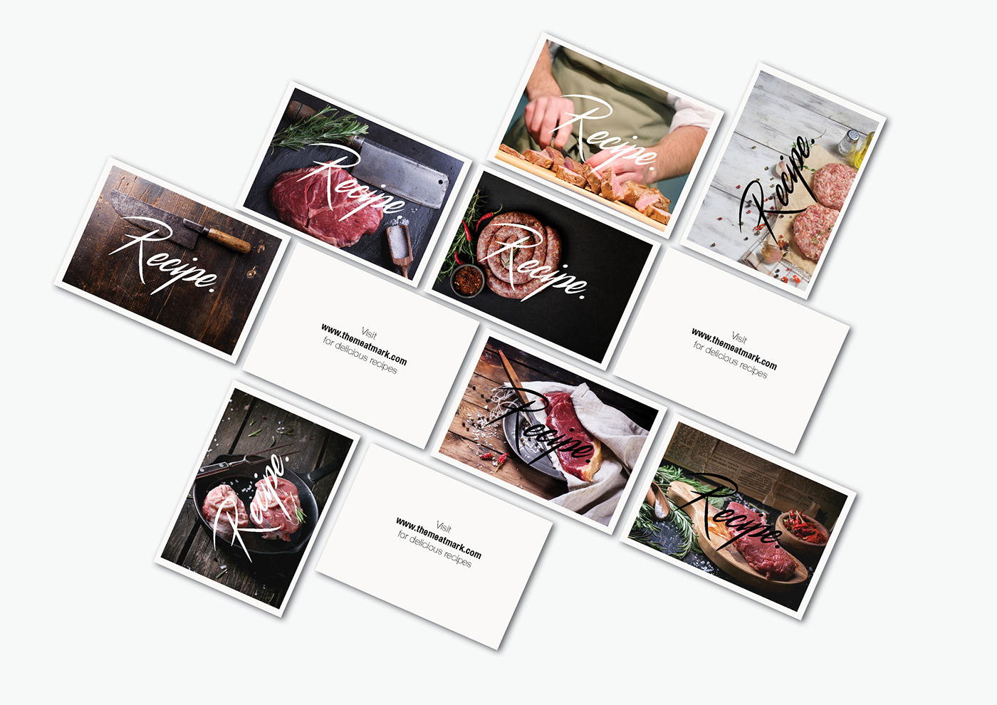
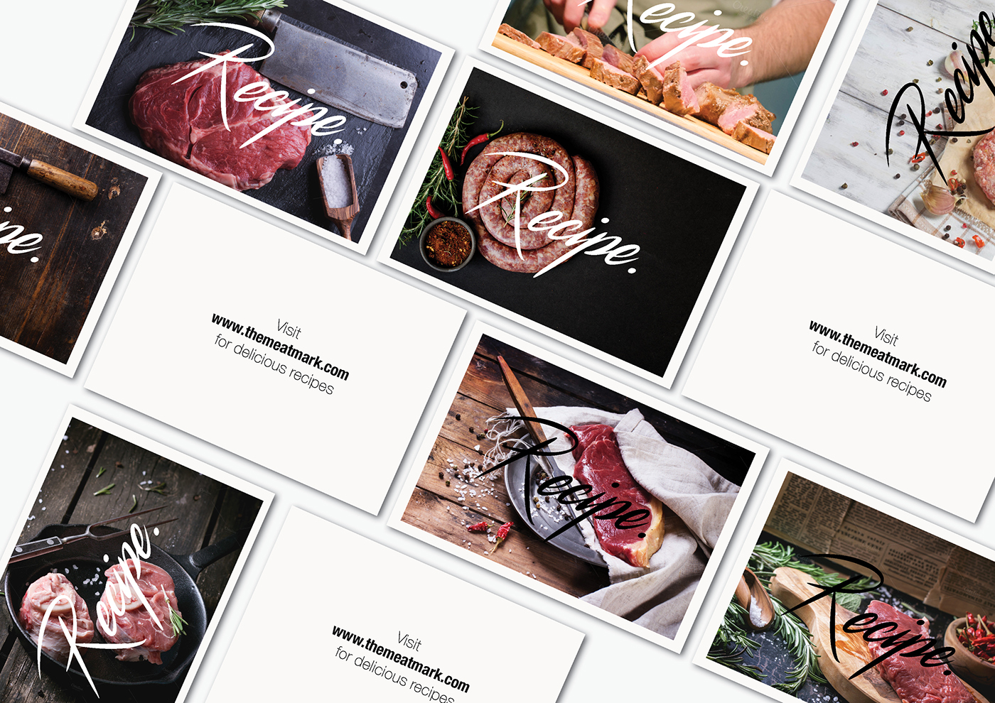
RECIPE CARDS (FOR A PROMOTIONAL PURPOSE)
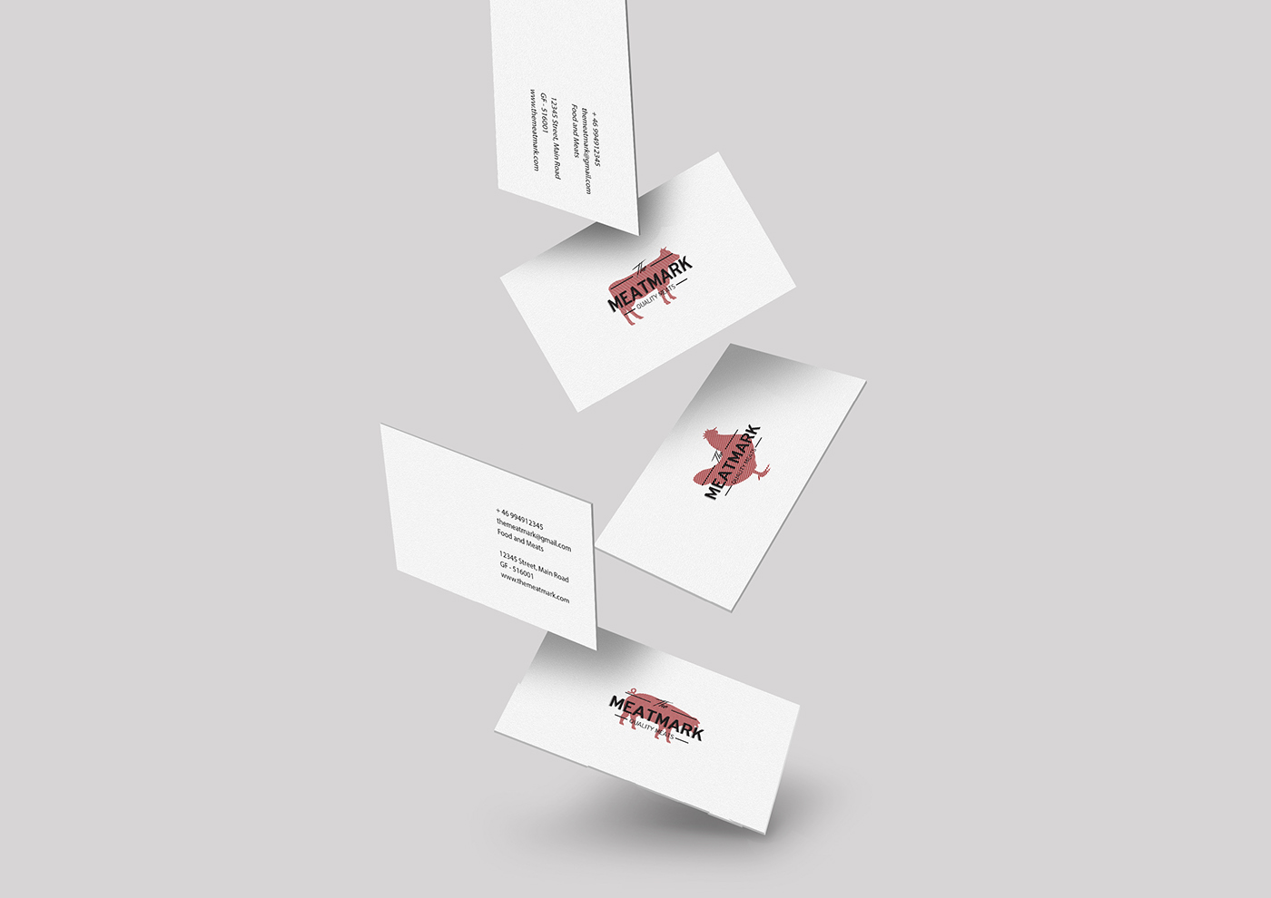
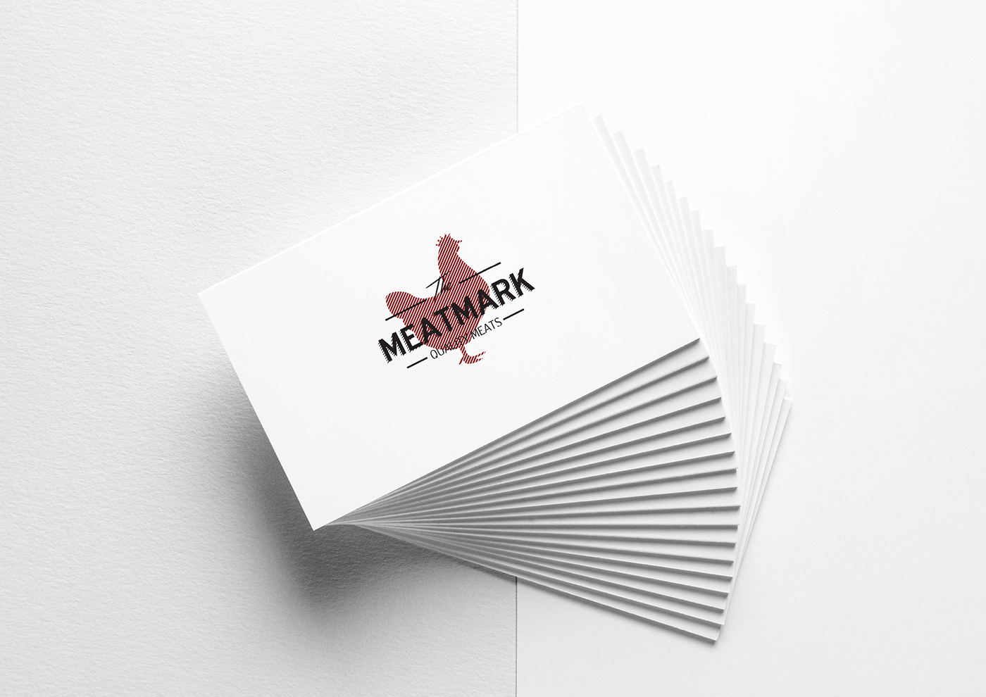
BUSINESS CARDS
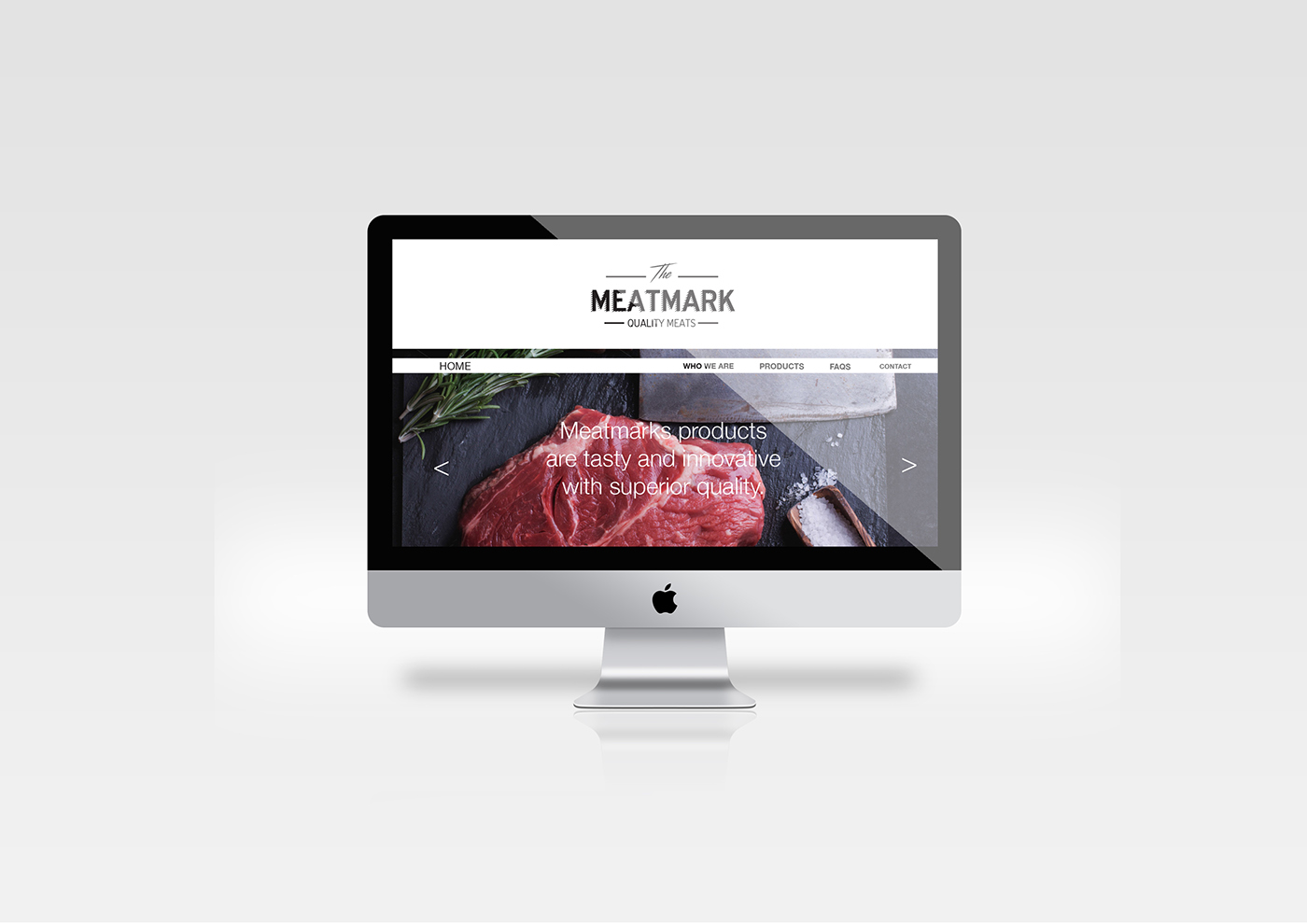
WEBSITE (HOMEPAGE)
all images are used for presentation purposes only


