
Type Design
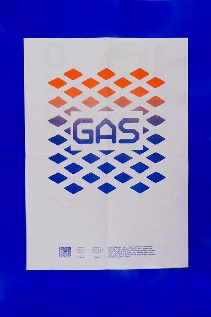
I decided to focus my type design on the gas covers on the footpaths in Auckland city. From the three uppercase letters G A S, I derived the rest of the uppercase, lowercase, numbers and select symbols.


Below is a risograph print of my typeface leaflet designed to be part of my class's collective typeface booklet. The front contains the name, the double-page-spread contains a blurb relating to the typeface as well as a typographic expression of the typeface and when folded out the poster in exposed. The back contains all the glyphs of the typeface.


Shown below is a one colour, fluoro red ink print of the typeface leaflet.


