Ambition
BangBang is a photo and video studio that wants to simplify the production of visual content for digital and offline platforms. Being its main clients advertising agencies, design studios and marketing teams, we had the challenge of developing a striking identity for an audience that consumes visual expressions on a daily basis. The idea was to bring strength and personality right from the first contact.


Strategy
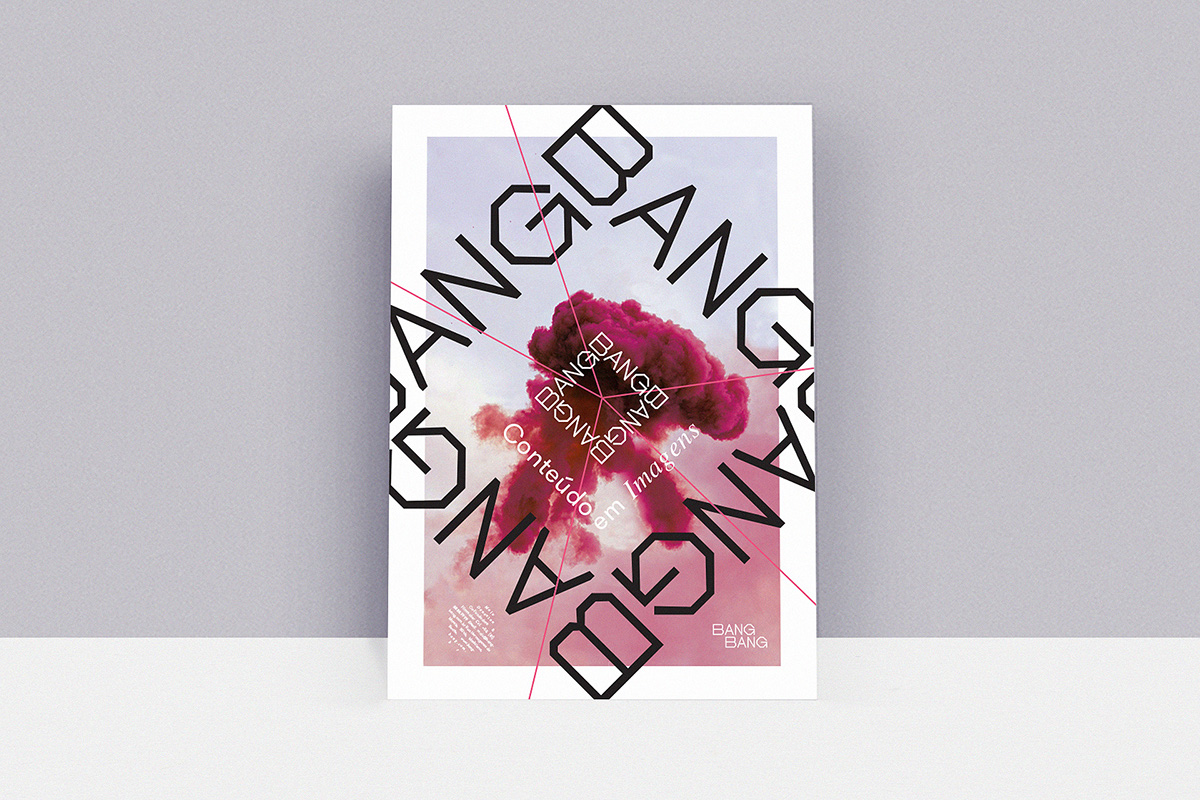
Credibility and know-how created by impact and perceived quality. The name "Bang Bang" carries with it a vast repertoire of associated imagery. With that in mind, we seek to re-sign classic symbols such as target and explosion as a way to create a unique identity. Fleeing from circular representations, the logo is composed only of straight lines. In addition, we created a version of the target, where the name itself composes the goal and guide lines form a vector to the center. The pink brings personality and strength in contrast to black, gray and white.