Here is a collection of logos carried out in 2011 and 2012.
Proof read me was a logo for a proof reader. I carried out this project whilst at Drink Tea Eat Biscuit (Design studio).

Rickards Associates was another piece I worked on whilst at Drink Tea Eat Biscuits, the client was looking for a logo to represent his work. He wanted it to look professional, yet approachable. The concept I worked on explored showing a visual of what the client does, helping his clients settle and organize their money. I did this by using circles to represent coins, the coins are in havoc but come to settle, this is to present how he can help them calm their money.

The Little Shop of Graphics was a competition that took place whilst at university. After two presentations I presented the logo above, which was selected to represent the universities graphics shop.
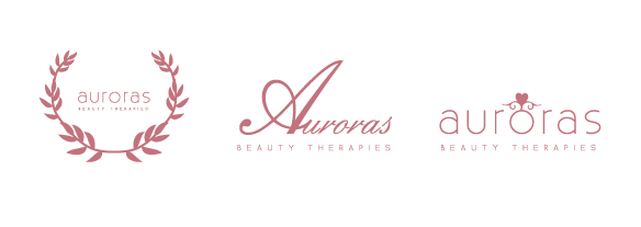
Aurora is a beauty therapist, who had set up her own beauty company and she was looking for a brand Identity.
I explored many routes and narrowed it down to the three you can see above - the first concentrates on the greek goddess of beauty (which ties in with Aurora's heritage), the second concentrates on creating a classic, timeless feel, the third stems from the fairy tale concept of girls being a 'princess' and feeling beautiful. After showing the client the ideas she decided on the third.
Concept to a my universities exhibition. The class has nine students, so the name Ennead was selected. This led into the concept of noughts and crosses - using a 3 x 3 grid, which contains 9 squares.
A client came looking to me for a logo to represent their freelance work. They create personalised embroidery, and go by the name of 'Bina.'
Alongside the main logo, 'Icon's were created that were printed onto stickers for the packaging of the products. The icons were created by using the circles underneath the text. This led to there being five different icons.

Whilst on Placement at WorkBrands I worked on a logo for Investment Week. After a few concepts, I combined two that created the logo above. The logo was based onto one of the other designers who chose the final colour.
Another logo that I worked on whilst at WorkBrands was for 'Good Food.' They were looking for an extended version of their logo for their Bristol Awards. The 'Good Food' stayed within the four circles, as this was the existing logo.

