Graze
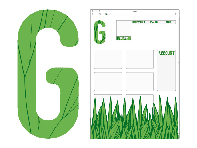
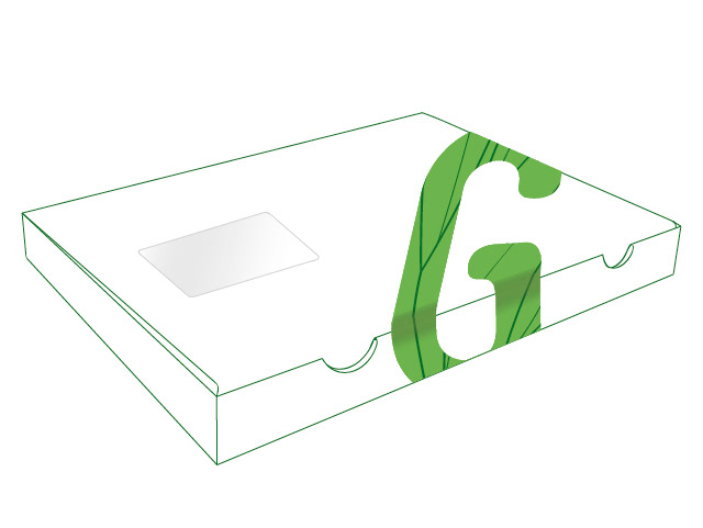
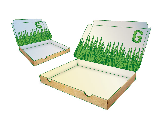
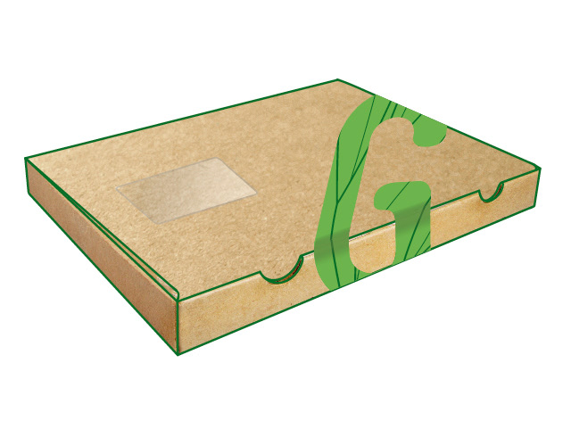
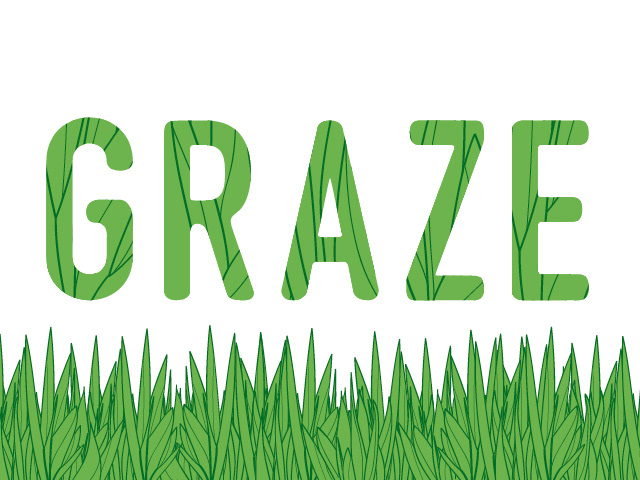
A response to the YCN 2012 brief set by natural food company Graze. The company wanted a refreshed identity, including logo, packaging for their product, and a mailshot for potential customers. Deliverables included a typeface based on DIN 1451 Engschrift, which incorporates grass vector imagery with curved terminations to the letters. The logo uses just the G from this new typeface, and is applied throughout the Graze printed products.