


Trikourakis Pharmacy
Who: Stelios Trikourakis and his father own a pharmacy shop in the city of Piraeus. It's one of the oldest and the most renowned shops in their neighborhood. Being "trapped" for years in the stereotypical Greek pharmacy identity which denotes the word pharmacy is written in capital Arial Black letters, fluorescent signs and random graphic styles being applied vaguely in several stationary applications, they had some very specific demands.
What: "We want to differentiate from the other pharmacies and leave the stereotypical and conventional image behind us, we want to refresh our identity but keeping clear of who we are and what we do."
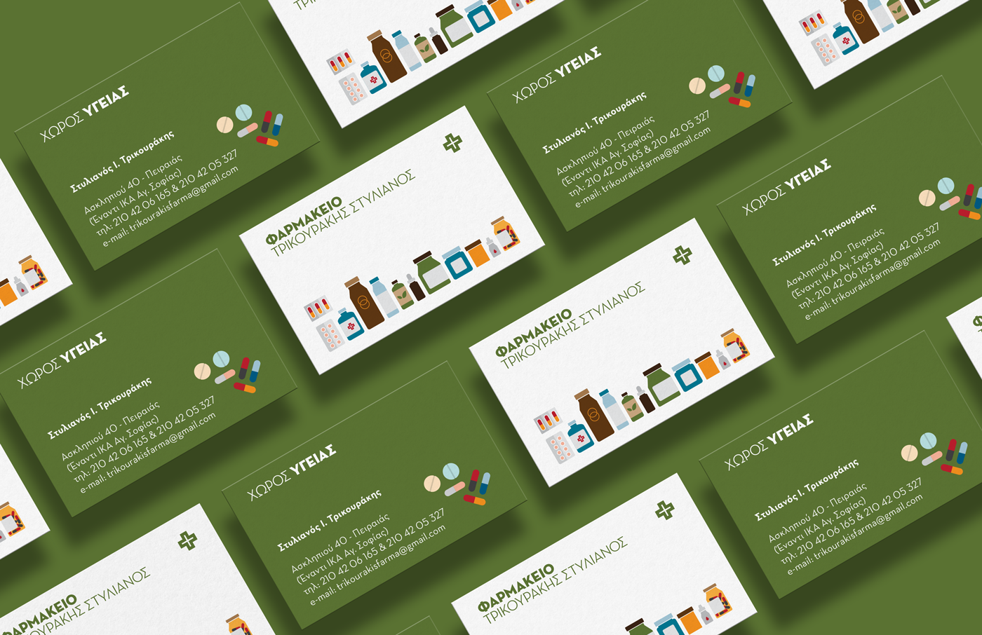
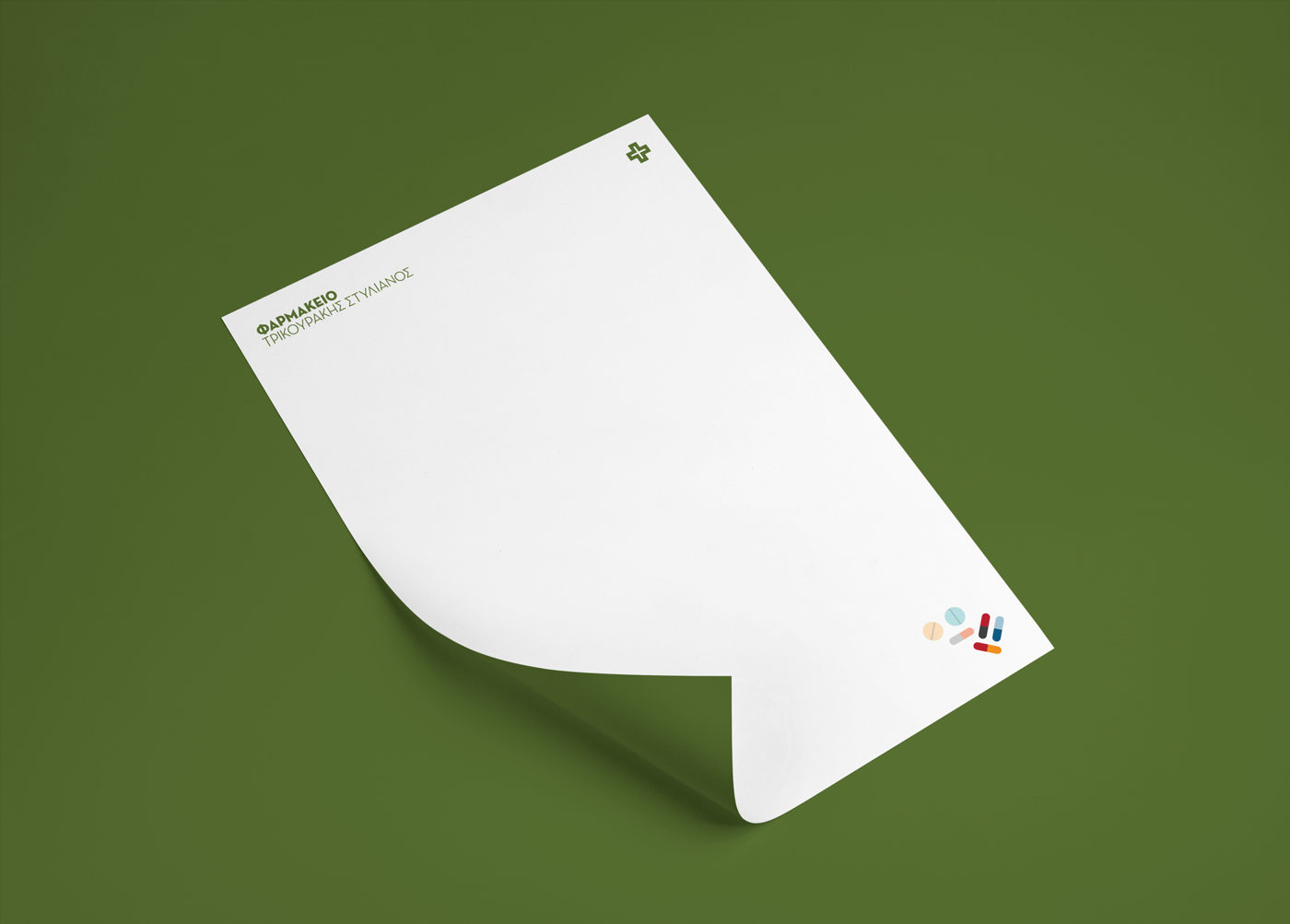
Well: The whole project started out by designing the business cards for the pharmacy. The need was to communicate directly that they sell drugs in first place and secondly, cosmetics. So, the solution was pretty much designing the products the wanted to focus on. The range of products acts as the main key visual for the business and the bonus card while the pills act more like an complementary visual. As for the logo I relied on the friendly yet serious character of the Neutraface Display. For the body texts the font used was Neutraface Text. The green color was inevitable. It was used as the main color of the identity mostly contrasting with white.
What: "We want to differentiate from the other pharmacies and leave the stereotypical and conventional image behind us, we want to refresh our identity but keeping clear of who we are and what we do."
Well: The whole project started out by designing the business cards for the pharmacy. The need was to communicate directly that they sell drugs in first place and secondly, cosmetics. So, the solution was pretty much designing the products the wanted to focus on. The range of products acts as the main key visual for the business and the bonus card while the pills act more like an complementary visual. As for the logo I relied on the friendly yet serious character of the Neutraface Display. For the body texts the font used was Neutraface Text. The green color was inevitable. It was used as the main color of the identity mostly contrasting with white.


Thanks for stopping by!


