D&AD Typographic Circle Supplement
Response to Pentagram's Typography brief 2012
Response to Pentagram's Typography brief 2012
I wanted to produce 3 separate booklets so I needed to make sure the style of each was consistent but showed the different personality of each designer. I also wanted to make sure that my booklets didn’t have the same content available if you googled the designer, so I sent an email containing just over 20 questions to each and crossed my fingers.
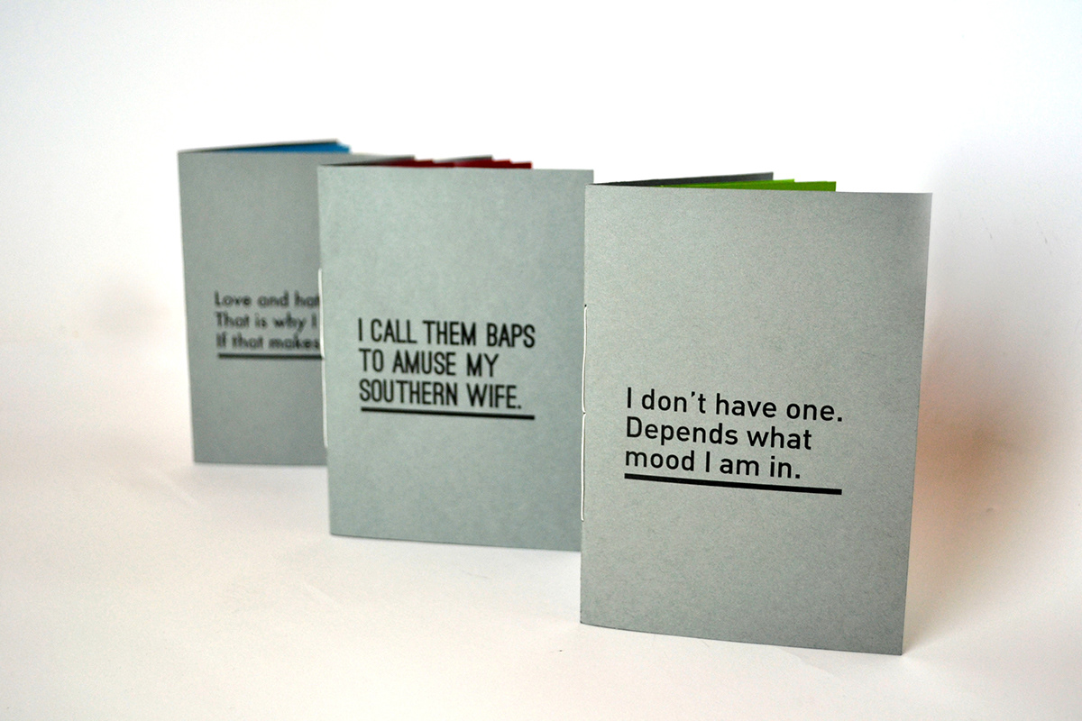
I chose Jonathan Barnbrook, Anthony Burrill and Angus Hyland. All have very different styles, attitudes and experiences so I thought this would make my content interesting to compare and help to give a strong character.
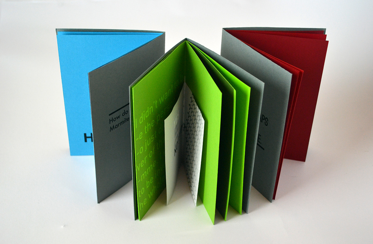
My approach was purely typographic. I wanted to use an interesting format to compliment the simplistic style so I decided to use tip-ins to make the questions and answers visually interesting, trying to steer away from using imagery to ‘fill the space’. I chose to design everything in black, white and grey and team it with coloured stock to create contrast and different tones.

