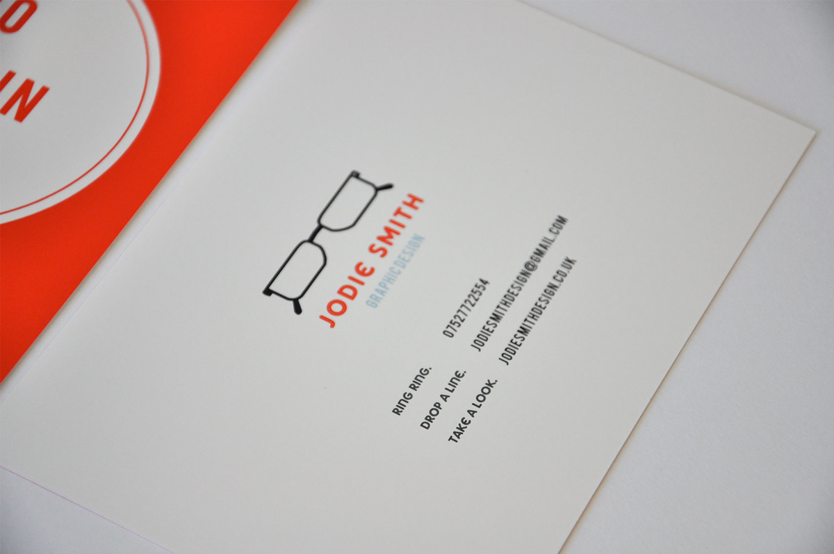
When creating my identity I looked into what best represents me, due to having worn glasses since a toddler I felt this was appropriate. I created a glasses shape that best matched the pair I wear and used the colours red and blue for the text. Red was used to represent my passion for Graphic Design, and blue was used to represent my understanding of the industry.
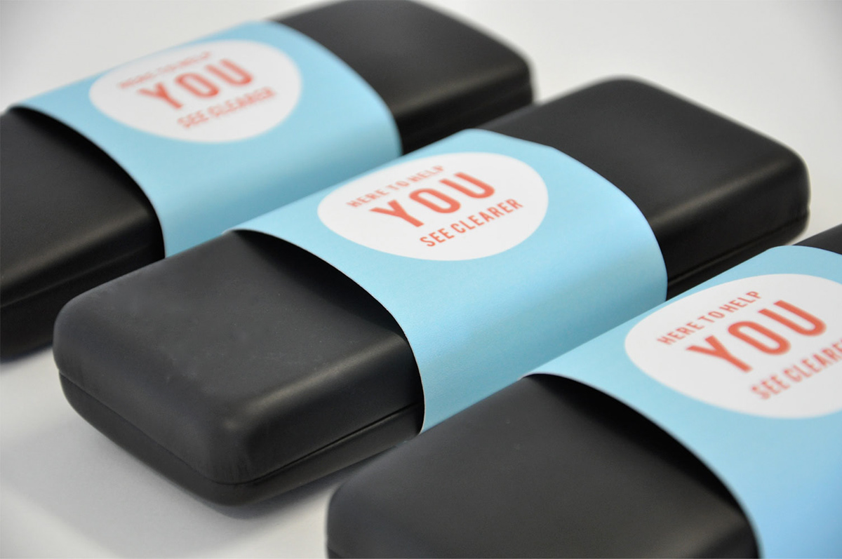
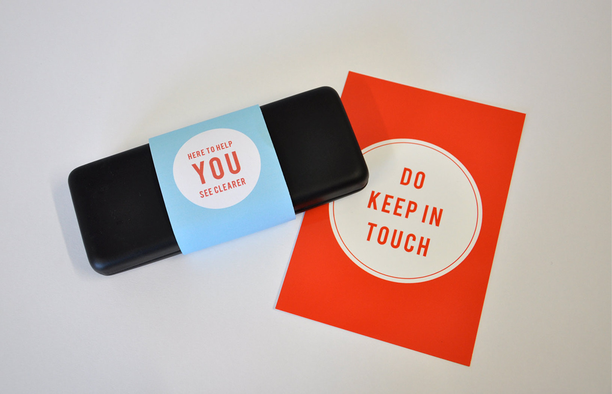
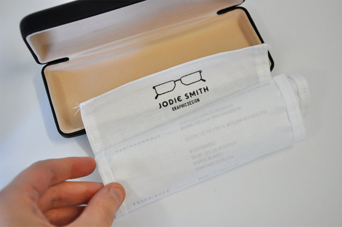
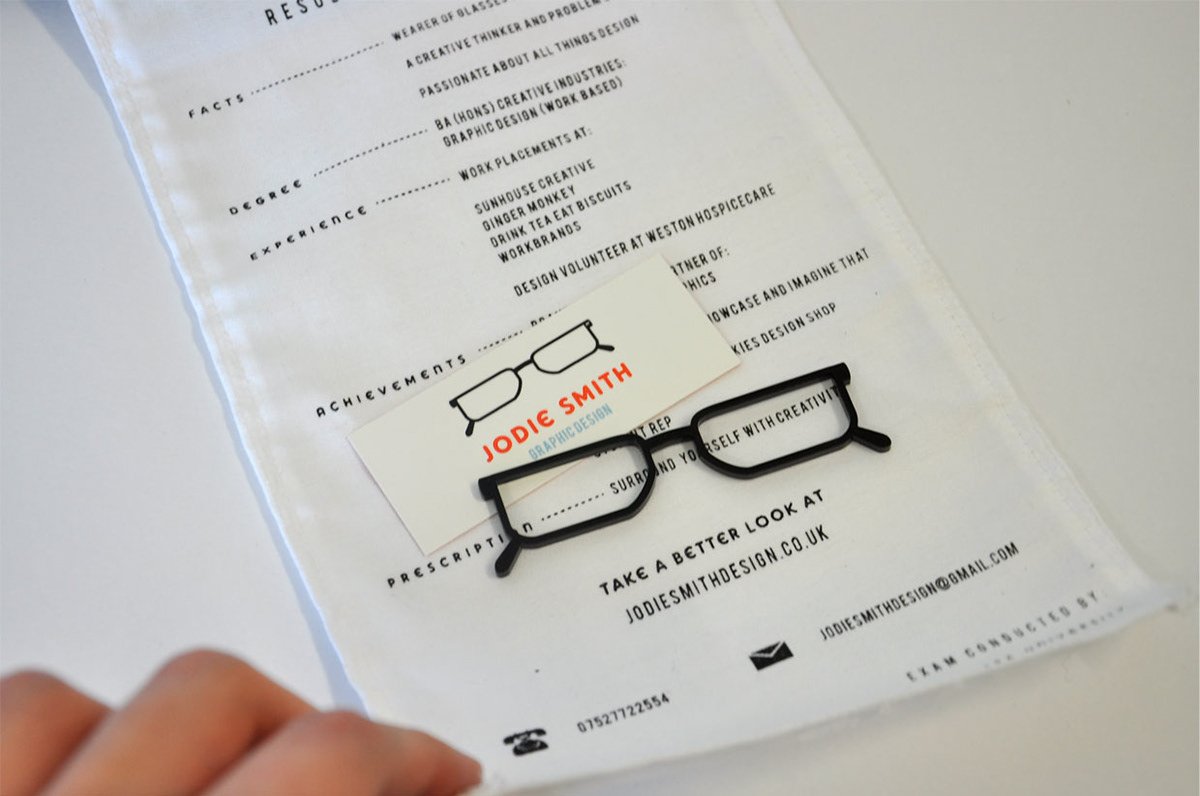
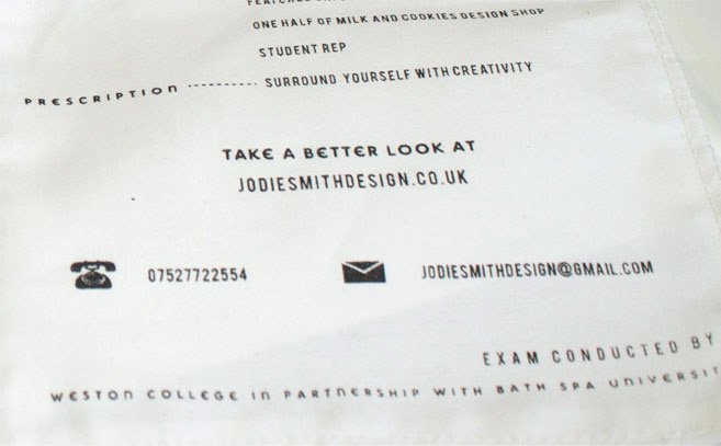
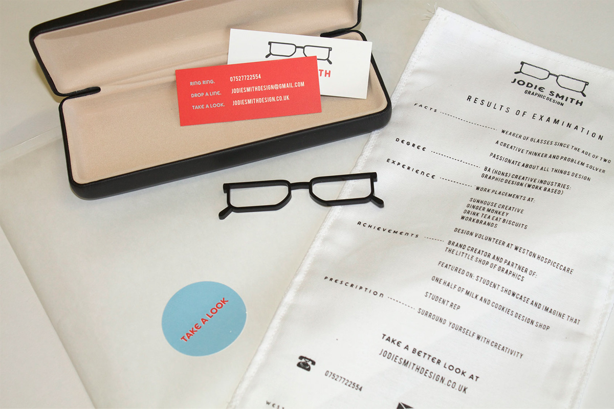
My promotional mailer follows the concept of the logo. It contains my CV on a fabric strip, inspired by the cloth used to clean glasses, it comes contained in a black glasses case alongside a business card and a small pair of laser cut glasses.
My promotional mailer follows the concept of the logo. It contains my CV on a fabric strip, inspired by the cloth used to clean glasses, it comes contained in a black glasses case alongside a business card and a small pair of laser cut glasses.