LEVRAIL
Branding a bi-coastal rail transportation service
Branding a bi-coastal rail transportation service
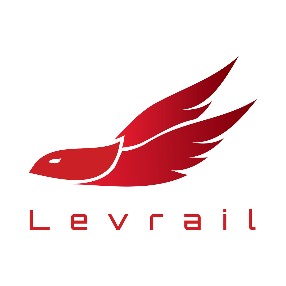
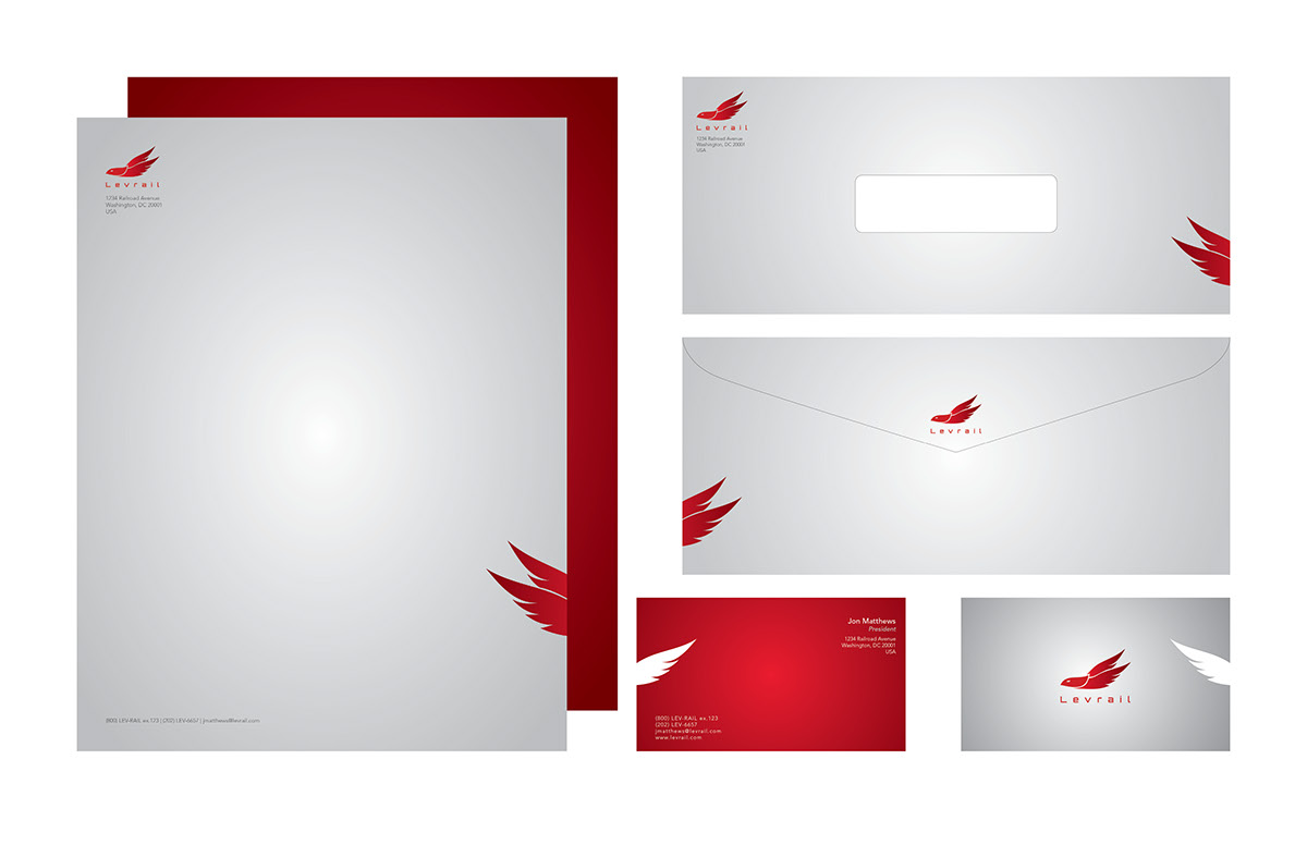
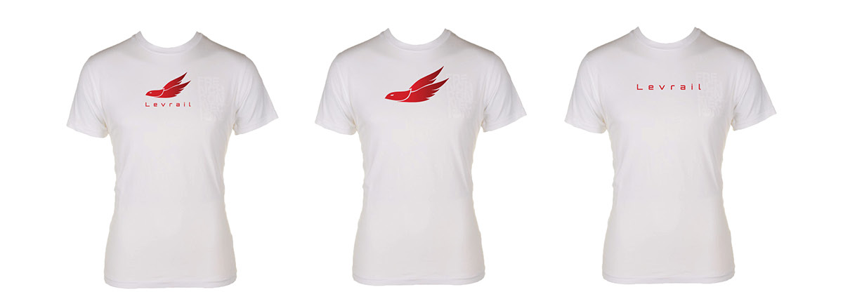
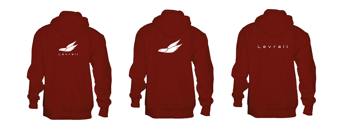
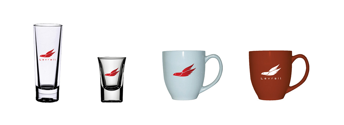
The objective was to brand a bi-coastal rail service, from ground up, that reflected the following qualities: high-tech, high-speed, and high-end. I wanted to create a logo that would hold all three qualities. Because the rail operates by MagLev (magnetic levitation) technology, my logo took the shape of a bird, named "Swifton". I wanted to make him appear floating as the rail would on magnetic levitation. The main audience is the entire US population, so I wanted Swifton to be the face of Levrail as it is fast, energy-efficient, and reliable. Levrail has destinations that carry every customer to the most popular tourist destinations from New York City, Las Vegas, Washington DC, Grand Canyon, and many more!
NOTE: Levrail Brand Standards Guide will be uploaded as soon as I am able to fix my Blurb presets for it to pass the uploading stages online! Stay tuned! Comments and feedback are welcomed and deeply appreciated!
NOTE: Levrail Brand Standards Guide will be uploaded as soon as I am able to fix my Blurb presets for it to pass the uploading stages online! Stay tuned! Comments and feedback are welcomed and deeply appreciated!

This was Swifton in his early stages. I wanted a mark that would be dynamic, representing Levrail as high-speed, high-tech, and high-end. After doing some subtracting with pathfinder, I finally got the mark I wanted.

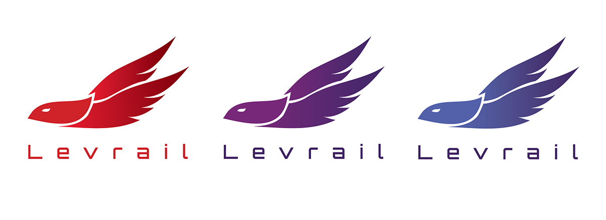
These were my final round of color choices. I applied a linear gradient on the wings to give it more dimension and body. In the end, I chose red because it is a strongest color that conveyed the brand I wanted. I eliminated purple because it only represented the 'high-end' of my brand for being the royal color. I eliminated blue because of I did not want to convey a medical environment.