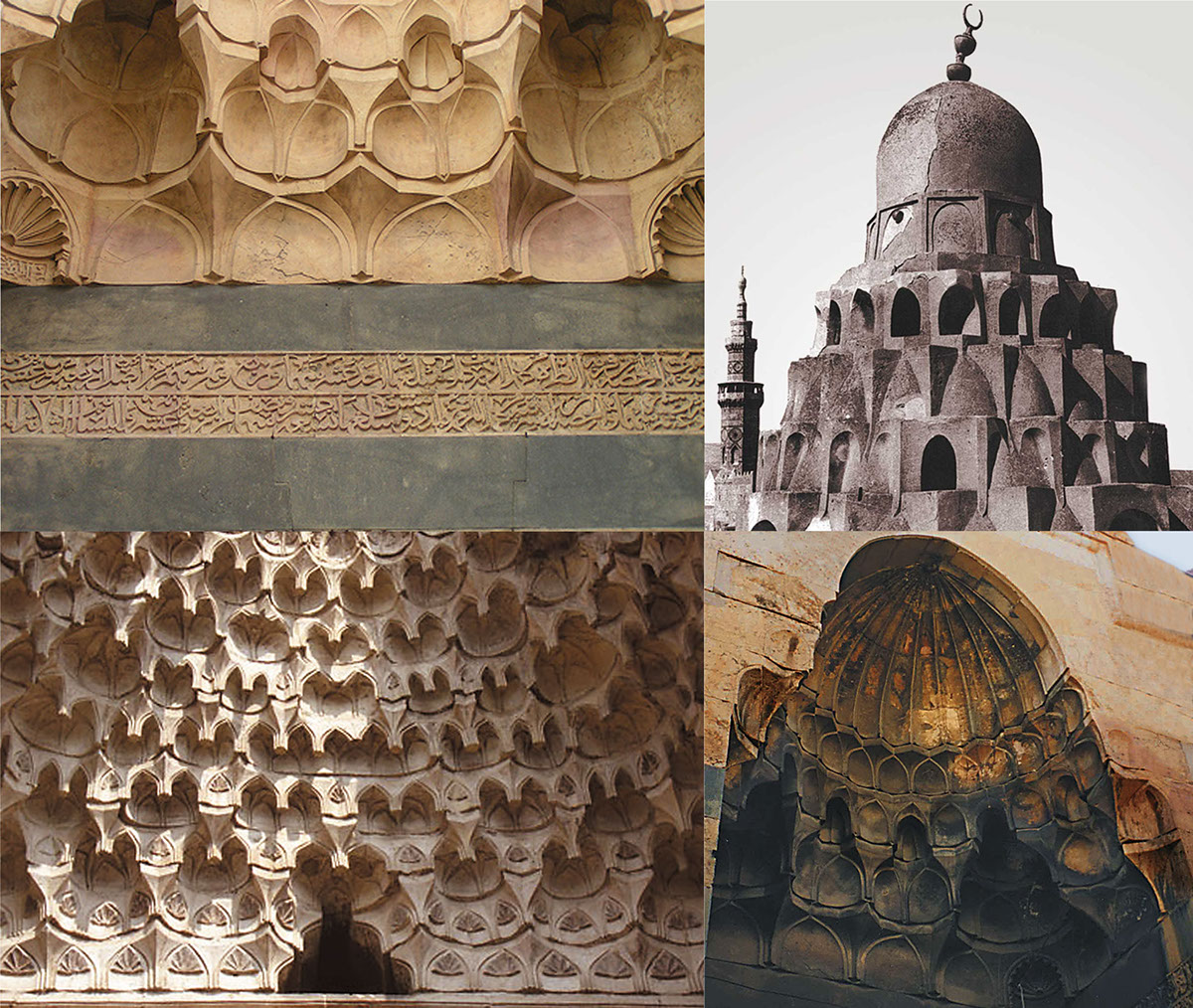
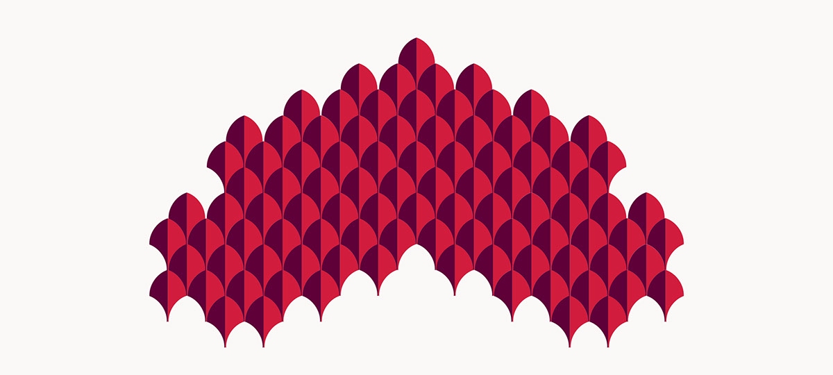
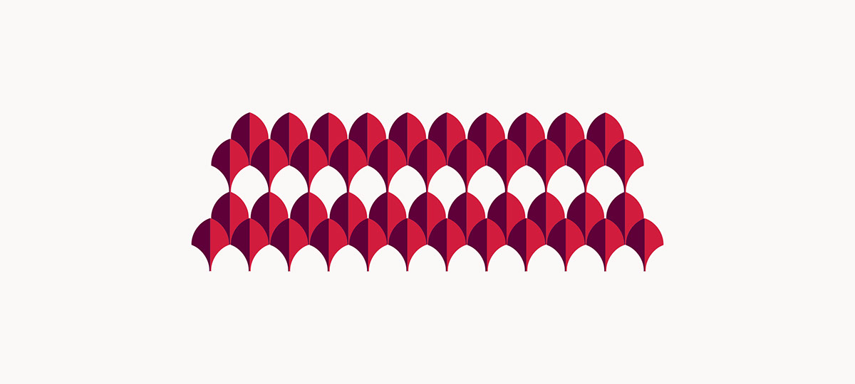
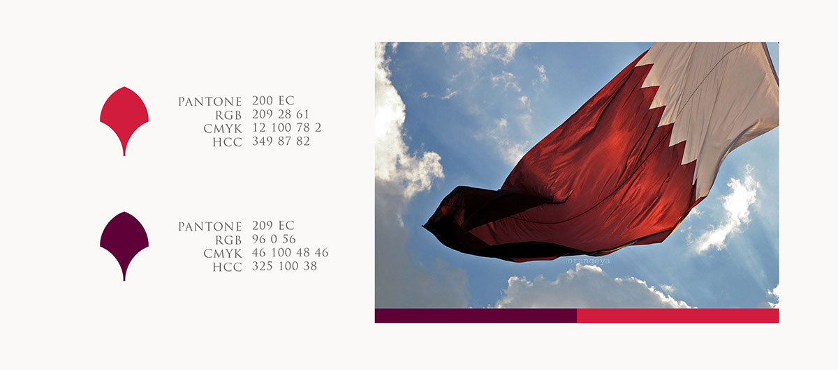
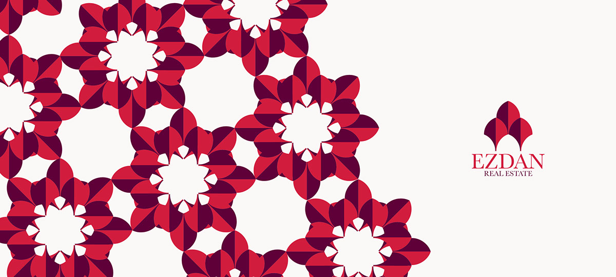
The basic idea of the logo is inspired from the meaning of the company name itself (Ezdan).
Ezdan word in the language means the decoration of the place or adorned to be beautiful and wonderful - for example: إزدان البيت بالأزهار–Also it has been connected between the company’s field of work (real estate) and its name, so after research it was clear that one of the architecture details and decoration was El Moqarnasat (Cornice) which was used for a function and gives extra beauty for the building. So the idea was inspired and simplified the main shape of El Moqarnasat to basic geometry preserving the spirit.The overall idea is a simple geometric shape that was inspired form ElMoqarnasat to be reflected on the realestate company logo.