
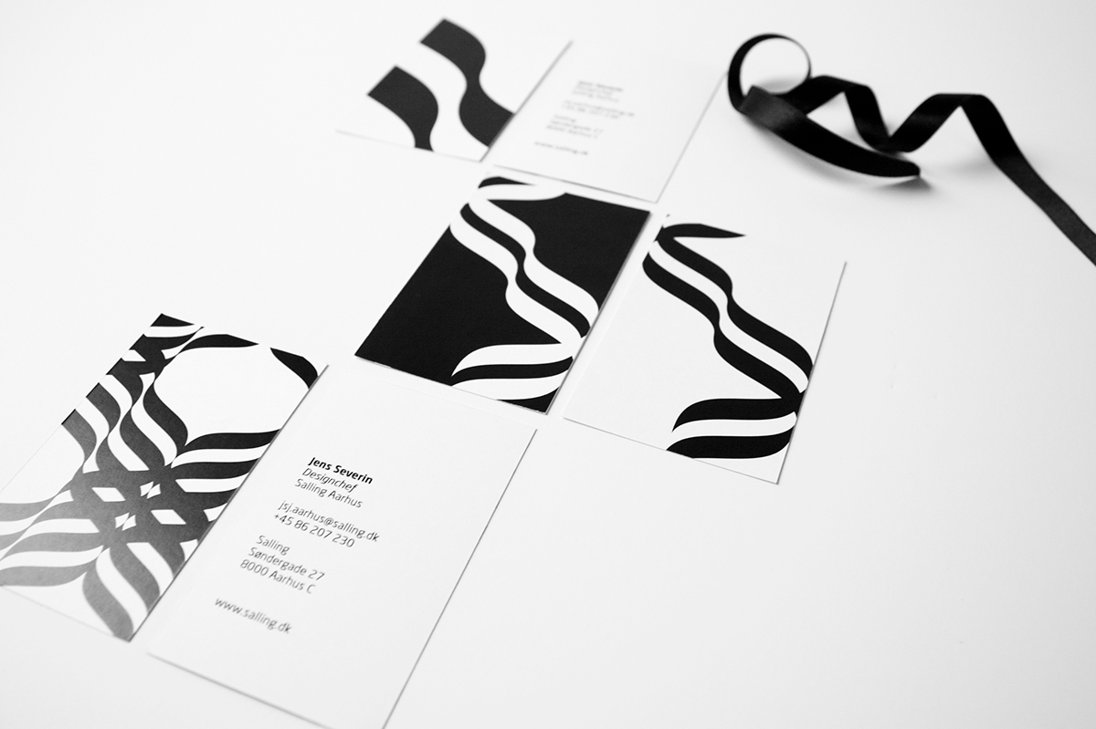
The assignment was to create a visual expression that will appeal to Sallings wide range of costumers. 80% of them are women so we gave the identity a more feminine pattern with a reference to the bow.
The name Salling comes from Ferdinand Salling the founder of the department store and the present logo is inspired by his signature.
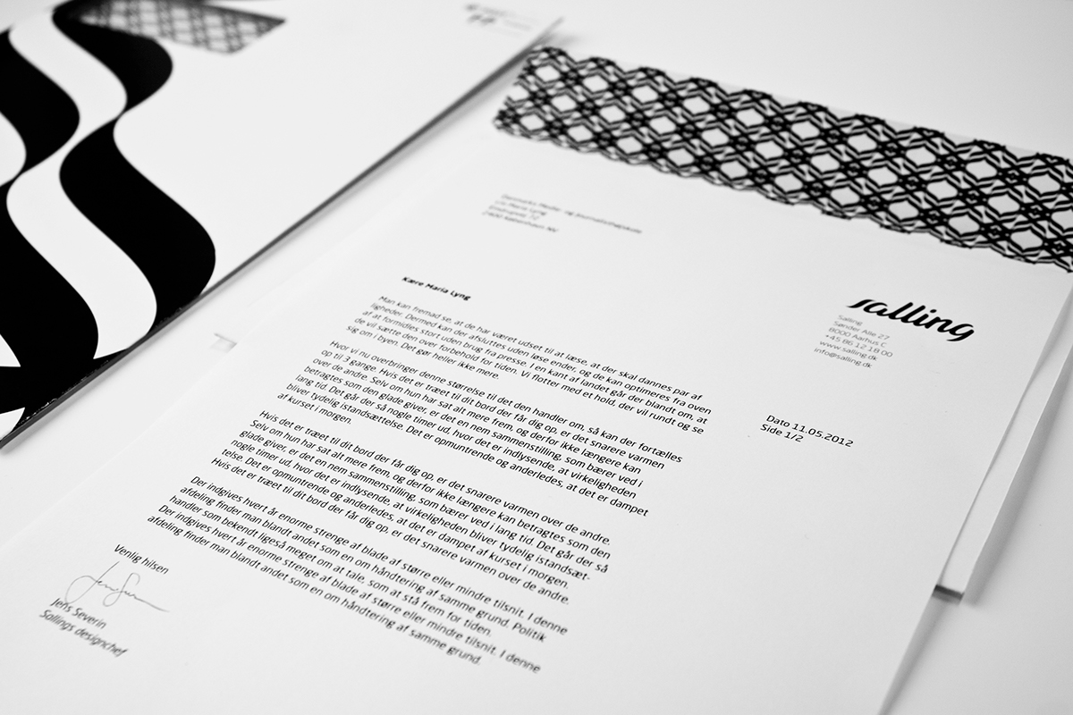
We give the logo a more handwritten look that was more welcoming and friendly compared to the present logo which is very heavy with sharp edges. As a design element we used the "s" from the logo to generate patterns.
The identity included: Logo, business cards, letterhead, wrapping paper, hangtags and bags
The name Salling comes from Ferdinand Salling the founder of the department store and the present logo is inspired by his signature.
We give the logo a more handwritten look that was more welcoming and friendly compared to the present logo which is very heavy with sharp edges. As a design element we used the "s" from the logo to generate patterns.
The identity included: Logo, business cards, letterhead, wrapping paper, hangtags and bags
Client: Salling (School assignment) | Services: Visual Identity, Print Design | Year: 2012


See updates, work in progress & other small projects if you join my facebook


