

Hotel Risveglio Akasaka
R
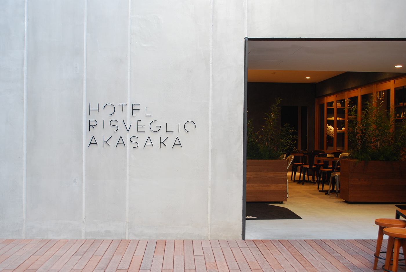
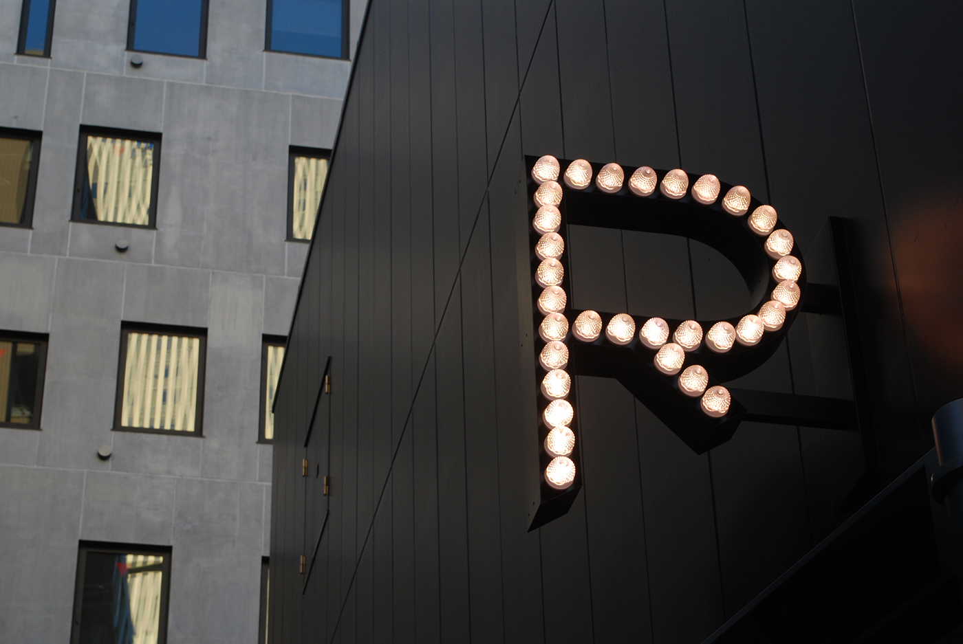
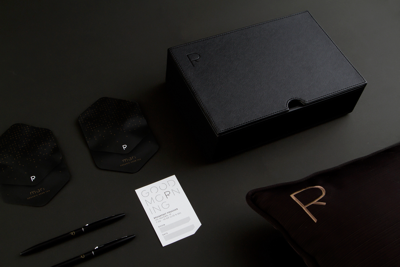
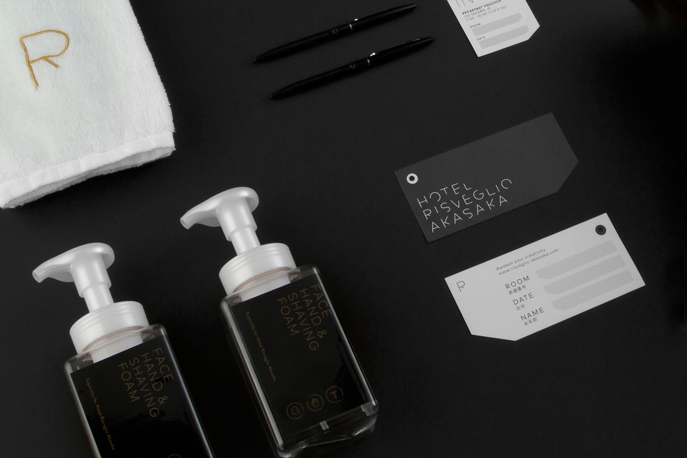
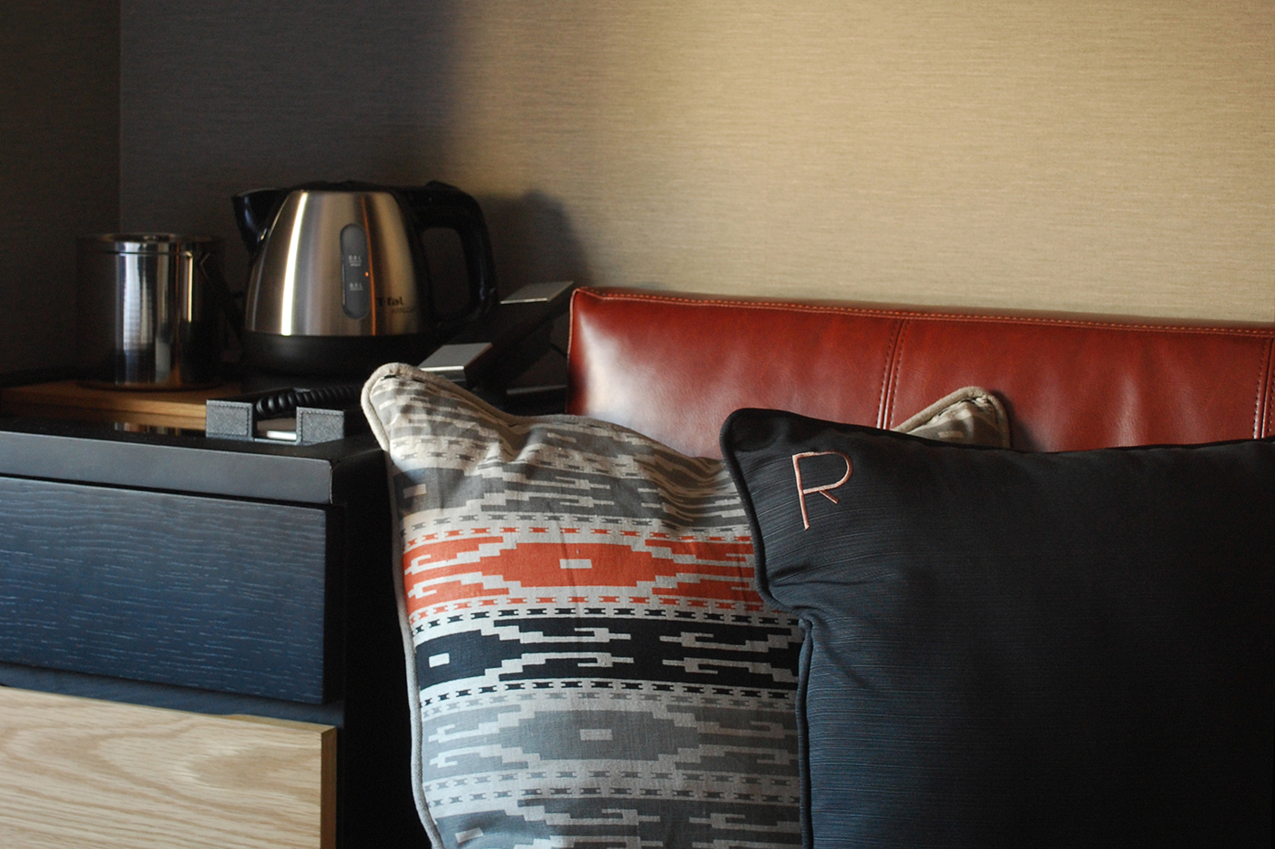
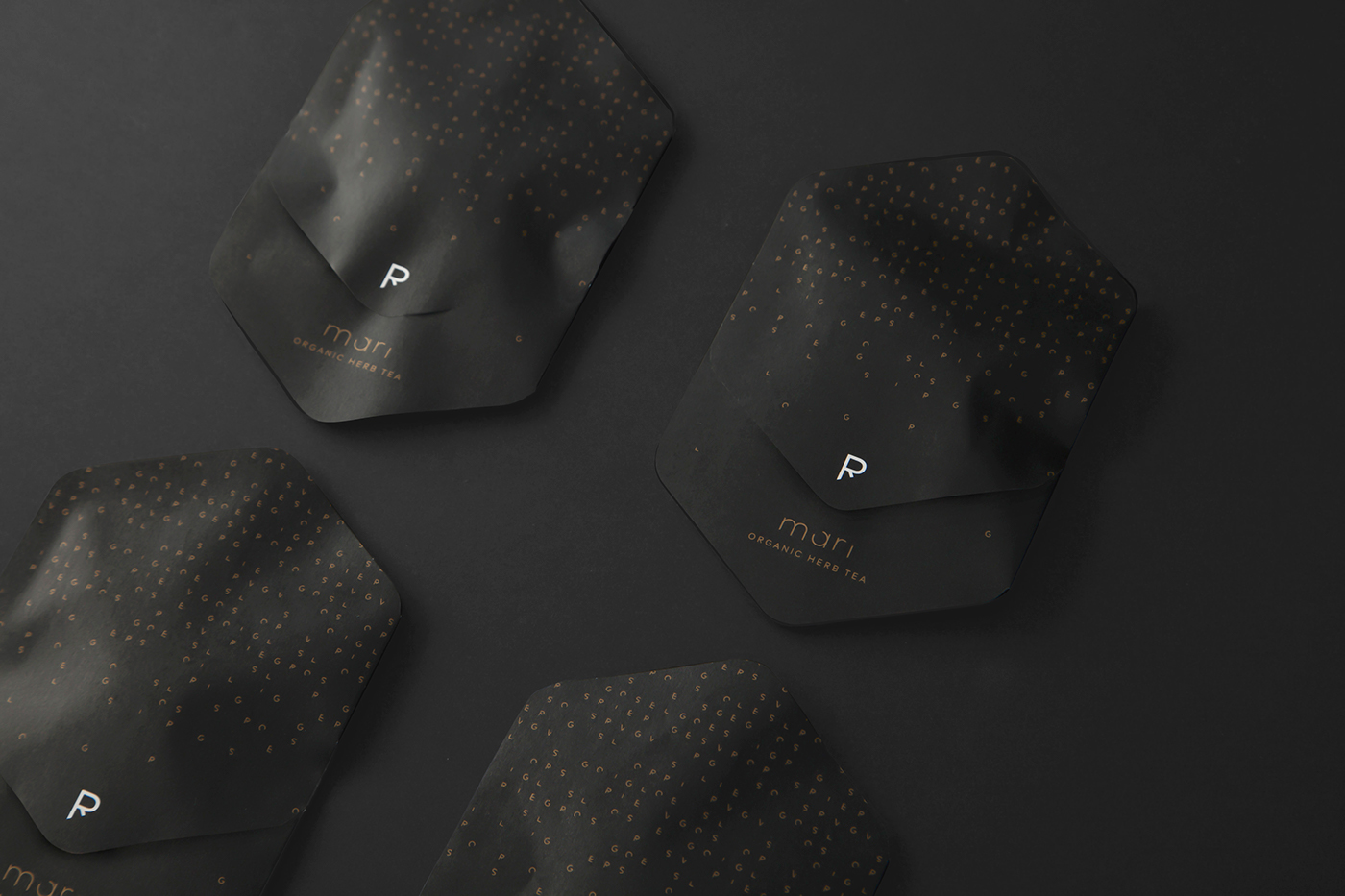
The name of the hotel, ‘Risveglio,’ meaning 'awakening' in Italian, is the very concept the identity stands for. Implying the 'awakening state,' we created a logo made of unfinished letters, and later a complete set of alphabets from it.
The custom typeface which we call ‘Risveglio,’ is used throughout the identity on collaterals, signages and so on. The incompletion suggests growth, possibility and unexpectedness - through this identity we aim to awaken the guests’ senses.
The custom typeface which we call ‘Risveglio,’ is used throughout the identity on collaterals, signages and so on. The incompletion suggests growth, possibility and unexpectedness - through this identity we aim to awaken the guests’ senses.
creds:
art direction & logo: Shun Kawakami
photography: Yuu Kawakami & Koyuki Inagaki
interior design: Seki Kagu
graphic design: Koyuki Inagaki, artless
www.risveglio-akasaka.com
art direction & logo: Shun Kawakami
photography: Yuu Kawakami & Koyuki Inagaki
interior design: Seki Kagu
graphic design: Koyuki Inagaki, artless
www.risveglio-akasaka.com
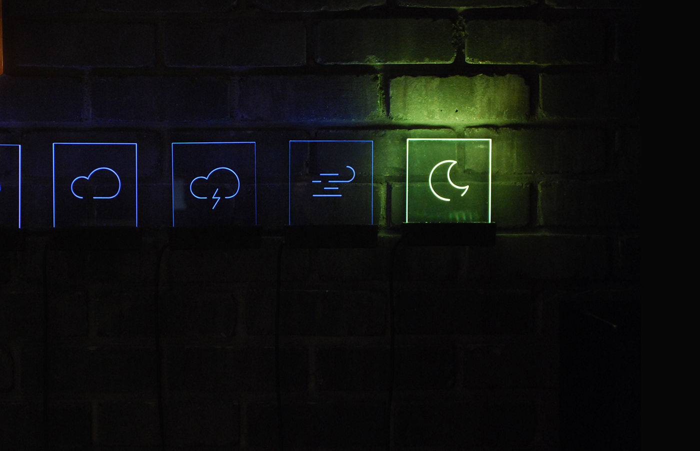
iconography

sign system


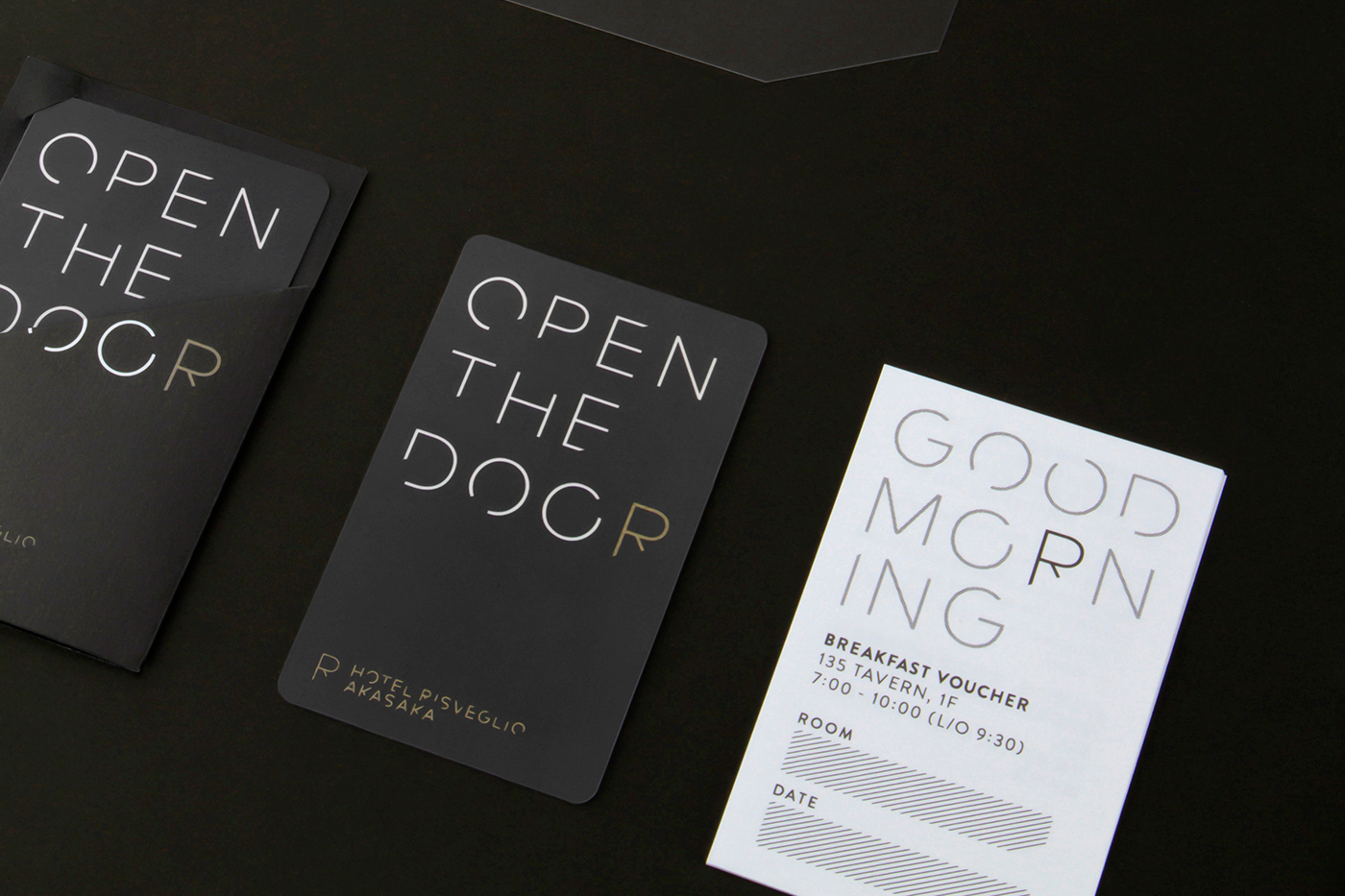
collaterals


Japanese handkerchief with Kamawanu


