

Great Wall of Type 2011
On 10th December 2011 the University of Huddersfield's Communication Design students held an evening to celebrate typographic design in practice.
Each student, including myself, had designed and constructed a 3D letterform out of a medium of their choice. We then collectively made decisions on the structure and aesthetic we wanted from the collection and built the wall. The result, documented in the photography below, was a scene of creative and communicative flair, with the variety within the wall expressing the individual strengths of each creative involved.
Each student, including myself, had designed and constructed a 3D letterform out of a medium of their choice. We then collectively made decisions on the structure and aesthetic we wanted from the collection and built the wall. The result, documented in the photography below, was a scene of creative and communicative flair, with the variety within the wall expressing the individual strengths of each creative involved.
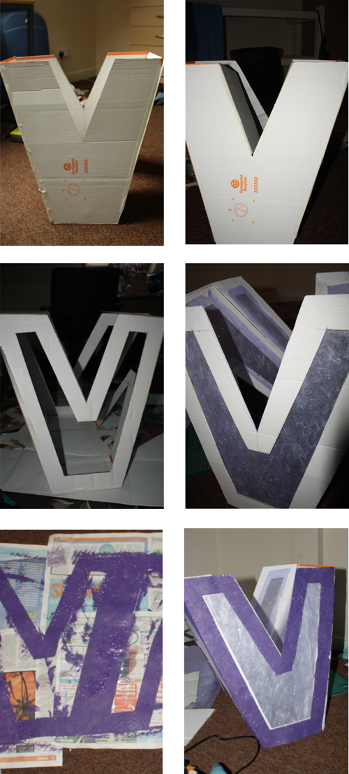
The production development of my letterform. It's has a height of 50cm and was constructed out of 'large box' card, wallpaper, tissue paper and paint. As explained in the DPS below, the inspiration for the this letterform came from associations with the letter itself. Vibrancy, violet and Victorian design were its main themes, and this is expressed through the elaborate and decorative wallpaper and its intense colour.
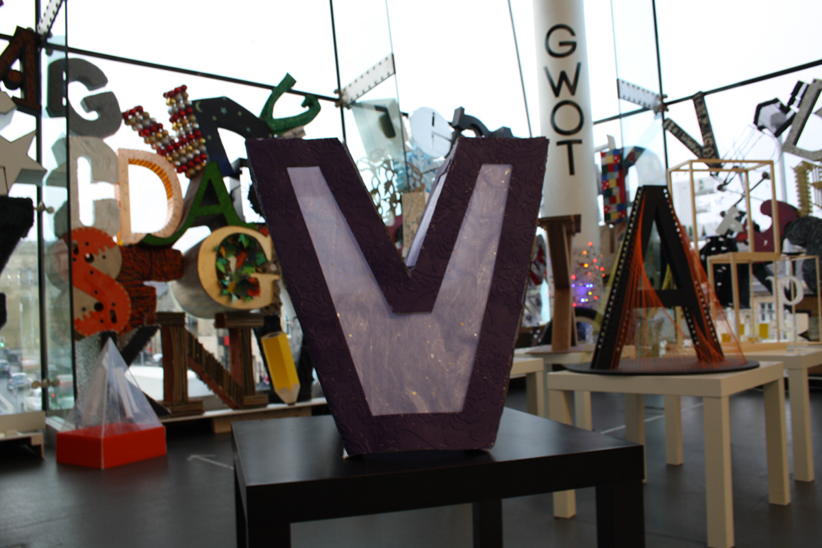
Final Letterform
Logo Design.
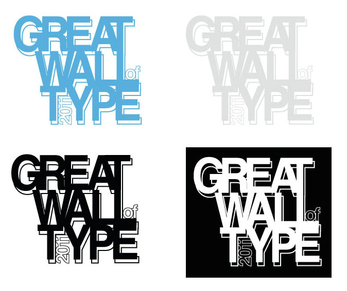
As well as the actual exhibition, each stream of the course was given different promotional tasks to further develop their skills and understand the relationship between design and typography. Graphic Designers were tasked to create a logo, DPS and web proposals. Above are the final variations for my logo proposal.
The shapes in this design play with the ideas of space, forms, shadows and structure. As a 3D exhibition I wanted to give my branding a feel of 3D whilst still being a readable and printable 2D element. The merging of positive space, being the connectivity between the letters, is representative of the connections and interactions between the letters in the wall. By physically building the wall the different forms occupy and merge to fil the same space, and so this gives them some sense of unity. The letterforms can also be appreciated for their individualism and the messages they express about each designer and the future of design.
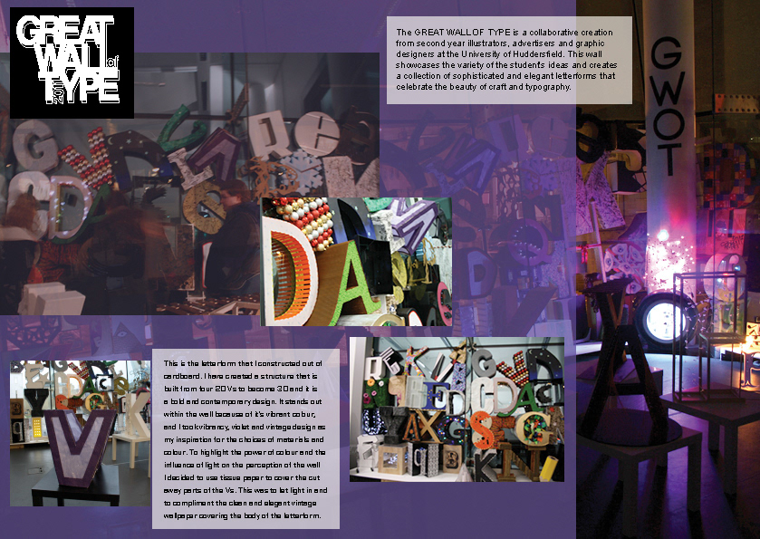
A Double Page Spread proposal for the exhibition.
This element of the exhibition was an individual aspect for each graphic designer, and this is my example of a possible DPS design and layout. I have concentrated on introducing the reader to the exhibition through bold visuals, and the copy explains what the exhibition is and my contribution towards it.
Being such a vibrant and creative project I though it important to centre my layout design around the details of the wall, and so my DPS is very image and photography focused. The photography I have featured expresses the mood and atmosphere of this wall through varying compositions, and from different times during the day, in an attempt to emphasis the power of collective creativity and the beauty in typographic design.

Initial web proposals - Index and Gallery pages.
Considering colours, I chose ones that are fresh and bright, but which don't overpower the overall design. Again, form and structure were important influences on this design. I wanted to produce a web design that would rely on user interaction, with elements of the index page, for example, moving and revealing information as they are rolled over. This would add an experiential element to the site, instead of it being just a static visual, and the user would then be able to feel more involved with the exhibition and discover more about it from the elements they want to interact with.
Considering colours, I chose ones that are fresh and bright, but which don't overpower the overall design. Again, form and structure were important influences on this design. I wanted to produce a web design that would rely on user interaction, with elements of the index page, for example, moving and revealing information as they are rolled over. This would add an experiential element to the site, instead of it being just a static visual, and the user would then be able to feel more involved with the exhibition and discover more about it from the elements they want to interact with.


