After six years of evolving Advantage, the team decided it was finally time to refresh the brand as well as the editorial content structure. We started with evaluating the current state of the brand and what we wanted it to become. After creating personas, we crafted a brand statement and keywords for the future of Advantage. This content served as our home-base throughout the redesign process. Our audience is Canadian executives, and we've noticed over the years that Canadian executives have a sort of "playful professional" essence about them. We used this concept to develop a dynamic, bright, playful, yet professional brand.

While redesigning the brandmark, we considered a full-departure from the heritage brandmark, but nothing too different felt quite right. We chose a refined yet playful slab serif—Bree Serif—to be the face of the new Advantage. Our most noticable changes in the brandmark are making the word "Advantage" sentence-case—where it was previously in lowercase, enclosing the word within a ruled rectangle, creating an alternate underlined version, and in treatment on the cover, scaling it down to be slightly wider than one-third of the width of the cover.
The colors are associated with specific sections, and pair exceptionally well with the meaning of each of the sections—which we highlight and define at the beginning of each section with a bright flood of color.
The colors are associated with specific sections, and pair exceptionally well with the meaning of each of the sections—which we highlight and define at the beginning of each section with a bright flood of color.
As a part of the redesign, we evaluated page size and paper type. We chose a slightly more narrow page size, and a heavier, matte paper type in order to bulk up the book and make it feel more like a book, less like a magazine.
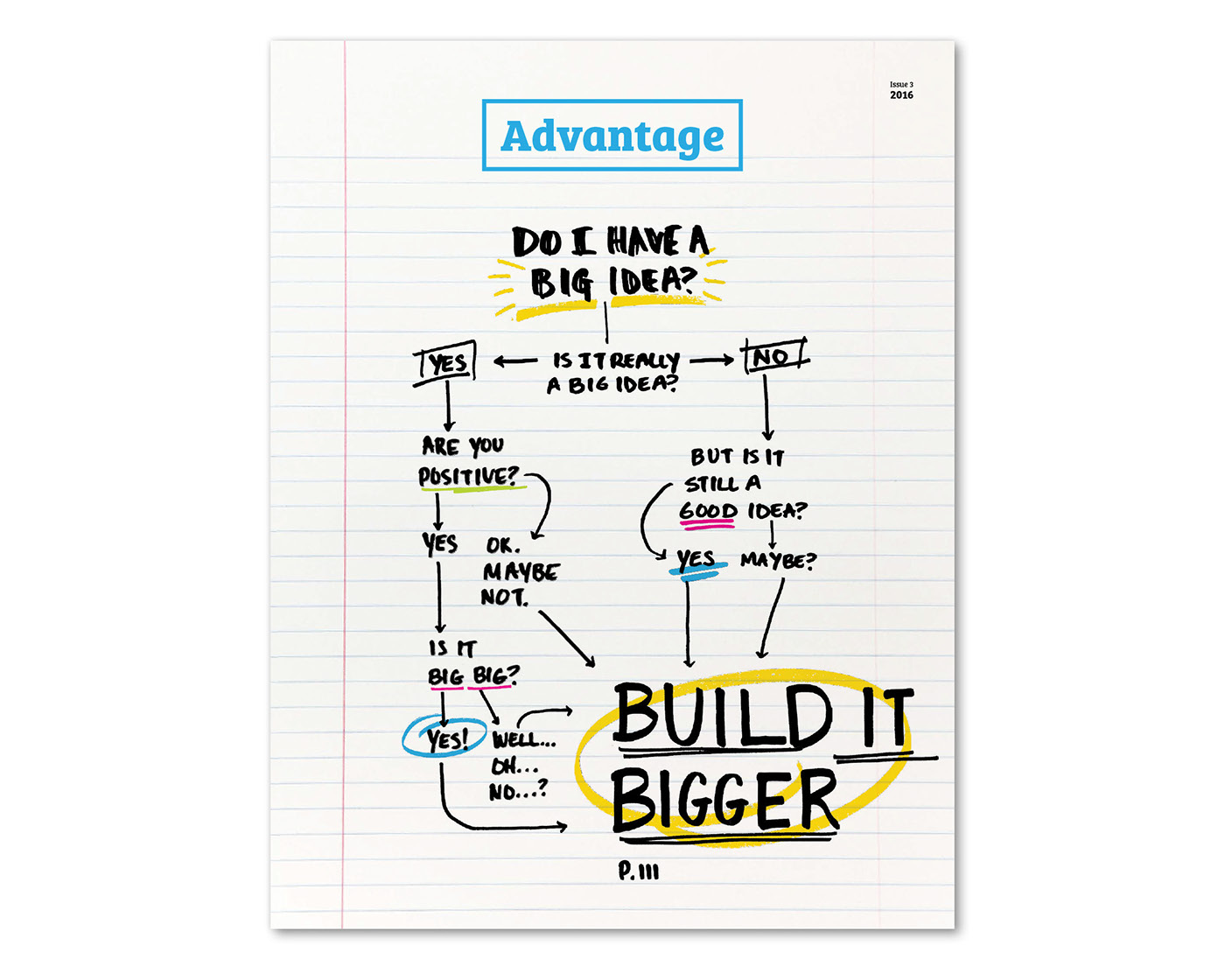
We chose to use the refresh as an opportunity to throw out all of the old Advantage cover rules and come up with a conceptual cover that would ultimately tie in with the Focus section theme, "Big Ideas," and the custom design elements within it. This is our cover and we are extremely proud of how it has turned out.

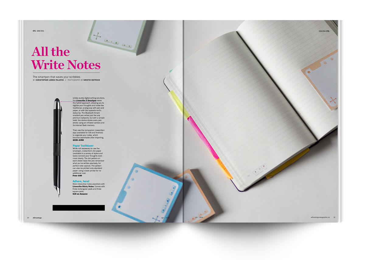
We also saw opportunities to create a more holistic book by tying in our redesign as our big idea (of sorts), and brought that idea to the front-of-book content from the Focus section and cover by having an in-house photo shoot of paper and sticky notes, as well as an interactive smartpen, a notebook, and sticky notes that we highlighted as our Grab Bag products this issue.


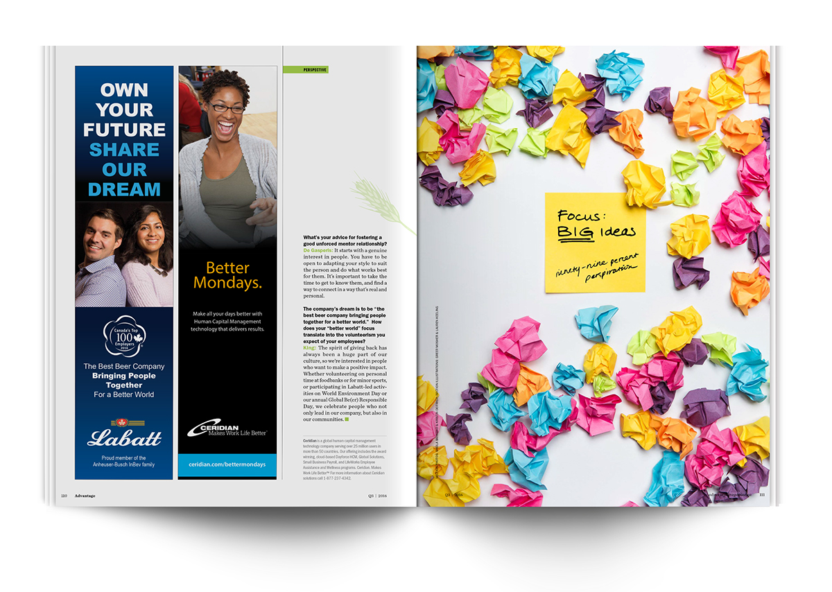
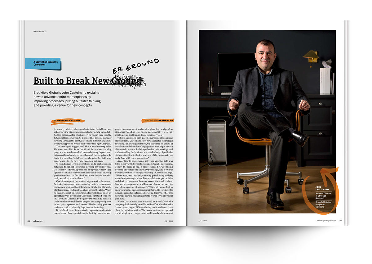
This is the beginning of our Big Ideas Focus section. We wanted this section to feel as if someone came in and marked-up changes and improvements to the stories with sticky notes, highlighters, and handwriting—as if they were working hard on an idea, trying to improve it, organize it, and make it bigger.