

This is a book about life and work of Adrian Frutiger, that I made for IST brief. This project was very challenging and interesting for me. I did a lot of research and was very glad to learn more about Adrian Frutiger. From my research I realized that however Frutiger was a type designer, who usually have a very certain way of thinking, he was also very lyrical in his approach. So I decided to focus on the humanity and sort of dialog between Frutiger, me, people I have talked to about Frutiger and the reader.
I gathered interviews from very different people including Katherine McCoy, Phil Baines and Ilya Ruderman together with contemporary designers who are working with and creating typefaces. I asked them to describe their attitude to Frutiger’s work and the era and place that formed him. I think this is really very important to talk to real people and to understand their’s points, if you want to talk about humanity: not just solid facts, but attitude. I have extended this idea and included the quotations of Frutiger that I found appropriate to the questions I asked. I also made Adrian speak in the typefaces he had created. I have created the visual language through the whole book dividing me, speakers, Adrian and reader from each other. Everyone has his own typographic voice.
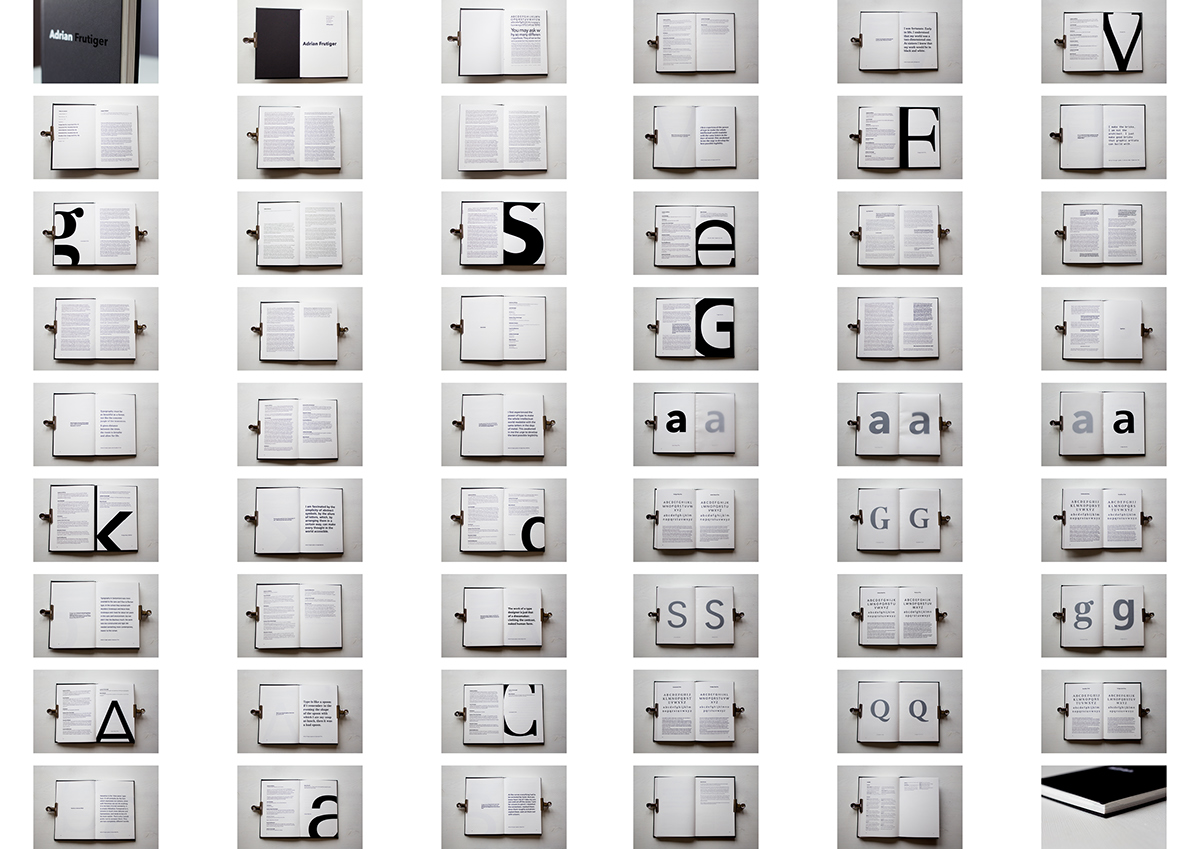
The book consists of the interviews, two articles (obituary from fontshop.com, I found it more appropriate than anything else, and the article of Robin Kinross from Blueprint, that was taken when Frutiger was still alive), and ‘interactive section’. Here a reader can open the window to a world of a type designer, outlining the letters, comparing different letterforms and leave the result as a memory of the beauty of letter shapes that Adrian had created. Through out the book I was hoping to pay attention to the quality of lines of the typefaces, so these letters are used out of context. This will be interesting for people who are just entering the type pathway and for typeface professionals.
The book is called ‘Adrian Frutiger’ and there is nothing outstanding about it. However, I decided to make it in two colors – white on black and black on black, so from the distance you will see only ‘Adrian’. This is more personal, from my point of view, this is how you call a person in a private talk.
The final work is very tactile and engaging from my point of view – I am glad when you can use some of the book parts. And these pages will get you back to the book you’ve read.

The title is made in plotter film Oracal in two colors – black and white. You cannot see Frutiger at a certain angle.

Each typeface is sited when letters are used as illustrations. This is done so to make a reader pay attention to the beauty of the shapes of the letters.

The main text is set in Avenir Next, however, it is still used as an expressive part.

People I have talked with. This is like taking interview from a rock star!
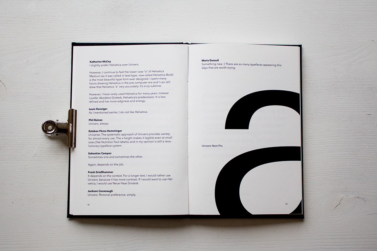
Interviews are also supported by the letter shapes.
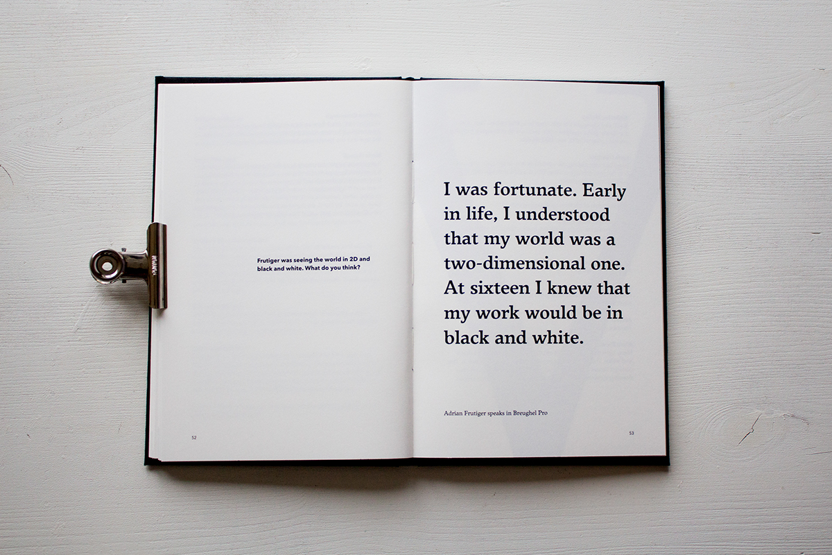
I tried to find the quote of Adrian so it can "answer" my question, as if Adrian is talking with us all.

Adrian speaks in his typefaces.

I've used tracing paper to make people trace and compare the typefaces.

Later, a reader may tear off the tracing paper an leave a reminder about this book and Adrian Frutiger.

The comparison sheet with typefaces, where a person may look how the typeface works as a display and as a text one.
For this work I was marked Merit and recieved the membership in ISTD
Thank you


