ARIM as a brand that delivers answers to the needs of its customer by supplying innovation products and service that crucial to digital business solution & development nowadays.
Here it is, my 3 alternative proposal for their rebranding project. Let's Take a Look Bro&Sis...
Here it is, my 3 alternative proposal for their rebranding project. Let's Take a Look Bro&Sis...

#1 TECHNOLOGIES THAT TALK
The inspiration of this concept come from word balloons (communication; dialogue), magnifying glass (thoughtful; observation; research), initial ‘a’ in the middle stands for arim).
The modern of its shape and simplicity of the curve apporach brings harmony to the brand and its design. Modern, simple, communicative, also memorable at the same time.
The modern of its shape and simplicity of the curve apporach brings harmony to the brand and its design. Modern, simple, communicative, also memorable at the same time.
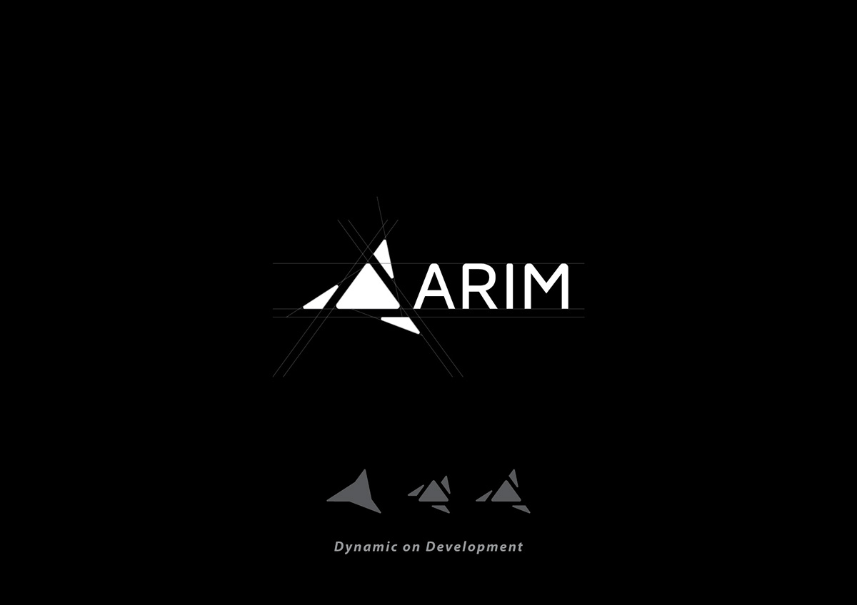
#2 DYNAMIC ON DEVELOPMENT
ARIM’s goal is to provide enterprises with strategic development insights on technology and enabling them to stay ahead of sustainable development in innovative also solutive ideas.
This logo inspired by dynamic and sustainable development in shape movement of triangle that spread out and develop something new outreach. Triangle also symbolized a strong accent for direction & enthusiasm.

#3 THE CURVE OF INNOVATION
Simplicity and modern innovation is the key message of this alternative. Inspired by the simple shape from curve combined into one word. ARIM as an inspiration to its customer regarding digital business solutions and everything else. The uniquely designed typography gives more meaning to the word ARIM as a brand name that is modern, flexible (adapative like plug & play system), also well designed.
THANK YOU!
M| thooneyns@gmail.com
