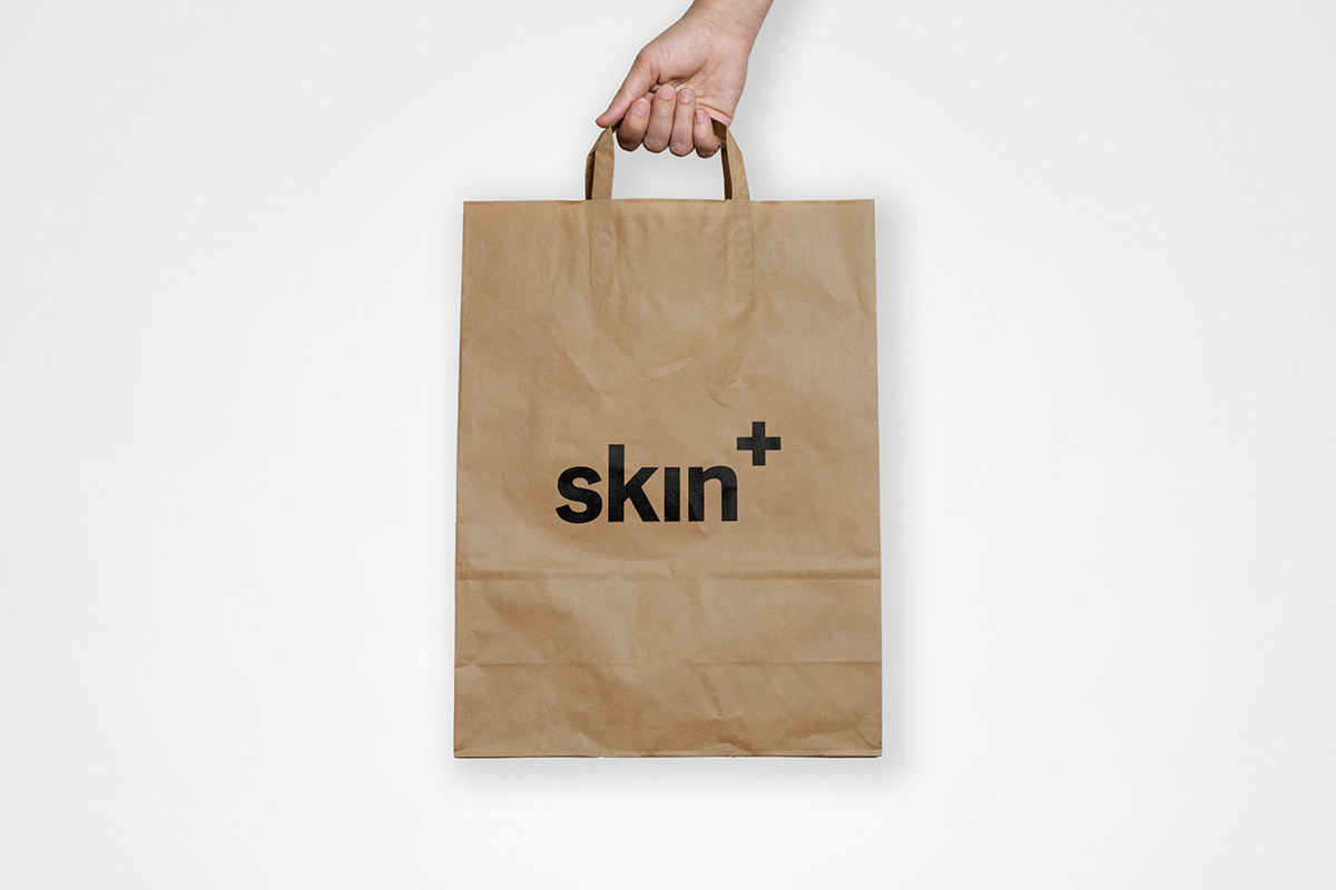
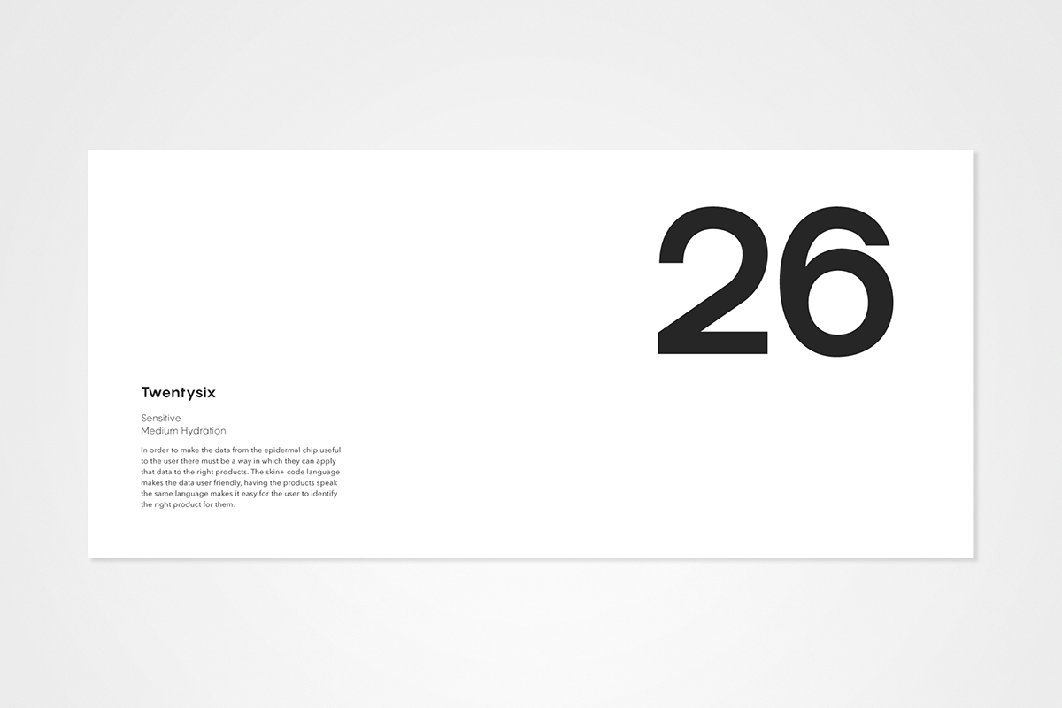
Skin+ is a cosmetic brand for skincare products. The unique aspect of Skin+ is the epidermal chip or 'EpiChip' which is the centerpiece of the brand. Using data from the chip presented via a phone application the user can purchase a product specifically suited to them. The branding on the packaging is deliberatly ambigious to entice potential customors. By only revealing the very final part to the Skin+ story (the number system), individuals are inclined to explore the brand further.

Brief
Create a new-to-world, accessible, mass-market beauty brand that breaks established category codes.
Your brand should be a response to some of the issues with which modern, post-demographic consumers identify: gender stereotypes, healthy body image, environmental concerns, or any other issues you feel are relevant to users of beauty products today.
Within branded packaging, the beauty category is among the most clichéd. Why do men’s personal care products look like power tools, whilst women’s remain delicate and ultra feminine?
The world has moved on. Facebook now offers 56 gender definitions for users to identify themselves with. The use of hashtags like #transisbeautiful or #effyourbeautystandards, and Charli Howard’s open letter to the fashion industry, show how conversations around beauty are changing. But beauty brands aren’t keeping up.

Solution
A contempory system of cosmetics deserves an equally modern design to compliment it. I wanted to communicate technology while keeping the product cosmetic orientated and not alienating less tech savvy consumers. Ultimately the target market is early adopters and well educated individuals who take pride in looking after themselves.


Brand Development
Logo development showing four stages of refinement selected from many logo alternatives. I began simple then explored more stylised options before reverting back to a minimalist visual aesthetic. The final logo was further refined using guides from the font.


The typography is fundamental to the brand as it is the means by which the information from the chip is communicated, it therefore is one of the key visual elements of the packaging.
Cutting edge cosmetic products needs an equally up to date typeface to go with it. Pangram by Pangram Pangram (yes) is a 2015 typeface that is both geometric and stylish, offering the perfect balance between technology and beauty. The body copy is set in Avenir by Adrian Frutiger, the word itself to mean ‘future’ in French, a lovely choice for the future of skincare. Finally the oversized type is set in Modernist by Sean Kane, once again a ‘modern’ choice with a stylishness through simplicity.


Implementation
The core of the brand is the epidchip and moisturisers specifically the packaging for them. Further implementation of the brand continues into the app (responsible for the linking with the chip, and the website, which acts as a go-to for those wanting to find out more about how skin+ works.