Mannifest.org is passionate about helping people to get involved with activism and volunteer work. With a tailor made social media platform, that ensures the user can achieve this with minimal effort. This is the main objective, everything should be aimed at this. This is what we should constantly refer back to.
The key elements of the branding focused on free speech and coming together.
http://mannifest.org/
'Manifesto'
After a year of watching activist videos on social media, our founder, Izak Jackson noticed that there were thousands of people commenting on these videos about how they want to get involved in social activism, but don’t know where to start. That's how he came up with the idea for Mannifest.org.
Our social media platform will allow activists to sign up, select types of causes they are interested in and then view activist and charity pages based on their choices. Here they can find out information about laws, culture and trends within their causes of choice, and will also be able to join these causes. Each causes page will feature an events system, the ability to talk to other members of the group and more. Causes can even send out direct mail to the activists in order to inform them about new events or changes etc.
Our goal is to give the general public a platform for them to share their voice and join others who share their ideas!

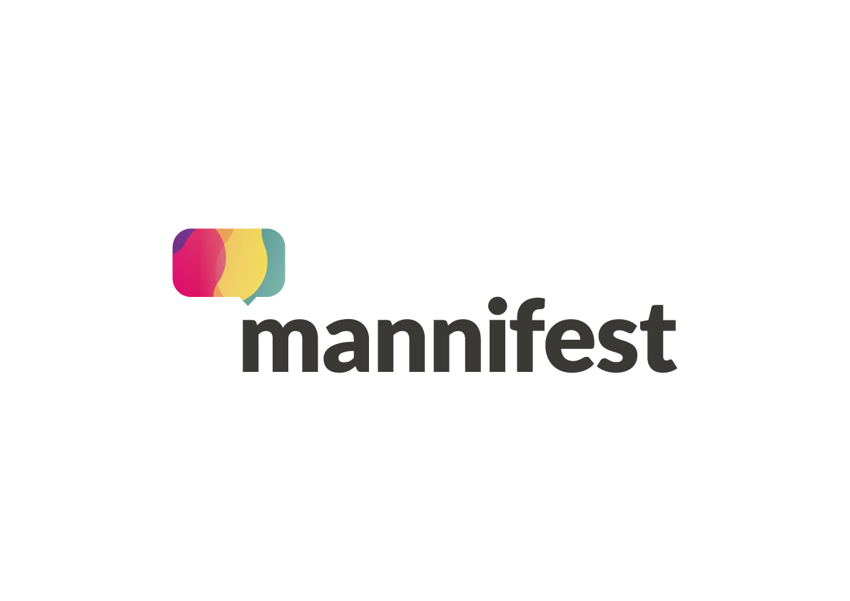
Logo Design
The design was led by the logo, colours and visual styles all evolved from the mark.
Activism, Voice, Empowerment, Change, Power, Freedom, Ideas & Passion.

Planning and initial ideas.

Logo Proposal 1: A visual metaphor of people coming together in groups around mannifest.

Logo Proposal 2: A mixing type visual style of crossover and dynamic movements.

Logo Proposal 3: A speech bubble visual with overlapping mixing elements within representing opinions.
Proposal 3 Continued
After proposal 3 was chosen I explored a more detailed aesthetic and underwent a process of refining the logo.


Exploration of typefaces.

Two slightly different typefaces demonstrating two potential routes, left being younger and right being more academic.

Gradients represented change and also made for a colourful and visually appealing aesthetic.

Refining the logo.
Final Logo