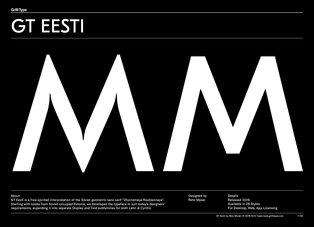
GT Eesti is a characterful geometric sans serif typeface with Soviet roots.
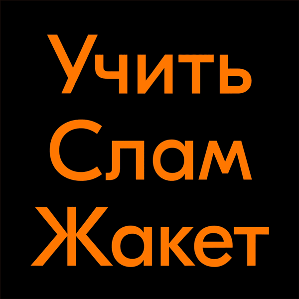
Swiss type foundry Grilli Type is proud to present GT Eesti, a new typeface family designed by Reto Moser. It’s a free-spirited interpretation of the Soviet geometric sans serif Zhurnalnaya Roublennaya (Журнальная рубленая), first released in 1947 and designed by Anatoly Schukin.

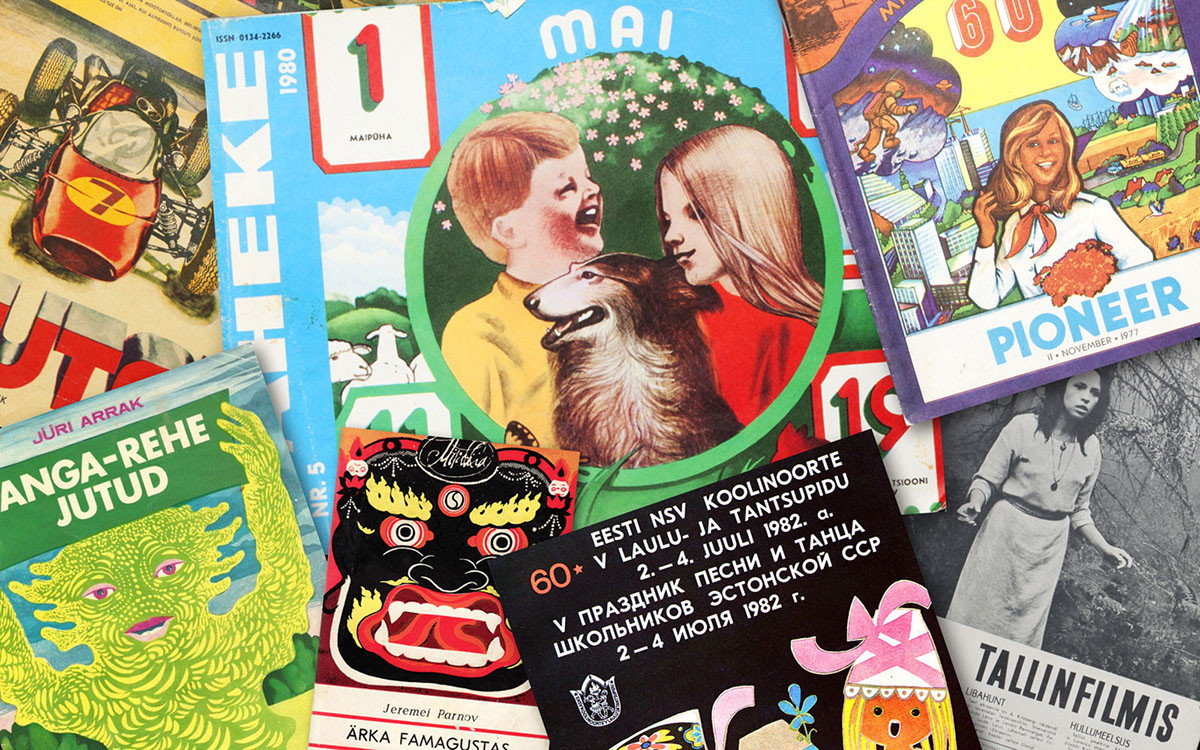
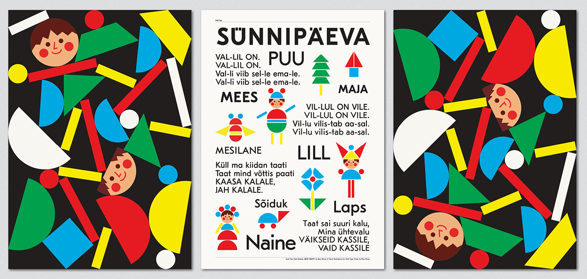
In 2009 Swiss graphic designer Urs Lehni brought a couple of Estonian children’s books to the attention of his students, Reto Moser & Tobias Rechsteiner. They were immediately hooked by the books and their typefaces. And so they started digitizing Eesti based on scans from those books.

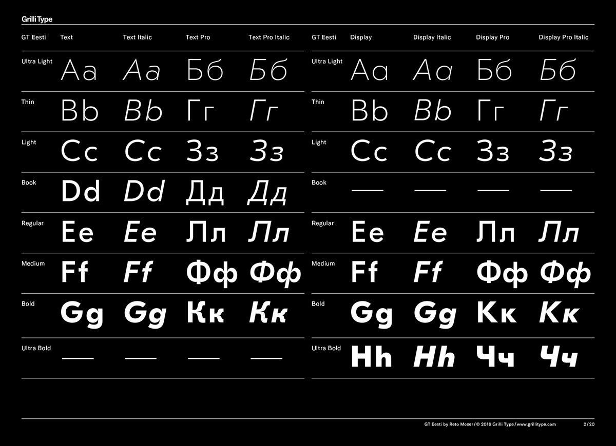
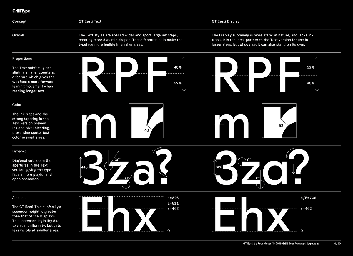
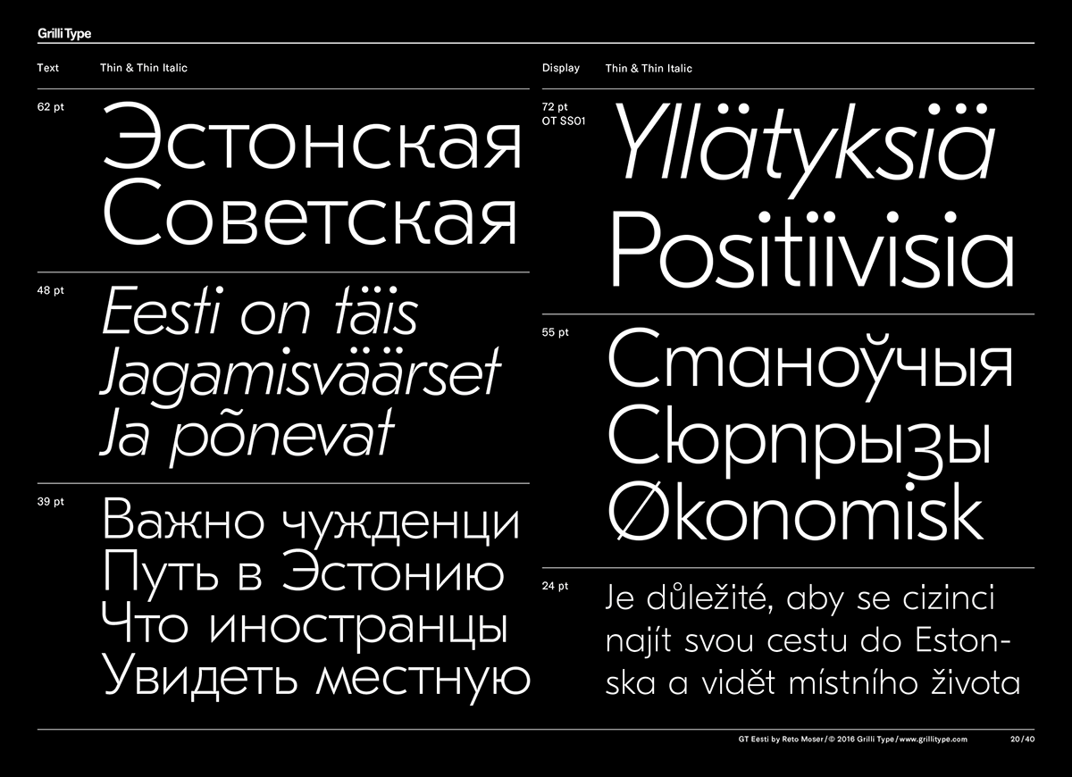
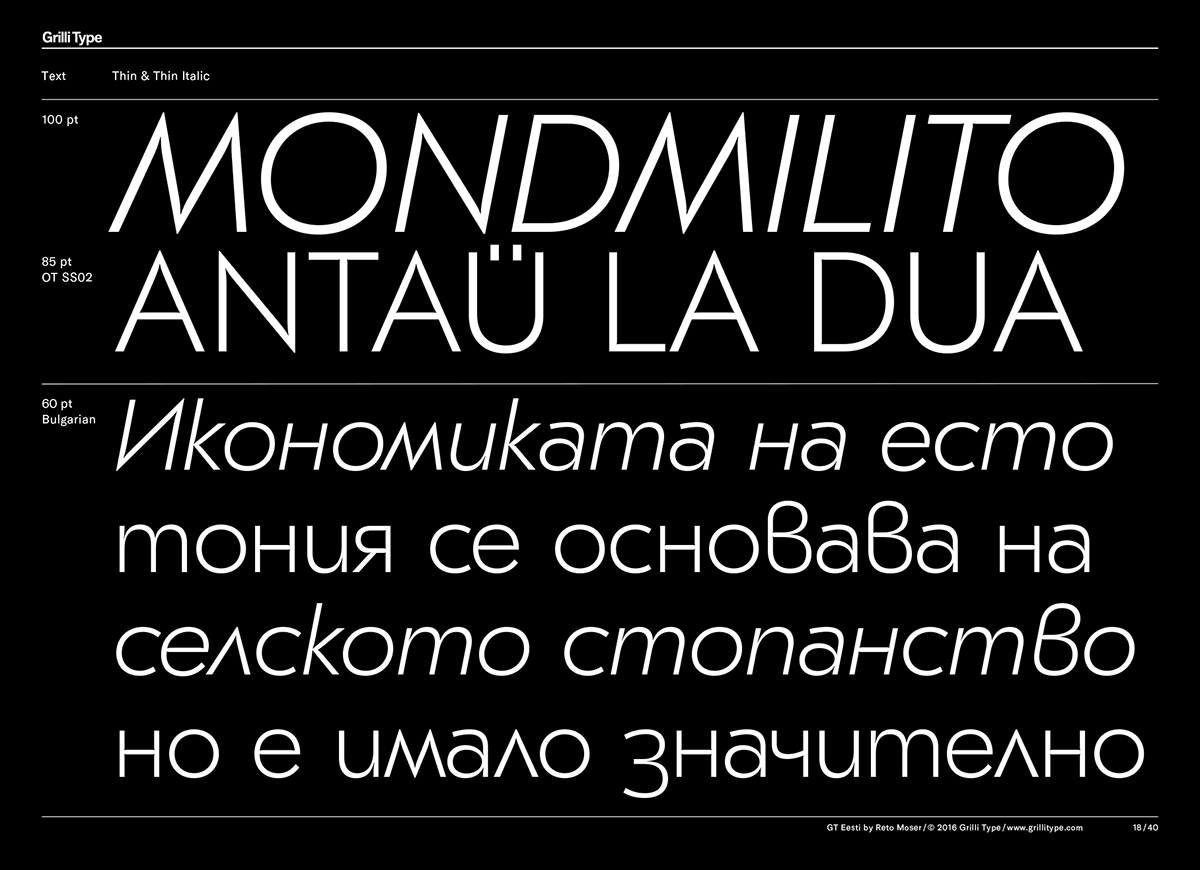
Soon they discovered that there were actually two versions of the typeface: One for larger sizes named Display, and one for small uses called Text. GT Eesti Text sports ink traps and tapering to prevent ink and pixel bleeding, avoiding spotty text color in small sizes. Diagonal cuts open the apertures in the Text version, giving the typeface a more dynamic character. The more static nature of the Display subfamily is supported by its horizontal and diagonal stroke endings.
At this point, Moser took the lead on the project, shaping the typeface’s character and discovering more books featuring Eesti in both Latin and Cyrillic.
Find out what happened next on the GT Eesti Minisite.
Want to learn more about the typeface? Don’t miss the GT Eesti minisite with even more information about the typeface’s design and its history.


