I worked on this project about six years ago when I was finishing university.
For some time I was employed in the alcohol industry and had a chance to develop brands and labeling for various alcohol items. Unfortunately the company and I did not share the same vision and they ultimately decided to go in a different direction. I decided to freeze it and keep this work for another opportunity.
For some time I was employed in the alcohol industry and had a chance to develop brands and labeling for various alcohol items. Unfortunately the company and I did not share the same vision and they ultimately decided to go in a different direction. I decided to freeze it and keep this work for another opportunity.
The first concepts were published online in 2007-2008 at some russian sites:
For this project I decided to create something that would reflect the spirit of Russia. I wanted something that was easy to understand, rooted from a strong background, and something that could speak for itself. The image that stood out most in mind that would properly represent all of these things was Saint Basil’s Cathedral.
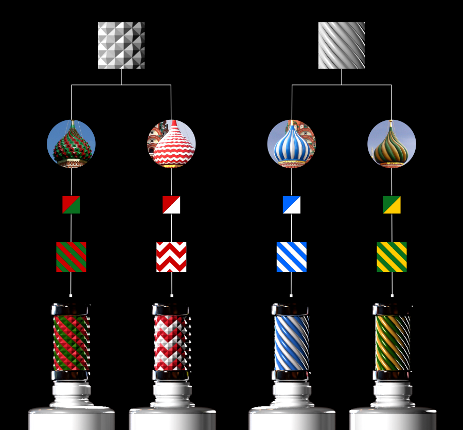
The Cathedral is a famous Russian landmark equipped with bright and funky colors that represents a deep culture and rich history.
In the end I chose not to use the domes as itself, as this was too obvious. More importantly is to make a representation of the Cathedral, a system with a symmetrical and balanced design.
In the end I chose not to use the domes as itself, as this was too obvious. More importantly is to make a representation of the Cathedral, a system with a symmetrical and balanced design.

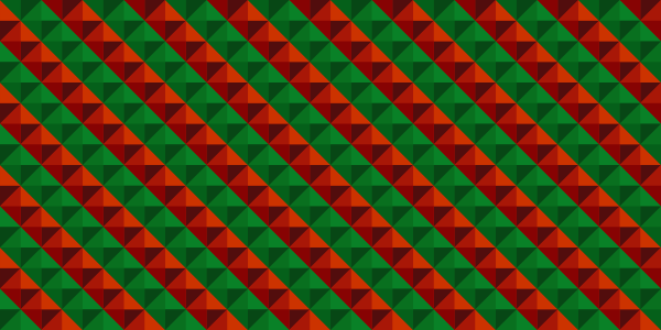
The colors are very important. As seen in the image, I was able to locate around four different color combinations and one dome is golden.
I wanted to find explicit elements which associate the design to the Cathedral's domes. At this stage the object as a whole is more important than the details.

#5 (gold dome) – I decided that this element would be used for something special (premium)
and would be set aside.
I continued to look over the designs and collect and decipher the visual characteristics of each of the Cathedral’s domes, concentrating on the surface’s structure.
I continued to look over the designs and collect and decipher the visual characteristics of each of the Cathedral’s domes, concentrating on the surface’s structure.
Again, my objective was to create a simplified, practical, and commonly recognizable design.
To achieve this I started by combining the domes into pattern types of 3, followed by deleting repeating and excessive elements. The end result needed to be simplified without losing the recognition of the Cathedral.

Next, I deleted repeats and excess objects.
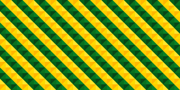
Top domes are the same, the second green-yellow row is repeating also.
Top domes are the same, the second green-yellow row is repeating also.
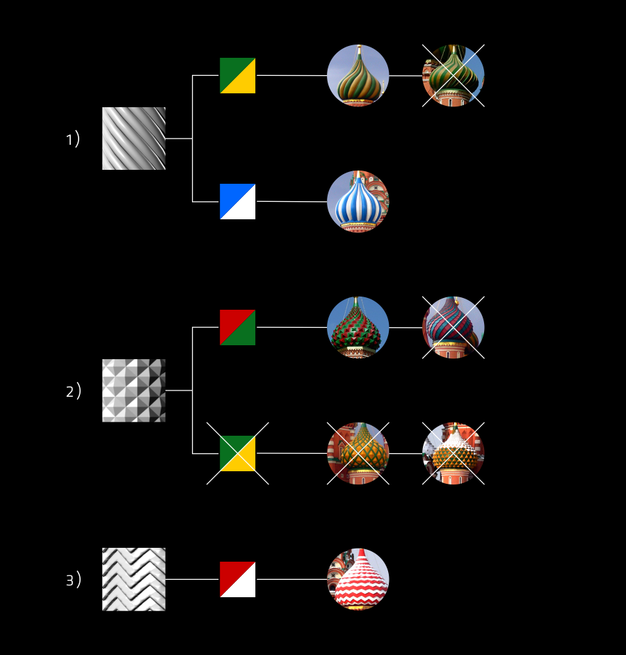
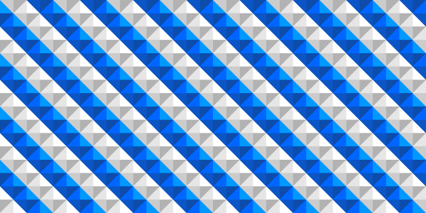
So, this is intermediate result.

Surface of #4 (W-form) from above is superfluos element, better to combine it with #3.
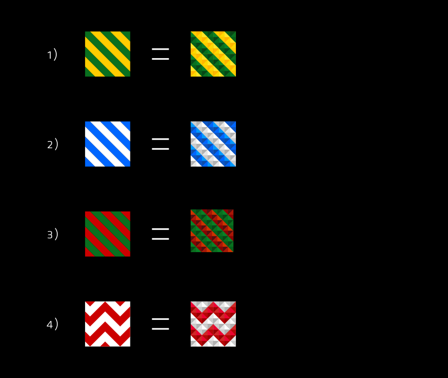
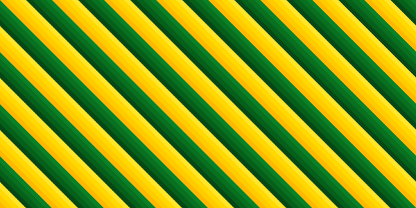
Patterns. This is how possible to make W-formed texture.
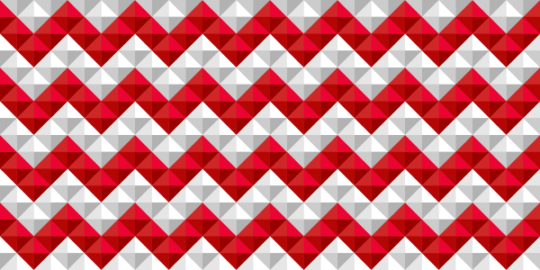
Patterns are also very important. It can work well and easy anywhere.


Now it's time for final smear - flavors. How it works:

I used classic vodka's falvors: clean (original), pepper, lemon (citrus or fruits) and berries.


First step is done.