


INTRO
—
Kent Brewery (UK) was established in 2011 with a clear target—to make ever more interesting and tasty beers and take Kent in a new direction. Kent beers are different, never bland, never normal and show how much more can be achieved from the art and craft of brewing. In 2015 Kent Brewery decided to start bottling their beers and asked me to help them redesign radically their original rather old-fashioned look.
DESIGN
—
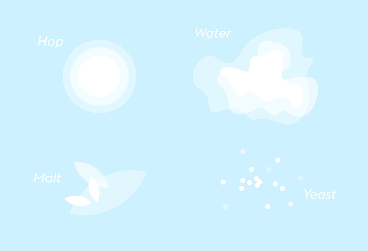
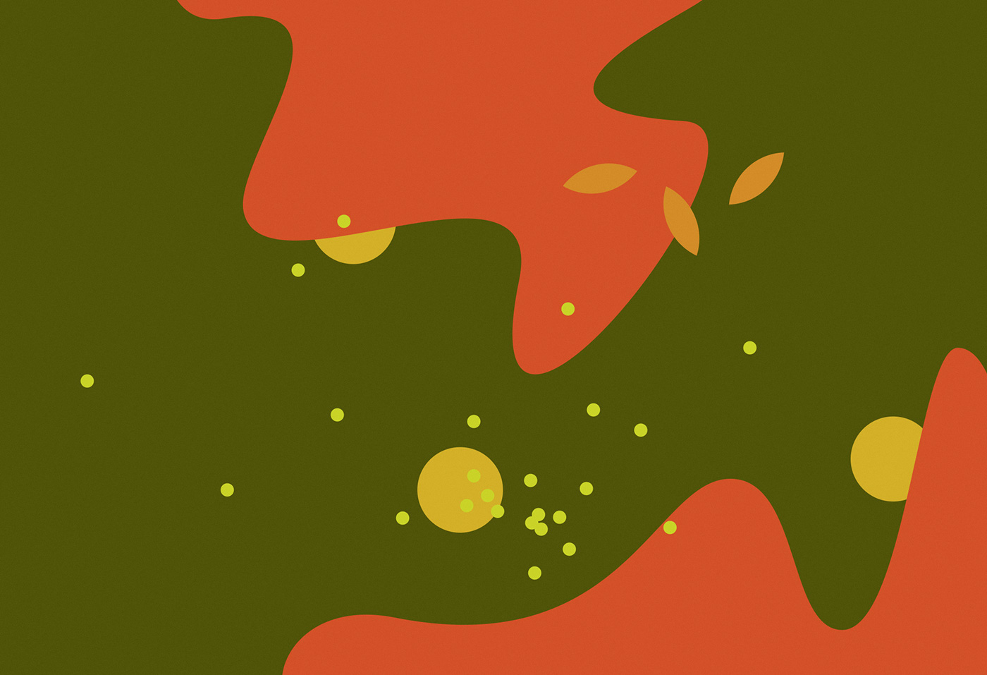
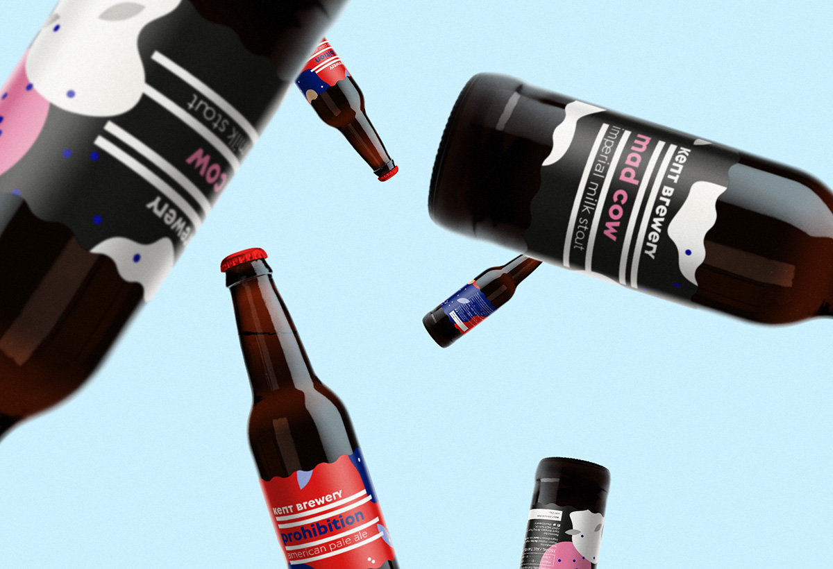
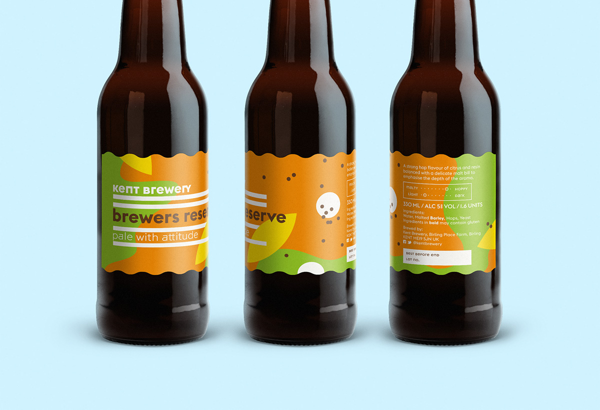
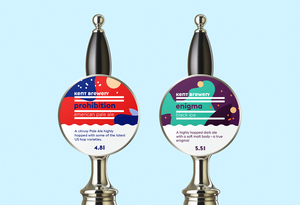
The initial task was to create a generic label that could be adjusted easily by changing only the colour and beer name. Soon it was clear that a shade of one colour is not enough to provide a proper differentiation within their impressive series of 15 beers. So I developed a dynamic system of shapes that represent the very basic ingredients of every beer—water, malt, hop and yeast. By rotating, cloning, scaling and mixing these colourful shapes I generate literally unlimited amount of patterns which all are very unique but share same characteristics. Also, thanks to the 5–colours combination they are quite difficult to mix up.
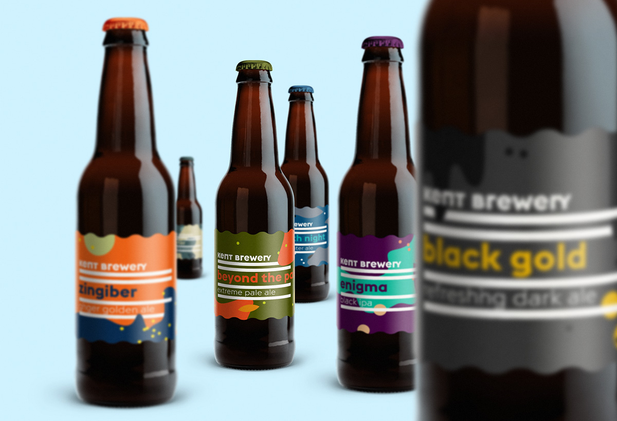
The design conversion has already begun and you can now taste the most colourful craft beer ever in craft beer pubs in London, Brighton and around Kent. Cheers!


ADVERT
—
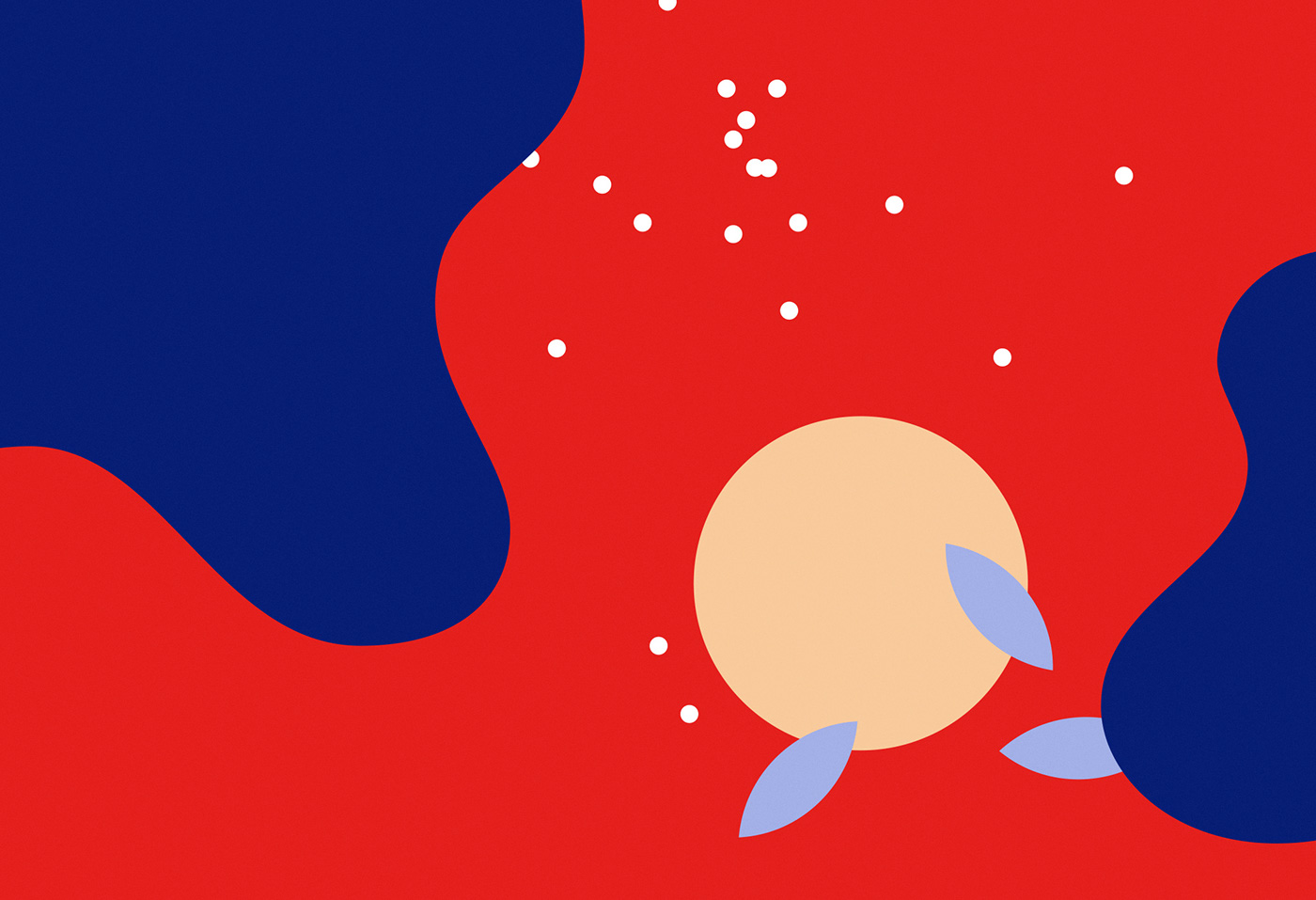
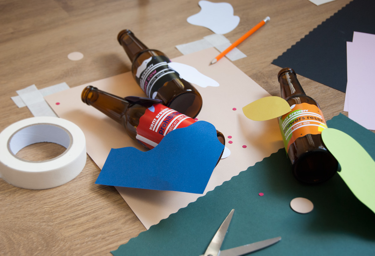
Shortly before introducing the new design I also created a full-page magazine ad to promote brewery's new look and inform about the launch details. To support the idea of craft beer brewing we chose a very colourful and bold style. I crafted the ad from color papers showing typical elements of the new design along with first three bottles from the brewery's portfolio range.
—
Shortly before introducing the new design I also created a full-page magazine ad to promote brewery's new look and inform about the launch details. To support the idea of craft beer brewing we chose a very colourful and bold style. I crafted the ad from color papers showing typical elements of the new design along with first three bottles from the brewery's portfolio range.


INSTAGRAM


