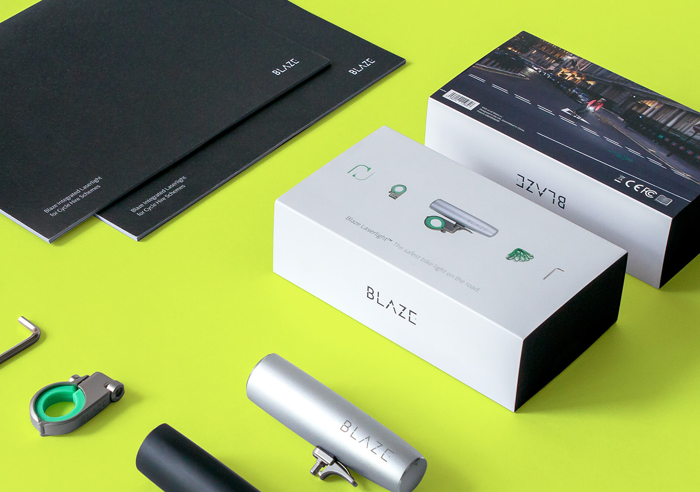
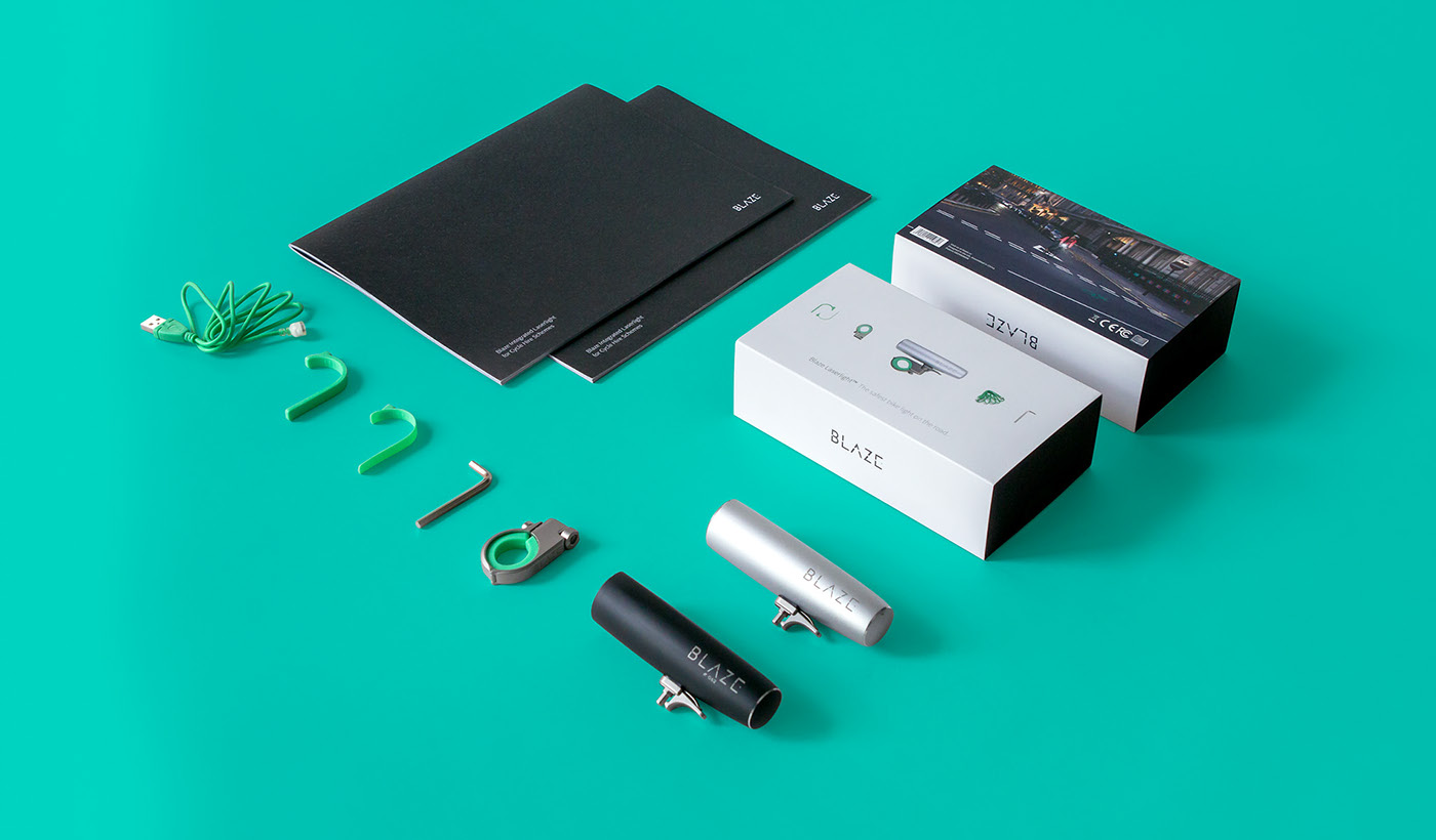
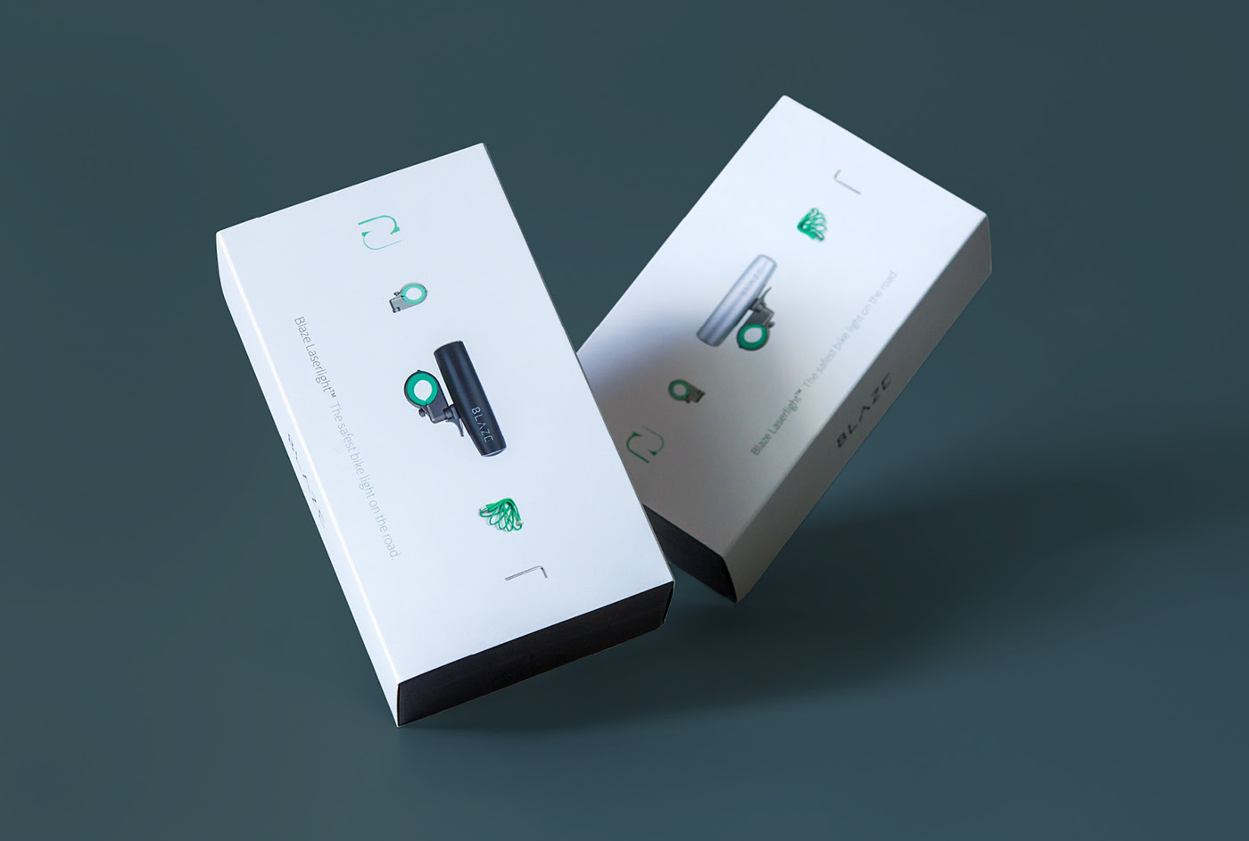
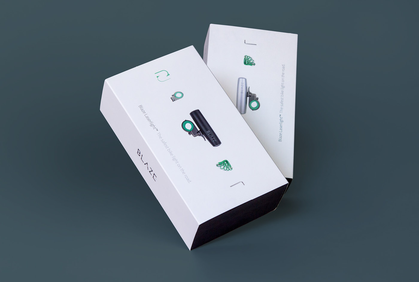
Shortly after Blaze launched their redesigned site, they sought to update the packaging design for the Laserlight sleeve to be more consistent with the new look. The resulting design shares a similar visual language: sharp contrast, sophisticated typography and a quiet, understated use of imagery.
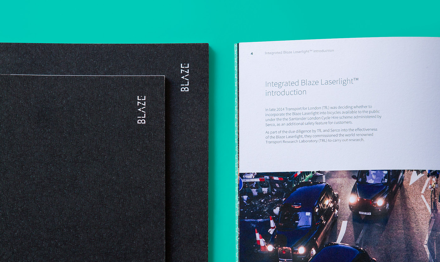
The brochure was commissioned to highlight a study showing the significant safety benefits of using a Laserlight, and was presented to business leaders in the USA. The cover uses a photograph I took of tarmac to resemble a dark road.