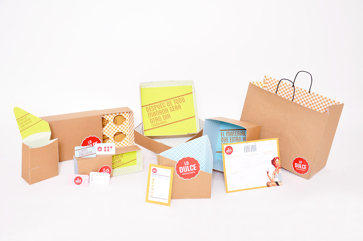
LO DULCE
Repostería
Repostería
NO ES TAN DULCE COMO PARECE / NOT AS SWEET AS IT LOOKS
Branding for a new bakery business with a girl power touch. We believed in the idea that cupcakes can be sweet and sexy at the same time.
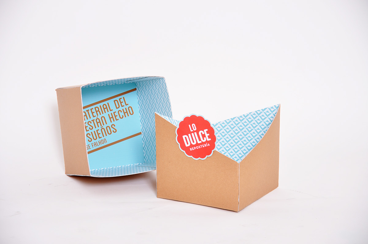
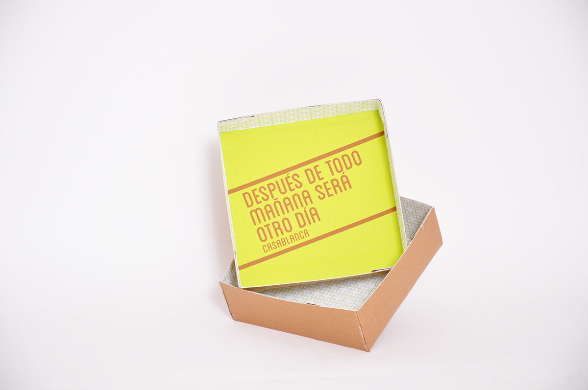
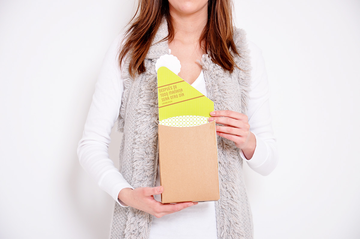
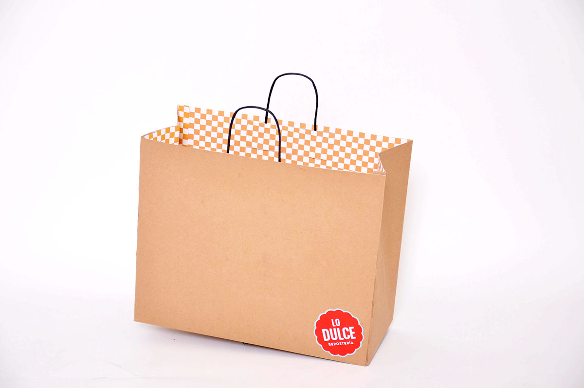
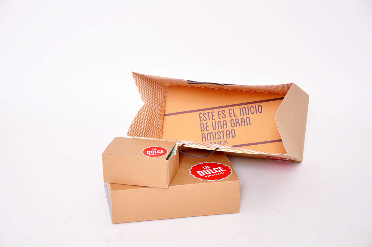
For the packaging we decided to leave them really simple from the outside and give them a little twist from the inside with color and patterns and a quote from the 50's and 60's.
For the packaging we decided to leave them really simple from the outside and give them a little twist from the inside with color and patterns and a quote from the 50's and 60's.
To make a stronger statement, we designed "Betty", our Pin-up girl; she brings the sexy to the brand in contrast to the sweet looking logo.