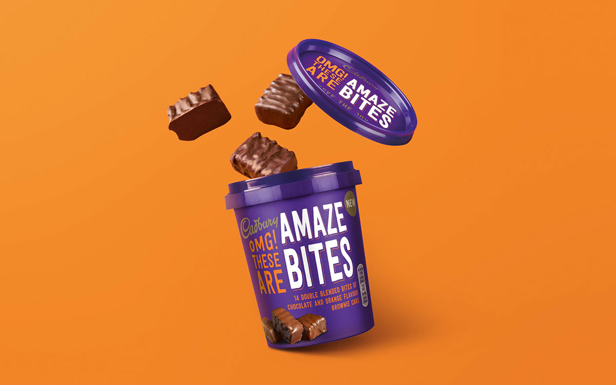
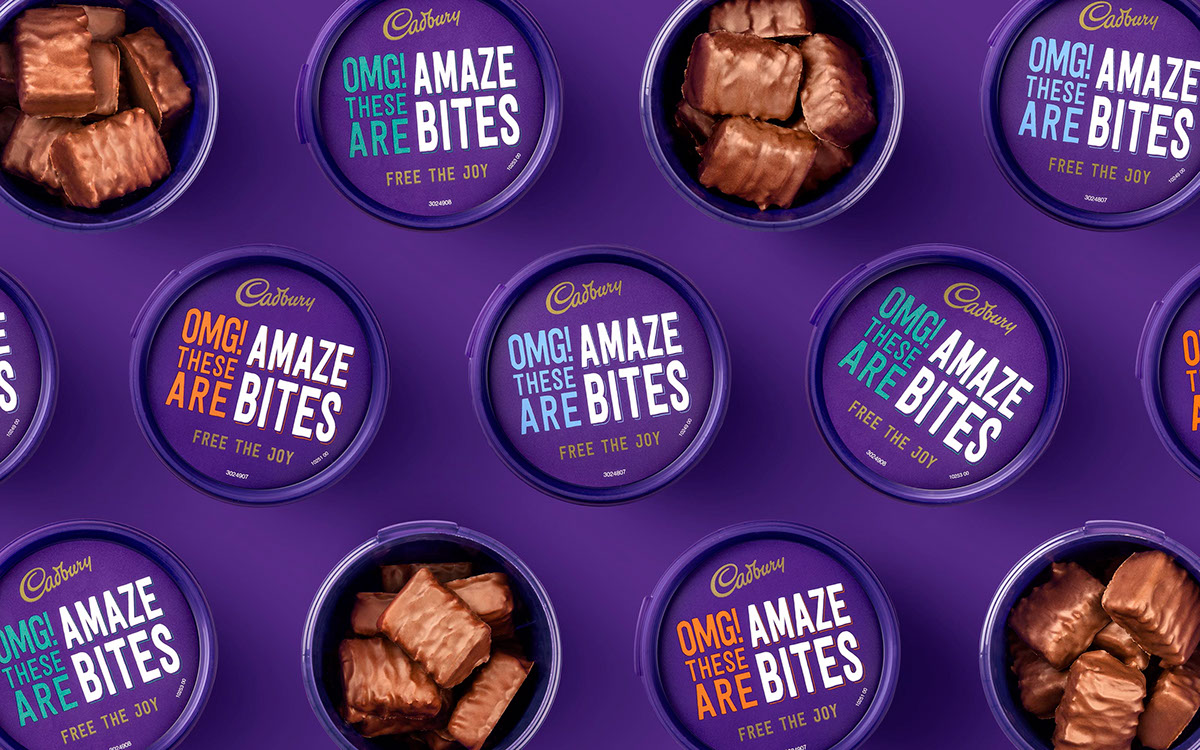
The name came first. After one taste of these double-blended delights, someone blurted out ‘Amazing!’ This quickly became Amazebites, setting the tone for the design strategy. For maximum shelf-shout, we ramped up the shareability and Joy (Cadburys’ core brand proposition) with unmissable typography and a bold tone of voice. Aimed at women, the seriously moreish treats are loud enough to advertise themselves, and luxurious enough to wait until the kids are in bed.