Project summary: to redesign a logo for the eReader Prestigio Android app, the logo should convey that a user can read conventional e-books, playback its text with text-to-speech feature and listen to audio books; to keep the same feeling as the original logo, but at the same time give it more of a Material Design.
The project has been divided into two stages: stage 1, to update an existing app icon, but to retain the red color and the shield shape in line with other Prestigio apps; stage 2, to suggest an alternative version in material design and without shield. All the graphics, designs and images presented here (except of the old logo) are made by Julia Albul.
The A/B test has been performed by the customer afterwards in order to define which logo users prefer and to analyse how the particular logo influences views and downloads of the app.
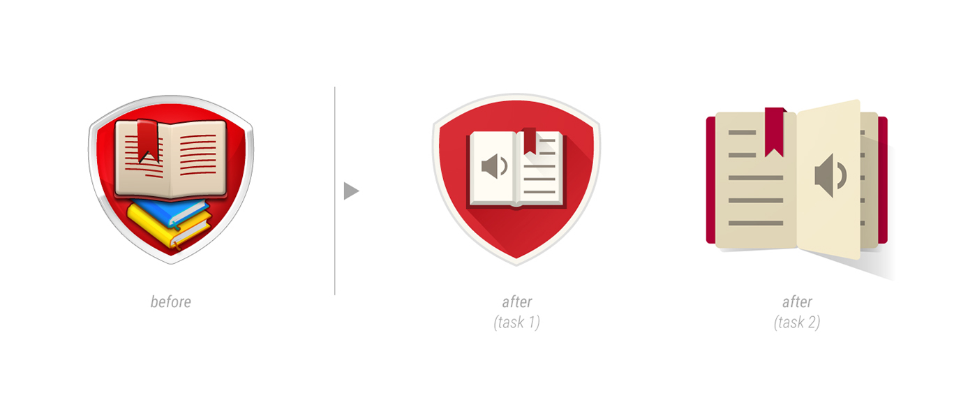
Material Design Logo (Stage 2)


Light and shadow exploration

The logo on a pixel grid

512px

192px

48px

Web banner ad, featuring user interface and logo
"Shield Logo" Version (Stage 1)


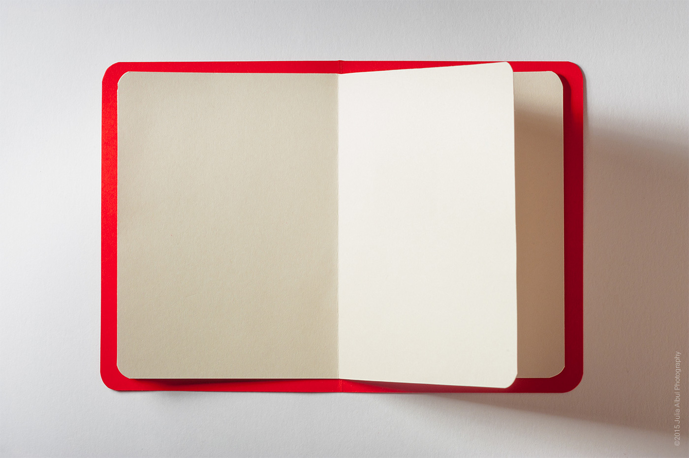
Exploration sketches, playing around with open book, trying to give it a dimension.


The logo on a pixel grid

Color studies

512px

192px

48px

Installed application

Web banner ad, featuring user interface and logo


